Oct 03, 2007
May 02, 2014
May 15, 2008
Dec 12, 2007
Apr 21, 2008
Jul 23, 2012

Wildfires, Taxes, and the American West

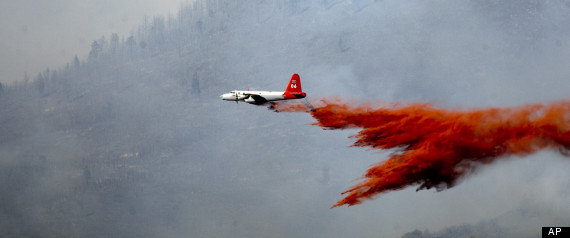
Every summer, it’s the same: forests flare up like kindling, tired emergency crews fall back along the firebreaks, home owners stand guard on their roofs with pitifully thin garden hoses, and the skies are crossed with planes and helicopters cutting through the smoke to drop the equivalent of a teacup of water on the blaze below.  Perhaps that’s why I liked this photograph from among the many more dramatic shots taken in the last two weeks.

Although cropped to feature the plane in action, the image still suggests that we are looking at a child’s toy, or at least a movie made for the younger set.  Although lacking the spectacular power of Air Force flyovers on July 4th, this nondescript supply plane would be thrilling to anyone still capable of being dazzled by simple technological prowess.  And the red fire retardant swooshing behind it bundles together work, warfare, firefighting, fire, drama, and good works alike into a visual emblem of adventure.  The West still evokes the majestic, thrilling chords of romantic heroism, even as it burns like the gates of Hell.

The photo doesn’t just play the old tune, however, for it captures as well the miniaturization of human effort when set against the vast backdrop of nature.  Westerners get that, although they also forget it from time to time.  How can you blame them, for modern civilization is a story of harnessing nature’s power and of living far beyond what the terrain alone would allow.  In the past 100 years, the US  has damned the rivers, pulled water, oil, and coal from deep in the earth, provided electrical power for everyone, and made the desert bloom.  All it takes is a good fire, however, to remind us that human scale is a small thing.

Until, that is, the cool rain finally falls and amnesia returns.  I’ve posted on the fires before (here, here, and here), and I suppose I will again.  Every summer it’s the same.  Except, of course, when it gets worse.  As Timothy Egan points out, the combination of global warming and Republican ideology can only lead to disaster.  Unrestrained growth while cutting government services (as for fire prevention and fire fighting) gives new meaning to hubris.  Need I add that currently these services are underfunded?  For example, the small fleet is aging and some planes have had to be grounded, and states and municipalities espousing low taxes once again are turning to the federal government for a bailout rather than burn to the ground.

By trying to live well on the cheap, people are playing with fire in more ways than one.  And when a political party or a society develops an excessive appreciation of its own powers, nature is sure to provide a harsh lesson in humility.

Photograph by Kim Raff/The Salt Lake City Tribune.
 0 Comments

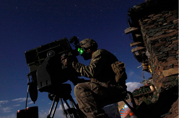
The Night Watch

There is something altogether haunting about this photograph.  Shot in the evening, it is illuminated by the starlight (and perhaps a bright moon) but animated by the green glow of night vision.  Rembrandt’s “The Night Watch” was famous for its use of light and dark to suggest movement where we might otherwise imagine a static frame, but here we get natural and artificial light as it combines to suggest a lone and anonymous presence stuck in an altogether static frame in a scene where we might otherwise anticipate agency and movement.

To get the point contrast the image with the photograph of the Raising of Old Glory on Mt. Suribachi during World War II. There too the soldiers are anonymous, but their anonymity is masked by their collectivity; we may not know who they are individually, but they are working as a team to a common and coordinated purpose. And, of course, it is a clearly national purpose, as symbolized by their connection to and effort on behalf of the flag.  Here the soldier is an army of one and there are no markers of nationhood. Indeed, the only identifiable symbol in the photograph appears to be the top of a soda bottle (possibly a Coca Cola bottle, marked by the characteristic red cap, but there is no way of knowing for sure) which emerges from the bottom of the frame.  But surely this soldier does not serve and sacrifice in the name of sugared water.  Or at least one would hope that we are not fighting and dying in the name of commercial interests.  The bigger point, however, is that there does not seem to be any movement at all as the soldier is hunched over, motionless, immobilized as he appears to be gazing  trance-like into the past.  Once again, contrast this with the photograph from Iwo Jima, where the image not only captures the raising of the flag at the height of its extension  upwards, but also where the direction of such movement faces to the right of the frame, the more conventionally forward looking, future oriented direction.

According to the caption, this is a U.S. soldier sitting at an observation post in Afghanistan’s northeastern, Kunar Province.  We are not told what he is looking at, but Kunar is a largely mountainous area besot with muddy rivers and rock filled, craggy pathways that combine to make passage treacherous if not impossible and so it is not hard to imagine the landscape he is observing.  But what exactly he is looking for … that is hard to say.  The war in Afghanistan is, of course, the longest war in America’s history, and Kunar has been the site of some of the fiercest battles between U.S. troops and Al Qaeda, the Taliban, and various mujahideen, but even for all that it is not clear what has been gained or lost (except for human lives, American and Afghani alike; the displacement of millions of individuals; and a price tag conservatively estimated at 600 Billion dollars) by such engagements.  And yet, the photograph suggests, for all that we sit and watch.  Static.  Unmoving.  Transfixed, it seems, by an advanced technology that allows us to see into the dark even if it is unclear what we are looking for—or what exactly we should do if we find “it.”

What makes the photograph haunting is perhaps how it functions as an eerie cipher for American involvement in Afghanistan writ large: individual, not collective; transfixed by a backward looking tunnel vision; and altogether immobile.  In its own way, it perhaps encapsulates the current war in a manner similar to how Raising the Flag on Mt. Suribachi symbolized an earlier war–only in reverse.

Photo Credit: Tim Wimbome/Reuters

 0 Comments

Exhibition: Liberty & Justice (for All)

Fovea is celebrating its 5 year anniversary with the exhibition:

Liberty and Justice (for All): A Global Photo Mosaic.

The exhibition includes photographs and personal narrative from 68 photographers from 22 countries.  It will be on view from June 9 through August 5, 2012, Fridays to Sundays, 12-6 pm, 143 Main Street, Beacon, New York.  More information is available here.

The exhibition is a tribute to Chris Hondros and Tim Hetherington, who were killed while covering the conflict in Libya last year.  Fovea is a volunteer-run 501(c)3 educational charity dedicated to promoting public understanding of world events and social issues through the works of photojournalism.

Photograph by Alex Masi from Bhopal, India, the site of the 1984 Union Carbide industrial disaster.

 0 Comments

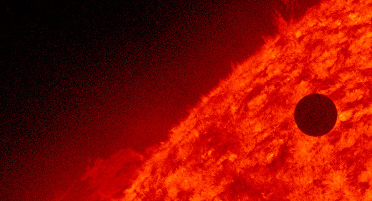
The Transit of Venus–from Optic to Image

Yesterday was an astronomical occasion known as the Transit of Venus, which refers to the passage of the planet between the sun and Earth.  The passage occurs infrequently (by human standards) and won’t happen again until 2117.  You may already have seen images of the small black dot outlined against the larger golden disk of the sun–100s of them are available at Google Image and they will be featured in many slide shows today.

But you’ve seen that before–and not just during the transit of 2004–but in thousands of decorative designs in advertisements, on clothing and accessories, and throughout popular culture.  OK, the dot may not have been there, but smooth surfaces, solid colors, and abstract shapes were present, just as they are found throughout modern design.  Thus, a stock image of this relatively unique celestial event is already crafted according to a standard way of seeing–that is, according to the optic of modern design.  And in that optic, the world is already well under control and everything, including visual experience, has been made made manageable through processes of abstraction.

Perhaps that is why I prefer this image of the transit, which inverts many of the features of the modernist representation.

The sun appears to be the moon, and its power has been reduced further by the occluding clouds.  Likewise, the position of Venus seems less a matter of decoration and somehow almost as substantial as the sun itself, perhaps because it is continuous with the darkness surrounding and partially covering the sun.  The clean circular lines are the same, of course, but now they, too, are but cuts in the vast darkness rather than containers of light and movement.  Most important, the mood is darker, almost elegiac: the image activates deep, rich  emotions rather than sanitizing emotional response.  If the sun and planet are still somewhat abstracted–we see but shapes at a distance–that formalism is complicated by how they are covered, almost shrouded, by the clouds.  In place of timeless symmetries, we also see shifting atmospheric conditions.  In place of a visual spectacle, we are reminded that we see as through a glass, darkly.

We will never see the sun face to face, of course, but other images use other mirrors to get us close to its seething surface.  The image above is another shot of the transit, but now only the small planet is still a flat, uniform surface, while the enormous energies of the sun breach the surface of earlier abstractions.  Now Venus is precarious again, but not merely because of a difference in size.  As superheated gasses plume outward into space, Spaceship Venus becomes a vessel in constant peril.  It’s fine to contemplate another planet orbiting the sun in tandem with our own circuit through space, but now one can begin to see that the universe is a dangerous place.  Instead of formal unities, here you can begin to appreciate actual dangers.  Were we a minute closer to the sun, we wouldn’t be enjoying the view.

The last image is as crafted as the first, of course, but at least it is less familiar.  Each image contains an optic, but in some cases the image may challenge complacency.  The transit from optic to image is not from mediation to an authentic encounter or from a predetermined response to radical openness.  Likewise, each image and each way of seeing is valuable and particularly so in one setting or another.  But a transit is possible nonetheless, if only from an illusion of control to a sense of awe and gratitude.

Photographs by Bobby Yip/Reuters (2004), Adalberto Roque/AFP-Getty Images, and NASA/Reuters.


 1 Comment

Flying Through Photography’s Fourth Wall

I doubt that any title can quite capture the aesthetic intelligence contained in this photograph of an artwork by Arlés del Río at the 11th Havana Biennial.

I’ve referred to the fourth wall in order to highlight some of what the photographer has added to del Río’s remarkable installation.  The wall refers to the formal barrier between stage and audience in the theater, and by extension between the artwork and audience in any work of fiction.  The term is rarely applied to photography, which instead is assumed to either directly reproduce reality or immerse the spectator within visual experience.  By contrast, this photograph clearly discriminates a series of viewer positions in regard to both the artwork and the photograph: the direct, embodied, even imitative response; the more distant act of recording the event with a camera; and the still more distant act of viewing the photograph.  Each spectator is set out in a spatial array along the central axis–just off center right, back and further right, and then further back to center for your standpoint–and so you are oriented directly toward the art work but also zigzagging toward or away from it through these other viewers.  Thus, a question arises: you can see what they are doing, so what are you doing?

But perhaps this is backwards, for I have described the photographer’s framing of the scene in place of its central object: del Río’s artwork. And what a work.  The plane’s silhouette cuts through the screen with terrifying force–indeed, it is the presence of terror as it evokes the image of those planes hurtling into the twin towers on September 11, 2001.  The poles at the center of the screen make that point emphatically, for they need not be there and so remind us that in place of an ethereal image real aircraft collided with buildings of steel and glass.  Because this plane is but an outline and air, it becomes a ghostly sign of all that now is gone forever, from the planes to the buildings to the people within.  In the artwork, however, the plane both hangs in the air and has already cut into the wall of the building.  It is just at the other side of impact and already past that point, barreling past us in an invisible fireball.  We see a provisional structure of concrete blocks and metal fencing, and an impossible compression of time and space, and a terrifying emptiness.

But is it really a 9/11 image?  No one actually saw the outline of a plane cut into one of the towers–that image is entirely reconstructive.  Likewise, the woman entraining her body with the outline is being playful, not mournfully commemorative.  She seems to be channeling her inner child, as if running around the yard imagining that she’s a plane, although now also with something of the dancer’s body sense of weights, ratios, and coordinated movement that is available to an adult.  She imagines not horror but the beauty of flight, and perhaps also its fantasies of adventure, liberation, or transcendence.  By showing one viewer’s response, the photograph reminds us that meaning is characterized by plurality.

And what of the woman behind with the camera?  Whatever her attitude, it is confounded by the much more prosaic act of taking the photograph.  And is she trying to record the artwork or her friend’s imitation of it?  (Thanks to cheap imaging technologies, tourists now regularly play this life-imitating-art game in museums, as when kids will act out a sculptural tableau for the camera.)  Because either photographer could have taken a picture of the artwork alone, we have to assume that they are intending to foreground viewer responsiveness.  But is the artwork just a pretext for a little play in the performance of everyday life, or are art and audience being brought into view in order to question what they have in common?

And what about you?  The photograph clearly creates a space for the viewer: that is, it points backwards toward the space inhabited by the viewer.  In fact, each of the positions becomes calibrated as what we might call degrees of separation: the artwork from the reality it represents, followed by the direct response, followed by the documentary response, followed by the mediated response.  What is more important, however, is how the image can simultaneously mark and collapse those distances.  Photography has a fourth wall, but like del Rio’s artwork, it also can remind us that the task of art is not to reproduce the direct encounter.  Photography works by making things present, but also by evoking what is absent; by bringing things closer, but also by maintaining the distance needed for reflection.

Photograph by Jose Goitia for The New York Times.  The artwork Arlés del Río is entitled “Fly Away.”

Cross-posted at BAGnewsNotes.

 1 Comment

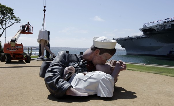
Icon Dismembered!

You might say they loved till their dying breath.  And left everyone else to pick up the pieces.

“No, Nancy, no, we can’t do this any more–I, I’m just a stump of a man!”  “That’s OK, Biff, I’m not the woman I once was, but I’ll love you with everything I’ve got.”

Roy Lichtenstein it’s not, but it is the 25 foot tall statue commemorating the iconic photograph of the “Times Square Kiss” taken by Alfred Eisenstaedt.  The statue is being moved from the San Diego waterfront to somewhere in New Jersey.  Not to worry, however, as the LA Times has reported that $1,000,000 was raised in eight weeks to purchase a replacement.  So one version of the iconic image is being dismembered, but only temporarily, and the result will be two versions instead of none.  Iconic reproduction continues even when it appears that the image is being dismantled.

But can you really dismember an iconic image?  Doesn’t an icon have a unique singularity, such that you always get the whole instead of a part?  Isn’t it an icon because it has resisted the forces of fragmentation and dispersion that are constantly at work in the media environment?  Well, actually, sometimes icons are broken up into their parts, whether as citations of the whole work or for other reasons as well.  It’s only because the statue is gargantuan, urethane, and imitating human bodily form that this dismemberment is unsettling enough to merit a news photograph.

What is interesting, however, is that the piece in the foreground contains all the features that distinguish this particular icon.  Compare it with the two pieces in the background (one is largely obscured) and you’ll see what I mean: the kiss itself, their postures, and their hands tell most of the story.  The rest is all uniform–which, like their actual uniforms, provides the background against with the figural distinction occurs.  Once again, by breaking up the image, the image is reconstituted anew.

Or not.  For there is another sense in which the image is being dismembered or, more precisely, disremembered.  The caption at the Washington Post slide show yesterday included this description: “The statue of two Navy sweethearts kissing.”  Much as I’d like to think otherwise about the major paper in Washington DC–but why am I not surprised?–it seems that the editor knew nothing about the original photograph.  The sailor and nurse in that photo were not sweethearts, but rather completely anonymous to one another, and she was not in the Navy.  Instead of historical veracity, the statue has been recontextualized in terms of its location beside the USS Midway museum in San Diego.

Many spectators along the waterfront may have seen it much the same way, and so the icon had already been dismembered, taken out of context, made a part of another time and place.  A similar transformation applies to the title”Unconditional Surrender,” which had been supplied by the sculptor, Seward Johnson, and also referenced by the Post.  While it could still refer to the surrender of Japan in August 1945, for many today it will refer only to a fantasy of romantic love.  This wholly privatized meaning can get by even though the hands of both the sailor and the nurse, faithfully reproduced to adhere to the iconic template, make it pretty clear that restraint was still somewhat the order of the day.  But that was then.

Today, iconic images are as solid as ever, which is to say: more than most, but less than you might think.

Photograph by Gregory Bull/Associated Press.

 0 Comments

Signifying Shoes

You might think that a high end fashion item would seem more valuable for being rare, hard to get, almost one of a kind.  Everyone should want one of the items, but it should be clear that not everyone will have one.  So it is that this display of Christian Louboutin shoes seems counter-intuitive.  How can there be so many of something so pricey?  Why pay so much for something that appears mass produced and uniform?  The Louboutin website opens with a pair of heels under glass, as if they were a rare treasure that should be protected from the open air, whereas this display of indistinguishable copies invites comparisons with the knockoff items that you can buy for a few bucks on the New York street.

But the curator who created this exhibit at the Design Museum isn’t in the business of selling shoes.  Like the designer, she is keenly aware of how shoes signify, but the focus here is on prompting reflection on fashion as a design art.  Two of the contradictions within modern fashion are that “exclusive” products typically are mass produced, and that consumers strive to distinguish themselves using identical items.  These conditions make good design harder, not easier to achieve.  Instead of individualized tailoring whereby everyone could be outfitted uniquely, clothing, furniture, and everything else has to be appealing and functional for many different people despite having a single, impersonal form.  By acknowledging these constraints, the exhibit captures Louboutin’s achievement: even when one pair of shoes is shown to be exactly like all the others, they still look really good.

It’s also interesting to see how focusing on one art can reflect back on another.  The display of the shoes makes each pair interchangeable with the others; what are real shoes become mere copies of an absent original.  Thus, the mere awareness of mechanical reproduction subverts a secure sense of the reality or worth of the object.  Photography, of course, suffers the same fate: the ease in making reproductions of any image heightens awareness of how each one is a copy of another reality.  One result, particularly in the hands of some theorists, is to fault the art for cheapening our sense of what is really real.  What happens, however, is that some images prove to be all the more exceptional for that.  Their artistic achievements become more obvious, not less, when set against many others much like them.  And that competition for attention amidst a pervasive process of copying is another of the constraints in fashion design.  Perhaps we shouldn’t be surprised that one way to distinguish each of the shoes above is by the way it catches the light.

Nor need the comparison stop there.  Fashion and photography can intersect not only in the museum but also out on the street.  Or at the Golden Gate Bridge.

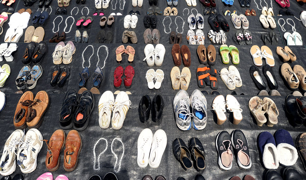
This commemorative display was created by the Bridge Rail Foundation, which advocates for measures to prevent suicides at the structure.  Turns out there is more than one design problem involved.  On the one hand, the bridge proves to be superbly suited to a wholly unintended use; on the other hand, perhaps the most deep-set objection is that preventative modifications mar the bridge’s aesthetic appeal, which is one of its principle design features.

In any case, it is interesting that a display of shoes can say so much about the tragic cost of inaction, and comparison with the first image can identify some of the reasons why.  Whereas in the first image multiple copies enhanced distinctiveness, here the obvious uniqueness 0f each of the pairs heightens a sense of common fate. Each person wearing the identically recognizable Linboutin shoes will stand out in a crowd, and the status markers proclaim that they have the personalized flair that comes with being among society’s winners.  Each of these motley yet varied shoes at the bridge marks a single individual no longer visible, someone who ended up at the bottom of life, caught in an undertow of despair that lead to the same darkness.

However cheap, each one of those shoes was a small fashion statement before it became a means for civic advocacy.  The shoes’ second significance is extended further by being copied by the camera.  Shoes, like photographs, are social objects, and so can talk by being seen and communicate further by being displayed.  This photograph expresses the advocates’ intention, but it also prompts the viewer to think about who is seen and valued, who is granted attention or other social goods and who is left to walk by unseen–as if just another copy of the one before, even if on their way to the bridge.

Photographs by  Jonathan Short/Associated Press and Noah Berger/Associated Press.

 1 Comment

What If They Held a Protest and No Photographers Showed Up?

Democracy relies upon dissent. Not just the theoretical possibility of protest implied by the First Amendment, but the very thing itself—flesh and blood individuals speaking truth to power and thus embodying  the possibility of popular sovereignty in contexts that demonstrate both the risk and safety of political opposition.  Of course, in a mass society of over 300 million people, “speaking” truth to power has less to do with words per se—although sound bytes, posters, placards, graffiti, and 140 character tweets do play a role—and more to do with visibility.  Put differently, political protest is as at its root a matter of public spectacle, and its success or failure is generally a measure of who controls what is seen and by whom.  Of course, governments and political operatives have known this for quite some time, and each seeks to manage the dialectic between seeing and being seen to strategic benefit.  Photographers know it as well, and they too use it to strategic effects.

The NATO protests in Chicago this past weekend are an interesting case in point, as both protestors and police have jockeyed to control the public eye, each enacting what have come to be fairly conventional poses.  The protestors, of course, want to be seen en masse as a way of giving a sense of solidarity and magnitude to their popular presence, but they also want to make it clear that they “see” what is going on behind the closed doors of governments and corporations.  Theirs is, we might say, an attempt to embody a democratic gaze—the people seeing and being seen.  Governments, on the other hand, also want to be seen, but they get caught between official political/diplomatic roles played by recognizable leaders (think of all of those photo ops you’ve seen of the heads of State shaking hands with one another, or relaxing together while watching a soccer match on the television) and the maintenance of public order, (hence lots of pictures of anonymous, paramilitary forces whose task is to “uphold the peace”).  Theirs is a statist gaze or what we might call “seeing like a state.”  Corporations, it seems, are generally content to remain largely invisible—their recently achieved status as individuals to the contrary notwithstanding—in a manner that implies an apolitical neutrality.

Photographers tend to capture all of this in a manner that reinforces the status quo, which is to say it underscores the sense in which our government remains democratic (dissent is allowed), even as government officials perform their tasks (leaders meet, negotiate, do their business), and the police maintain the peace (they “watch over” the scene” and “clash” with those who pose risks to public safety).  Sometimes, of course, the police become over zealous and have to be reigned in (one more sign that the status quo is working) but in general they are professionals doing their job under difficult circumstances.

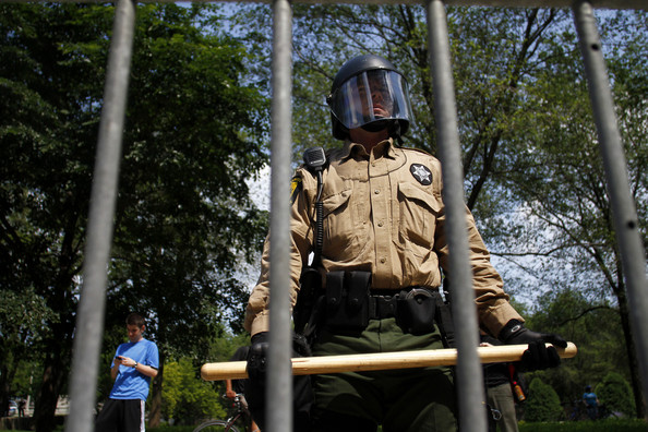
It is easy to be cynical of such an account, but there is a different point to be made.  For such images also remind us of the importance of political spectacles as a potentially important medium of public engagement that are not entirely controlled by any one agent or set of agents, whether protestors, governments, or the media—or for that matter, the audiences that consume the images. The caption to the image above notes that the police officer shown “watches demonstrators protest”  in Chicago during the first day of the NATO summit.   And the point is that he wants to be seen watching—notice his stance and how he holds his baton as a visual threat to anyone who would challenge his territory or charge; indeed, the point is precisely that he needs to be seen watching in order to enact any sort of agency.  But in this regard he is no different than the protestors who also need to be seen watching.  Both are actors in a political spectacle.

In an important sense, democracy in particular relies on such spectacles as a way of giving presence to its effectiveness and legitimacy.  And that is not an inherently bad thing, for spectacles rely upon the active involvement of a viewing audience to authenticate the experience on the ground even if its members are not directly involved in it.  That said, political spectacles always come with the risk that seeing and being seen can be manipulated as absolute and hierarchical technologies of domination and control.  In the photograph above, are we looking at the legitimate defender of a democratic regime or big brother?  There is no final answer to that question, of course, but it is one that we need regularly and vigilantly to entertain.

Photo Credit: Joshua Lott/Getty Images North America

 0 Comments

Let This Be a Sign: Exhibition by Simon Roberts

LET THIS BE A SIGN

An Exhibition by Simon Roberts

 25 May to 01 July 2012 Swiss Cottage Gallery
Swiss Cottage Central Library, 88 Avenue Road, London, NW3 3HA

New work from Simon Roberts looking at the economic, political and social effects of the recent UK recession. Alongside the exhibition, a participatory space will be set up where visitors will be invited to share their thoughts and experiences.  Admission is free.  More information is available at London Festival of Photography and The 6th Floor blog at the New York Times.

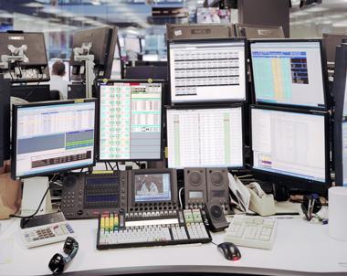
Photograph by Simon Roberts: The desk of a trader on the Lloyds Trading Floor in London. Photographed on 30 November 2011, officially known as the Day of Action where public sector workers joined in a mass walkout in London and across the UK to protest against government pension reforms. The Sky News headline feed on the television screen reads “Strike Action.”

 0 Comments

Man Down in the Global War on . . . . What?

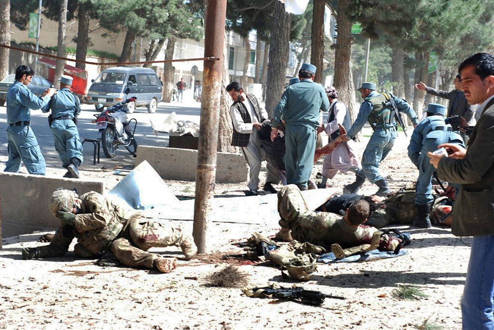
Whatever your politics, you’ve got to be affected by this photograph of the aftermath of a suicide bombing in Maimanah, Afghanistan.

Even if viewed by an Afghan citizen opposed to the US occupation, I think the image would be mesmerizing.  It has a magnetic pull something like what happens when traffic slows to a crawl as it passes by a really bad roadside accident.

The two soldiers are survivors, it seems, but even they are stunned and slowly dropping into an immobility and isolation approaching death.  Behind them, someone worse off is being dragged unceremoniously away, whether to a hospital or the morgue remains unclear.  The empty space in the middle of the frame seems to radiate out from the pole, as if reverberating from the blast that already has occurred.  Weapons and body armor are scattered on the ground, or slung over the back of one of the police officers, so this is not a story of projecting power, building stability, or any other imperial objective.  This miniature battle was over as soon as it began, and all that remains is the frenetic running around of some Keystone Cops doing damage control.

The fact that three people in the scene are taking pictures only adds to the sense of chaotic futility.  Shoot all you want–and a lot of good that will do the guys on the ground.  Pan further into the background and you’ll see that for other spectators it’s a lot like driving by a really bad accident.

The photograph was taken in April.  Not this month, and so it’s now being taken somewhat out of context.  Or is it?  April, May, last year, this year, does it really matter to most people?  Ten years and counting, “context” starts to sound hollow–what kind of context is appropriate when images become interchangeable and few are paying attention anyway?  And even if I supplied the rest of the captioning information–April 4, 2012, at least ten dead, etc.–would that create anything like the terrible body blow that knocked those soldiers to the ground?

Contextualization is one of the most important ways of articulating and anchoring meaning, but there also are important ways of thinking that become available through decontextualization.  By letting the image resonate while withdrawing those props that can be used to place, categorize, rationalize, and file away the event, one may, however briefly, be awakened to empathy and thus to serious thought.

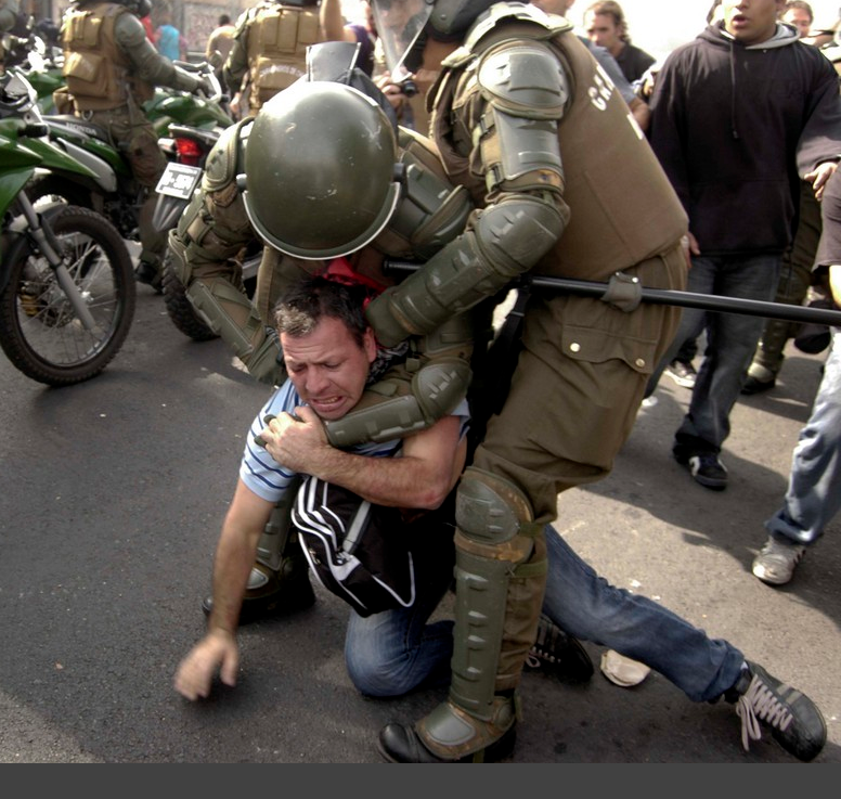
Thinking includes comparisons, and another benefit of taking things out of context–which we do all the time when using language, by the way–is that one can make unexpected comparisons.  Like this one, for example.

One picture or two?  Well, two.  In the second image the man down is a civilian and his assailants are right there rather that vaporized.  He isn’t so much knocked into semi-consciousness as struggling painfully to avoid being choked and smashed into the pavement.  And the cops are attacking, not scurrying about, and hurting rather than helping.  In fact, they are all citizens of the same country, though not on the same side.  The photo is of violence occurring at a Labor Day march in Santiago, Chile, which is a long way from Afghanistan.

But not as far as you might think.  This photo, too, could have been taken in many another month or year.  Indeed, the neo-medieval body armor of the riot police suggests that the scene may be more timeless than we know.  And one of the more punishing side-effects of globalization is that the world is coming to have one continuous street.  And that street is the scene for insistent outbreaks of dissent, protest, and other forms of resistance, and for recurrent crackdowns by security forces having varied uniforms and insignia but an increasingly unified apparatus of equipment, techniques, training, and deployment.  And one way or another, it seems that the guys getting knocked down are being betrayed by leaders too complicit with the redistribution of resources up the economic hierarchy.  It’s all one street and sometimes it seems to be all one war.

So perhaps they are similar images after all.  In a world becoming re-habituated to violence, the usual distinctions come to mean less and less. In order to comprehend a world out of joint, sometimes the photos have to be seen out of context.

Photographs by Gul Buddin Elham/Associated Press and Luis Vargas/ZUMAPRESS.com.

 0 Comments