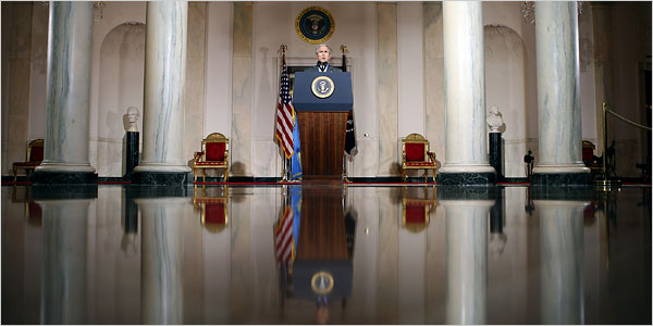
The President of the United States is the most powerful person in the world. Or at least so we are told. And photographic representations of him typically reinforce the point, commonly filling the frame with his visage, often shot from a low angle to accent his omnipresence, frequently surrounding him with an entourage in courtly fashion, locating him in the midst of cheering crowds, and so on. The conventions here are so familiar that we normally don’t even notice them until they are ignored or otherwise distorted and exploited. Consider this image that appeared in the NYT on July 16th, 2007:
The president is speaking from the Cross Hall. Built as part of the original White House plan in the 19th century, it connects the State Dining Room and the East Room. The floors, walls, and pillars are made of marble. It is often used for receiving foreign dignitaries, and it displays all of the grandiloquence we would expect as the location for putting the most powerful head of state in the world on display in all of his magnificence. And all of the accoutrements of the presidency are here as well, including the U.S. flag and the presidential seal displayed twice. Clearly, the stage is set for majesty.
And yet, the force of the image is anything but majestic. Ironically, what is most striking about the photograph is the president himself, who is barely noticeable, a tiny head protruding from the podium, fully and completely dwarfed by his surroundings. Shot from below, as per convention, it is from such a long distance and at such a wide angle that it makes him seem out of place and altogether inconsequential. Cast in a diminutive register, he seems more akin to Comedy Central’s “Lil’ Bush” than to the portraits of past presidents that grace the walls surrounding him. Indeed, the angle is so low and so wide that it not only miniaturizes the president, but it calls attention to how truly alone he is, with no visual evidence of an entourage or a viewing audience—let alone an adoring American people—to be seen. The president’s reflection on the floor in front of him suggests that perhaps he is only speaking to himself. And indeed, it would not be a stretch to see this photograph as a visual metaphor for a presidency that has become increasingly insular and isolated, performing only for its own pleasure: a Court without courtiers. Contrast this image with the photograph of the same speech at the White House website and the capacity of the camera (or perhaps, more properly, the photographer) to manage the conventions of visual representation to maximize or minimize presence and power is palpable.
Photo Credit: Doug Mills/The New York Times

Should it be any surprise the the NYT wants to paint Bush in the worst possible light and the White house wants to present him in the best?
C. Holland: Good point. In one sense you are absolutely correct. My point was not to take either to task so much as to call attention to how various conventions of visual representation get used in different ways to maximize and minimize the subject. On the other hand, the WH is quite obviously an interested party. Their task is spin. And there is nothing wrong with that. At the same time, notice how their use of common conventions dictates a more or less positive outcome — not a fair and balanced rendition of anything. And, of course, these are the conventions commonly used by photojournalists. On the other hand, photojournalism is supposed to operate with some sense of a commitment to balance and objectivity. Now I know that that is a myth of sorts. But it still imposes certain kinds of constraints. They still have to honor some sense of decorum in how they represent things, no less the president of the U.S., and the common way to do that is to rely on standard conventions for such representation. What is interesting here is how the photojournalist is more or less true to some of the conventions for representing the president, but also manages them in a way that is really rather critical. Hence there is something like a kind of critical agency operating within the practice of photojournalism. And from my perspective that is a good thing (regardless of the particular politics here) so long as the citizenry recognizes what it going on and is willing to talk about it. Where we get into trouble is when we assume that such images offer a “window on the world” sensibility that assumes the unfettered truth of the matter. In a sense, having both photographs puts us, as a polity, in a much strong position to understand the range of ways in which the world “could” be, or might be understood. If your interest is in authentic democracy that is a good thing.
[…] has written about Lil’ Bush, referring to how the president is being photographed to emphasize a diminished stature; whether […]
[…] of the scene. Fidel is cut to heroic dimension, bold, direct, and resolute. Raul is like a Lil’ Bush, outmatched even by the lecturn blocking him off from Fidel, the audience in Camaguey, and the […]
[…] salience of this most recent rendition of Lil’ Bush is emphasized by contrasting it with a photograph of Nancy Pelosi, the Speaker of the House, which […]