The cover of the current issue of Time provides a fine example of two features of the visual public sphere: allusions between images in different media, and the role of visual memory in shaping historical analogies. Here’s the cover:
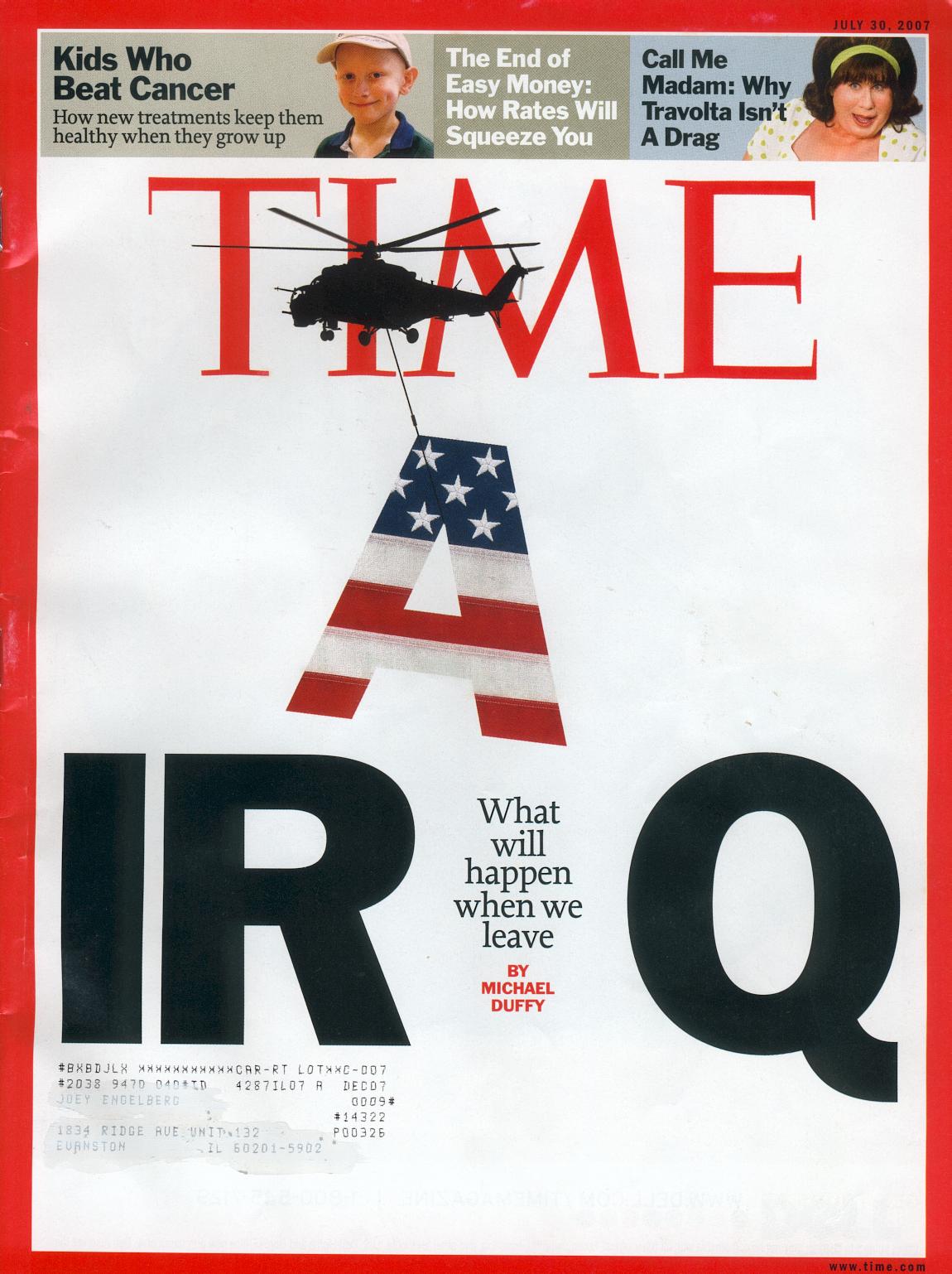
This is a remarkable piece of graphic design. The most important feature, I believe, is the helicopter, which is a direct allusion to the fall of Saigon. That event is fused in collective memory with photographs of helicopters–they are omnipresent in the images and the discourse about the last hours of the evacuation. For example, Time‘s silhoutte is a reprise of this image:
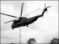
There are few examples of this or similar images in the Google image archive, however, which is dominated by this photograph:
The photo was taken by Hubert Van Es; you can read his report on the shot here. There also were images of of the choppers being pushed off the decks of one or more aircraft carriers, but those are less available today. Helicopters became the visual marker of the fall, and any one image probably channels the others. I suspect that there are fewer still shots of the airborne machines online because those images were more likely to be on video. The one I used was taken from a BBC puff piece on Peter Arnett; the photo is captioned “Fall of Saigon, but Arnett stays.”
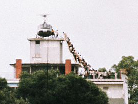
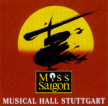
These photographic and video images shape collective memory in part because they have been relayed in the intervening years by graphic designers. So, for example:
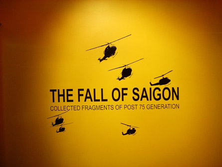
and, probably the most widely circulated design, which could rely on the literal image to support a formal allusion:
Thus, the Time designer could count on the historical analogy because the visual design had become so thoroughly disseminated.
And the analogy has specific implications that are evident from other elements of the cover. For example, look at the text that is where the A had been in “IRAQ”: “What will happen when we leave.” It is not a question.
Time photo-illustration by Arthur Hochstein, July 30, 2007.
Update: To see how the Bush administration tries to counter the analogy, look at the July 26 post at BAGnewsNotes, which compares the Time cover with the latest photo op.
An interesting detail of the Time cover is that the helicopter portrayed is a Soviet era Mil Mi-24, which saw service with most former Soviet Block (and allied) armies, including Iran and Iraq. Just a mistake, or an intentional comment on the implications of a US withdrawal?
[…] image could be from the Vietnam War. The helicopter became the symbol of that tragedy, and once again we see a chopper lowering itself into an inferno. The aircraft is […]
A good and interesting read, thank you.
I love TIME MAGAZINE cover a lot (Design, Idea, Breathing space, technically and all)…
Pepin Kumar- Graphic Designer
I love the time magazine because they are provided all the world’s information…