Jan 17, 2011
Jan 28, 2008
May 30, 2012
Sep 06, 2007
Aug 06, 2008
Mar 16, 2015

The Banality of War

kabul-attack.png

Two soldiers walking past a burnt out vehicle on a city street. It is an altogether ordinary photograph of what has become an altogether ordinary event in the Persian Gulf region, if not the Middle East more generally. A somewhat long caption tells the story in a passive, matter of fact voice, “U.S. soldiers pass by a damaged armored vehicle following a suicide attack in Kabul, Afghanistan on Tuesday, Nov. 27, 2007. A suicide bomber blew himself up next to a convoy of armored vehicles used by foreigners in Kabul, in a huge explosion Tuesday that killed at least two civilians and left the wall of a nearby house in ruins, witnesses and officials said.” We have seen similar photographs hundreds of times in recent years and its only real distinction would appear to be its almost pure banality.

Appearances, however, can be deceiving. The photograph was published on the Washington Post website on Wednesday, Nov. 28th as part of an AP story titled “Afghans: NATO Airstrikes Kill 14 Workers.” According to the report, NATO warplanes were tracking Taliban insurgents in eastern Afghanistan and mistakenly bombed a road construction crew while they were asleep in their tents. The deceased workers, civilians from nearby provinces, were paid at the rate of $5.00 a day by Amerifa, a construction company contracted by the U.S. Army Corp of Engineers to build 135 miles of roads for the U.S. military. One NATO spokesman confirmed that two bombs had been dropped with “strong indication that we got a Taliban leader,” but another spokesman commented that the “situation is not clear … [and we are] trying to get a clear picture.” As if to mitigate the significance of the event, the reporter noted that “If confirmed that NATO hit the wrong target, the incident in mountainous Nuristan provice late Monday would be the first major blunder in months.”

It is really hard to know where to begin. According to the NYT, the road had been under construction for a year. And given that the project was under contract with the U.S. Army Corp of Engineers one might think that NATO would have access to its whereabouts. Surely such “blunders” could be avoided, particularly given the history of the involvement of U.S. and NATO-led forces in causing civilian casualties—so called “collateral damage”—in Afghanistan. But accidents do happen and tragic mistakes are made, particularly in war zones. And more, bureaucratic spokesmen are skilled in the rhetoric of obfuscation and the deferral of responsibility. And so, perhaps, what we have is just an ordinary day in the life of a war that seems to know no end. But none of that explains the photograph above which seems to have nothing to do with the accidental airstrike. Why exactly is it here? What purpose does it serve?

Normally we might assume that the photograph accompanying a news article is designed to provide evidence of the reality of the story being told, illustrating its facticity in a “seeing is believing” sort of way. Alternately, it might function to enhance our affective or emotional understanding of an event by creating lines of identification between the viewer and what is viewed. But, of course, in either case, there is the assumption that the thing pictured is an index of the event being reported. Here, of course, there is no direct relationship between the photograph of the remains of a suicide car bombing in downtown Kabul and the accidental deaths of 14 Afghan civilians by NATO military forces in the mountains of Nuristan.

There is probably no shortage of alternative explanations for what the photograph is doing here, but it is hard to imagine how any of them reflect positively on the Washington Post or its motivations. For example, it could be a mistake caused by the pressure of meeting a deadline, but that seems highly unlikely given the source.

An alternate explanation, far more insidious, is that it functions to defer attention from and to mitigate the significance of the accidental deaths of the 14 Afghani civilians. It does this in two ways. First, while the absence of a photograph does not automatically deny the existence of the event being reported, neither does it do anything to enhance our understanding of the event or to enable our identification with the lives lost. Such pictures were available, and the NYT used one in its report and in its daily slide show, but the Washington Post went in a different direction.

Second, the photograph itself invites a perverse logic that models itself after a version of the quid pro quo: Yes, it seems to say, it is possible that NATO “blundered” (although it would be only their “first major blunder in months”), but that is a collateral effect of a war on terror, an insane condition where the enemy is impossible to identify and the most dangerous insurgents are suicide bombers who show no respect for the “rules of war.” And as if to prove the point, look at the photograph. Here we have two soldiers walking past the “ruins” of a nearby house (not actually seen in the photograph but marked by the caption) and a “damaged armored vehicle” destroyed by a suicide bomber the day after the accidental airstrike. That it is an armored vehicle that has been destroyed underscores the power of the threat. Protection is impossible to come by whether you sleep in a tent, live in a house, or drive in a vehicle fortified to withstand attack. And yet, notice that the soldiers are relatively nonchalant and inattentive as they walk by. There is nothing new here. Just as we have seen similar images over and again in recent years, so too have they, albeit up close and personal. It’s just another day on the job.

And so, perhaps, the placement of the photograph with this story is a somewhat subtle endorsement of administration policies. One more indication of the utter banality of war and all that it produces.
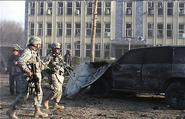
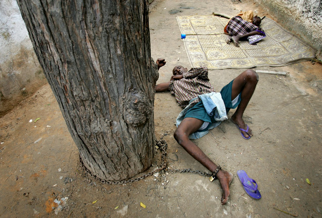
Photo Credit: Rahmal Gul/AP

Digg!

 2 Comments

War, Terror, and a Chain of Photos

Recently the Chicago Tribune ran a special report on one of the lesser known consequences of war: an increase in mental illness among civilians. The story is set in Somalia and includes a slide show of scenes from the only mental health clinic in Mogadishu. Some of the patients will be dangerous to themselves or others, and so the problem arises of how to restrain them. In the West, this is done with drugs, locked wards, and other disciplinary technologies. In Somalia, the means are simple, though effective:

boy-chained-to-tree.png

This young man is chained to a tree. Viewers in the US shouldn’t get too judgmental, as here he could be “free” but homeless, sleeping in the ground, and less likely to be fed regularly. Better resources are needed in Somalia and in the US. My question is, what can photojournalists do to motivate public action on behalf of the mentally ill wherever they are? The press can be damned either way: one always will be faulted if not documenting a social problem, while visual documentation is subject to charges of creating an atrocity aesthetic and compassion fatigue. How, then, should we assess this image?

We can begin by asking how it seems unique, and then how it might nonetheless iterate prior images and assumptions. The photograph is distinctive because of how it places the young man prostrate, legs splayed and body core exposed, and because the girl huddled behind him suggests an unending series of damaged souls, and because the viewer towers above the scene. Indeed, the angle joins the viewer with the trunk of the tree: strong but immobile, anchoring a system of benign restraint but not responsible for the fetters. This is not a position of action.

One reason the photo above caught my eye is that I’d seen it before.

jolie-with-title.jpg

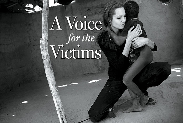
This is the signature shot from the March 19, 2007 edition of Newsweek. (The image was brought to my attention last spring by Beth Iams, who wrote a fine paper on the magazine’s photo essay for my graduate seminar on visual rhetoric.) The story, “Star Power,” chronicled Angelina Jolie’s attempt to focus attention on the suffering in Darfur. Jolie states that “‘If I can draw you in because I am familiar, that’s great because I know that at the end you’re not looking at me, you’re looking at them.'”

Of course, the image is all about Angelina, and there are very few correspondences with the first photograph. I think the few that are there are important, however. The boy is restrained for the same reason in each, and perhaps the tether is becoming a visual convention. (There are other examples of this tether and other forms of shackling by the two photographers.) If so, we might consider how it not only depicts limited means but also implies more fundamental deficiencies. As long as the tether remains identified exclusively with mental illness, poverty, and Africa, it ties understanding to a host of assumptions about premodern medicine and social organization. Never mind that the restraints shown above are age-appropriate and keep the patient within the daily round of community life. Such considerations fall outside the modern disciplinary matrix.

Thee might be a second set of implications. We see not only restraint but also a black body, male, barelegged, tethered to a pole. I can’t help but wonder whether these images allude to lynching photos: whether hanging barelegged from a tree, as in the famous photograph from Marion, Indiana, or chained to one in order to be blow-torched, as in Without Sanctuary. Whatever the source, the association is horrific, and completely mistaken. It could be there, however, in the hope that the public would be motivated to act if they intuitively sensed that they were witnessing a similar descent into brutality.

If there is a chain of visual allusions binding African victims of war to American victims of terror, it surely is unconscious. One should ask whether it might also be influential, and to what end. Are the photos merely imitative of those before them, or are they artistic attempts to mark yet another breakdown in humane social order? Are we becoming complicit in normalizing violence, or is some potential for public action being suggested? Are they hypocritical reconstructions of a tragedy on familiar terms, which certainly is part of the Angelina Jolie story, or do they reflect some peculiar progress regarding public understanding of the suffering of others?

You tell me.

Photographs by Kuni Takahashi/Chicago Tribune and Per-Anders Pettersson/Getty Images. Newsweek gave a documentary tone to the second image by reproducing it in black and white; you can see it in color here. Note also the recently published Beautiful Suffering: Photography and the Traffic in Pain. Thanks again to Beth Iams, who can be contacted at elizabethiams@yahoo.com.


Digg!

 3 Comments

Public Mourning

turnley-casket.png

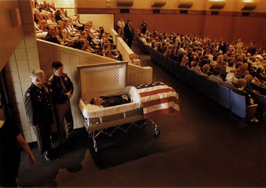
This photograph was taken by photojournalist Peter Turnley and published in Harper’s in August, 2004 as part of a photo-essay titled “The Bereaved: Mourning the Dead in America and Iraq.” It shows an open-casket funeral for Army SPC Kyle Brinlee, killed by an IED in Iraq on May 11, 2004. The memorial service was held in the Pryor, Oklahoma High School auditorium and attended by 1,200 mourners, including Governor Brad Henry. Brinlee’s family subsequently sued Turnley and Harper’s for violation of privacy, infliction of emotional distress, fraudulent misrepresentation, and a number of other torts. The district court rejected the suit in summary judgment, noting additionally that the event was both public and newsworthy and thus protected on first amendment grounds. The 10th U.S. Circuit Court of Appeals upheld the finding of summary judgment, noting that the publication of the photos was arguably “in poor taste” but that there was no basis for an actionable claim. The case made its way to the Supreme Court where it was recently denied a writ of certiorari, thus confirming the finding of the lower courts.

Legal issues aside, what I find most interesting is the Court’s aesthetic judgment that the publication of the image was arguably “in poor taste.” The conclusion here is qualified by the assumption that the family had expressly requested that no pictures of the open casket be taken. Whether that request was ever conveyed to Turnley or not is a fact in dispute, but even if it had been, the question of taste remains: What renders this a tasteful or tasteless image and what interests are served in making such a judgment?

We might begin by noting that it is an arresting photograph, doubly unique amongst the hundreds (thousands?) of photographs of military funerals that have been reported in newspapers and magazines over the past several years. The most obvious distinction, of course, is the open casket. Military funerals are not particularly rare, especially during times of war, but they do not typically feature open-caskets; and even on those few occasions when they do, there seems to be a standing photojournalistic convention against taking or publishing open-casket photographs. Turnley challenges that convention, and in a manner that subtly requires the viewer to acknowledge what is otherwise neatly hidden (or is it erased?) by the closed casket.

Contrary to the aesthetic judgment of the Court, then, what we have here is a photograph that is crafted with a deep and abiding sense of decorum and respect. Indeed, in my judgment it treats the event with far more reverence than might otherwise attend the depiction of such funerals where the ordinary conventions of representation are followed simply as a matter of form or habit.

Shot from a moderately long range that is neither overtly intrusive nor violates the conventional distance of personal space, the deceased is nevertheless recognizable as a soldier and a person. His uniform and white gloves lend an air of military formality to the occasion; the coffin, reverently dressed in the American flag, adds the mark of national honor. Cast in the yellowish hue of indoor lighting, the casket also catches rays of natural light from the doorway behind it and through which it will soon exit the auditorium, thus invoking both a sense of communal warmth and movement towards a brighter and purer light. Framed from a high angle and looking down upon the scene, one might even imagine an omniscient viewer monitoring the ceremony.

A second distinction, arguably more significant, is the setting for the photograph. Military funerals memorialize the death of individuals, and as such they are typically photographed at graveside, featuring family members and close friends. They are private ceremonies that take place in public, and the grief and mourning that they display is fundamentally domestic and personal even if it is of interest to and observed by a larger public. It is this tension between private ritual and public observance that no doubt contributed to the Brinlee family’s sense that its privacy had been violated despite the fact that they had invited the public and the press to attend the memorial service. Notice here, however, that the photograph is not shot at graveside, but in a recognizable, public setting. Indeed, in many locales the high school auditorium is a communal gathering place used for a variety of public rituals including voting, convocations and town meetings, the annual rite of passage known as “graduation,” and, as here, to honor and remember one of its own, a citizen/soldier who sacrificed his life to the common good. Note in this regard that the photograph does not appear to feature family and close friends so much as a fairly large slice of the community. Indeed, the only easily recognizable individuals in the photograph other than Brinlee are the police officers posed between the coffin and the exit, and their uniforms both overshadow their private selves and accent the very public and communal quality of the ceremony taking place. And so what we have is the representation of a community that has come together as one, as a public, to mourn its collective loss.

In Pericles’ Athens the entire citizenry would annually attend funeral orations designed for the community to grieve collectively as it to bore witness to those who had sacrificed their lives fighting for the common good. In our own time Memorial Day purports to serve a comparable purpose, but truth to tell, it functions more as the “official start of summer” than as an occasion for public mourning. And in the interim from one year to the next we too often represent military deaths either as nameless and faceless numbers designated by abstract body counts, or as private individuals whose loss is felt and mourned primarily by family and friends. Neither seems adequate to the task of addressing the communal grief that attends such losses. In his important book, Achilles in Vietnam, Jonathon Shay emphasizes the importance of the “communalization of trauma” – the collective sharing of the pain and responsibility for war in public acts of communicative interaction—for helping to heal the psyches of those who leave their families and friends behind and risk their lives in the name of the community. The communalization of trauma through localized, public acts of grief and mourning might be no less essential to advancing a productive and sustainable species ethic during a time of war. Peter Turnley’s photograph of the public mourning of Army SPC Klye Brinlee invites us to consider one way that might be accomplished with a great deal of taste.

Photo Credit: Peter Turnley/Harper’s

Digg!

 14 Comments

Ship Sinks, Fools Saved, For Now

On an admittedly slow news weekend, there was something about this photograph that tugged at me.

sinking-ship.png

The picture was front page above fold for a story entitled “An Icy Rescue As Seas Claim A Cruise Ship.” An iceberg punched a hole below the waterline, those aboard spent a few hours in lifeboats before being rescued, and the ship eventually went to the bottom of the Antarctic Ocean.

The story is sappy from start to finish. The Explorer was “fondly known in the maritime world as ‘the little red ship,'” as in The Little Engine that Could, perhaps. It closes with a staffer playing the role of the Old Salt who says, “‘She doesn’t want to give up, I can tell you. I still believe that perhaps it is not the last time that we see her.'” Well, maybe someone will try to salvage a 40-year-old single-hulled craft at the bottom of the world, but don’t bet on it.

If you don’t like the yarn, you won’t like the facts. Although named Explorer, the ship is a cruise ship, carrying “modern adventure travelers” for $7,000-$16,000 a pop. To put it bluntly, those on the ship don’t explore anything. Instead, they go on a set route to have preprogrammed experiences. No wonder they were in such “good spirits”after the rescue: the disaster was a genuine novelty, and one that proved to be just as safe as the trip to Shackleton’s grave. I have no doubt that the episode will be good for business.

Given the reasons to be cynical about this soft news story, why does the image take me down a different path? Perhaps because it looks like one of the toy boats powered by baking soda that I played with in the tub long ago. Or it could be the color: lying on its side on the cold ice flow, it resembles an animal bleeding to death in some lonely winter field. Or the name might matter after all: not just this explorer, but exploration is over, and the challenge now is not discovering some new region but rather living amidst natural scarcity. The ship is disappearing, and so are the ice flows around it. Although they are far more important, no one in the story romanticizes their loss.

Let me add something more to the allegory. Roland Barthes once remarked somewhere that the attraction of a cruise ship, which everyone knows is an antique technology, was that it created the sense of living in an autarky, that is, a self-contained, self-sufficient place. That sense of being a world onto itself is an illusion, of course, one similar to the notion that “modern adventure travelers” are exploring the unknown.

Both myths die hard. If the photo is poignant, it may be because we can imagine not just a ship but a civilization going under. That is, if modern civilization is to avoid disaster, it needs more than a double hull or other technological backups. Instead, we have to give up the idea that we are a law onto ourselves, that we can provide adequately and sustain indefinitely without regard to the natural limits and complex dynamics of the rest of the planet.

Photograph from Fuerza Aerea de Chile [Chilean Air Force] via European Presssphoto Agency.


Digg!

 4 Comments

Sight Gags: No Parking Soprano Style

310120769_130ad2a8331.jpg


 Our primary goal with this blog is to talk about the ways in which photojournalism contributes to a vital democratic public culture. Much of the time that means we are focusing on what purport to be more or less serious matters. But as John Stewart and Stephen Colbert often remind us, democracy needs irony, parody, and pure silliness as much as it needs serious contemplation. For our part, we will dedicate our Sunday posts to putting some of that silliness on display in what we call “sight gags,” democracy’s nod to the carnivalesque. Sometimes we will post pictures we’ve taken, or that have been contributed by others, or that we just happen to stumble across as we navigate our very visual public culture. And we won’t just be limited to photography, as a robust democratic visual culture consists of much more. We typically will not comment beyond offering an identifying label, leaving the images to “speak” for themselves as much as possible. Of course we invite you to comment … and to send us images that you think capture the carnival of contemporary democratic public culture.


Photo Credit: Static Flicker

 0 Comments

Symposium: Changing Faces of Journalism

The Changing Faces of Journalism: Tradition, Tabloidization, Technology, and Truthiness

11/30/2007 The All-day Symposium

Location: Annenberg School for Communication

3620 Walnut Street, Philadelphia, PA 19104 215.898.7041

From 8:30 am To 6:30 pm

The Scholars Program in Culture and Communication and the Graduate Working Group in Journalism Studies present this all-day symposium at the Annenberg School for Communication.

Speakers include Elizabeth Bird, University of South Florida and a Visiting Scholar, Annenberg School for Communication; Pablo Boczkowski, Northwestern University; Peter Dahlgren, Lund University, Sweden, and a Visiting Scholar, Annenberg School for Communication; Mark Deuze, Indiana University; James Ettema, Northwestern University; Herberg Gans, Columbia University; Jeffrey Jones, Old Dominion University; Carolyn Kitch, Temple University; Julianne Newton, University of Oregon; Carlin Romano, Critic, Philadelphia Inquirer, and Chronicle of Higher Education, Lecturer, Annenberg School for Communication; Michael Schudson, University of California, San Diego, and Columbia University; Barbie Zelizer, Raymond Williams Professor of Communication, and Director, Scholars Program, Annenberg School for Communication.

For more information and to register for this free event, go to http://www.asc.upenn.edu/changingfaces.

 2 Comments

Public Art and the Pain of Others

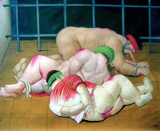
Since my post about Making Nice on a Day of Shame, Michael Mukasey has been confirmed as attorney general. More to the point, yet another attorney general has been confirmed to oversee rather than stop the American institutionalization of torture. Meanwhile, the news has moved on to more important things like the run up to the Macy’s Thanksgiving Day parade. Along the way, you may have missed the few stories that appeared about an art exhibit that opened recently at the American University Museum in Washington, DC. The exhibition provides the first complete show of Fernando Botero’s 79 painting and drawings of the torture of Iraqis by American soldiers and private contractors at Abu Ghraib prison. Botero’s work draws on the massy bodies of pre-Columbian art, usually regarding cheery subjects. As Arthur Danto at The Nation remarked on the horrors of Abu Ghraib, “if any artist was to re-enact this theater of cruelty, Botero did not seem cut out for the job.” Others in the know will have shared that thought, until they saw what Botero has done through paintings such as this:

botero-abu-g-1.jpg

Botero has avoided reproducing those images that have circulated so widely: the cowled, cruciform victim hooked up to wires, or Lynndie England holding a leash or pointing her cocked hands. Instead, he has taken pains to depict scenes that were captured by print journalism. In fact, a Google search will turn up photographs of many of the abuses marked in his exhibition, but that is beside the point. If nothing else, Botero’s paintings provide another attempt to provoke renewed public revulsion, reflection, and debate. There certainly is need for that as the initial photographs are becoming either icons or curiosities. His images also place the scandal into the archive of Western painting while drawing on that tradition to strengthen protest; so it is that the exhibition is compared to works such as Guernica, among others.

One question is whether painting provides a unique form of documentary witness, one characterized by its superior capacity for moral response. Danto, for example, argues that “Botero’s images, by contrast [to the Abu Ghraib photographs], establish a visceral sense of identification with the victims, whose suffering we are compelled to internalize and make vicariously our own. As Botero once remarked: A painter can do things a photographer can’t do, because a painter can make the invisible visible.’ What is invisible is the felt anguish of humiliation, and of pain. Photographs can only show what is visible; what Susan Sontag memorably called the ‘pain of others’ lies outside their reach. But it can be conveyed in painting, as Botero’s Abu Ghraib series reminds us, for the limits of photography are not the limits of art.”

Although the last clause is certainly true, I find this argument to be bizarre, and not only because it contradicts his claim, earlier in the same article, that “it was hard to imagine that paintings by anyone could convey the horrors of Abu Ghraib as well as–much less better than–the photographs themselves.” Of course, once you invoke Sontag, you had better be prepared to contradict yourself. I’m not questioning Danto’s subjective reactions, of course, but I know that he is wrong about mine. And I have to wonder how anyone could think that people were not feeling the pain of others when they reacted with disgust, shame, and outrage as they saw the photographs. Millions of people have reacted that way, which is precisely why the photos made torture a major topic of public debate. One hypothesis is that it may be difficult for those, such as Danto and Sontag, who are steeped in the pictorial traditions of the fine arts to identify with or respond emotionally to photographs. Fortunately, that is not true for the rest of us.

I won’t go on, for surely there is something obscene about turning the depiction of evil into an intramural debate about aesthetics. Whatever the art, there is need to confront the horrors–and the indifference–of our time. Botero has done that, and his artistic medium and style are important forms of witness. He asks, “Is this what 400 years of modern Euro-American civilization has come to? Is the indigenous body still being tortured?”

Look again at the painting. Keep it in mind when administration officials and neocon pundits obfuscate about torture, or when the leading Republican candidates and various editorial cartoonists joke about torture. This holiday weekend let’s not only give thanks for the good life with friends and family, but also renew our resolve to stop state terrorism.

You can see more of the images from the exhibition here and here.


Digg!

 5 Comments

Second Look: Economic Girlie Men – Rediva

bernanke.png

Last week I posted about this photograph of Reserve Board Chairman Bernanke preparing to speak before a congressional committee on economics, contrasting the ritualistic, faux-piety of the scene with the photographic representation of the gluttonous impiety of Marshall Whittey, a sales manager for a floor and tile company in Reno, Nevada who was feeling the “pinch” of the equity credit crisis that left him “eating in” more often.

equity.png

I suggested that the juxtaposition of images, published as part of separate articles in the NYT on the same day, invited a civic attitude that located the problem of the economy in the psychology of private life—individuals making bad economic decisions—rather than in any inherent systemic problems with the so-called “free market.” One reader wondered if the affect of the Bernanke picture would change if we were to juxtapose it with a more tragic and typical representation of a foreclosure or eviction; another reader pondered whether it was even possible to represent systemic social problems visually without reducing them to individuals in a manner that might tend to discourage collective action. These are both excellent questions that deserve a second look.

Several days following the Bernanke’s report to Congress the NYT published this photograph as the lead-off to an article in its Week in Review:

equity-race-gap.png

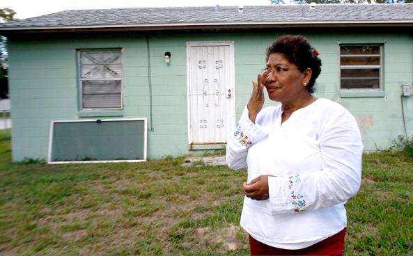
The caption reads “EX HOMEOWNER Esta Alchino of Orlando, Fla., was late paying her mortgage and lost her house.” Both this photograph and the one of Whittey point to individuals caught in the equity crisis, of course, but in this case the photograph is framed by the title of the article, “What’s Behind the Race Gap?” The difference is pointed, for the earlier article focuses on how an acquistive individual, is being “pinched” by the economy and his risky economic decisions; here our attention is directed to Esta Alchino as a representative of racial difference, and thus, presumably, a systemic state or condition, i.e., racial discrimination.

The tension between the two photographs is particularly conspicuous. He sits in his home amongst his prized possessions, she stands in front of (or is it behind?) what used to be her home with nothing but the clothes on her back. Both look out of the frame to the viewer’s left, what we conventionally understand to be the past, but what they purport to see behind them is somewhat different as he exudes a devil may care attitude, a gambler who made poor choices but will be back to play again as soon as he has recovers his stake, as is the promise of the American dream; she wipes tears away in contemplation of a profound loss as she looks back on a national history of racism in which the “dream” seems always out of reach for our dark skinned citizens. The key to the two photographs might well be how the citizens/actors are located within their respective scenes. His home is large, lavishly adorned, and full of light with the promise of more by simply opening the shades behind him—a simple personal choice; her former home is small and dilapidated, lacking any adornment whatsoever, and drab by almost any standard, even as it sits in the full light of day. He is the lord of his manor, accompanied by his dogs; she is completely isolated and disconnected, visually homeless and without any sort of shelter, either physical or symbolic. She is literally alone in the world.

The question is, how might we understand this later photograph as an indication of a systemic problem? What makes Alchino more an illustration of racial discrimination than simply an ineffective liberal economic actor? This is no easy question, but part of an answer can be found in considering how Alchino is framed as something like an “individuated aggregate,” an individual posed to stand in for an entire class or race of people. Here that is marked in part by the fact that she is never once mentioned in the accompanying article that features two neighborhoods in Detroit, a city that is a fair distance from Orlando. We know nothing about her beyond the fact of her race and that she could not make her mortgage payment. We are never even told why she could not make the payment, though we are told that on par high-cost subprime mortgages tend to be concentrated in “largely black and Hispanic neighborhoods.” As such, she stands in as a victim of circumstance, and as the article underscores, the circumstance is a potent and often ignored systemic racism.

The additional question is how we might understand the portrait of Bernanke differently in comparison to the image of Alchino, who is arguably more representative of those harmed by the equity crisis than Whittey. Here, of course, Bernanke’s countenance now changes some, as his prayerful pose seems sorrowful and contrite—worried less about the difficulties of his own job, than about the conditions of people like Alchino. But of course, this comparison is problematic as well, for if we go back to the words he spoke that day, there is nothing that indicates a concern for systemic problems of any kind, either rooted in economic policy or more deeply in the kind of implicit de facto racial profiling that seems to be pronounced within the mortgage industry. What the different comparison of the images does speak to is the need for more sustained consideration of how any particular photograph operates within the visual economies in which it appears.

Photo Credits: Doug Mills/New York Times; Joe Raedle/Agence France-Presse/Getty Images

Digg!

 7 Comments

An Icon Goes Global with a Bang

Eddie Adams’ photo of General Nguyen Nguc Loan executing a bound Vietcong prisoner of war remains one of the searing indictments of the criminal conduct of that war.

eddie-adams-icon.png

Adams went to his grave insisting that the photograph was being misused because the execution was a justifiable act in the context of the battle for Saigon. That may be so, but the literal dimension of the image has from the beginning been irrelevant to its distribution, interpretation, and acclaim. The photograph’s rhetorical power comes from its symbolic and ethical implications in respect to the justification of the war itself. Whatever else was happening on the street that day, this image provides stunning illustration that the war was spiraling far out of control–militarily, politically, and morally.

If this interpretation of the photograph is valid, it nonetheless remains one of many. As John and I elaborate in No Caption Needed, iconic images are important not only because of the role the images play at the time of their initial distribution, but also subsequently as they become templates for artistic imitation and improvisation across a wide range of media, arts, topics, and standpoints. This image from a recent art fair in New York City is only the latest example:

xiangjing1.jpg

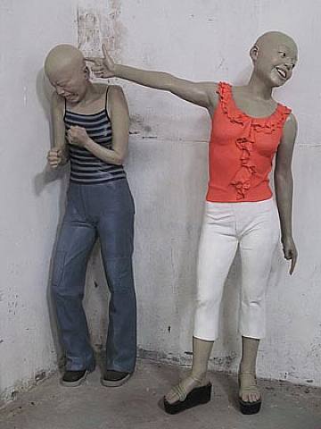
According to the review of the show, you are looking at Xiang Jing’s “Bang!” (2002), a work in painted fiberglass. That this image was selected from the hundreds at the show probably is testament to the continuing power of the iconic image, although we also should recognize the reviewer’s rationale: “Ms. Xiang’s sculpture embodies the mood of the first Asian Contemporary Art Fair . . . Fizzy and entertaining on the surface, it has a disquieting underside.” Likewise, the reviewer remarks that “the playful surface of ‘Bang!’ masks a half-repressed trauma.”

I’m not so sure that anything is being “masked” or “half-repressed.” The language of art criticism, and not least its depth psychology, really doesn’t get this one right. There is no underside to this image: the horror is right there on the fizzy surface.

One might wonder why Adams’ photograph was mentioned at all. Jing’s artwork has reversed virtually everything of note in the original image: the figures are women instead of men, civilians instead of soldiers, wearing stylish contemporary clothes instead of the de facto uniforms of the past, highly expressive instead of stony faced or having a tight grimace, hairless instead of having hair, positioned right to left instead of left to right, backed into a corner instead of an open street, colored statues rather than people in a black and white photograph, and fictional instead of real. The “killer” is even more obviously transformed, as she is using a finger instead of a gun, facing the viewer, looking away from the victim, and smiling. And why is a Chinese artist appropriating American photojournalism about the Vietnam War to depict contemporary young women?

Just as the meaning of the iconic photograph quickly escaped the photographer’s sense of scene, our response to this work of art is not likely to be tied to knowledge of the artist’s intentions. If there is no intended connection between the two images, then the sculpture still is troubling, if somewhat puzzling. If the viewer makes the connection, intended or not, part of the experience of the artwork, then it instantly becomes deeply disturbing. Now the social violence of adolescence acquires the killing power of warfare, while the passage of time suggests that killing is becoming ever more casual, routine, normative, and even enjoyable. And just as the traumatic image from Vietnam lives on it the contemporary artwork, so does a history of war, dislocation, and layered betrayals continue to shape contemporary life, not least in societies experiencing both hidden violence and comprehensive modernization.

Don’t be too quick to guess which nation I might be referring to. On reflection, it can make sense after all to speak of surface and depth. “Bang!” might place the medium of photojournalism under the medium of sculptural art, as with a palimpsest, to suggest that under the fizzy surface of modern consumer culture there still are layers of personal and collective violence.

Finally, a footnote: The title “Bang!” may be a double allusion, including both the Adams photograph and another iconic image from the Vietnam War: the photograph of a naked girl running away from the napalm drop on her village. The name of the village was Trảng Bàng.

Photographs by Eddie Adams/Associated Press; ChinaSquare.

Digg!

 0 Comments