Feb 19, 2010
Feb 28, 2008
Mar 21, 2018
Aug 30, 2013
Mar 08, 2013
Aug 01, 2007

In Memory of Making Sense Out of Senselessness

Last week we missed the passing of artist Robert Raushenberg (1925-2008), who maintained that he worked “in the gap between life and art.” Characterized as a “neo-dadaist” his work challenged the difference between traditional art objects and the objects of the everyday world (including everything from the “junk” one might find on the streets to snapshot photographs), creating what became known as “combines” and “assemblages.” By some accounts he sought to make “sense out of senselessness.”

Often controversial, he was also a prolific artist and his work occasionally graced the cover of Time magazine. He will be missed.

Note: For a commentary on the conflicted reception of Raushenberg’s work see James Johnson’s post at (Notes on) Politics, Theory, and Photography.

 0 Comments

The Many Shades of Racism

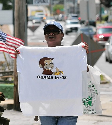
I learned to read at the age of five because of the tireless efforts of my grandmother who would spend hours teaching me how to sound out words and then sentences after working a full shift on a factory assembly line.  There wasn’t much money to buy books and so all that we read came from the public library.  Each Saturday we would get five new books.  And the books that I loved the most were a series of tales about a mischievous monkey by the name of Curious George who had been “rescued” from his native Africa and taken to live in a big city by “The Man in the Yellow Hat.” I would check the same ones out over and again, never tiring of reading about George’s adventures. I was reminded of all this recently when I encountered the image above and the recent controversy it sparked in Marietta, Georgia.

By now you probably know the issue.  Bar owner and ultra-conservative Mike Norman was selling the t-shirt displayed in the above photograph.  When challenged that the image was offensive to African-Americans he recoiled, claiming that he was “no racist” and that he had simply “seen” a resemblance between Senator Obama and the monkey while watching a cartoon movie.  In his words, “Look at him … the hairline, the ears, he looks just like Curious George.”  According to Norman, the comparison to a monkey was simply coincidental.  Watching Norman on CNN I initially considered the possibility that he was simply an uneducated redneck who really didn’t know how truly offensive and racist the image was.  That assumption was quickly proven false when it became clear that Norman was a notorious local provocateur (one sign outside of his bar announces, “I wish Hillary had married O.J.; another reads “INS agents eat free”) and he later acknowledged that he understood the connection between the image and racist stereotypes of the Jim Crow South, averring, “this is 2008 … not 1941 in Alabama, so get over it.”  But the question for me was whether someone could identify with the image of Curious George and not know that it was a racist image.  Was my grandmother a racist because she had allowed me to develop a close attachment to Curious George in the 1950s?  Was I? 

The answer to these questions, I fear, is yes.  Or at least a qualified “yes” with the acknowledgement that racism comes in many shades and that some are much easier to see (or to veil) than others.  As an example that seems less obvious to the sight, consider columnist Kathleen Parker’s recent endorsement of those who “would be more comfortable with ‘someone who is a full-blooded American as president’.”  Her argument is that politics is now driven by a “patriot divide” animated not by race or gender but by “blood equity, heritage, and hard-won American values.” And lest there be any confusion as to the target of her argument, she notes “Hillary has figured it out.  And the truth is, Clinton’s own DNA is cobbled with many of the same values that rural and small-town Americans cling to.  She understands viscerally what Obama has to study.” 

It is hard to know where to begin here.  But surely it is difficult to imagine an appeal to “blood equity” that isn’t fundamentally racist at its core.  And that one candidate can know America’s underlying core values “viscerally” while the other can only “study” it would seem to make the point.  Or maybe, like Mike Norman’s claim that his comparison of Obama to a “cute” monkey was only coincidental, so too, perhaps Parker’s contrast is simply a matter of happenstance. But I think not.  Norman, after all, is a caricature of himself, a local character that we might find in an episode of The Dukes of Hazard seeking out his fifteen minutes of fame; Kathleen Parker is a syndicated columnist whose reasoned missives are featured nationally as part of the Washington Post’s writer’s group.   Norman, it would seem, is really just trying to make a buck by selling parodic t-shirts and beer to his local constituency, and so perhaps he has an excuse (i.e., racism sells, or as he puts it, “it’s my marketing tool”), but what is Parker’s excuse?  I’m really curious to know.

Photo Credit:  Thinh D. Nguyen/AP

 10 Comments

Private Grief and Public Life

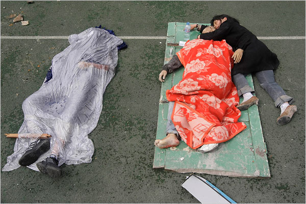
I’m not sure why, but the photos from China that have been devastating. Disaster coverage is familiar to everyone–whether it’s twisted wreckage or a bloated corpse, long lines of refugees or supplies stacked on the tarmac, we’ve seen it before. And we’ve seen people crying over lost homes, villages, loved ones. But somehow not like this:

Can a photograph be more tender, or more heartbreaking? The contrasts only make everything worse by underscoring deeper similarities. He looks as if he still could be alive, but he is as dead as the hardening body shrouded next to him. His covering is colorful, alive with color, but that only marks the vitality that has been lost. She holds him so lovingly, as if they had fallen asleep in each others’ arms, but she will never hold him again.

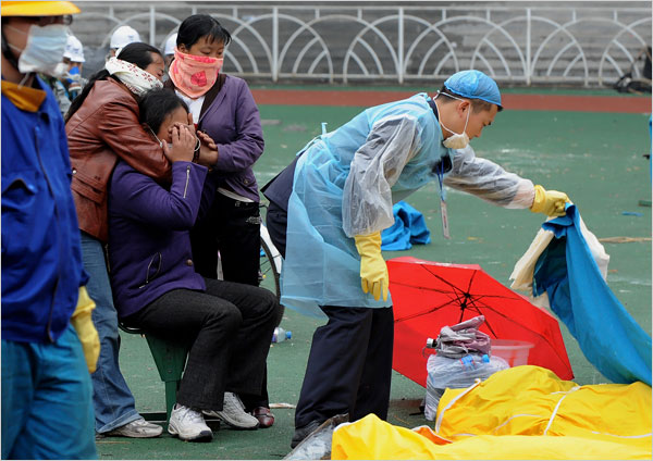
Nor is she alone in her loss. There are many images of parents, sisters, friends, stricken in their grief. Like this:

This woman has just identified a loved one. The shock is palpable–a heavy body blow driving her into herself. (The English word “grief” derives from the Latin gravis, heavy.) Her hands claw at her face, as if to scratch out her eyes. Other friends or family are with her, holding her, yet she is inconsolable.

This photograph is less elemental than the first. Instead, it is cluttered with signs of the public character of the disaster. A uniformed emergency worker fusses with tarps and other material while overseeing the body bags. The background suggests some public venue (a stadium?) and a stranger walks by on his own business. The informal masks, which are an indication of mass death, also signify the anonymity that divides private lives and public interaction. And that’s where we come in: anonymous spectators far away from those whose lives are being ripped apart in full view of the world press. Some writers on photography are appalled by the visual mediation of suffering, and they could describe these images as a voyeuristic indulgence in false sentiments that deaden genuinely ethical relationships.

And they would be wrong.

Second photograph by Mark Ralston/AFP-Getty Images; I misplaced the credit for the first photo but hope it will turn up.  (If anyone can let me know, it would be much appreciated.)

 3 Comments

What Disaster Photos Reveal

Photojournalism about natural disasters has always served a political purpose, which is why authoritarian governments censor it as much as anything else. US coverage of foreign disasters has at least two themes: first, demonstrating our magnanimity and the wealth; second, suggesting that authoritarian governments are incapable of helping their own people. Frankly, I’ve always liked the second half of this story: it’s good to be reminded that democracy, though not perfect, still works better than non-democratic regimes. Apologists for dictatorship rely on the conventional wisdom that dictators are more efficient than democracies. That overlaps with other hierarchies as well and so it seems natural to think that you can make the trains run on time by keeping decisions in the executive suite.

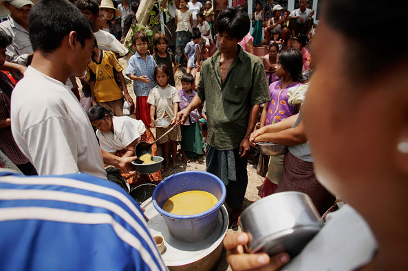
So it is that I don’t mind seeing Myanmar exposed for what it is, a brutal, incompetent regime whose only priority is holding on to power. When coupled with the many reports of that government’s control–and theft-of international relief, photographs such as this one speak volumes:

The government is not in sight, and people seem to be making do with whatever they were able to scrounge or share. The New York Times caption included the report that “Nearly one week after a devastating cyclone, supplies into the country were still being delayed and aid experts were being turned back as they arrived at the airport.” Look again at the one pan of food, then at the children waiting to be fed, and do the math. There is not going to be enough to go around.

Because of my commitment to democracy, I don’t mind this political message being added to the reportage. For that very reason, however, coverage of the earthquake in China should be seen as a genuine challenge to American complacency. Despite staggering levels of destruction and enormous difficulties due to terrain, weather, the remoteness of the region, and wreaked infrastructure, the response of the Chinese governments at all levels has been superb. From local first responders to mobilization of medical personnel on a large scale to sending in 100,000 troops, the scale, coordination, and competence has been obvious. In addition, you might also note the high levels of modernization and affluence. The heavy equipment, medical supplies, temporary shelters, equipment, clothing, and more are first rate.

There are dozens of photographs supporting this story, including this one:

Civilians are being helped around a mechanical hoe that is being used to clear a mountain road. That late model Volvo probably wasn’t airlifted in. As the refugees are helped out, fully laden and unarmed troops march in to the disaster area. People seem to know what they are doing.

Initial coverage in the US included criticism of Chinese restrictions on media coverage. When those restrictions were quickly ignored by the Chinese themselves and then lifted by the government, the criticism ended for the simple reason that there was nothing left to fault.

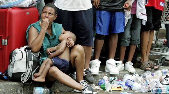
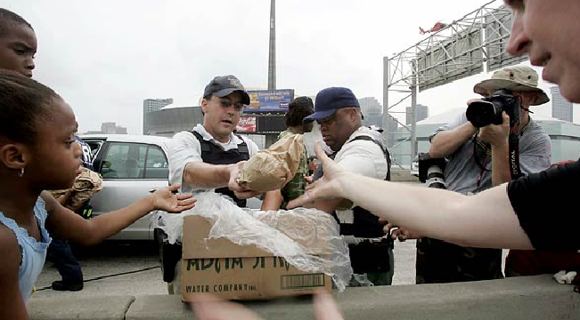
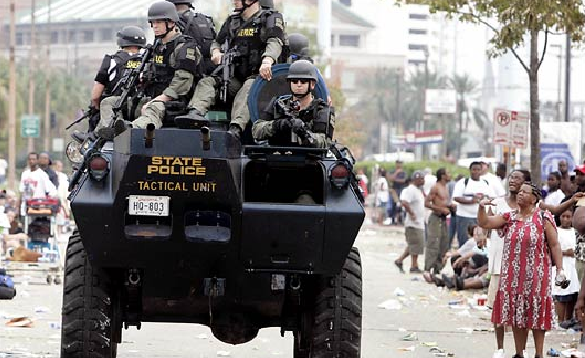
And so we get to Katrina. Although the response to that disaster may have been better than that of the despot in Myanmar, it nonetheless was terrible. Nor could the US claim that it was in a remote region or that vital infrastructure had been destroyed–Interstate highways went right to the door and the port remained open. So let’s take a moment to recall how things looked on the fourth day after the flood:

And the food? Peanut butter sandwiches:

And the troops?

None of this is the full story. There were differences that have not been mentioned. Visual evidence, like any evidence, should treated with some skepticism. But, still. US or China: which scene looks more like a third world society–and a third world government?

Photographs by Chumsak Kanoknan/Getty Images; Du Bin/New York Times; Eric Gay/Associated Press; James Nielson/AFP-Getty Images; Eric Gay/Associated Press.

 5 Comments

Sight Gag: Stayin' Alive

Photo Credit: Alex Wong/Getty Images

Our primary goal with this blog is to talk about the ways in which photojournalism contributes to a vital democratic public culture. Much of the time that means we are focusing on what purport to be more or less serious matters. But as Jon Stewart and Stephen Colbert often remind us, democracy needs irony, parody, and pure silliness as much as it needs serious contemplation. For our part, we will dedicate our Sunday posts to putting such moments on display in what we call “sight gags,” democracy’s nod to the ironic and/or the carnivalesque. Sometimes we will post pictures we’ve taken, or that have been contributed by others, or that we just happen to stumble across as we navigate our very visual public culture. Sometimes the images will be pure silliness, but sometimes they will point to ironies, poignant and otherwise. And we won’t just be limited to photography, as a robust democratic visual culture consists of much more. We typically will not comment beyond offering an identifying label, leaving the images to “speak” for themselves as much as possible. Of course we invite you to comment … and to send us images that you think capture the carnival of contemporary democratic public culture.

 0 Comments

BUILT: Why Can't Bikes and Cities Just Get Along?

BUILT explores the changing city in the US and the challenges that will affect housing, infrastructure, neighborhood cohesion, and equity in the coming years. BUILT is a series of research, installation, dialogue, interview, and performance events of varied scale, including the opportunity for public conversation offered at this blog.

This week’s discussion begins with this photograph:


City of Portland transportation workers install a new bike box at the corner of SE 7th Ave. and SE Hawthorne Blvd. made of thermal plastic and sealed onto the road with propane torches

Bike box and automotive thoroughfare: accommodation or tokenism? Cooptation or change?

Sign and reality, sign and system: what happens when public space becomes public signage?

BUILT is a performance/civic dialogue project and a collaboration of Northwesten University’s Theater Department & Portland, Oregon’s Sojourn Theatre, led by visiting artist Michael Rohd.

 2 Comments

Compassion Fatigue and the Parade of Images

For the past few weeks the news seems to be awash with images of natural catastrophes from around the world: cyclones, tornadoes, earthquakes, volcanic eruptions, floods, fires, and the list goes on. And the photojournalistic record is extensive with pictures of rubble and debris, usually shot from above, as if viewing the event from a safe distance; rescue operations; dead bodies (at least outside of the U.S. and other so called “first world” nations); forlorn and wretched family members dramatically mourning their losses; lines of refugees seeking food, water, and medical attention; and, of course, children, often tattered and worn, the almost universal sign of innocence and victimage—if not humanitarian identification. The sheer quantity of photographs at the internet sites of major news outlets is truly impressive. And yet, after only a short while it is difficult to tell one disaster apart from another as the images become virtually interchangeable with one another. Susan Moeller calls this “compassion fatigue,” a state of utter habituation to the conventions for representing disasters that “militates both against caring and action” and animate political passivity and quiescence.

Those who subscribe to this theory tend to overstate the case, seeing it always and everywhere, but there are surely times when compassion fatigue is activated and this may well be one of those times. There is a different point to be made, however, which has less to do with the “fact” of compassion fatigue per se and more with the ways in which the visual conventions which enable it can be deployed to animate a range of social and political effectivities (identifications, memories, etc.) that alter how we see the world and ourselves in it. As a case in point, consider the NYT slide show of “Pictures of the Day” for May 13th.”

Slide shows are a common feature at major internet news sites; sometimes they supplement specific news stories as illustrations and sometimes they substitute for the stories themselves as standalone visual narratives. “Pictures of the Day” is a slide show genre that purports to represent the “best” images of the day. The parade of images in these “best of” slide shows often range from the serious to the mundane, and from the poignant to the frivolous; indeed, nothing necessarily connects the images to one another in anything like a logical or storied fashion. But of course viewers are habituated to interpreting the sequence of images in a slide show as a montage driven by a narrative logic—whether a clear and obvious storyline is present or not—an impulse that can be encouraged by the regularized, formal conventions of representation that anticipate and meet with the audience’s expectations. And, of course, sometimes this can produce the oddest of results.

Pictures of the Day for May 13th” begins with the photograph below of the earthquake in the Dujiangyan in the Sichuan Province of China and is followed by three additional photographs, all recognizable by their conventional representations of the disaster and the attending relief efforts.
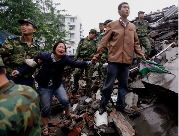
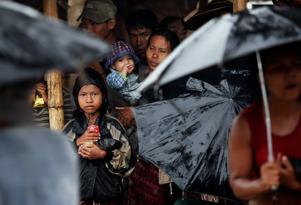
The third picture, a tight close up of an injured survivor from Chengdu, moves almost seamlessly to the fifth picture, now suddenly in Myanmar, where the people of Dedya await food and supplies in the rain. If you do not read the captions you would be hard pressed to know that we have shifted either the locale or the nature of the particular disasters being reported as even the weather seems to be the same (as marked by umbrellas in each photograph).
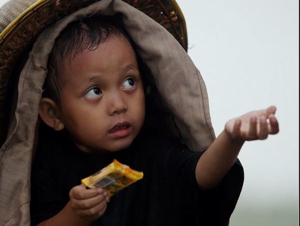
Three more conventional pictures of the disaster in Myanmar end with a photograph of a child holding out his hands and asking for food:
The next picture once again shifts the locale, this time to the streets of Lebanon:
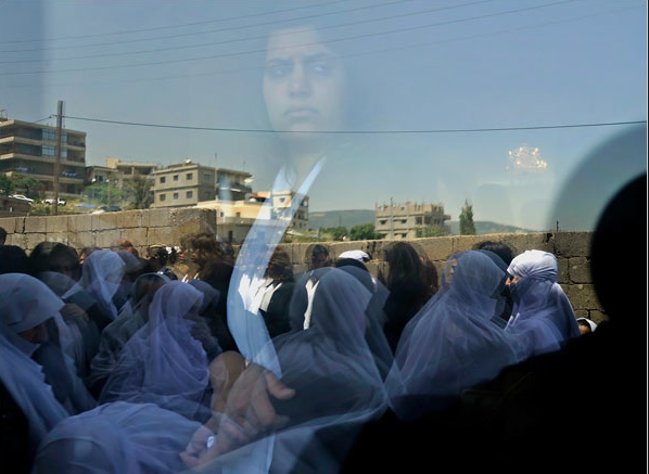
This photograph is shot through a window and captures the reflection of a Druze women watching a passing funeral procession from within a Mosque. The segue here is subtle as both the spectral image and the movement of the mourners soften (without entirely eliminating) the visual connection with the earlier images from Myanmar, but notice the line of sight for both the child and the woman, which are in almost perfect synchrony and thus invite a sense of visual communion as together they seem to issue a unified emotional demand upon the viewer. Of course, the bigger point to make is that the sequence of images has now shifted the narrative register from natural disasters to political, man-made tragedies.

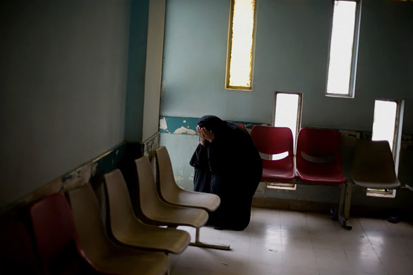
The next two pictures move us to Baghdad’s Sadr City. In the first we encounter a battle scene that would appear to be the narrative antecedent to the funeral in Lebanon, but for the fact of physical distance; of course, the physical location in the image from Baghdad bears enough resemblance to the scene form Lebanon that one could easily be forgiven the mistaken assumption that they are in close physical proximity to one another. The second photograph, below, shows us a woman in mourning who could easily be mistaken for the ghost-like visage of the woman in Lebanon above.
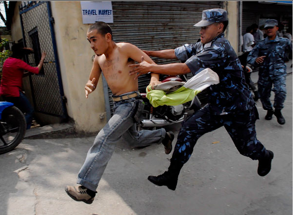
And from this scene we move back to the sphere of Chinese influence in Katmandu, where, it appears, political problems have replaced all concerns for earthquakes and other natural disasters.
The story does not end here, however, as two final images create a rather abrupt shift to another kind of politics in a very different part of the world:

Alas, what we have here is the equivalent of the Hollywood ending: What begins in tragedy ends in farce as we move seamlessly (once again) from conventional representations of a world out of control to the implication that such problems can be solved by the U.S. presidential election.

Compassion fatigue, it would seem, is the least of our problems.

Photo Credits: David Gray/Reuters; Getty Images; Bela Szandelszky/AP; Moises Saman/NYT; Narendra Shrestha/European Pressphoto Agency; Doug Mills/NYT. On “compassion fatigue,” see Susan D. Moeller, Compassion Fatigue: How the Media Sell Disease, Famine, War and Death (New York: Routledge, 1999).

 1 Comment
Fashion Violence at the Commedia Dell'Arte

Tilda Swinton does not wear makeup, off the set anyway. Needless to say, this makes her the perfect prop for selling makeup to the ultra trendy. The image below is from a session for the Extreme Makeover column in the New York Times Sunday Magazine.

tilda-swinton.png

The column by Alex Kuczynski gushes about Ms. Swinton while taking this ugly shot at the rest of her gender: “Any woman who has used makeup can look at this photo and imagine the actual shades in the service of beauty, and realize, with a shudder, that there is nothing more yearning and sinister than a woman’s face covered in carefully applied paint, mascara and shadow.” Help is on the way, however, as the small print tells us that Tilda “is so on trend” and offers nine products from eyeshadow to lipstick. No one said being a woman was easy.

To camouflage the sales pitch, Alex compares Swinton’s makeup to the character of Pierrot in commedia dell’arte. Well, yes, and no. That comparison is the real makeup in the story because it covers up the face we might actually see. That face–particularly when seen in the full page reproduction in the Magazine–looks more like a battered woman than a clown. And those lips could also be stained from engorging on some ripe fruit or raw meat; now the allusion is to The Island of Dr. Moreau. We’re back to that earlier description of women being simultaneously yearning and sinister. A creature of both fantasy and reality who signifies both victimage and vindictive consumption, this extreme makeover has taken us right back to where we started.

The artistry is remarkable, of course, as it works at many levels–I didn’t even mention the hint of ghoulishness, or of a vampire having just slaked her thirst, or the almost medical garb and the dream of making a woman, bride of Frankenstein, and Perrot really is there as well. But under all that lies not the “virginity of her unpainted face” (the Times really said that), but the same old myth that women are both flesh and false, danger and desire. Extreme Makeover? No, one that is all too conventional.

Photograph by Jean-Baptiste Mondino for the New York Times.

 0 Comments

Conference Paper Call:Cultures of the Image

CALL FOR PAPERS

Iconotopoi/Bildkulturen (Cultures of the Image)
Current Academic Practices in the Study of Images
Joint Eikones-McGill Graduate Conference
Department of Art History and Communication Studies
McGill University, Montreal
December 3 to 5, 2008

The joint McGill-Eikones Graduate Conference Iconotopoi/Bildkulturen (Cultures of the Image) aims to identify and challenge cultural and linguistic barriers within the academy, so that the study of images may one day become as mobile as its objects of inquiry.

Since the early 1990s, at least two interdisciplinary fields dedicated to understanding images attest to the differences in cultural/academic approaches to the study of images: Visual Studies in America, and Bildwissenschaften in German-speaking Europe. Each of these fields traces its roots back to the Linguistic Turn, and both stem from the Pictorial or Iconic Turn (cf. W.J.T. Mitchell’s Critical Iconology and G. Boehm’s notion of Bildkritik). Bildkritik emphasizes the singular image, its inner tensions and structures, and its temporal and affective interplays. In contrast, Visual Studies often focus on the social and political contexts of image production
and reception, thereby broadening the field in which images are considered.

Iconotopoi/Bildkulturen aims to confront these diverse critical cultures of the image through case-study presentations by international scholars. The conference will forge a constructive dialogue between German-, French-, and English-language academic cultures, at a time when allegedly international discourses tend to lose sight not only of the singularity of the image, but also of singular approaches to understanding images that can be found in
different cultures.

Proposals in English or French from graduate students in all relevant
fields are welcome. We especially encourage reflections on
interdisciplinary and/or cross-cultural methodologies in the study of
images. Possible research topics include:
–Affective imagery (Anthropology, Art History, Dance Studies,
Performance Studies, Religious Studies, Theatre Studies)
–Imaging knowledge (Information Design, Scientific Visualisation)
–Non/narrative imagin(in)gs (Anthropology, Literature, Philosophy,
Psychology)
–Digital Images (New Media Studies, Informatics)

Send a 250-word abstract, along with a 100-word biography, to
iconotopoi@gmail.com <mailto:iconotopoi@gmail.com> by May 30, 2008.

All submissions should be identified with your name and complete contact information, as well as details about your institutional affiliation.

Additional information: http://www.mcgill.ca/ahcs/iconotopoi
<http://www.mcgill.ca/ahcs/iconotopoi>

 0 Comments

21st Century Coffee Break in Beirut

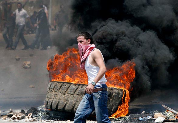
If aliens were observing Earth from some observatory elsewhere in the galaxy, they could be forgiven for believing that human societies were continually contending with spontaneous combustion. Shootings, bombings, riots, gang wars, clan wars, border wars, civil wars, invasions, insurgencies, counter-insurgencies–all over the planet “hot spots” keep erupting as if from some molten lava field barely below the surface of civilization. Scenes like this are all too familiar, ritual irruptions of violence.

beirut-burning.jpg

This is from a couple of days ago when things were heating up again in Beirut. We are looking at the stock scene of street violence in the third world. The burning tire spews its oily smoke amidst the debris of destruction, a young man becomes the figure of revolution, and bystanders mill about in various combinations of self-preservation and collective resistance. Everyone knows the script so well that this photo could be a movie still: male lead front and center, moving confidently between light and fire, while the little people and a smoke machine create atmosphere. Look at his hair–he could be the young De Niro.

Some of the images in the coverage of the recent violence in Beirut do look posed, but the carnage is real. It is important to recognize, however, how our visual knowledge of global violence naturalizes war as it exposes its causes. The image above, for example, reminds us that so much of what is going wrong can be traced back to oil–like the oil used to make that truck tire. The young man’s clothes should remind us that the problem is not a clash of civilizations or one of a lack of modernity–those street fighters look exactly like the guys I see on the subway platform in Chicago. (OK, often they look better. Fitness and fashion seem to be givens over there.) The inversions in the scene–using a tire to stop traffic, setting fire during daylight–suggest that the natural order of things in Beirut is already upside down, a regime of violence and exploitation rather than a well-functioning civil society.

Unfortunately, that path though true enough doesn’t lead anywhere but back into the cycle of violence. The problem is not simply one of removing oppression to let peace bloom. Just as the street scene and its photograph are both now almost ritual performances, actors at every level have become habituated to war. Indeed, the most chilling photograph to come out of the weekend is the one most removed from the effects of the fighting.

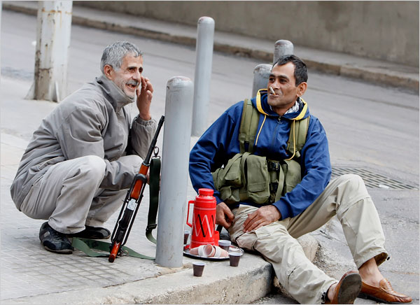
beirut-gunman-coffebreak.JPG

The caption read, “After Shiite fighters seized control of parts of west Beirut, a gunman, right, took a break to drink coffee on a street corner.” This is almost disorienting, or it should be. The scene is the epitome of a worker’s coffee break: thermos, a smoke, a joke. This could be an image of civilization at its best: making the impersonal curb into a place of conviviality. And look at his feet: loafers, no socks. See the military vest as a life jacket and he could be waiting for his yacht to be put in the water. What is all too obvious is that these guys are normal human beings who are nonetheless habituated to moving in and out of war on a daily or even hourly basis.

Just like the rest of us.

Photographs by Mohammed Zaatari/Associated Press and Ramzi Haidar/Agence France-Presse-Getty Images.

 1 Comment