Warning: Undefined array key 0 in /home/hariman/nocaptionneeded.com/wp-content/plugins/as-random-post-images/as-random-post-images.php on line 20
Dec 16, 2007
Aug 29, 2007
Nov 05, 2007
Feb 01, 2012
Sep 17, 2010
Jul 19, 2010

The Face(s) of Death

4000.png

The death toll for Americans in Iraq reached 4,000 on Sunday. “It’s a sober moment, and one that all of us can focus on in terms of the number.… The president feels each and every one of the deaths very strongly and he grieves for their families. He obviously is grieved by the moment but he mourns the loss of every single life.” Or at least that is what one of his surrogates reported as President Bush himself was too busy entertaining the Easter Bunny on the South Lawn of the White House to acknowledge and address the gravity of the moment.

The number of U.S. casualties is really rather hard to get a handle on, and the administration treat it as something of a shell game. When it is pointed out that we have reached something of a milestone with 4,000 deaths there is an effort to deflect the magnitude of the number by mourning “every single life”; when attention is turned to individual deaths the focus shifts to how the overall number of deaths has slowed since the beginning of the “surge” or how, as Vice President Cheney emphasized today, “every casualty, every loss” had joined the military voluntarily (as if that somehow mitigates the tragedy of their loss or soothes the pain of their families and friends).

Of course, visually representing the relationship between individual and collective is always a vexing problem. Since social and political collectives are corporate entities constituted by more than the sum of their parts, it is difficult to put the whole on display in any demonstrably real or objective manner. All we can ever really show is a part that presumably stands in for the whole, such as when large groups of people saluting the flag stand in for “the American people.” The typical strategy for representing the collective is through opinion polls or charts and graphs which aggregate individuals into statistical displays. The problem with this approach, of course, is that it removes all sense of the individual from the equation, literally reducing people(s) to abstract numbers. So it is that we can report that the average American family includes 2.6 children.

The NYT has addressed this problem inventively with a graphic representation that literally “puts a face” on war casualties in a manner that imbricates individual and collective losses in an interactive image that holds each in a kind of suspended animation, both the “one” and the “many” present at the same time with neither yielding their magnitude or significance to the other.

What we have above is a photo/graphic representation of David Stelmate, U.S. Army, age 27, who died on March 22, 2008. His face is made up of 4,000 squares, each one representing one of the other 3,999 U.S. deaths since the beginning of the invasion and occupation five years ago. When you click on any single square the name of one of those others appears; if you double click on it the large image changes to that individual. Below, for example is Jay T. Aubin, age 37, a U.S. Marine who was among the very first to die on March 21, 2003. To get to his image you would double click on the first block in the lower right hand corner of the graphic. To see how it works click on either the image above or below.

auben.png

Looking at these “faces of death” is excruciatingly difficult, all the more so when we condition ourselves to recognize how each demands that we take account–and responsibility–for the combined magnitude of individual and collective loss simultaneously. These are not just 4,000 Americans, but also and simultaneously 4,000 individuals: husbands and wives, mothers and fathers, sons and daughters, sisters and brothers, friends and, yes, even strangers. And as you gaze upon these faces what you need to acknowledge is that even though the “number” of American deaths in Iraq has gone down since the surge, we are still losing American lives at the rate of “one a day” and there does not appear to be an end in sight. 4,000 American deaths–and lord knows how many Iraqis; a “sobering moment” indeed.

Photo Credit: Gabriel Dance, Aron Pilhafer, Andy Lehren, Jeff Damens/New York Times

Note: For a non-interactive variation on the this visual theme that uses the faces of the dead to create a mosaic that underscores both the magnitude of the collective loss and emphasizes cupability, see this representation at the Huffington Post.
 3 Comments

The Deer Hunter and the Fashion Show

When looking through the slide shows at the online newspapers there are times when I wonder how some of the photographs could be coming from the same planet. Let’s start with this one:

deer-hunter.png

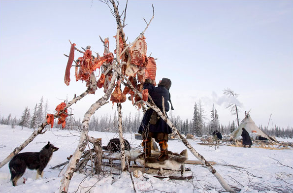
A Komi deer hunter is setting meat out to dry near his lodge on the Yamal Peninsula north of the Arctic Circle. You probably have a similar rack of meat in your backyard, right?

To someone who grew up reading popular histories of the Plains Indians, the picture appears to record a lost world. The lone hunter stands near a nomadic tipi with his dogs and fresh kill in a harsh natural environment. The shockingly raw slabs of the deer carcass suggest that he lives on the edge of survival himself. If you look around, however, you might notice that family members are tending to strong sleds while a good fire is going in the lodge. And look at the dog: he is disciplined, not lunging for the meat just above his head. Nor is everything austere, for the hunter has decorative wear on his leggings and boots. Instead of raw meat against a cold, barren landscape, we are looking at a sustainable culture.

But a very different culture from the one that produced this hothouse plant:

fashion-signs.png

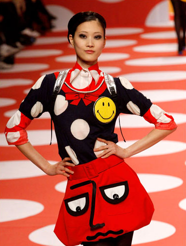
You are looking at one of the offerings from a fashion show in Paris. This show featured ready-to-wear outfits–you know, something you might need when visiting the Yamal Peninsula. Her features might fit in there, and the color scheme features red, white, and black somewhat like the first image, but that’s the extent of the visual similarity between the two worlds.

She stands alone only because she already is supported by a vast social and technological network that includes everything from the media to the microwave oven in which she’ll cook her dinner. And rather than living in visceral closeness to nature, she is immersed in culture. Indeed, her livelihood depends entirely on dressing for display, while the outfit of the moment features a world of signs: fabric appliques mime a face while the smiley icon suggests that everything about her is but distinctive variation within a process of constant circulation. As the circles on her top are echoed by the circular motif on runway and wall, she exists in perfect harmony with a wholly artificial environment.

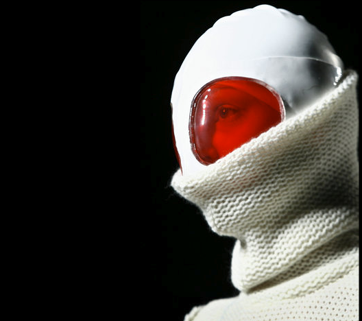
Can these two worlds converge? Should they? How might each attempt to do so? These questions can be answered from either standpoint–and usually in the negative, I would think–but I don’t have good access to either. There is one example of something like a synthesis, however, also from a fashion show. What might the fashion designer do if confronted with life above the Artic Circle? This is one answer:

pm-burqa.png

That, anyway, is how someone in Madrid imaged winter wear. He got the color scheme right, I guess, but it doesn’t look sustainable.

Photographs by Vassily Fedosenko/Reuters; Pascal Rossigno/Reuters; Daniel Ochoa de Olza/Associated Press.

 0 Comments

Sight Gags: The War President

stay_the_corpse.jpg

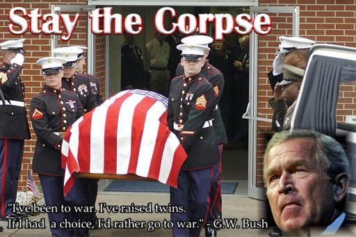
Photo Credit: Kyrion Quote Confirmation: Sourcewatch

Our primary goal with this blog is to talk about the ways in which photojournalism contributes to a vital democratic public culture. Much of the time that means we are focusing on what purport to be more or less serious matters. But as Jon Stewart and Stephen Colbert often remind us, democracy needs irony, parody, and pure silliness as much as it needs serious contemplation. For our part, we will dedicate our Sunday posts to putting such moments on display in what we call “sight gags,” democracy’s nod to the ironic and/or the carnivalesque. Sometimes we will post pictures we’ve taken, or that have been contributed by others, or that we just happen to stumble across as we navigate our very visual public culture. Sometimes the images will be pure silliness, but sometimes they will point to ironies, poignant and otherwise. And we won’t just be limited to photography, as a robust democratic visual culture consists of much more. We typically will not comment beyond offering an identifying label, leaving the images to “speak” for themselves as much as possible. Of course we invite you to comment … and to send us images that you think capture the carnival of contemporary democratic public culture.

 1 Comment

Photographer's Showcase: The Reciprocity of People and Environment

This week we welcome Tom White to the NCN community. Tom is a freelance photographer who lives in New Jersey and hails from Bradford, West Yorkshire in the north of England. Tom has studied Fine Art at Goldsmiths College in London and and photojournalism and documentary photography at the International Center of Photography in New York. His travels have taken him throughout Europe, as well as the Far East, Brazil, and India, and his work has been published in the U.S. and U.K. and exhibited in both places as well as in Japan.

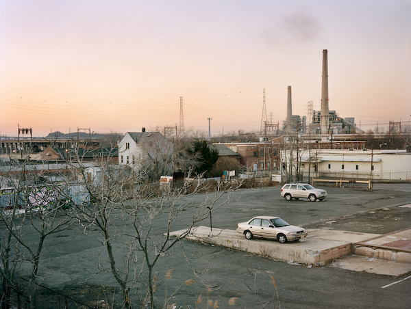
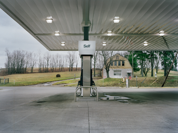
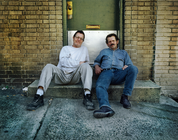
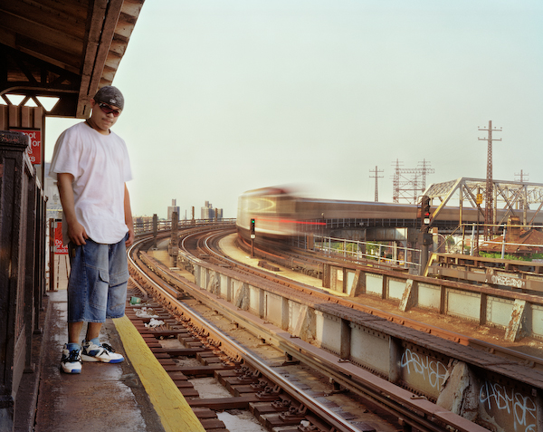
The photo-essay below is from a series on the reciprocal nature of people and their environment, focusing on the way people shape the landscape, which in turn shapes the people. We offer the images initially without commentary, but include White’s captions at the very end.

tiw_ncn_001.jpg


tiw_ncn_002.jpg


tiw_ncn_003.jpg


tiw_ncn_004.jpg


tiw_ncn_005.jpg


tiw_ncn_006.jpg


tiw_ncn_007.jpg


tiw_ncn_008.jpg


tiw_ncn_009.jpg

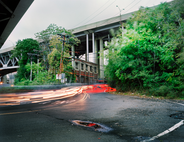
1. A coal fired power plant in NJ looms over an area which was once a small rural township.

2. A gas station forecourt on I-78 in PA stands empty amongst the vestiges of the surrounding countryscape.

3. Bobby and Richie relax on a step outside a bar just off the Tonelle Avenue 1&9 truck route in NJ.

4. Half Latino, half Chinese, “Chino Chan” stands at Whitlock Ave. Station in the South Bronx, a densely populated and heavily industrialized region.

5. A heavily trafficked area near the entrance to the Lincoln Tunnel from NJ to NYC.

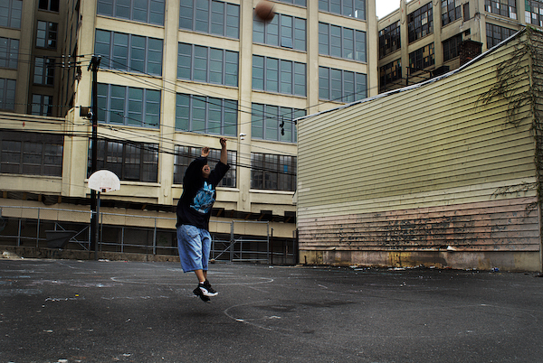
6. A boy plays basketball surrounded by derelict warehouses scheduled to become luxury condos in Jersey City.

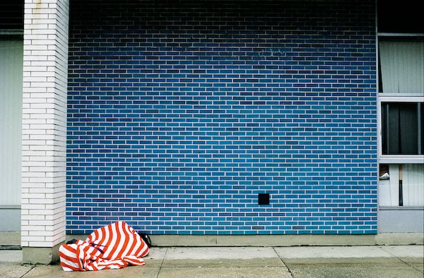
7. Homeless man Randy Vargas sleeps in front of a church affiliated community center in Hoboken, NJ.

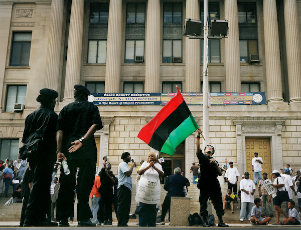
8. Members of the New Black Panther Party – a group unrelated to the original Black Panthers – stage a demonstration against street violence in Newark, NJ.

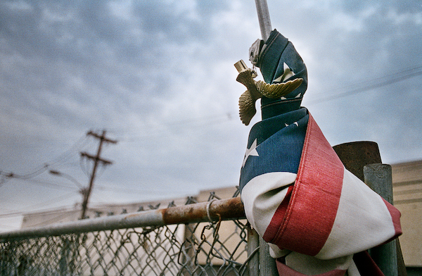
9. A knotted flag on the gatepost of an industrial estate in NJ.

 2 Comments

Iraq War Anniversary: Notes from the Charnel House

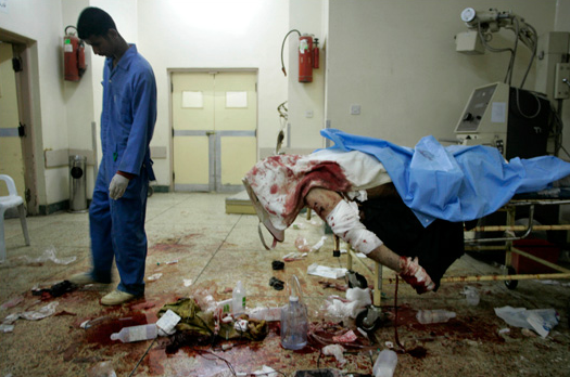
“Anniversary” hardly seems like the right word, but that’s what is being used to mark five years of war in Iraq. The New York Times is devoting a lot of print and digital coverage to the start of the sixth year of the war. Their interactive time line is particularly depressing, not least because the Times still isn’t admitting to its complicity in the rush to war. For example, the photo selection suggests that Saddam was a casus belli and that the toppling of his statue was a popular uprising rather than a media event staged by the military in concert with our puppet du jour and international pariah Ahmed Chalabi. Even so, the truth gets through. Like this:

iraqi-hosp-dead.png

I can barely stand it. Death–stupid, senseless death–is right there in front of us. And mess–the unholy mess of war and especially of this miserable, unnecessary, pathetic war. The whole scene is an allegory: the room obviously is not equipped for the emergency that has developed; the mutilated body (politic) has been bombed and then abandoned, leaving only horror and waste and indignity.

The photograph accompanies notes from the field by the photographer, Max Becherer. The caption reads, “A hospital worker in Kirkuk cleaned up after doctors tried, and failed, to save Mahmood al-Obaidei, a car-bomb victim, in 2005.” What hospital worker? I hardly noticed the orderly, who could as well be a department store mannequin. If you look closely you can see that he is alive but hardly a model of can-do professionalism. Nor can you blame him, as he too is dispirited, pushing a piece of the carnage with his foot like a kid with a mashed toad, not able to leave and not knowing what to do now that nothing really matters any more.

Becherer reports that minutes before the staff had been working furiously to save the bombing victim, who was responding to a defibrillator, only to have the power go out. Mahmood al-Obaidei, Kirkuk, death due to roadside bomb and power failure. The same could be said of the occupation.

Photograph by Max Becherer/Polaris for the New York Times.

 6 Comments

The Lone Red Shoe

protest-1.png

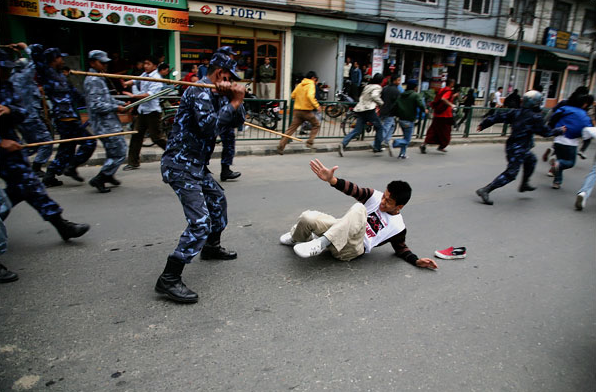
It is hard to look at the images of the “riots” in Tibet and the Chinese provinces and not be reminded of our own history of human rights repressions, and especially the violence that erupted across the South in the early 1960s. Just as then, those animated by a commitment to non-violent protest and resistance are being accused of causing the disturbance. And just as then, the visual evidence seems to give the lie to the claims by those defending the repressive regime—or at least it did until the Chinese government began to censor internet sites and to expel foreign journalists. And perhaps with good reason …

The Chinese government maintains that the police and military have used “restraint,” refusing to “open fire” on the crowds. That might be true enough (though there are conflicting—albeit unconfirmed—reports of nearly 30 Tibetan Monks being shot by the police in Aba, Sichuan), but the photograph above from Nepal and others like it would seem to give new meaning to the word “restraint,” at least as it is used by governments in the area. The lone individual laying in the middle of the street seems to be helpless, and even if he had previously been “riotous,” here he certainly isn’t much of a threat to anyone or anything, least of all a squad of riot troops who could easily detain and arrest him if that was their goal. And yet the soldier about to beat him with a baton has his legs spread and weight back to bring the full force of his weapon to bear upon the face and head of his target, a victim who can only feebly attempt to ward off the blow.

What makes the photograph all the more difficult to look at—and yet also somehow hard to look away from—is the red shoe left sitting in the middle of the street. We can only assume that whoever lost the shoe literally ran out of it in a frantic effort to escape the oncoming mayhem. But more than that, it is only a flimsy canvas shoe, a stylized covering for the foot that offers the merest of protection. Notice how it sits in stark contrast to the heavy leather boots worn by the approaching troops. And thus, the photographer has revealed the sense in which the supposed physical threat posed by the protestors is no threat at all. What we have here, then, is an image not of restraint but of brutality. The difference between the shoe and the boot marks the fundamental inhumanity that all too easily results when established regimes set out to suppress ethnic and sectarian differences. We’ve seen the inhumanity before, and not just in foreign lands.

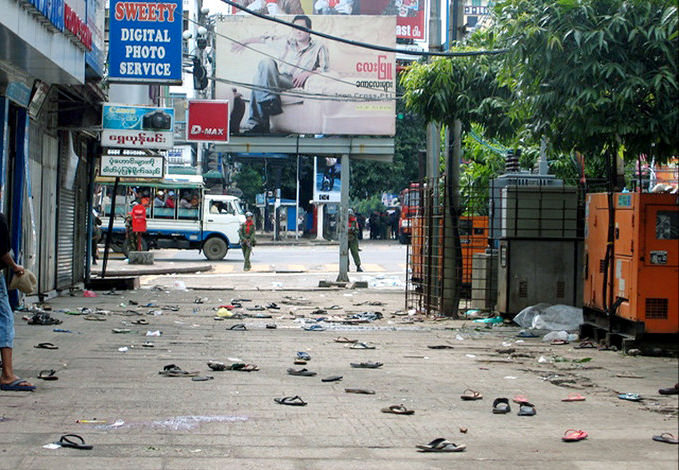
But there is more, for the image of the lone shoe also invites comparison with another photograph taken during the Burmese government’s brutal suppression of protests challenging its violation of human rights. That crackdown occurred in Myanmar this past September:

yangon-myanmar.png

The obvious difference is that here we have hundreds of shoes and sandals, not just one, and so the magnitude of the situation is somewhat more pronounced. But now, the street, virtually empty with the exception of a single individual lurking in the margin, is being guarded by troops as if democracy will arise spontaneously from the shoes and sandals left lying around. And it might, for that is the mythic promise of the democratic movements that the Chinese and Burmese governments fear. My fear is that it will take more than simple faith for sandals and flimsy shoes, however numerous, to challenge jackboots in any effective way. This is not to say that it cannot happen, but it will surely take more than lone individuals to forge the battle, whether lurking in the shadows or standing up against tanks in a public thoroughfare.

Photo Credits: Euan Deenholm/Bloomberg News; Mandalay Gazette-AFP/Ghetty Images

 6 Comments

The Political Mask

Everybody knows that politicians are two-faced. They say one thing and mean another, or promise something to one audience and promise the opposite to someone else. They smile and smile and smile and we know that nobody can feel that happy. We know that they are supposed to put up a good front but have to be someone else inside, and so we don’t trust them. And then we go and vote according to how we like them or how we judge their “character.”

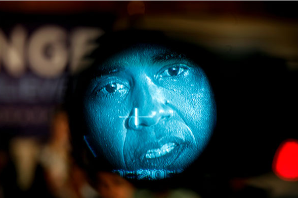
So it is that the politician’s face deserves some attention. And gets it. The photograph below is one of several that have featured the candidates up close and personal. Too close, perhaps:

obama-in-lens.png

You are looking at Barack Obama through a television camera viewfinder. Surely this is one example of the lengths to which photojournalists will go to create a distinctive image that might be picked out of the thousands sent to photo editors each day. This is distinctive and more. Some might say it’s a hatchet job–cutting Obama’s head away to make him look grotesque. Could be, but it also captures some of the elements of the presidential campaign as it is almost completely embedded in and defined by the media.

We could caption the photo “Moon Man.” The visual allusion is at once to the man in the moon and to an astronaut (think of the film 2001: A Space Odyssey). In either case he is far away, distant, almost alien. He also appears to be behind heavy glass, as if on the other side of an air lock. In fact he looks trapped in there, encased in the media apparatus of the campaign, ready for launch but also in danger of running out of oxygen.

The more you look, the worse it gets. The dark framing on the bushy brows, direct gaze, and exposed teeth might appear menacing to some, but look closer. I see someone assuming the look not of a predator, but of someone’s prey. The cross-hairs are just about dead center while he seems immobilized, caught in the hunter’s scope, stunned by the glare of a sudden flash, almost imploring us to help him. All we can do is stare and in staring note the moles, the pores, the creased skin–all evidence that here, in this twice mediated, highly distorted image, here we are actually seeing a real face.

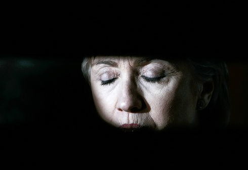
But not the only one:

hilary-face.png

Again, it may have been taken for its novelty value, but it succeeds as a work of art. I won’t say this is Everywoman, but she is one very tired woman. She also is someone whose long experience with fatigue is matched by deep reserves of strength. Most of the American public have not a clue about how grueling the presidential campaign is, but you get a glimpse of it here.

I’m not backing Hillary in the campaign for the nomination, but I’m touched by this photograph. Perhaps it’s the contrast with the conventional shots of candidates smiling (much less the manic, bug-eyed shots the press likes to serve up about Hillary). Likewise, the closed eyes offer her to the viewer, as opposed to the demand placed by eye contact and the campaign generally. That’s only part of it, however. As with Obama’s image above, the dark framing isolates the face and all it stands for. But where Obama looks trapped, she has been exposed. We see her make-up and a tracery of wrinkles in spite of that. This, too, is an image of vulnerability. And look closer: it could be a death mask.

It certainly is a mask–and this is the photographer’s achievement. We are shown the candidate in an unguarded moment, one in which she is doing nothing to please anyone, and, sure enough, she is wearing a mask: the make-up, the disciplined concentration, the facial mask itself. And it is for precisely that reason that we can be sure we are seeing a real person.

Photographs by Damon Winter/New York Times; Carolyn Kaster/Associated Press.

 4 Comments

St. Patrick's Day 2008

Neither John nor I give a damn about St. Patrick’s Day, but it did seem odd that it would be moved to protect Holy Monday from contamination. Is nothing sacred?

So it is that we offer this retrospective:

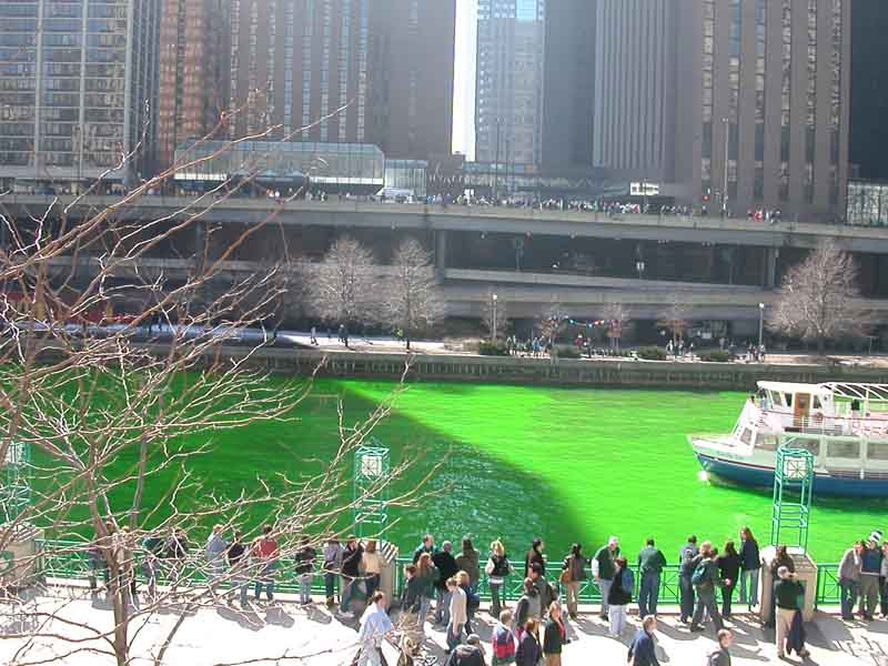
chicago-river-green-1.JPG

In Chicago, they dye the river green. They do so by adding orange. Question: what + orange = green? Second question: Do we really want to know?

st-pats-beer-guy.jpg

As you can see, he has a special hat for the parade.

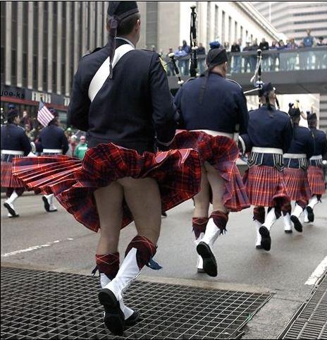
st-pats-kiltblown.jpg

OK, the Church may have a point after all.

 1 Comment

SIght Gag: Redistricting

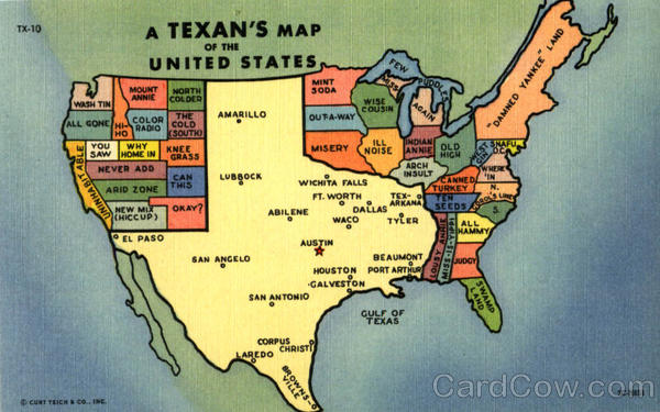
a-texans-map-of-the-united-states-scenic-us-state-town-views-texas-scenic-42458.jpg

Credit: Cardcow.com

Our primary goal with this blog is to talk about the ways in which photojournalism contributes to a vital democratic public culture. Much of the time that means we are focusing on what purport to be more or less serious matters. But as Jon Stewart and Stephen Colbert often remind us, democracy needs irony, parody, and pure silliness as much as it needs serious contemplation. For our part, we will dedicate our Sunday posts to putting such moments on display in what we call “sight gags,” democracy’s nod to the ironic and/or the carnivalesque. Sometimes we will post pictures we’ve taken, or that have been contributed by others, or that we just happen to stumble across as we navigate our very visual public culture. Sometimes the images will be pure silliness, but sometimes they will point to ironies, poignant and otherwise. And we won’t just be limited to photography, as a robust democratic visual culture consists of much more. We typically will not comment beyond offering an identifying label, leaving the images to “speak” for themselves as much as possible. Of course we invite you to comment … and to send us images that you think capture the carnival of contemporary democratic public culture.

 1 Comment

Traces of a Vanishing World

In his magnificent book The Ongoing Moment, Geoff Dyer includes a meditation on how different photographers’ styles are revealed by looking at how they have photographed hats. Dyer is a master at zeroing in on the distinctive genius of the individual artist, but attention to the distinctive object can lead down other interesting paths as well. John and I have been intrigued by how frequently isolated shots of hands or feet occur in the daily papers and slide shows. The feet can be bare but usually display footwear, and often the footware alone are featured. Like this:

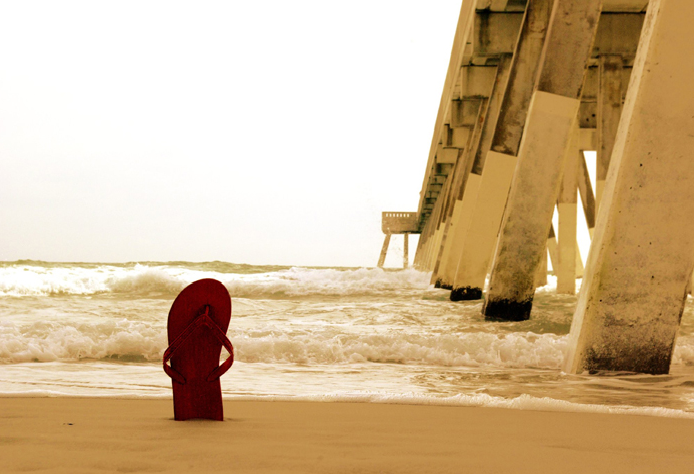
shoe-beach.png

Although actually taken in February (in North Carolina), this photo presents a typical end of summer shot. The winter light and muted colors imply a transition from summer to autumn and so from leisure to work. The lone sandal probably was lost as someone was playing in the waves and then washed up later. Someone else probably stuck it in the sand to help it be found again.I’d like to think that the motive was not so pragmatic. Perhaps someone saw the sandal and propped it up as a votive offering, a small memorial to the end of the season. Even better if it were taken off and stuck there, dooming its partner to the trash bin but becoming the more fitting gesture for saying goodbye. By leaving this fragment behind, you get to take a piece of the place with you. Leave a bit of your heart here, and you can have an inner beach when back in the daily grind. These thoughts make the photograph itself seem less contrived as well: what hints at being posed and a bit too neatly elegiac can be thought of instead as a small and beautiful act of homage.

Yesterday John commented on a pile of shoes in Baghdad that looked like they were from a lost and found bin. As he noted, the shoes were the remains of people who had disappeared due to a bombing. What little was present signified how much had been lost. This theme of loss doesn’t haunt every photograph of empty shoes, but it can mark a vanishing summer–and the disappearance of much more as well.

shoe-desert.png

You are looking at a photograph of the Barrios de Luna reservoir in Northern Spain. The reservoir, which is dry due to a severe drought, is aptly named for it does look like a moonscape. As above, the image positions the viewer between earth and sky, nature and culture, and, once you’ve read the caption, between water and land, now ironically so. Just as the shoe is missing its owner, the lake bed is missing is reason for being. Again, the lighting and color tone suggest that the good times were in the past. And they were.I can’t help but see the shoe as a track, like a fossilized footprint. It’s as if we are looking back to a prehistoric riverbed, at the traces of a lost species, homo sapiens sapiens, who were not so wise after all. Someone lost a shoe, probably when playing in the water long ago. Now it becomes an accidental memorial, the trace of a vanishing world.

Photographs by Josh Kruzich/National Geographic Daily Dozen; Eloy Alonso/Reuters.

 0 Comments