Sep 10, 2008
Jan 19, 2015
Mar 10, 2010
Nov 14, 2008
Apr 09, 2017
Mar 13, 2009

Then and Now

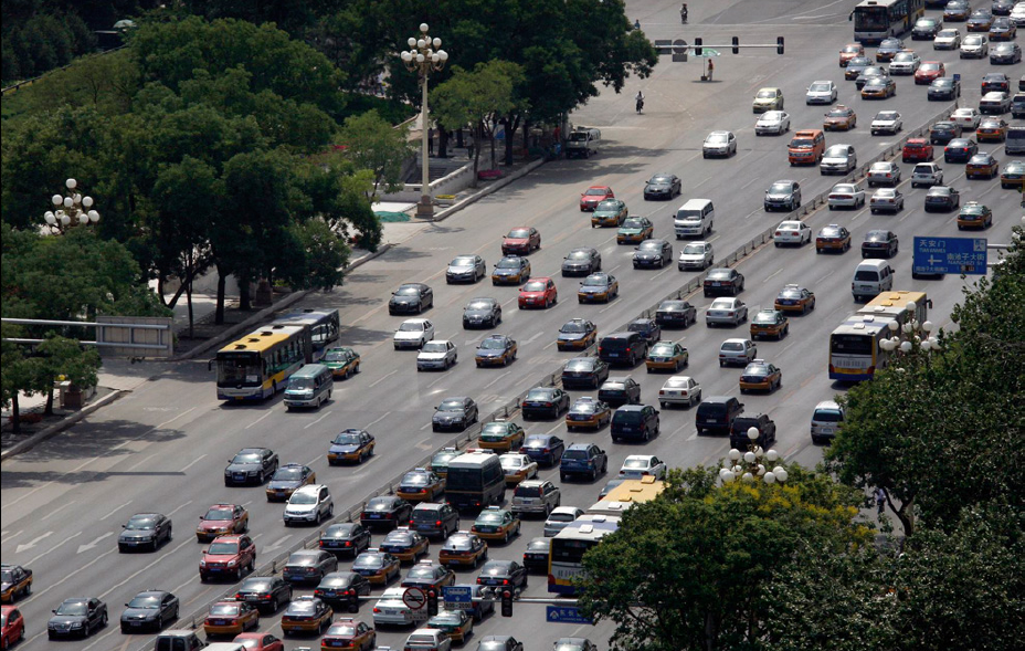
Can you name the location of this photograph?  If you need a hint click on the image.

tsquare-today

Even those who actually recognize the scene probably misidentify it.  Most westerners would be inclined to say that it is Tiananmen Square, though it is actually Changan Avenue, which is a bit east of the square.  On its face that small detail of misnaming would seem to be relatively unimportant, after all, what really matters was the event, right?  And the iconic photograph nails that as a lone individual stands down a row of tanks. Of course, when we say “iconic photograph” we have a bit of a problem too since there are at least four different photographs that are commonly referred to as “the” photograph.  But again, perhaps that too is just a trivial matter as each image is really quite similar and collectively they appear to confirm the relevant facts—a man, a row of tanks, a public thoroughfare, etc.  So what if the four images are not identical to one another—if in some you have a close-up and in others you can see the wide street and bus, or if in some the man is carrying a bag in each hand, but in at least one he no longer has a bag in his right hand?  What difference does it make?  Maybe nothing.

Then again, perhaps it calls our attention to the ways in which photographs become reductive representations of places and events that can (and often do) direct (or misdirect) our attention and, subsequently, our memory.  What was the dance between the man and the tank all about?  Was it about a lone, heroic individual standing up against incalculable odds in a scene that might have been played out in the mythic American west with Gary Cooper cast as the man holding the bags?  Or was it one small part of a mass, collective demonstration, a radically democratic  (and potentially dangerous), grass roots  revolution?  Did that photograph inflect a liberal or a democratic moment?  Perhaps the photograph above coaches an answer.

It is not hard to see this photograph as a visual quotation of the iconic image of the man and the tank.  Taken from almost the identical vantage of the iconic photograph(s), it shares many of the high modernist aesthetic conventions of the original that make it easily identifiable to western audiences:  It is universal rather than parochial (it could be anywhere in the world), it is geometric rather than organic (notice how the scene and all that it contains are disciplined by rigid angles and vectors), it is functional rather than customary (the street is designed to “move” masses of people from one place to another rather than to accommodate social interaction), and so on.  But more, it is shot from on high and at some distance.  The viewer thus looks down upon the scene with a degree of objective detachment that James C. Scott affiliates with “seeing like a state,” a panoptic vantage “that is typical of all institutional settings where command and control of complex human activities is paramount.”  That the iconic photograph has circulated mostly (and almost exclusively) in the west is a clear indication of who is viewing whom, and who presumes cultural hegemony. But what is being naturalized here?

The template is framed in a figural dialectic defined by the relationship between “then” and “now.”  And from this chronotopic perspective, what is different are the particular figures within the scene.  In 1989 we had a showdown between the heroic individual and the authoritarian state, in 2009 we have the traffic and commerce symptomatic of a busy thoroughfare in any city in the world.  What is important to notice is that in each photograph the anonymity of the actors remains intact, with this crucial difference: then they were defined as political agents caught in a struggle between good and evil, now they are seen as global consumers defined (as so often in the U.S.) by their cars.  What was thus then cast for western eyes as a liberal-democratic revolution is now cast as a liberalized, global economy of undifferentiated, mass consumption. Liberalism, it would seem, is the trump card.  Their present is our past … again.

That could be useful framing of the social order, as it animates the possibilities for trans-global identification, or it could reduce our sense of the possibilities for a global civil society to a neo-liberal economic hegemony disciplined by the narrow and limited conventions of  late modern design.  Its all a matter of what we choose to see and remember.

Photo Credit: David Gray/Reuters  (For more on our consideration of the original “tank man” image and its various iterations and appropations see chapter five in No Caption Needed (the book) and posts here and here.)
 0 Comments

Visual Histories Framing the Obama Presidency

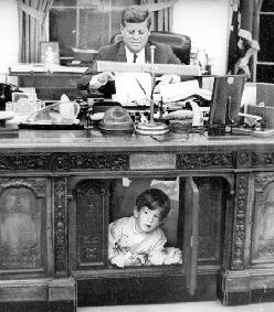
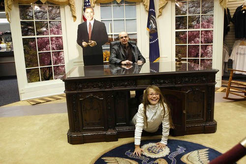
The presidential inauguration is a time of new beginnings, but it cannot avoid comparisons with the past. Indeed, a time of transition places a special premium on the past. Speech writers, pundits, retailers, and ordinary citizens have been trying out various comparisons and narratives to place the historic event in its proper perspective. This attempt to make sense of collective life includes notable images as well. Images such as this one:

As dad sits at the president’s desk in this faux Oval Office, his daughter pops out of the door in the front, neatly reprising the famous image of John-John Kennedy doing the same in 1963.

Dad forgot to pretend to be reading, but then he is on vacation–all the way from Italy, in fact. The Kennedy image apparently has global appeal, and the Oval Office replica probably is doing a brisk business in the run-up to the inauguration. The cardboard cutout of Obama standing behind the desk will be there to help sell the photo-op as a fitting part of the inaugural festivities, but it does more as well. The future president is already there in spirit, as if waiting to sit down and get to work once the public has had its fun. The image makes it easy to believe that the administrative transition between past and present will be as seamless as shifting one’s attention from the replica to the real thing.

The insertion of Obama into one of the stock scenes of the visual history of the Kennedy presidency has other implications as well. Many a commentator has been pushing the Camelot analogy, and there are indeed many similarities between JFK and Obama, including both eloquent oratory and skill at manipulating the media. Kennedy’s photo-op with John-John for Look magazine was no accident, and Obama has not been innocent of selective encouragement of the comparison with his classy predecessor. At the end of the day, however, I think that the Obama-Kennedy comparison is largely kitsch. That’s why the first photo above is perfect, as it captures the analogy exactly as it is–a cheap form of popular entertainment that should be played for laughs rather than taken seriously.

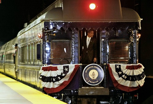
To put it bluntly, I can think of one very good reason why I don’t want to see that analogy become significant, and others as well. Oval Office replicas are not going to shape history, of course, but historical analogies can shape the way we understand the world and evaluate leadership. Images of the presidency can have historical resonance which in turn can guide collective efforts at renewal. That’s why I like this image:

This photograph of Obama at the back of his inaugural train is hardly innocent of strategic design on his part. The train ride is a trip down memory lane to influence public understanding of what lies ahead. The conjunction of the slogan on the seal–Renewing America’s Promise–with the largely abandoned technology of passenger rail travel speaks volumes. Individual comparisons with Lincoln or Roosevelt or Truman are the least of this image of a gleaming railroad car decked with patriotic bunting. This renewal will include restoration of traditional values such as personal discipline and public service, decision-making conducted in a deliberative manner, and government programs addressing collective needs.

Renewing America’s Promise at the back of a railroad car is nothing less than a commitment to using whatever works to sustain American democracy. All this is possible, of course, because the black man at the back of the train will be the president, not the porter. Now that the oppression that also was part of that old order can be discarded, renewal through restoration can begin.

Thus, we have two images and two senses of a usable past: With the one, kitsch and the undertow of tragedy. With the other, the possibility that what was best about the past can, finally, be restored now that so many prior failings can at last be left to history.

Photographs by Nancy Stone/Chicago Tribune; Stanley Tretick/Look Magazine; Pablo Martinez Monsivais/Associated Press.

Update: Thanks for the cross-post at BAGnewsNotes.  To see an earlier NCN post on another Oval Office replica, go here.

 3 Comments

Picturing America, Past and Present

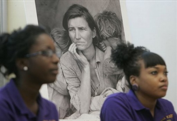
Recently Laura Bush was in New Orleans in tandem with the Picturing America project sponsored by the National Endowment for the Humanities. The project involves reproductions of 40 works of art that are available for use in the classroom. Freedom, equality, and similar civic virtues are featured as themes for the collection, which includes works from a range of periods and media. Many will be familiar to adults and none of them are likely to offend the protectors of public morality. Indeed, the lack of a critical edge is all too predictable, which is why this photograph has added value.

Dorthea Lange’s Migrant Mother is one of the 40 art works, but here it has become a part of work number 41. This photo of the two students raises many of the questions that could but perhaps would not arise during discussion of the iconic image. The fact that they are placed in equivalent positions to the two children in the Lange photo makes the point sharply: These are now the children at risk, and they are here, in real time and living color, waiting to see if their government will respond as it did during the crisis of the 1930s.

There has been no New Deal for New Orleans, of course, of for anyone else below the million dollar line during the seven years of the Bush administration. Another difference between the two photos provides some consolation, as the two students look attentive and capable rather than wholly dependent. Progress has been made in spite of everything, but that should be no excuse for not having good schools, levees, health care, banks, and all the other little things that once were understood to be the obligations of a good society.

Photograph by Bill Haber/Associated Press.

 0 Comments

The Challenge to America's "Greenest Generation"

picture-3.png

By most accounts Joe Rosenthal’s photograph of the flag-raising on Iwo Jima’s Mt. Suribachi is the most reproduced photograph of all time – ever! Claims to universality always invite dispute, but this one tends to go uncontested and for the life of me I can’t think of another photograph that might seriously challenge its primacy. Such reproductions have occurred not just in traditional print media, but on stamps (twice), commemorative plates, woodcuts, silk screens, coins, key chains, cigarette lighters, matchbook covers, beer steins, lunchboxes, hats, t-shirts, ties, calendars, comic books, credit cards, trading cards, post cards, and human skin, and in advertisements for everything from car insurance to condoms and strip joints. Additionally, it is frequently parodied in places like The Simpsons and it is a common trope in editorial cartoons where it draws its rhetorical force from both the power of its familiarity and the logic of substitution, whether to pious or cynical ends. And if there is a point to be made here it is that the image is regularly invoked to a wide range of patriotic and resistant or counter-cultural ends, thus marking the interpretive tensions invited and invoked by the original photograph.

All of this is to say that on the face of things there is nothing particularly noteworthy about Time’s appropriation of the image this week to frame and promote its “green” agenda in a special issue on the “War on Global Warming.” The original photograph works in three registers, emphasizing by turns a commitment to egalitarianism (the men are anonymous and without rank, while working together to a common purpose), nationalism (the raising of the flag on foreign territory is a symbolic expression of national sacrifice and victory), and civic republicanism (heroic sacrifice and commitment to the common good often commemorated in statuary designed to display civic virtues). Time’s usage of the photograph operates in all three registers as it substitutes a tree for the flag, and inserts color into what was originally a black and white image (as well as substituting a “green” border for the magazine cover’s traditional “red” border). The appeal, then, is to invoke a national effort of heroic proportions that will require equal sacrifice from every citizen in a war against an enemy that presumes to pose at least as large a challenge to world security as the axis powers. Just as the “greatest generation” brought the full force of its resources and resolve to vanquish fascism and make the world safe for democracy, so the image seems to say, the “greenest generation” can do battle to produce a greener, postcarbon world. The key difference, of course, is that here the enemy is ourselves, though that doesn’t really receive very much attention in either the photographic appropriation or in the lead article that accompanies it.

In short, the appeal of the cover image appears to be altogether innocuous. And given U.S. contributions to the problem of global warming, as well as our refusal to endorse the Kyoto protocols (even with their arguably flawed accords), there is no question that we need a serious and sustained national environmental policy designed to reduce our carbon foot print. And yet, there is something just a little bit troubling about the image. “Green,” we are told in something of a caption on the inside of the magazine, is the “new red, white and blue.” The lead article concludes, “The U.S. has enjoyed an awfully good run since the middle of the 20th century, a sudden ascendancy that no nation before or since has matched. We could give it up in the early years of the 21st—or we could recognize—as we have before—when a leader is needed and step into the breach. Going green: What could be redder, whiter, and bluer than that.” And there is the rub, for just as the title on the cover employs a martial metaphor to announce a “War on Global Warming,” so the photograph frames it—and all that follows—in terms of “the good war” remembered in not so subtle imperialistic terms.

We can (and should) debate the propriety of war metaphors as a basic strategy for dealing with global problems, but my interest here is in mapping out how the particular appropriation of the original photograph coaches an attitude that seems to rely on tired and clichéd conceptions of American exceptionalism. The key is in recognizing how the substitution of color for black and white on the cover is far more significant and complex than it might at first appear. Put simply, it is not just an appeal to be “green” (although it is that), but it also functions to translate the meaning of being “green” into a symbolic register that both defines environmentalism in terms of U.S. nationalism—“green is the new red, white, and blue”—and, more, makes something of an imperialistic fetish out of it.

If all we had was the Time cover to support this claim we might be rightly subject to the charge of over interpretation. But when we turn to the nine page cover story we find a series of what Time characterizes as “photo-illustrations” —not exactly the realist photographs of conventional photojournalism, but the medium of photography combined with creative photoshop skills that produce more or less surreal effects—that make the point visually over and again, ad nauseum.

The story begins with a full page color photo-illustration of a U.S. flag attached to a sapling that is growing out of a planter and being watered by an anonymous hand. Where the cover image substitutes the color green for the grey scale rendition of the red, white, and blue flag, here we get the reverse, a red, white, and blue flag substituting for ought to be green leaves; the anonymous hand completes the connection with the cover image as it stands in as a cipher for the anonymous soldiers. Two pages later we have another full page, color photo-illustration of two toddlers raising a green leaf up a flag pole on what would appear to be a mountain top. Nationalism and environmentalism are thus sutured in a naturalistic register, and all the more so as both are reinforced by the apt attention and simple innocence of children. That they appear to stand on a mountaintop draws the connection to Mt. Suribachi and further accents the natural, generational association between the “greatest generation” and the “greenest generation.” Turn the page once again and we come to a third full page color photo-illustration, this time of a sapling that appears to be exploding through a wooden floor that might otherwise contain it, its leaves bursting out in a full array of reds, whites, and blues as if part of a fireworks display on the Fourth of July. Whereas the first image shows a flag attached to a sapling, and the second shows nature being colonized by human hands to nationalistic ends, this third image completes the transformation as here nature has become fully and expressively one with the nation despite obstacles that might stand in its way.

Three other half-page photo-illustrations interspersed throughout he article underscore the claim to the “natural” connection between nationalism and environmentalism, as well as a more implicit appeal to American exceptionalism. The first and most stunning is of a tree branch with five green leaves, the most prominent one in the middle of the image growing in the shape of the United States. The last is a photo illustration of a man pushing a reel lawn mower as he sculpts the image of Old Glory in a giant lawn. Each underscores the sense in which both nature and nation are animated by the same impulse, whether driven by both geography (the “natural” boundaries of the map) or ideology (the histories and traditions marked by the “March of the Flag.”). It is the middle photo-illustration that makes the point most subtly, for here we have two men dressed in white and painting the white stripes and stars on the U.S. flag green: By contrast to other places in the article where “green” is substituted for “red, white, and blue,” and visa versa, here the two are imbricated with one another in a manner that makes being green a matter of nationalist identity and ownership, even as it implies the natural legitimacy (and thus authority) of national interest.

And lest we think that too much is being made of six images that occupy half the space of a nine page article that purports to be about how to solve the problem of global warming, we would note that there are only four 1¾ inch photographs of various alternative technologies for fighting global warming, each barely visible, let alone recognizable, and certainly neither informational nor memorable.

Let’s be green by all means, but let’s do it as citizens of the world, not as the dying vestiges of last century’s American exceptionalism with all that it implies.

Credits: Cover photo-illustration by Arthur Hochstein/Time and Joe Rosenthal/AP; Photo-illustrations by Anne Elliott Cutting and Frederick Broden; Petroalgae LLC. For a more detailed discussion of the Rosenthal “Iwo Jima” photograph and its history of appropriation, see No Caption Needed, pp. 93-136.

 8 Comments

A Man, A Tank, and A Cow

olympic-tank.png

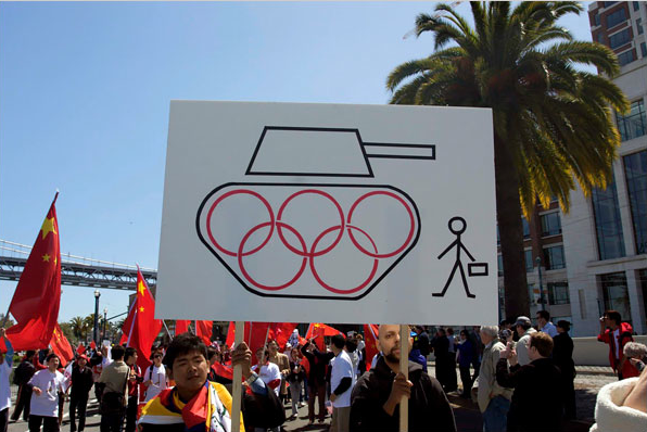
From time to time we comment on creative appropriations of iconic photographs. One image that has been frequently copied, parodied, and otherwise appropriated to various political and commercial ends is the photograph of the lone individual standing before a row of oncoming tanks in Tiananamen Square in 1989. The image has shown up with some frequency recently in protests against the upcoming Beijing Summer Olympics, as in this photograph of a rally in San Francisco that appeared this past week in the NYT. The iconic photograph (which is really three different photographs by three different photojournalists—Jeffrey Widener, Charles Cole, and Stuart Franklin—all shot from similar but nevertheless different vantages) is widely recognized throughout the western world, but interestingly, it has almost no visibility or recognition in China where it has been effectively censored.

We have written about the image somewhat extensively in No Caption Needed (the book) where we argue that the image activates a cultural modernism that displaces democratic forms of political display and opposition (remember that the protests in Tiananmen Square included thousands of students and nearly a million protesters in all who had organized in various groups) and plays to western conceptions of individualism and apolitical social organization. Thus, while the original photograph can function as a progressive celebration of human rights, it also risks limiting the political imagination to narrowly liberal versions of a global society.

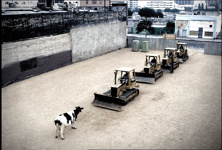
We see the possible implications worked out to some extent in an ad for Chick-fil-A that parodied the Tiananmen Square photograph during the 2002 Peach Bowl. To see the ad click on the image below.

tiananman-square-cow.jpg

As we note in our discussion of the image in No Caption Needed, the ad’s sophistication speaks volumes about liberal-democratic identity construction. Key features of public dissent are recreated within a comic fame that allows one to enjoy them without actually becoming in any way committed to political action. Instead, identification occurs entirely with regard to a topography of private life: the viewer makes choices about small scale consumer consumption—where to drive through tonight?—that supposedly are choices between social conformity or individual self-expression. Cows cannot speak and consumers are not likely to speak out, but the comic imitation of a silent act of public protest makes consumption appear to be a public act. The democratic mythos of representing the will of the people to challenge authoritarian power becomes a vehicle for motivating completely individuated acts within private life. But the active agent with whom we are invited to identify is a cow with no voice. And there, of course, is the rub, for while the ad is witty, it nevertheless also masks a deep fatalism about individual powerlessness as it asks us to smile along when the brutal suppression of a popular movement is remembered as an argument to shift our allegiance from one fast food franchise to another.

Photo Credits: Reagan Louie/NYT; Chick-fil-A, Inc./The Richards Group. For our detailed discussion of the Tiananmen Square photograph and its many appropriations, see No Caption Needed, 208-41.

 2 Comments

Iconic Images, Lego Art, and the Limits of Imitation

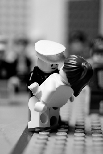
One of the characteristics of iconic images is that they are reproduced across a wide range of media, genres, settings, and topics. Actually, that is true of media more generally–think of how songs, jokes, quotations, recipes, fashions, and many other other things circulate widely–but it usually is not so intentional or distinctive as when it is done with widely recognized and influential images. Iconic photographs have been reproduced as drawings, paintings, sculpture, murals, graffiti, embroidery, beadwork, silkscreens, figurines, stamps, plates, coins, tattoos–you name it. Oh, yes, and Lego art:

lego-kiss.jpg

This is one of a set of nine that are posted at a Flickr page. The set contains reconstructions of three canonical photographs by Henri Cartier-Bresson, the Charles Ebbets’ shot of iron workers sitting on a beam hanging in empty space, Robert Capa’s photo of a soldier being shot in the Spanish civil war, the Times Square kiss, two from the Vietnam war, and the lone protester standing before a tank in Tiananmen Square.

The question is whether there is anything to be learned from the Legos. One wouldn’t expect much beyond what we already know: with a few key features in place, we can recognize the iconic image in any medium, and people can be clever when they have time on their hands. The odd imitation is basically a joke, and we marvel–briefly–that someone could get so much out of Legos or ice cream (it’s been done: the flag-raising at Iwo Jima) or whatever else is getting the iconic upgrade.

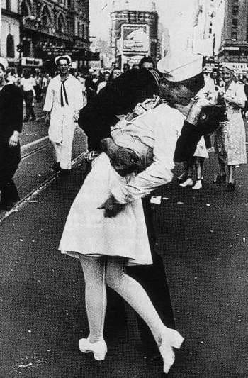
I wonder, however, if there isn’t more to the Lego art. Let’s take two examples–briefly. First, the Times Square kiss:

kiss.png

The Lego version captures both the strongest positive feature of the photo as well as one cause for criticism. The positive feature is the good vibe that so many people get from seeing a young couple passionately “kissing the war goodbye” on V-J Day. You get that feeling in the Lego work from the smile on the sailor’s face. In the photograph from Times Square, there is much more: youth casting off of wartime restrictions, Eros and regeneration triumphing over war and death, private and public life beautifully harmonized; what’s not to like? Well, there is one thing for some, and that’s how the woman may be a less that willing participant. He didn’t ask first, and so one form of domination could be giving way to another form of domination. And sure enough, the Lego art gets that as well: look at how awkwardly she is bent back, and how she is not returning his advance.

I could stop there, but let’s do one more:

lego-shot.jpg

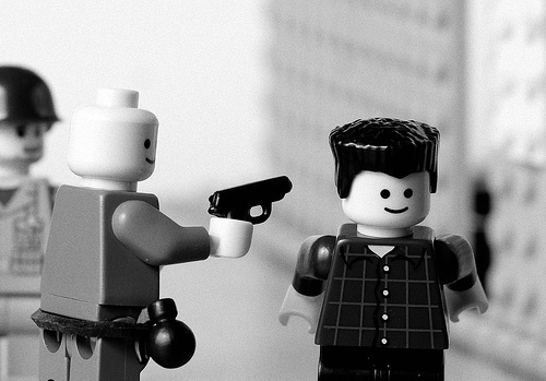
This is a reprise of the Eddie Adams photograph from the 1968 Tet offensive in during the Vietnam War.

eddie-adams-icon.png

Adams believed that the officer was justified in executing the bound prisoner of war, and perhaps a case can be made. But the photo records more than a single incident, and it fit too well with many other acts that were both criminal and marked by the official indifference that is displayed here. So, much to Adams dismay, the photograph became memorialized as a statement against the war.

And something like that ambiguity is evident in the Lego art. The smiles of the two figures, and particularly the one being shot, are just not right. They’re wrong because not in the photograph, and because not fitting with the scene, and because not appropriate for cuing our reaction to a killing. As with the iconic photograph, what seems to be a simple image is in fact one that churns complicated responses, in part because it isn’t right with itself.

There are limits to imitation. Not everything can be said in any medium, and some media can’t say much at all, but there still can be more there than we might think. Next up, iconic images in cornfield mazes. Really, they’re out there.

Photographs by Alfred Eisenstaedt/Getty Images; Eddie Adams/Associated Press.

 7 Comments

When Machines Die

I suppose I’m getting sentimental in my old age, but this photo brings me to the first pangs of sadness, even grief.

broken-plane.png

A forty-year-old DC-9 is being dismantled after being damaged by a ground vehicle at Midway Airport in Chicago. After being stripped of its avionics and other high-end materials, it’s being broken apart for scrap. Something about the scene really gets to me, as if it were a beloved old dog being laid to rest. But this is the fuselage of a plane, one I probably never even flew in, and what if I had? This is like getting sentimental over a bus stop bench that you drove by once or twice. Who cares?

Perhaps it’s because the the wings are gone and the plane is broken in two and laying at an angle on the ground; that, along with the appearance of a face and mouth makes it seem like an animal, something that once was alive and now is returning to the earth. This organic feeling is heightened by contrast with the machine that is tearing into it–and looking like some large insect predator feeding on a carcass. I would no more identify with a garden slug or snake or any rotting backyard mammal than with a machine, but the innate fear of being prey may have changed all that. A broken machine has become the embodiment of mortality, and with that the horror of being killed and eaten, or, almost as bad, dying alone and unmourned.

This is not the usual reaction to seeing machines hit the scrap heap. Usually there is some fascination with the heaps of twisted metal and similarly mangled objects following any accident, but no grief. “Was anybody hurt?” we ask, not referring to the vehicles. Sometimes we go further, taking out our rage against the machine in delightful visions of cars exploding or other familiar objects getting what they deserve. Like this:

hind-awful-steadiman.jpg

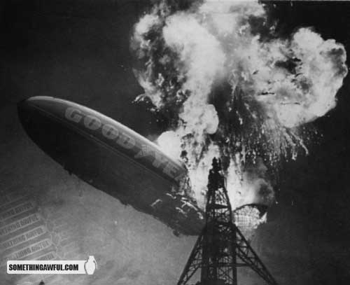
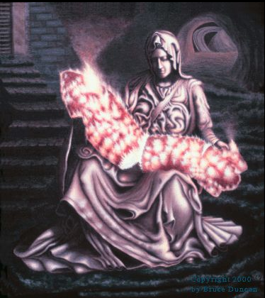
I once read about a place in New York City where you could take your small appliances, put them at the business end of an indoor firing range, and blast away. I’d absolutely love to go there. But that’s personal. There is something collective, and importantly so, in the reaction I had to the DC-9. Something like what was captured in this painting about the Hindenburg explosion.

hind-pieta.png

John and I included this in No Caption Needed (the book), and I’ll repeat a bit of what we said there: “By drawing on the traditional form [of the pieta] and making the machine so palpably organic, the work fuses two contradictory tendencies: she mourns the burning body and so the humanity burning in a fire of their own making, and she mourns the machine itself, a beautiful, almost living thing, a life form of the machine age that, like the age itself, is doomed to catastrophe.” Maybe the photo from Midway touched the same nerve. If we don’t mourn the death of a machine, we are in some degree indifferent to our own demise.

Photographs from the Chicago Tribune, SomethingAwful.com, and Bruce Duncan.

 4 Comments

Domesticating Dissent

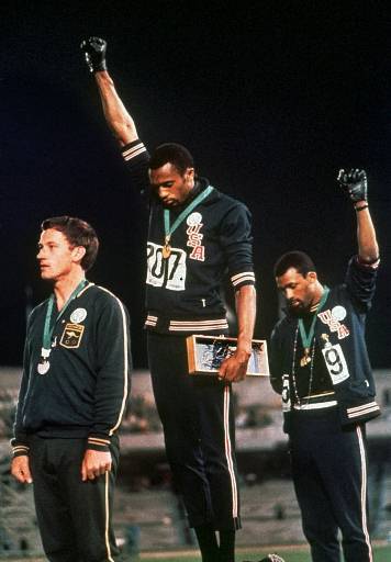
When I ask my students to make a list of iconic photographs they almost invariably recall the image of the two black athletes at the 1968 Olympics with their hands raised in a “black power” salute.

ap47405iu_black_power_000da.jpg

They rarely know the names of the athletes, nor can they typically recall the particular track event that was being celebrated or who won what medal, but the image itself seems to be seared in their collective consciousness. And why not? Reproductions of the photograph of this moment of political dissent during a time of social and civic turmoil are ubiquitous. Indeed, one can barely read about the 1968 Olympics without the picture showing up, and indeed it has been the subject of several movies including an HBO documentary film titled “Fists of Freedom: The Story of the ’68 Summer Games.” It was prominently displayed in the movie Remember the Titans and it is available for purchase as a mural-sized poster and as a fine art print, as well as stenciled on t-shirts; a rendition of it was cast as a larger than life size statue and is on display at San Jose State University were the two athletes went to school. Both of the men—Tommie Smith and John Carlos—have recently published autobiographies about their experiences featuring their moment on the victory stand.

Given the notoriety of the photograph it is of little surprise that Smith and Carlos have embarked on a year long lecture tour in anticipation of the 40th anniversary of the “black power” salute and the significance of the moment of political dissent that it depicts. What is surprising—if not altogether disappointing—is how the NYT chose to cover the lecture tour as it made its way to the Black National Theater in Harlem last Wednesday. The Times article is titled “Enduring Image Leads to Enduring Dispute” and the story it reports focuses on the petty and personal jealousies that have vexed the lives of Smith and Carlos, once good friends who now “harbor deep-seated and previously unexpressed resentment toward each other.”

As with so many iconic photographs – think of the migrant mother, the flag raising on Iwo Jima, the Times Square Kiss, the Kent State massacre, accidental napalm, and the list goes on – popular interest seems quickly to shift from the key public issues represented and negotiated by such images to the subsequent private lives of the individuals being depicted, i.e., who are they? what became of them? And so on. And in the process, the complexities of significant political events central to the history of liberal-democratic public culture fade deeper and deeper into the background, as a neo-liberal interest in the life of the individual trumps the public interests of a democratic polity. Or at least that is how such images are typically treated by the national media.

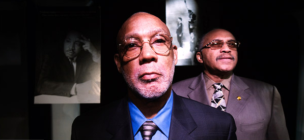
This cultural and ideological revisionism is marked by the photograph that accompanies the NYT report on Smith and Carlos:

enduring-image.png

The first thing to note is that the image signifies the tension between “then” and “now” while putting the accent on the present moment. The point is emphasized spatially as the contemporary Carlos (on the left) and Smith (on the right) dominate the image. But note too that the two men are cast in the light and seen in living color, while the past that spawned their relationship is represented by black and white photographs and cast in dark shadows. The author of the article bemoans the “inevitable” moment when “idealism” (then, black and white) gives way to “reality” (now, in color), but the focus in the article on the contemporary travails of these two men (now more private individuals than citizens) seems reinforced by the photograph which treats the past as a antique and fading memory. One might wish for more attention to the idealism of that earlier time, perhaps emphasizing a truly “Olympian” moment when at least some athletes were guided more by issues of social justice—and its attendant risks—than by private self-interest. But I think that there is a different and more important point to be made here, for the photograph above also functions to domesticate the original image of the “black power salute.”

Notice how the contemporary photograph puts the black and white image of King closer to the foreground than the iconic image of Smith and Carlos, even though chronologically the later image is more recent. Our present day remembrances of King thus become the frame through which we are encouraged to view and interpret the original image of the two athletes, and accordingly it is the standard of King’s Christianized, “beloved community” that becomes the marker of idealism against which the current day dispute between Carlos and Smith is to be measured (and found lacking). What this ignores is that the 1968 summer Olympics took place nine months after the publication of the Kerner Commission Report, six months after the assassination of Dr. King, and in the midst of increasing concerns that the then so-called “civil rights movement” had lost its political edge and effectivity. And most of all, what it ignores is that the “black power salute” – a phrase which is never once mentioned in the NYT article – constituted a very different and more threatening political idealism than the one we retrospectively affiliate with King’s “dream.”

In short, what we seem to be witnessing is the domestication of a valued photograph that marks and models an important and radical moment of dissent in the life of the polity. The tragedy here is that the “enduring dispute” announced in the title of the NYT article refers to a normalizing, private quarrel between two individuals, and not the more important tension animating our understanding of the relationship between the “civil rights movement” and the “black power movement.”

Photo Credits: Staff Photo/AP, Gabriele Stabile/NYT

 12 Comments

Kissing War and Tasting Victory

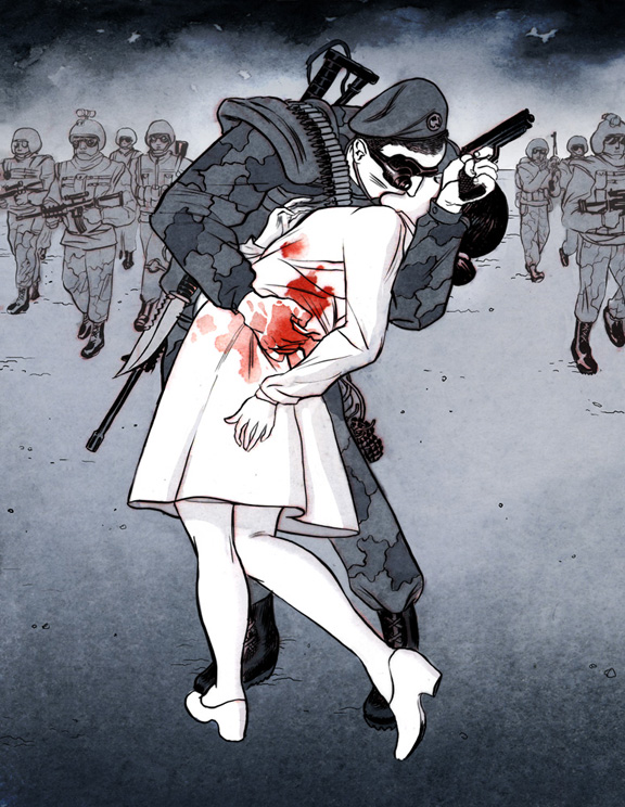
Alfred Eisenstaedt’s “Times Square Kiss” is among the most famous photographs ever taken.With the exception of Joe Rosenthal’s “Raising Old Glory on Mt. Suribachi,” it is possibly the most reproduced, imitated, and performed photograph of any in the pantheon of U.S. photojournalism or documentary photography. It is, as Time/Life might say, the center piece in the American family photo album, a representation, as one caption of the image has it, of “The Way We Were.” It should come as no surprise then, when critics draw upon it to call attention to the hypocrisies and tragic ironies of U.S. policies and cultural practices. The most recent case in point is this digital illustration by Koren Shadmi that appears in “Artists Against War,” a collaboration between The Nation and The Society of Illustrators to showcase the work of 60 prominent graphic artists whose work “challenges the self-destructive ignorance, indifference, incompetence and corruption that is the result of the U.S. Middle East foreign policy.”

shadmi-kiss.jpg

The illustration is easily recognizable as an imitation of Eisenstaedt famous photograph, but of course the differences are both pronounced and resonant. The original is a bright and fairly high contrast image produced in the grey scales of black and white film and according to the strict conventions of realist photography; there are shadows, but they are barely recognizable, and in general the visual tableau invokes the symbolic brightness of a new day, just as the occasion of V-J Day invited the promise of the return to a golden past. Following the visual conventions of the graphic novel, the illustration above is drawn in muted tones and tinctures, only slightly more colorful than the black and white photograph. The kissers here are cast at the edge of a dark shadow (emanating from the space of the viewer, and pointing, no doubt, to the future), the background of the drawing enveloped in either billowing smoke or black clouds, and in any case the overarching tonality of the image is dark and ominous rather than bright and joyful, menacing rather than hopeful.

It is the thorough absence of joy and hope that determines the affect of the illustrated kiss. The photograph represents a joyful moment, its kiss a passionate and public performance of the release of nearly four years of repressed desires. Thanatos gives way to eros, marked not only by the kiss itself, with the promise of greater release yet to come, but by the way in which civilian spectators witness the event with approving smiles. This is the world we want to live in, and there is a sense in which the bodies of the kissers channel the emotional energy—the hopes and desires—of the people that surround them as the vectors of the image vaguely recall the “V” for victory, men on his side, women on hers.

By contrast, the illustrated kiss is neither joyful nor passionate, but rather decidedly foreboding. The awkward and somewhat restrained left hand of the sailor in the photograph now holds a gun poised for use (although the enemy remains unseen and thus anonymous), while his right hand is covered in red blood that blemishes the purity of the nurse’s white uniform and forces us to acknowledge that eros and thanatos are inextricably entwined. The kiss is made to seem all the more impersonal—if not also somewhat transgressive—by the fact that the kisser is wearing night goggles as well as a wide array of weapons and military accoutrements. And note too that the pair are no longer surrounded by ordinary citizens—an indulgent and approving public—but by an anonymous and armed military force. It is not clear that the surrounding soldiers even notice the kissers, and even if they do, they certainly offer no signs of approval. Overshadowed by the events of war, both the presence and voice of the public has been erased—a telling cipher, perhaps, for our current political condition. If victory has been achieved here, it clearly seems to be short lived.

The Eisenstaedt photograph is often captioned as a “return to normalcy,” and on one popular poster for sale, it is titled “Kissing the War Goodbye.” From this perspective the normal world is a rejection of the dark and dreary culture of war, and with it the eternal return to a bright and joyful place where the sexual obsessions of private life can operate in tandem with the decorum necessary to the discipline of public life without the hint of tension or irony. By contrast, Shadmi’s illustration is titled “Tasting Victory,” and thus frames the image as the embrace of war, rather than its rejection. From this perspective, the normal world seems to be a culture where one eroticizes the taste of military success and in which wars are cultivated and eventually normalized in a never ending cycle of violence.

It is easy, of course, to prefer one image over the other at any given moment in history, entranced either by the romance of the photograph or the critical skepticism of the illustration. But what we need to acknowledge is the fundamental sense in which the two images are inextricably connected. Treated apart from one another, each underwrites a more or less simplistic political fantasy of civic life that invariably falls short of the complex social and political needs of the late modern world; treated together the two renditions remind us that each representation is a limited construction of the world and that a healthy polity needs both romance and skepticism—and more—in order to enable and sustain a robust public culture.

Illustration Credit: Koren Shadmi

Digg!

 5 Comments

An Icon Goes Global with a Bang

Eddie Adams’ photo of General Nguyen Nguc Loan executing a bound Vietcong prisoner of war remains one of the searing indictments of the criminal conduct of that war.

eddie-adams-icon.png

Adams went to his grave insisting that the photograph was being misused because the execution was a justifiable act in the context of the battle for Saigon. That may be so, but the literal dimension of the image has from the beginning been irrelevant to its distribution, interpretation, and acclaim. The photograph’s rhetorical power comes from its symbolic and ethical implications in respect to the justification of the war itself. Whatever else was happening on the street that day, this image provides stunning illustration that the war was spiraling far out of control–militarily, politically, and morally.

If this interpretation of the photograph is valid, it nonetheless remains one of many. As John and I elaborate in No Caption Needed, iconic images are important not only because of the role the images play at the time of their initial distribution, but also subsequently as they become templates for artistic imitation and improvisation across a wide range of media, arts, topics, and standpoints. This image from a recent art fair in New York City is only the latest example:

xiangjing1.jpg

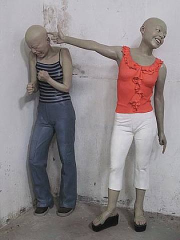
According to the review of the show, you are looking at Xiang Jing’s “Bang!” (2002), a work in painted fiberglass. That this image was selected from the hundreds at the show probably is testament to the continuing power of the iconic image, although we also should recognize the reviewer’s rationale: “Ms. Xiang’s sculpture embodies the mood of the first Asian Contemporary Art Fair . . . Fizzy and entertaining on the surface, it has a disquieting underside.” Likewise, the reviewer remarks that “the playful surface of ‘Bang!’ masks a half-repressed trauma.”

I’m not so sure that anything is being “masked” or “half-repressed.” The language of art criticism, and not least its depth psychology, really doesn’t get this one right. There is no underside to this image: the horror is right there on the fizzy surface.

One might wonder why Adams’ photograph was mentioned at all. Jing’s artwork has reversed virtually everything of note in the original image: the figures are women instead of men, civilians instead of soldiers, wearing stylish contemporary clothes instead of the de facto uniforms of the past, highly expressive instead of stony faced or having a tight grimace, hairless instead of having hair, positioned right to left instead of left to right, backed into a corner instead of an open street, colored statues rather than people in a black and white photograph, and fictional instead of real. The “killer” is even more obviously transformed, as she is using a finger instead of a gun, facing the viewer, looking away from the victim, and smiling. And why is a Chinese artist appropriating American photojournalism about the Vietnam War to depict contemporary young women?

Just as the meaning of the iconic photograph quickly escaped the photographer’s sense of scene, our response to this work of art is not likely to be tied to knowledge of the artist’s intentions. If there is no intended connection between the two images, then the sculpture still is troubling, if somewhat puzzling. If the viewer makes the connection, intended or not, part of the experience of the artwork, then it instantly becomes deeply disturbing. Now the social violence of adolescence acquires the killing power of warfare, while the passage of time suggests that killing is becoming ever more casual, routine, normative, and even enjoyable. And just as the traumatic image from Vietnam lives on it the contemporary artwork, so does a history of war, dislocation, and layered betrayals continue to shape contemporary life, not least in societies experiencing both hidden violence and comprehensive modernization.

Don’t be too quick to guess which nation I might be referring to. On reflection, it can make sense after all to speak of surface and depth. “Bang!” might place the medium of photojournalism under the medium of sculptural art, as with a palimpsest, to suggest that under the fizzy surface of modern consumer culture there still are layers of personal and collective violence.

Finally, a footnote: The title “Bang!” may be a double allusion, including both the Adams photograph and another iconic image from the Vietnam War: the photograph of a naked girl running away from the napalm drop on her village. The name of the village was Trảng Bàng.

Photographs by Eddie Adams/Associated Press; ChinaSquare.

Digg!

 0 Comments