Jun 11, 2014
Aug 20, 2007
Oct 03, 2011
Mar 11, 2015
May 02, 2008
Jan 24, 2014

Eyes on the Prize

14campaign600.jpg

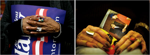
The NYT published this diptych in a story titled “Race and Gender are Issues in Tense Day for Democrats.” The story is a “he-said, she said” tale that is implicitly about who gets to play the race card in the on-going democratic primaries. Apparently Barack Obama should be able to, but doesn’t want to (because presumably he doesn’t have to in order to preserve his base); Hillary Clinton apparently does play it, but in an allegedly backhanded way that allows her to underscore her own marginalized status as a woman (thus, presumably to energize her base). The issue comes down to a debate about the relationship between race and gender, as if, at the end of the day, we should decide our votes somehow on who is more marginalized than the other. The photograph that accompanies the story – and is nowhere remarked upon, and thus might appear to be something of an excess – tells a somewhat different tale.

The key here is in understanding how the stark tension between race and gender is muted by attention to more complex generational differences. To see how, envision one set of hands as white and female, the other as black and male. How would each be inclined to vote? The lines of identification would seem to be pretty obvious, driven by both race and gender in each direction. And indeed, it is this stark and uncomplicated dialectic that the NYT exploited on Sunday when it juxtaposed images of Elizabeth Cady Stanton and Frederick Douglass in a story that featured what Michael Shaw at BAGnewsNotes called the “pink-black divide.” But notice that the demographic put on display in the above diptych is much more complex, as the images feature the much harder case: How do African-American women who share identities with both candidates choose? Will they be guided by their racial identity or their gender?

And the answer we get is a study in ambiguity that takes the false essentialism of identity politics to task—or at least it complicates it in ways that bear consideration. Thus, while both sets of hands are clearly female and African-American, there are nevertheless important and notable differences that mark something of a subtle, but complex and significant generational divide. To begin, take note of the fact that these are neither young nor inexperienced hands. Each pair is clearly weathered by the passage of time and the accumulation of experience, but they wear their experiences differently. The hands on the left bear a feminine style that associates them with the feminist politics of the 1970s, where the cosmetics that we traditionally affiliate with female sexuality were somewhat muted. Notice how the fingernails are carefully trimmed and without polish. They are adorned by rings that mark them as female, to be sure, but they are folded in a somewhat pragmatic, masculine fashion that underscores the attitudes about gender equality that animated many women in the post-civil rights generation of the 1970s. Indeed, they seem to be protecting the poster, a symbol of the political world and the public sphere that was opened to women by the efforts of second wave feminism.

The hands on the right present a somewhat different, older, feminine style, with more rings, and long, painted fingernails. The pose is more traditionally feminine as well, as the hands rest in the woman’s lap, gently holding a snapshot. And unlike the poster, the snapshot signifies the private, domestic sphere – the world of family photo albums – to which women have traditionally been relegated in a patriarchal order. In a world of cultural stereotypes then, these are the hands of a woman who, in all likelihood, comes from an earlier generation than the woman on the left. She is perhaps old enough to have participated in a sit-in in Mississippi or to have marched in Washington, D.C. From this perspective, the snapshot she holds may well be the cipher for an emotional aide de memoire to her youth, as the picture of Obama recalls the eloquence and charisma of John F. Kennedy or Martin Luther King, Jr., young, men whose uplifting appeals to a color blind society no doubt resonate with her candidates’ eloquent promises for a changed world. Indeed, his very candidacy may serve as the evidence that the struggles of the civil rights generation were not for naught. In this register it is little wonder why some might have interpreted Clinton’s recent comments about Dr. King’s role in bringing about the Civil Rights Voting Act as derisive.

If experienced African-American women can be so divided over their support for Obama and Clinton, then it should be clear that there is something more complicated going on in this political campaign than a simple race-gender opposition. Here that complication is a somewhat subtle divide between maturing generations, but in other contexts it is no doubt something else. The diptych underscores the centrality of such impediments to the interpretive process, however, by forcing the viewer to negotiate such complexities and instabilities of meaning as a condition of even the simplest reading of the images. Note in this regard how the poster on the left is designed to be displayed in a horizontal plane, but here it is out of kilter, held on a slanted, vertical plane that is further obscured by the hands. The photograph on the right is even more askew. The effect is to force the viewer to have to strain to figure out what it is that they are seeing, tilting their head to the left to decipher the poster (and to guess at what the missing hidden letters might be) and then squinting to take account of the snapshot. One has no choice but to be an active reader/viewer.

The ultimate point I want to emphasize here is that the diptych calls to our attention a more important and complex tension in the current democratic primaries than the simple, faux battle between race and gender being crafted and preached by those who would prefer to see two historically marginalized groups doing battle with one another rather than working in solidarity. That doesn’t mean that there aren’t differences that have to be negotiated here, or that there isn’t a great deal at stake in the various generational divides (and there is clearly more than one) that seem to vex the democratic party at this historical juncture. But what it should also remind us is that we need to keep our eyes on the prize rather than to be distracted by reporters with time on their hands.

Photo Credits: Todd Heisler/New York Times; Eric Thayer/New York Times

Digg!

 0 Comments

The Post-Human Peasant

The following two images each merit their own post, but I also want to point out how they suggest a larger pattern. First, there is this shot from a morgue in Pakistan following the attack on Benazir Bhutto’s arrival in Karachi.

paki-feet-dead.png

I noticed the photograph because it was another instance of photographing only feet rather than the upper body or entire body. Readers of this blog may have noticed that “boots and hands” is one of our archival categories, as John and I are interested in why these truncated images appear frequently in mainstream photojournalism.

The feet featured here are bare, brown, worn (look at the back of the heel), and charred. They may have belonged to a middle class accountant, but it is difficult not to see them as peasant feet. The burns look like dirt, and feet have symbolized peasantry in the discourse of the body politic from antiquity to today.

Above all, these feet are dead. The awkward angle suggests a broken body, and the caption cues us to see the stiffness of rigor mortis. Most important, life itself seems to have been thrown away as the blood spilled on the floor forms a hopelessly large, ugly stain on the tile floor. It is as if the body had been drained prior to being preserved, and the feet do look like a specimen. More to the point, the photograph makes this stiff, dismembered, emptied, anonymous body into a specimen, as if it were something awaiting taxonomic classification before being filed away in a natural history museum.

It is easy to claim that the photographic gaze objectifies human being, and I usually avoid that critique. Surely it is not the camera but rather a bomb that turned this living person into a thing. Indeed, perhaps the photograph is doing something else: not objectifying but creating a visual allusion to the Holocaust, that is, to the images taken there of bodies stacked like cordwood. If so, that again points to those using weapons, not journalists using cameras.

Fair enough, but let’s look at the second photograph.

hands-in-bowl.jpg

This is a beautiful image. Edward Weston once remarked that color photography should be taken seriously when the photographer could see “colour as form” rather than a decorative addition to the black and white image. (There’s more to color than that, of course.) The artistic intensity of this image comes directly from the formal power of its dense richness and subtle variations of brown and bronze, all captured through the silver light that seems to have been painted by a Renaissance master. Likewise, the circle of the bowl is repeated in miniature by the circles in the solution and the half-circle in the lower right of the frame, and so the formal completeness of the circle is fused by color and light with the brachiated pattern of the arms and hands, which converge and then branch out again.

And yet, something is missing. The body, for example. Once again, we have a dismembered, anonymous peasant, in this case a man painting “earthen lamps at his workshop for the Hindu festival of Diwali.” The “painting” is crude, simply immersing objects in the paint, and the lamps are “earthen,” the sort of thing that comes from a workshop rather than a factory.  Even that humanizes, however, for the image itself gives us something beautiful but also alien, almost arachnidal as those hands spider across the surface, breathing paint and light.

What is most interesting to me is how, again, life is being separated from the body. In this case, the inanimate nature of bowl and paint seem to have already recast his hands and are moving up his arms. It’s as if his primitive workshop is the early form of some later fusion of human and nonhuman processes in a Blade Runner shanty town. The lamps are being changed by his labor, but he is being changed by the metallic solution coating his hands. As it is, the paint may kill him, but the image suggests a post-human worker who won’t have that problem, as life already will have been altered to become part of a process of production.

Each photograph is a distinctive portrait of a specific event, yet together they suggest a third thing: the idea that the peasant is disposable because not really alive. After all, there aren’t supposed to be peasants in a modern world. The good news is that other, more Romantic concerns are well off the table: You see no noble savage here. But you also see common people as either specimens of natural history, or as artistic premonitions of the post-human. In neither case are they alive—in history, in the present, or in the political imagination.

Photographs by Paule Bronstein/Getty Images and Parth Senya/Reuters. Weston’s remark is cited in Geoff Dyer, The Ongoing Moment, pp. 190-191.


Digg!

 5 Comments

Footwork at Reed College

We could post about the war in Vietnam–oops, I mean Iraq–every day, but since continuing the quagmire depends on a loss of perspective, we should turn to other things as well. Like feet. Next week John and I will be giving a paper at a photography conference, where we will discuss why photojournalism features hands and feet when one could show more of the individual pictured. Like this:

feet-and-computer.png

This example may be somewhat more artistic than others we could show, and it has more of a pretext as it was part of a New York Times “Trendspotting” story on the custom at Reed College of going barefoot just about anywhere and any time. Even so, it’s not a typical news photo, which suggests that something else is going on.

Most of the images in the Trendspotting photo essay were mildly informative and less evocative. They showed students standing in line, standing in groups, and so forth. In each case we saw young people much as we often see them, and they happened to be without shoes. This much more distinctive photograph removes the student body (sorry, I couldn’t resist), but for the sharp focus on a pair of bare feet resting on a desk between books (front) and computer (middle). In the back of the photo we see the blurred top of a student’s head. He is wearing earphones, and the effect of the image comes in part from the contrast between the student’s heavily mediated experience–books, computer, digital music, even the food is processed–and the unmediated, elemental experience of resting his bare feet in the air. Whereas the other images showed more of the local culture through stock scenes such as standing in the lunch line, this one joins the special experience of higher education at an elite school with a seemingly universal symbol of youth.

Most people have neither occasion nor inclination to go around barefoot, or to study as much as is the norm at Reed. The photo does double duty at making the story significant: by foregrounding books, computer, and the obviously habitual posture of the student reading, the seeming frivolity of going barefoot–rather than working for a living–acquires a serious cast. The student isn’t working, but he is in training. Likewise, Reed’s foot fad stands in for the peculiar subculture of good higher education and makes it appealing through an iconography that channels the barefoot boy of American myth. Huckleberry Finn now goes to school, and leisure time is spent not on the river but drifting through the liberal arts.

Reed’s reputation includes both intensive study and liberal politics. Note the student’s longish hair. And so this post is about Iraq after all. Those feet are the feet of privilege and are not likely to wear combat boots. But there are places where privilege is used to learn, to discipline judgment, and prepare for both innovation and good stewardship. The press now provides many images of boots on the ground, and while honoring the sacrifice of working class youth it becomes too easy to forget their betrayal by those who benefited from the privileges of wealth without bothering to learn from history, deliberate carefully, and act with regard for others. We need boots on the ground, but we also need good education and good government. And not just for the few.

Photograph by Molly Gingras <gingrasm@reed.edu>.


Digg!

 12 Comments

Politics as Performance Art

Jay Leno once remarked that “Politics is just show business for ugly people.” He got that right: politics is a performance art. The media are rightly criticized for focusing too much on style during electoral campaigns, but they actually are on to something important. Political campaigning is an art of improvisation on stock repertoires, and the skills honed there can be put to use later in the practice of governing. A photo from the recent A.F.L.-C.I.O forum in Chicago provides a nice example of this political stagecraft:

labor-meeting-gestures.jpg

This image is a study in the relationship between convention and improvisation on the rubber chicken circuit. Pointing to someone in the crowd obviously is a stock gesture on the political stage. You’ve got to do it to appear active, attentive, and connected with the audience. It also communicates past experience with those present, and it even is a bit charismatic, as the leader dispenses the gift of his or her much coveted attention to an individual singled out of the crowd. Thus, the candidate not yet doing it in this photo looks a bit withdrawn, disconnected, or slow on the uptake. Note to Joe Biden: you don’t get elected by not following the script.

Despite their uniform behavior, the candidates also are improvising as they can to distinguish themselves from the others on stage. (Remember, there is no director to keep anyone from stealing the scene.) Christopher Dodd, on the right, looks poised, polished, and wholly scripted. He’s the newcomer to the presidential stage, and it shows. The other two are old troopers and much more interesting, perhaps surprisingly so. Hillary, who is portrayed by the media as highly controlled, looks very different here. She’s having a great time and really letting it show; you can feel the emotional energy that she is channeling. And then there is Kucinich, who supposedly is the loose canon of the bunch. Look closely: sure, he’s pointing towards someone in the room, but he’s looking directly into the camera. That’s what Hillary is supposed to be doing: acting as a hardened professional whose only relationship to real people is to use them as props while playing to the media. That rap may not fit Kucinich, but he clearly is a savvy actor.

So it is that anyone can say that “politicians are all alike.” They have to be to make it on stage. And yet they are not all alike as every performance is slightly different. And while the media feed us stock characterizations, they also show more than they tell. But you have to look to see it.

Photograph by Peter Wynn Thompson for the New York Times.


Digg!

 3 Comments

Bare Life in Kabul

This photograph is one I could write about for hours, and yet none of that could do justice to the image itself:

burqa-begging-image.png

I’m not going to write for hours, but where to begin? The photograph combines in a single, compact image so much of the human condition: naked physical need, confinement, dependency, vulnerability, shame, desolation, death. Surely this is the truth of the image.

And perhaps we should stop there. It is a stunning, haunting, damning image. Leave it alone. Think about the carnage and suffering being wrought in the world, about how these two human beings without status or money are caught between two civilizations, one medieval and the other mechanized, and excluded and abandoned by each of them. Think anything you want, just don’t turn away, yet another abandonment.

But it’s not that simple. Read the caption: “A woman begs as she lets her son sleep with his head covered to attract attention in Kabul, Afghanistan.” How the writer knew her motive for covering the child’s head, I don’t know; it could also be covered to help him sleep in the sunlight. And perhaps this caption exemplifies the abyss between image and text, between the mad, raw truth of an image and the linguistic shroud being applied to keep it tame. Perhaps, but the fact is the boy is asleep, not dead. In fact, he looks pretty healthy. And his pants look like they came from the mall and not long ago either. Does she really need to beg, or is this just a gambit to pick up some loose change when the foreigners walk by?

Perhaps there is a double manipulation, one by her and the other by the photographer. We’ve written at this blog about how the burqa (she is wearing the Afghani variant called the Chadri) is a traumatic violation of Western norms of visibility, and of how images of feet and hands (accompanied by virtual decapitation) are techniques for creating emotional meaning and intensity. And that empty desert background is part of a city, not some alien moonscape. Worse yet, the photograph is austerely beautiful and so perhaps aestheticizing suffering. There also may be an orientalist appeal to the male gaze: the mystery of flesh revealed from underneath the restrictions of purdah. And one can go further down that road. The photograph seems to be a powerful witness to suffering and yet also a trap pulling one into a perversely pleasurable spectacle.

That’s where a lot of academic commentary would stop, but let’s look at it again. She is sitting on a piece of cardboard; that seems to undermine the idea that she is being opportunistic. This could well be her sole source of income, at best. Next, and this is the punctum (the term comes from Roland Barthes, Camera Lucida) in my experience of the photo, look at her shoe. What is it doing there? It could be a signal, it could be that she was more comfortable sitting on her bare foot, we don’t know. It looks like an ordinary sandal that could have come from Walmart, and that may bring the manipulation thesis back in, but I see it differently. The shoe is a sign of several things that further complicate the meaning of the photograph. First, this odd, ordinary item of apparel reminds me that her culture is not medieval but, like all culture, hybrid. Second, she is not a symbol but someone who acts, however limited her sphere of action, and acts practically by adjusting, dealing, making do. I’m not sure how, but somehow her mundane practicality challenges any metaphysical exclusion or aesthetic regime. That shoe is a thread connecting to other threads of personal and then social activities that can become a web of associations, obligations, actions. Thus, she is not entirely cast out but rather still within her society, and ours.

Photograph by Farzana Wahidy/Associated Press; caption from the Washington Post Day in Photos, May 8, 2007. For a summary of Giorgio Agamben’s concept of “bare life,” read here. If you want to see another (consistent) level of meaning, read the story in Genesis 21 of Hagar and Ishmael.


Digg!

 2 Comments

"It's the least the American People can do …"

Purphle Heart 1

Earlier this week former Secretary of Defense Colin Powell visited Walter Reed Hospital and presented Purple Hearts to two soldiers wounded in Iraq. The formal occasion for the ceremony was inauspicious: the third reissue of a U.S. postage stamp honoring the Purple Heart on the 75th Anniversary of its having been initiated by the War Department (even though the order establishing it was signed in February 1932, not August). In presenting the awards, Powell, himself a Purple Heart recipient, noted, “It’s the least the American people can do to recognize those of our soldiers, sailors, airmen, Marines and Coast Guardsmen who have been willing to step forward to serve the nation …” As I read these words I was reminded of an episode of the TV show M*A*S*H in which Hawkeye Pierce responded to a similar comment with the retort “… and never let it be said that we didn’t do the very least that we could do.”

Even a minor occasion for a photo-op requires photographs and this event was no exception (after all, August is a slow news month). The AP posted 8 photographs. Two featured Powell by himself, one featured Powell and the Postmaster General unveiling the new stamp, and there were five photographs that featured the Purple Heart and the presentation ceremony. Of these later five, all by the same photographer, three are particularly interesting.

The first photograph of the set, shown above, is the one that seems to be most frequently reproduced in newspapers and on websites. It is a thoroughly conventional representation of an awards ceremony. We’ve seen it before in pictures from the county fair, or the local Rotary Club, and so on. Here the former Secretary is pinning the medal on Army PFC Marcus LaBadie while his mother proudly (if somewhat uncomfortably ) looks on. The image is shot from a slight, low angle, and from off to the side. The effect is to distance the viewer from the scene as spectator, and thus to allay emotional identification; the more important point is that there is no evidence of injury. There has to have been one, of course, otherwise there would be no award, but the clear message here is that once hurt, LaBadie is now whole again.

Contrast this with an image that, as far as I can tell, has not been reproduced anywhere but at the AP website. This photograph seems to be a somewhat sardonic comment on Powell’s claim that the American people are in fact doing the least that they can do:

Purple Heart 2

Here we have Pvt. LaBadie’s wheel chair with a framed reproduction of the postage stamp commemorating the Purple Heart resting where he should be. Following the conventions of realist photography, it is shot straight on and in fairly close range, encouraging the viewer’s direct involvement, and thus increasing the likelihood of emotional identification with the scene. The wheel chair is a harsh reminder that LaBadie is not as well as he looks in the previous photo as, apparently, he still needs help getting around; but of course all of that has to be inferred as the hurt body itself has vanished. The framed commemorative stamp physically takes his place – and our attention – and is thus a reminder that the occasion has more to do with a political spectacle than the honoring of a particular soldier’s sacrifice. Or perhaps it is a signal that contrived photo ops such as this actually damage the award itself, putting it in need of rehabilitation and care. In any case, the placement of the picture frame is a clear indication that the presentation of such awards, however honorable and deserved, is a poor substitute for giving soldiers what they need in order to heal and become whole. It is an image of “the least the American people can do” with the clear implication that much more is needed.

In the third photograph the body returns.

Purple Heart 3

On the left is Powell’s healthy hand, the prosthesis on the right belongs to Army Sgt. Robert Evans. Again, it is not a photograph that has been reproduced all that much, though it did appear in the Bloomington Herald-Times (8/8/07, C8) in conjunction with a story on the number of U.S. troops killed in Iraq in the first week of August. Like the photograph of the wheelchair, it is shot straight on, though here the cropping is tight and in a manner that forces the viewer’s attention to focus on what she or he might prefer otherwise to ignore. If you “really” pay attention, the image suggests, here is what you get: Aging men (notice the wrinkles on the hand) in suits dictating what men in uniform do. And the result is palpable. The Purple Heart can help in the process of healing, perhaps, but it must sit in the shadows and in the background; it should never – because it can never – replace what was lost.

This last image is, in some measure, a poignant synthesis of the first two pictures. It moves beyond the somewhat antiseptic vision of the first, but it lacks (or rather softens) the biting cynicism of the second. It is a powerful and searing emblem of the real costs of war and who pays the price; but it is also a reminder that even as we need to do more than the “least [we] can do,” sometimes doing even as much as we can may never be enough.

Photo Credit: Charles Dharapak/AP


Digg!

 3 Comments

Arms and the Man

Recently I suggested that photojournalism includes an iconography of body parts that are used to communicate emotions, attitudes, relationships, and the other elements of political experience. Coverage of the celebration of the 54th anniversary of the Cuban revolution is a case in point, and also a brief lesson in the politics of photo selection. Let’s start with this photograph of Raul Castro speaking at the ceremony:

raul-no-hand-01.jpg

Raul is not exactly shown to advantage here. By contrast with the concrete bas relief of Fidel in front of the podium, he is a diminutive figure set into the background of the scene. Fidel is cut to heroic dimension, bold, direct, and resolute. Raul is like a Lil’ Bush, outmatched even by the lecturn blocking him off from Fidel, the audience in Camaguey, and the viewer. Most important, Fidel is pointing in a classic elocutionary pose as the leader pointing the way into the future. Although looking along the same line of sight, Raul’s arm is stuck next to his side as if he were a stiff, bureaucratic functionary. The implication is clear: Raoul is not the bold, active leader of a revolution. And since that leader is already set in stone while no longer on the political stage, he’s no longer a factor either. Whatever the past glories of the Cuban revolution, it seems apparent that the future will be dull, inert, doomed to decline.

But that’s not the only photo available. Some papers showed this one:

raul-hand.jpg

Here Raul still has to follow behind Fidel, but now the comparison is altered on both sides. Fidel now is not just pointing but doing so to give elocutionary inflection to his speech before a bank of microphones. Raul also is speaking before a row of mikes and he is pointing; instead of a lifeless speech shown up by an image of bold action, we have two speakers making an emphatic point in much the same way. Perhaps its much the same point; in any case, the photo becomes a story of continuity. Raul may be no Fidel, but he obviously knows the role and is playing it with gusto while leading the state in the same direction.

And, fittingly for Cuba, between decline and progress there also is a third alternative.

raul-hand-che.jpg

Now we have a more complicated scenario. Both Castros are set back while Che enters the tableau. This ghost of the revolution is set at an oblique angle to both Fidel and Raul. He also is set in a shadow that neatly follows the line of Fidel’s arm. That arm is no longer the dominant signal but rather the transition between past and present. This image has more ambivalent implications. The left-right-up succession goes from dead to nearly dead to living but perhaps geriatric leader. That would suggest decline. But there also is a deeper continuity from martyred idealist to bold founder to ordinary official. Raul may be less than his older brother, but he is grounded in their achievements and remains heir to the spirit of the revolution.

Three photographs, three stories. Regardless of what the photographer is thinking when the picture is taken, by the time the photo is published, photojournalism is an art not only of description but also of prediction and political judgment.

Photographs by Associated Press.


Digg!

 3 Comments

Giving Elocution a Hand

A long century ago some of the self-help gurus of the day were teachers of elocution, the art of gestural inflection in public speaking. Today it is easy to ridicule their elaborate systems for training speakers to communicate emotions through minutely choreographed patterns of hand movements. Note, for example, this diagram from Albert Bacon’s Manual of Gesture:

bacon-genture-diagram.jpg

Bacon’s system would describe the gesture in this pose as “right hand supine descending oblique.” It is one of 88 basic gestures, each of which had a preparation, execution, and return, and all of which could be used in combination with a large number of foot positions and facial expressions, and with varying degrees of energy, and sometimes including additional gestures of the hands such as a clenched fist. The thousands of possible combinations were supposed to communicate many different emotions or attitudes; the book helpfully includes a list of common sentiments and their accompanying gestures (e.g., “Abandonment, utter”: both hands descending lateral). Foucault would have been beside himself.

So, who would do that today? Well, nobody and everybody. Whether schooled or not, we talk with our hands. And some are even schooled, though not at an institution you’d care to attend. Here, for example, is a snapshot of a competitor for the Boylston Prize for Elocution at Harvard:

harvard-elocution.jpg

There even are elocutionary moments outside the ivory tower, but, again, not in reputable settings:

01military-600.jpg

John and I have started to collect images of hands being used for communicative effect, and there are a lot of them. More to the point, we believe that, although elocution is rightly no longer an important part of public speech, the elocutionary function of using gestures to communicate has been transferred from one public art to another, that is, from oratory to photojournalism. There are several dimensions to gestural photography, including recording elocutionary acts such as the images above, to relaying stock gestures characterizing the political class, to creating its own iconography of photographically dismembered hands and feet. We’ll be showing examples of each of these variations in later posts. Criticisms and other suggestions are welcome. We always can use a helping hand.

Photographs by Jose L.A. Camacho for the Harvard Crimson, August 9, 2004, and Brendan Smialowski for The New York Times, August 1, 2007.


Digg!

 1 Comment

Lil' Bush at Street Level

John has written about Lil’ Bush, referring to how the president is being photographed to emphasize a diminished stature; whether the reduction in size reflects his slide in the polls, a corresponding loss of political effectiveness, or continued moral decline may be in the eye of the beholder. John and I have each written on photographs that feature hands or feet while cutting faces or the rest of the body out of the picture. And last week I wrote about a striking illustration by Barry Blitt for the Sunday New York Times. Given these interests, imagine my reaction when I saw Blitt’s illustration in this Sunday’s Times:

29opart-1650.jpg

There he is, a real little Bush, surrounded by the many different shoes one can see in any New York City street scene. The illustration is a stand-alone piece, moreover, as it has only a very general relationship with the Frank Rich essay for which it is a visual caption. Rich presumes Bush’s loss of credibility and focuses on the administration’s strange PR strategy of hiding behind General David Petraeus. None of this is marked in the drawing.

So what is going on? Certainly the drawing does a fine job of cutting the president down to size. (To really get the point, look at the silhouette.) The contrast with the many feet brings in more as well: Bush and the other figures represent two versions of the body politic. Bush provides the standard image of the elected official speaking to the public. In that model, the official stands in for the office that represents the body of the people. He is a single person and they are a single, unified collectivity, as if a single audience within earshot of the speaker. Obviously, Lil’ Bush isn’t up to that job. And perhaps he shouldn’t want it anyway. Instead of the president’s stock gestures (note the prominent hands), canned speech, and failed policies, we see a variety of anonymous people representing different lifestyles, going about their business briskly in different directions, without getting in each other’s way. This is a different idea of the people–a plurality that need not be One, pluribus without the unum–because they already are members (note the pun) of a liberal, pluralistic civil society.

But liberal visions need not be innocent of violence. I think the image also evokes the fantasy that one of those busy feet on the crowded street might just step on Lil’ Bush and squash him flat. You can’t blame people for thinking–or drawing–that way, but this is one example of how even the reality-based community, feet solidly on the ground, needs to be reminded that there are no simple solutions.

llustration by Barry Blitt for the New York Times, The Week in Review, July 29, 2007.

 0 Comments

Boots, Hands, and the Empty Suit

Readers who are interested in our occasional observations about images of boots and hands might check out John’s post today at BAGnewsNotes on a photograph of President Bush with the troops. Boots and hands are proving to be remarkably rich tropes for visual argument, and for exposing the character of those being photographed.

 0 Comments