Aug 16, 2013
Oct 21, 2012
Sep 17, 2007
Apr 18, 2011
Jul 27, 2014
Mar 21, 2008

Visions of the 1 % at Fashion Week

Tired of war, refugees, and Donald Trump?  Take heart: Fashion Week is here.  But although we might want diversion, escape, or vicarious indulgence of wretched excess, even the fashion shows are saying something about the news.  One of the themes this year is that wealth is here to stay.

OK, that may be one of the themes every year, but what’s interesting is that the designers are tuned in to how the 1% will continue to rule.  So far this year, there are at least two serious options.  One uses the theme of a new feudalism.

29review04-blog427

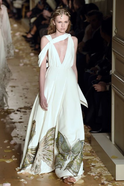
This couture gown from Valentino took 1,300 hours to make.  1300 hours, and it still gets a lot of mileage from bare skin.  Maria Grazia Chiuri suggested that the show represented “diversity, and freedom, and the chance to express yourself.”  True enough, and certainly so if compared to ISIS.  But actually the look is going in the same direction as the Islamic State: back into a premodern world.

I see a woman waking in an ancient courtyard.  She might be a queen or a courtesan, and there aren’t too many other options.  Her bare feet, flowing gown, and jeweled hair evoke movie images of Greece or Rome, and the bare feet and shoulders suggest a warm environment–whether in a past Mediterranean world or one remade by global warming.  Like the model she is, she is likely to be doing what she is  told: making an entrance to play her role, or an exit to meet her fate.

The dress is too expensive for most of us but the image suggests a common destiny: a world that is devolving–changing, despite all its technological prowess–back into a time of extremes and inequities, hoarding and scarcity, nobles and peasants.  Many TV shows, movies, video games, novels, and other arts are exploring this vision.  They are obvious acts of imagination, but they are representations of real tendencies in modern societies around the globe.

And they can be wrong.  Not, however, because something like a reasonable social contract and shared prosperity will be restored.  The fashion shows present another alternative, one that is just a bit retro, uncannily so.

30GUIDE_INSIDERSONLY-master1050

In this tableau, the future is already here and it looks a lot like a modern past.  Posh, preppy, call it what you will: the 1 % rule look as they have before, although perhaps even more explicitly entitled and insolent.  The image also suggests that race and sexuality can be easily appropriated (as they always were) to reinforce class domination.  But I digress.  This is not the time to denigrate what progress has occured; not when the image is reminding us that nonetheless we might be slipping back into a social order made for the few and the very few.

As Scott Fitzgerald knew when he wrote The Great Gatsby: “So we beat on, boats against the current, borne back ceaselessly into the past.”

Photographs by Miquel Medina/AFP-Getty Images and Kevin Tachman for Michael Kors.

Cross-posted at Reading the Pictures.
 0 Comments

Fashionable Ordnance

Fashionable Ordnance

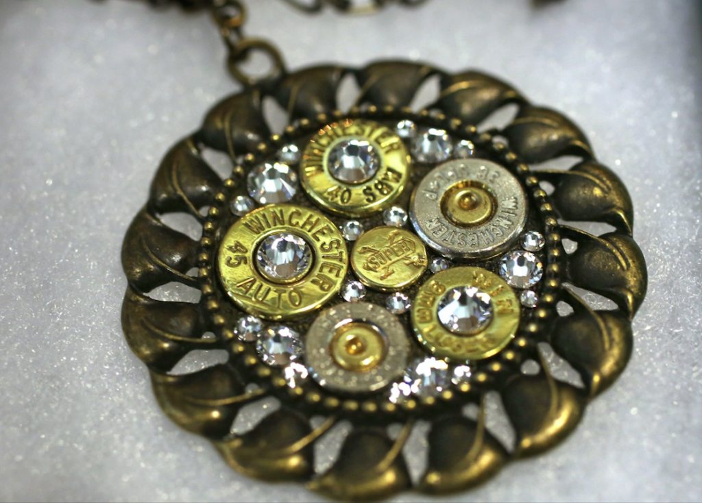
The spring/summer fashion season is upon us, and what would fashion be without a full complement of accessories, including handcrafted jewelry. Women are apparently the fastest growing segment of the gun buying market—approximately 20% of all gun permits were issued to women over the last three years—and so it is perhaps no surprise that fashion accessories of all sorts are being designed to meet the demand of women gun enthusiasts for bodily adornment and display. Bullet Designs is just one company catering to this demand, as with the medallion above crafted from spent bullet casings, and such offerings are made available at fashion and firearms shows all across the country.

Jewelry, of course, serves many functions, some quite instrumental, like the belt buckle or the watch, and others more aesthetic, designed either to coordinate the elements of one’s ensemble, such as a broach, or simply to accent various features of the body. Additionally, it also can serve as a symbol of social, cultural and/or political identity, as with a wedding ring or a lapel pin that marks one’s status or affiliation with a group or institution. And of course none of these more or less practical functions are altogether discrete, so that any piece of jewelry can (and generally will) serve two or more of these functions simultaneously. Regardless of how we think about such ordinary functionalities, however, there can be little question that jewelry (like a photograph) is meant to be seen—perhaps that is its supreme function—and the question then has to be: what exactly are we seeing?

The photograph above was part of a local news story about “How Women Can Look Good While Packing Heat,” and its ostensible purpose seems to be to illustrate one of the many accessories available for purchase at a local “fashion and firearms extravaganza.” And it does that pretty well, drawing upon the conventions of advertising and still life photography that highlight its features, accenting the relationship between the brass fitting, the sparkling jewels, and the bullet casings. But the photograph does more than that as it invites us to look carefully at the medallion as it is decontextualized from its more practical functions. In short, it asks us to consider what is being shown.

There is perhaps no shortage of answers to this question, but one answer must surely be that it shows us the beautification of a technology that was designed primarily for the purpose of killing and maiming. Bullets can be used for shooting at targets, of course, but it is hard to imagine that they would have been invented for that purpose alone. There may be good reasons to have bullets—I leave that topic for another time—but even if you believe that they are necessary to a civilized society it should give some pause to think that an instrument of death would be normalized as a fashion accessory. So what exactly do we see here?  Is it the conscious celebration of one aspect of a culture of violence? Or it is  a sign of a culture that lacks the capacity (or will) to reflect upon its unconscious tendency to animate the tragic cycle of violence that seems to haunt us?

Photo Credit: Kelly Wilkinson/Indianapolis Star.

Cross-posted at BagNewsNotes.


 0 Comments

Fashion Week in the Big House

Sometimes you just have to say “No, not really, please tell me you’re not doing that.”

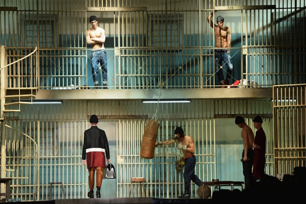
fashion week prison

And we all know the answer to that question.  In this case, it would come from whoever designed the Dsquared2 show for the Milan Fashion Week Menswear Autumn/Winter 2014 collections.  Italian prisons probably are not as bad as those in the US, but still. Are we really seeing fashion models posing as prisoners?  Didn’t anyone stop and think that maybe, just maybe, there might be something fundamentally obscene about pretending that prisons are just another place to strut your stuff?  Shouldn’t there be some recognition of the difference between affluent excess and stark deprivation, or between one of the more dangerous environments on earth and one of the most privileged?

At this point many people probably would pull back, shrug, and say, “What did you expect?  It’s a fashion show.  Of course it’s going to be over-the-top idiotic.”  I can’t do that, however, because I’ve already written 28 posts at this blog on fashion photography, and worse yet, I’ve argued that it is a weird form of performance art that can provide profound insights and prophetic warnings regarding society and politics.  Of course, not every image from fashion week does that–in fact, most of them fall far short–but the question arises of why some displays might be art and others miserable embarrassments.

There is a reliable answer, but we have to take an academic turn to get to it.  The key distinction here comes from Biographica Literaria, a book of literary commentary by Samuel Taylor Coleridge.  In that work Coleridge distinguished between imagination and fancy.  Imagination was the vital ability of the mind to see its way into new perceptions, new creations, new syntheses; it was the human ability to create ideas, images, and relationships that had never existed before, and to do so in a way that brought us closer to the real nature of things.  Fancy, by contrast, was merely the mind at play with things it already knew: it was the mechanism by which we assembled and reassembled memories without regard for reality in order to pander to our desires.

To bend the ideas in the direction of photography, we might think of imagination as a way of extraordinary seeing: that is, how one sees beyond the horizon of ordinary observation or conventional belief.  Astronomy, for example, is an incredible act of imagination: by looking at a pale disk and points of light in the sky, people came to understand that the earth and the moon are planets–something that couldn’t be seen in any way until just a few decades ago–and that the universe consists of billions of billions of galaxies that will never be visible to the naked eye.  Likewise, photography has been a remarkable exercise in imagination, for by showing everyone people, places, events, and things they would never see otherwise, it has brought billions around the globe to realize that they are part of a common humanity living in a myriad of different cultures that no one will actually see together.  In both arts, moreover, the mode of extraordinary seeing brought the viewer closer to reality, not farther away from it.

These examples also demonstrate that works of the imagination need not be accessible to everyone, and that they can be misused to very contrary purposes.  But we knew that.  That important contrast for the moment is with fancy as it is a mode of all too ordinary seeing.  The sad truth is that when someone is being fanciful, they also are all too predictable.  Fancy is party hats and balloons and drinks on the sly at the office; imagination is the single, mysterious flower waiting for you at your desk.

You get the point, and so back to the big house on the runway.  I won’t rule out the possibility that it could have worked, but I know what would have had to happen.  A fashion show staging a prison should bring us to see affluent consumer society from inside the prison, or to see how fashion is a form of imprisonment, or how it is an adaptation on behalf of freedom to less coercive forms of imprisonment in ordinary life, or . . . . You get the point, right?  Whatever the display, it should not simply take stock fixtures from the prison and stock poses from male modeling and mix them up for fun and profit.

To conclude, as we academics like to say: fashion and fashion photography can be works of the imagination, but they risk being merely fanciful confections.  When the subject being appropriated for the show is one involving tragedy, deprivation, humiliation, violence, and everything else that lurks in the dark side of the criminal justice system, it really matters whether we are being brought to see anew or to enjoy habitual blindness.

Which leaves only one question: which side is the photographer on?  Does the composition simply feature the bad art before it or call attention to its failure?  Does the distance between camera and tableau suggest a similar distance from the reality of the prison, or was he just trying to include all of the set?  This isn’t really a question about the actual photographer’s intention, but rather about how you see the image. What do you think: see anything that strikes your fancy?

Photograph by Tullio M. Puglia/Getty Images.

Cross-posted at BagNewsNotes.

 0 Comments

Fashion Week: When Human Being Becomes a Commodity

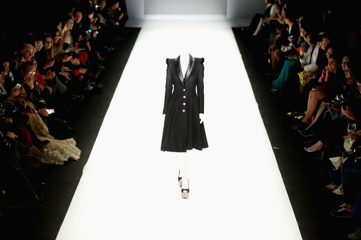
Perhaps it’s progress if a woman now can be an empty suit.

Mercedes-Benz China Fashion Week S/S 2014 - Day 5

And it’s certainly gets to the bare bones of the fashion show, where the models are there solely to display the clothes.  Living mannequins, they are not supposed to be seen as individuals, or even as persons, so why not use an artistic technique to capture that social fact and put it on display?  This specific technique of overexposing the film has even been used before on the runway, and I guess it bears repeating–this time at the Mercedes-Benz China Fashion Week Spring/Summer 2014 show.

The picture is striking, of course, and that alone is a prompt to ask what might be on display or if the image has anything unexpected to say.  Actually, quite a bit is there: we see the dress, and how the model has been reduced to pure functionality, and an audience that we can imagine could quickly become accustomed to actually seeing models that way, and a set of modernist design principles, and an environment created for the express purpose of showcasing aesthetic appeal and innovation, and a commercial system (back to the audience again) that will convert those experiments into a global network of clothing manufacture and sales, and a history of fashion with citations of 1940s couture (the dress again) and Orientalist accessories (the shoes), and with that an allusion to photography’s black & white past. . . .  That’s a pretty good haul for a single photo.

And there might be one more thing.  That reference to “Mercedes-Benz” provides the clue, because the auto industry continues to be a solid example of how commodity production can be hidden under fashionable styling.  No, cars are not like wheat or iron, but they’re closer than you might think, not least when the few differences among them are a small part of an industry built on robotics and branding.  And even if I’m wrong about cars, I think I’m right about the truth that is being exposed in this photo: Once incorporated into a global system of mass production, the human being becomes commodified–one in a series of uniform units as interchangeable and decontextualized as a model on the runway.

I’m not going to argue the point today, not least because I’m channeling a tradition of social thought that is part of a larger debate about modernity, and that doesn’t have all the answers anyway.  What is interesting is that the idea can be presented to vividly in a photograph of a routine event.  (Yes, even Fashion Week is routine, occurring throughout the year around the globe.)  Furthermore, another image from the same event by the same photographer adds yet another dimension to the argument.

Mercedes-Benz China Fashion Week S/S 2014 - Day 5

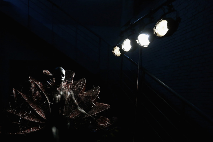
Same show, even the same collection (Hu Sheguang Haute Couture), except now we are backstage.  This would seem to offer an additional series of contrasts with the first image: darkness instead of too much light, figure present instead of absent, primitive instead of moderne, African instead of Orientalist detailing, encumbered or even caged instead of in empty, abstract space, etc.  True enough, but also on behalf of the same insight.

What you see here is the return of the human figure, but now encased in an apparatus instead of a dress, and situated downward, in darkness, almost as if in an infernal factory.  She appears to be immobilized, as if awaiting activation.  She may be subjectively immobilized as well, although it probably would be worse if she were self-conscious.  If the first design draws on the past to inflect the present, this one alludes to a more distant past to suggest a future without enlightenment.

In both images, however, our fate is the same: to become defined entirely by the system of production.  Erased or encased as needed, the only requirement is to be interchangeable and thus individually expendable.  And the result is the same whether working in the full glare of the spectacle or hidden deep in the hive.

Fortunately, absolute domination is impossible and the modern world-system is much more complex than social theory.  Even so, fashion houses and photojournalism have developed an intriguing working relationship on our behalf: images such as these expose tendencies that already are at work, and possibly refashioning what it means to be human.

Photographs by Feng Li/Getty Images.

 0 Comments

Science, Fashion, and the Post-Human

“Science” and “Fashion” are not often found in the same sentence, but welcome to the 21st century.  As the design arts and sciences become the central constellation in a new organization of knowledge, the older distinctions between science, art, technology, fashion, engineering, entertainment, and other domains of modern culture will become increasingly outmoded.  To get a sense of how things are changing, take a sniff of this.

synthetic cell nose

You are looking at a synthetic nose in a petri dish.  By coating a polymeric cast with human cells, the University College London’s Department of Nanotechnology and Regenerative Medicine can produce organs that can be transplanted without risk of immune reactions leading to bodily rejection and other complications.  Noses, ears, and even a windpipe are now possible, with much more to come.  (For a frothy, not very informative report on the lab, go to this story by the Daily Mail.)  Gives new meaning to getting a nose job, doesn’t it?

Jokes aside, one does wonder where it could end, and what strange sights might become commonplace along the way.  The artist Stelarc has already been cutting a trail in that direction, not least with through the surgical construction of a prosthetic ear on his arm.  (I’ve had dinner with the guy and seen the thing myself.)  But we expect that from artists, right?  Well, not exactly, but after the fact we come to believe that was the provocation we might expect.  And despite the lengths to which artists will go to break through to the other side, their efforts can remain merely provocative precisely because they are still framed by the cultural category of art.

Which is one reason to look again at fashion.  Although an even more limiting categorization, it also is a form of visionary design that can slip under the radar precisely because it is assumed to be so superficial and ephemeral.  Which it is, but not before it can be downright disturbing precisely because it might be modeling the future.

Erdem-Beauty-2452-610x405

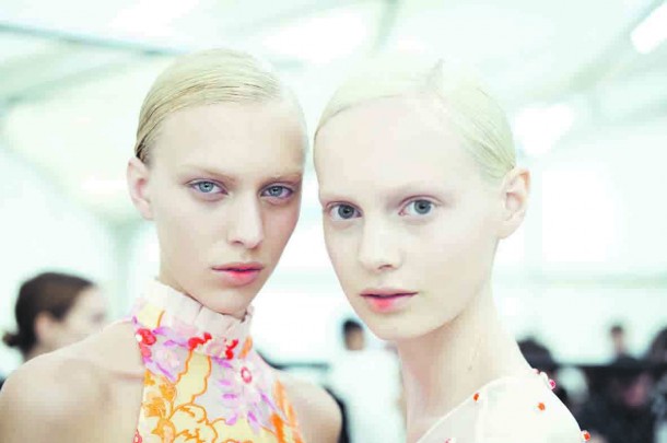
These creatures are from the Erdem collection during London’s Fashion Week.  Don’t they look like they could come from a vat in the lab?  The gush at The Daily, the industry publication for the show, got it exactly right: “Clone-like, robotic girls made up a beautiful model army at Erdem. The pièce de résistance? A dusting of neon orange to the inner lip. ‘It’s as if they are grasping a neon bulb in their mouth and it’s glowing,’ explained the show’s make-up man Andrew Gallimore.”  And some day we’ll be able to design for that more extensively.  Plug and play, you might say.

Which brings up the matter of gender, doesn’t it.  Just where will designing women end?  Equally chilling is the idea that the lab would select for such extreme whiteness.  Now that we have an image of the cloned body, and not just the part, we can realize once again that the real problem may not be the technological capability, but how it could be used to reproduce a retrograde politics.

That’s the kind of reflection that art is supposed to provide.  As one design art is used to reflect on another, perhaps the post-human can become a future that is not only possible, but worthwhile.

Photographs by Seamus Murphy and Morgan O’Donovan and Shaniqwa Jarvis.  FYI, I’ve mentioned the post-human before here, here, here, and here; as you can see, I haven’t even settled on the spelling yet.  I’ll hope that my understanding of the subject is, well, evolving.

 0 Comments

Visions of Austerity at Fashion Week

Fashion Week lasts far longer than a week, which is perfectly in keeping with its comprehensive commitment to excess, and also with its uncanny ability to capture the spirit of the age.  And this year, the buzz is all about austerity.

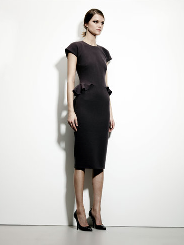
austerity model Bottega Veneta

The New York shows have started, and the Times has two articles and a slide show to point out “a Conservative Touch” that will provide “Thrills Without the Frills.”  Really.  And, of course, no frills doesn’t actually mean doing without frills, as you can see on the hips of the model posed above, but by the standards of the high end shows, the look is definitely, unmistakeably austere.

I can’t say why the industry has converged on this minimalism, and the answer would have to include the natural oscillation between styles that fashion needs to exist at all.  What I find more interesting is how the shows can double as political allegory.

Only a year ago, the Milan show captured the Aristocratic Dreams that lie behind the acceleration of income inequality around the globe.  Now, after a year in which the draconian austerity policies of Europe and the UK have withstood both continuous public debate and comprehensive failure to meet their own objectives, the US  is approaching yet another self-inflicted recession brought on by the same ideology.

The model above may suggest how this s0-called discipline feels inside the elite compound.  She doesn’t look too happy, but she isn’t starving either.  (Well, ok, she’s a model, so she is starving, but she’s getting paid for it.)  She also looks wary, and as if accustomed to wariness–that is, to keeping a close watch on what’s her’s and making sure that no one else gets any of it.  Perhaps there is a touch of fear mixed in as well–after all, if resources are thought to be scarce, then wealth makes security a preoccupation.  She stands almost as if at attention, as financial and military elites will naturally converge around shared conceptions of order and control.  At this level, austerity isn’t so much an economic necessity as a style for ruling in a Hobbesian world.

Which is how we get to this image.

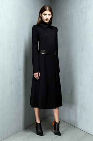
austerity model Narciso Rodriguez

After the shows are over, this should be put on the cover of Margaret Atwood’s The Handmaid’s Tale.  (Just as Fashion Week mimes social theory, it also can channel science fiction.)  Young, wrapped in a functionary’s costume much like she is trapped in a corner, and yet like her shoes elevated and fetishized, this could be the image of an imperial concubine.  But the Lords of Finance pride themselves on being liberal in more ways than one–two, actually–so she also could be a ruler in training.

Like the fictions it evokes, Fashion Week pretends to be about the future while being finely turned with the present.  Which is why it might have something to teach us: For those in power today, austerity is just another way to clothe the politics of greed.

The New York Times slide show features photos from the pre-fall collections previewed last month.  The two dresses shown here are from Bottega Veneta and Narcisco Rodriguez.  If you have any doubt regarding my claims about the failure of financial austerity policies, read Paul Krugman.

 0 Comments

The Ghost in the Machine During Fashion Week

Fashion Week never ceases to teach me something.  And now that the week lasts most of the year as the shows blossom one after another around the globe, there is much to learn.  Not least about photography.

bp1

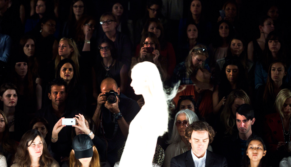
This image is from the New York Show last September.  Fashion isn’t timeless, but the photographer’s artifice has captured something about photography itself.  Perhaps the over-the-top artifice of the shows gave the photographer more artistic license than usual, for most would not intentionally overexpose the model that supposedly is the focal point of the event.  By focusing on the audience, however, the image both brings them out of the darkness while turning her into a creature of light.  Which she always was, of course.

But which is stranger: to see an all-white silhouette, or to see the act of spectatorship offered to view?  One answer is that both are strange, with the emphasis depending on where you want to go philosophically.  By focusing on the model, images of haunting come to mind, and one might recall how images of ghosts, fairies, spirit worlds, and other premonitions of life beyond death were a prominent part of the early history of photography.  Ultimately (but not completely), realism trumped that exercise in imagination, but photography has remained a medium in several senses of the word ever since.  As the bare outline of the model suggests, the camera is only capturing traces of what is there, with the rest to be supplied by the imagination.  Likewise, one can imagine how images are already within the camera, waiting to be released, and also floating unseen through the air, waiting to be captured.  Haunting is omnidirectional, I imagine.

But is there one ghost or many?  As the members of the audience are brought out of the shadows, we are reminded how they also haunt the camera: always there unseen and often unbidden, waiting for the image to appear.  Without the audience, there is no need for the image, so in one sense they have to always be there, unseen, as the potential force that allows the camera to flash.

They are more like us than any of us are like the model.  They double our viewing, as we do theirs.  I find the experience of seeing them seeing to be a bit troubling.  (If you want to get a good dose of the experience, sit through the scene in the film Amour when the concert audience is waiting for the performance to begin.)  We might ask why that is, but I don’t have time to consider that question today.  I’ll close instead by noting how much there is to see about seeing.

The gazes in the audience shown above are by turns appraising, calculating, desiring, distracted, bored, and more.  Some are extended into taking photographs, thus also doubling the act of taking this photo.  Photography is a study in plurality, extended further by its own reproduction, and ultimately about itself only when it is showing what it means to see and be seen.

Or perhaps I should have said, to see what often goes unseen, even during Fashion Week.

Photograph from the J. Mendel Spring/Summer Show, New York, September 12, 2012, by Andrew Burton/ Reuters.

Cross-posted at BAGnewsNotes.


 0 Comments

Signifying Shoes

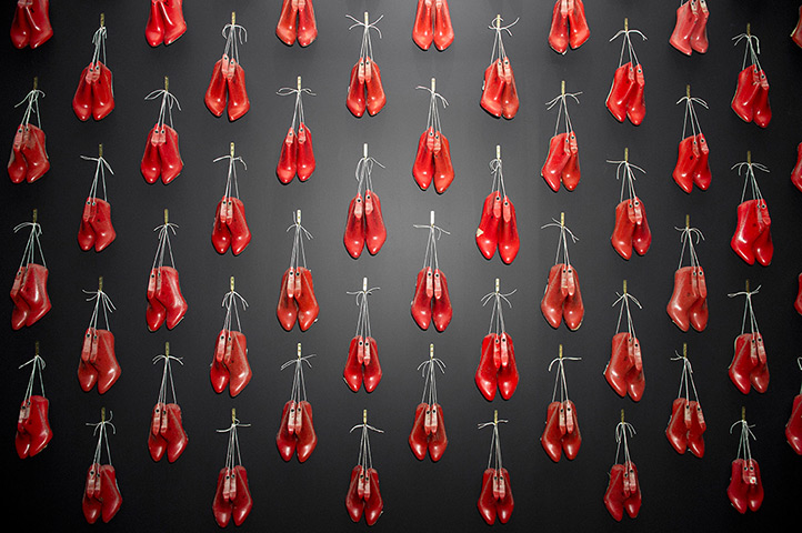
You might think that a high end fashion item would seem more valuable for being rare, hard to get, almost one of a kind.  Everyone should want one of the items, but it should be clear that not everyone will have one.  So it is that this display of Christian Louboutin shoes seems counter-intuitive.  How can there be so many of something so pricey?  Why pay so much for something that appears mass produced and uniform?  The Louboutin website opens with a pair of heels under glass, as if they were a rare treasure that should be protected from the open air, whereas this display of indistinguishable copies invites comparisons with the knockoff items that you can buy for a few bucks on the New York street.

But the curator who created this exhibit at the Design Museum isn’t in the business of selling shoes.  Like the designer, she is keenly aware of how shoes signify, but the focus here is on prompting reflection on fashion as a design art.  Two of the contradictions within modern fashion are that “exclusive” products typically are mass produced, and that consumers strive to distinguish themselves using identical items.  These conditions make good design harder, not easier to achieve.  Instead of individualized tailoring whereby everyone could be outfitted uniquely, clothing, furniture, and everything else has to be appealing and functional for many different people despite having a single, impersonal form.  By acknowledging these constraints, the exhibit captures Louboutin’s achievement: even when one pair of shoes is shown to be exactly like all the others, they still look really good.

It’s also interesting to see how focusing on one art can reflect back on another.  The display of the shoes makes each pair interchangeable with the others; what are real shoes become mere copies of an absent original.  Thus, the mere awareness of mechanical reproduction subverts a secure sense of the reality or worth of the object.  Photography, of course, suffers the same fate: the ease in making reproductions of any image heightens awareness of how each one is a copy of another reality.  One result, particularly in the hands of some theorists, is to fault the art for cheapening our sense of what is really real.  What happens, however, is that some images prove to be all the more exceptional for that.  Their artistic achievements become more obvious, not less, when set against many others much like them.  And that competition for attention amidst a pervasive process of copying is another of the constraints in fashion design.  Perhaps we shouldn’t be surprised that one way to distinguish each of the shoes above is by the way it catches the light.

Nor need the comparison stop there.  Fashion and photography can intersect not only in the museum but also out on the street.  Or at the Golden Gate Bridge.

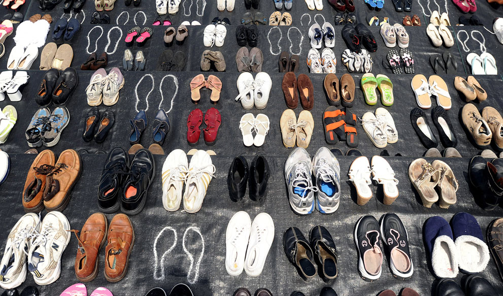
This commemorative display was created by the Bridge Rail Foundation, which advocates for measures to prevent suicides at the structure.  Turns out there is more than one design problem involved.  On the one hand, the bridge proves to be superbly suited to a wholly unintended use; on the other hand, perhaps the most deep-set objection is that preventative modifications mar the bridge’s aesthetic appeal, which is one of its principle design features.

In any case, it is interesting that a display of shoes can say so much about the tragic cost of inaction, and comparison with the first image can identify some of the reasons why.  Whereas in the first image multiple copies enhanced distinctiveness, here the obvious uniqueness 0f each of the pairs heightens a sense of common fate. Each person wearing the identically recognizable Linboutin shoes will stand out in a crowd, and the status markers proclaim that they have the personalized flair that comes with being among society’s winners.  Each of these motley yet varied shoes at the bridge marks a single individual no longer visible, someone who ended up at the bottom of life, caught in an undertow of despair that lead to the same darkness.

However cheap, each one of those shoes was a small fashion statement before it became a means for civic advocacy.  The shoes’ second significance is extended further by being copied by the camera.  Shoes, like photographs, are social objects, and so can talk by being seen and communicate further by being displayed.  This photograph expresses the advocates’ intention, but it also prompts the viewer to think about who is seen and valued, who is granted attention or other social goods and who is left to walk by unseen–as if just another copy of the one before, even if on their way to the bridge.

Photographs by  Jonathan Short/Associated Press and Noah Berger/Associated Press.

 1 Comment

Seeing Double During Fashion Week

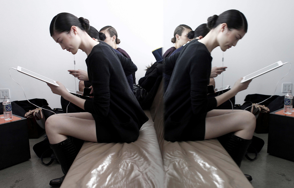
Fashion Week in New York has ended, with the show moving on to London, Milan, and Paris.  Each event will strive to distinguish itself as it jostles for pride of place on the international circuit, yet one doesn’t have to step back very far to see them as alike as peas in a pod.  Which may be one reason why photographers on the fashion beat like to capture double images.

Which side is the mirror image?  Does it matter?  Isn’t any fashion model already a reproduction of a type that is used to motivate imitation?  As with the replicants in Blade Runner, we might come to learn that they, too, have feelings, personalities, and lives, but that is hardly the point.  More likely, the process provides just enough human features to ensure conformity while subverting any attempt to further humanize the model or those around her.  So it is that we see this model reading, as if she has an interior life of her own, but that interest is then quashed by the duplication that emphasizes her impersonal appearance and replicative function.  All models might read, but so what?

One could place the image in a long lineage of paintings of the woman reader,  If that could restore enough of an aura of authenticity, the viewer might become interested in a considering a woman’s private experience as it can be found in the act of reading.  But that possibility raises the prior question of what one should be looking for in the first place when viewing a double image.   One answer might be some assurance of what is real, or some cue regarding how we might know.  The double image creates an initial skepticism–which side is reality and which is appearance?–and that in turn prompts more careful scrutiny to identify the reflective surface.  Carried far enough, that examination extends to the photograph itself.

Let me suggest that there is much more to be learned than whatever might be gleaned from that philosophical exercise.  And one key to unlocking the power of the double is to turn from the exact duplicate to images could be seen as double images, but need not be.

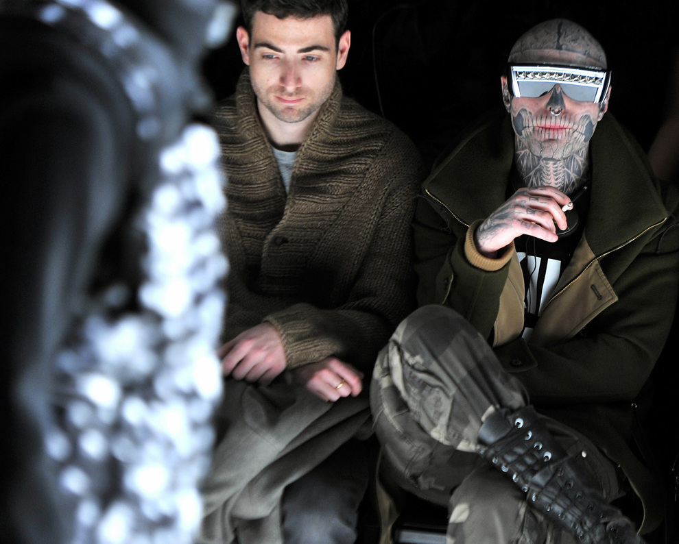
You want uncanny, you got it.  Or, if you want to shake off the really disturbing vibe, just pretend that they are two very, very different people and focus on either one or the other.  “What a freak” or “What a nice guy” will each work the same–and it doesn’t matter which way you apply them.  The power of this photograph, however, comes from the fact that it, too, is a double image, and one that taps a far deeper fear than the first photograph.  In the first image, whatever lay under the surface could be assumed to be as docile as the well-groomed body on the soft bench.  After all, whatever the content, she’s only reading.

But what if the nice boy in the sweater and the Mad Max outlaw are the same guy?  Because they are, of course: each carefully styled in a different idiom, bodies neatly complementary from top to bottom (look at their legs and hands, for example), with similar clothing (the same V-neck color scheme), and, of course, very comfortable together.  It’s as if the each could fit comfortably in the other’s skin, each the other’s alter ego, good boy and bad boy, the date you can take home to mother and the figure in every slasher movie looming in the dark outside the window.  And, of course, they can be one and the same person.

A subculture dedicated to the production of appearances proves to have more depth than we might think–at least when it becomes a subject for photographic artistry.  A world of social display and mechanical reproduction can also be one in which surfaces can be deceiving.  In place of surface and depth, however, we might want to think about how we always are choosing between simplicity and complexity, and between familiarity and fear.

Photographs by Carlo Allegri/Reuters and Stephen Lovekin/Getty Images.  This is one of several posts I’ve made over the years on double images, although don’t ask me if they form a coherent argument.  For the record, you can see those that a quick search pulled up here, here, here, here, here, here, and here.

 0 Comments

Starship Troopers and Other Super Bowl Fantasies

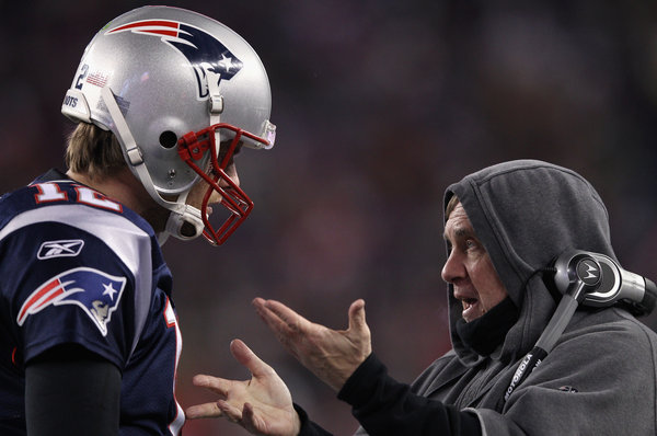
OK, it also could be Star Wars, if Yoda–or is it Obi-Wan Kenobi?–would give advice to a helmeted officer of the Imperial Guard, or something like that.  Either way, it’s a long way from Bart Starr and Vince Lombardi.  By 2012, the Super Bowl has become the ultimate mainline mash-up: sports, advertising, food, fashion, fundraising, socializing–so why couldn’t a sports photograph double as a place where two sci-fi films come together?  Come to think of it, that might make for a good ad. . . .

The basic structure of many of the Super Bowl ads is parodic: create a comic imitation of some habit of popular culture or everyday life, place your product in the mix, and hope that the audience of over a 100 million people likes the joke.  The production values are sky high and the jokes are lame, but what did you expect?  Which is one reason I like this photo, as it delivers quite a bit at a bargain price.

The allegorical significance of Star Wars is that the United States is reflected in both sides of the cosmic conflict between the Empire and the rebel forces: democratic ideals and imperial policies, civic virtue and a military-technocratic complex, freely given friendship and the libido dominandi. . . . The list goes on and that’s part of the point, as the two sides are not easily disentangled (as father and son each learned).  Starship Troopers traded on the same market, and the allegory was both clumsier and more direct: an otherwise liberal society (say, on matters of class, gender, and race) could still become a fascist state sustained by perpetual war.

And so we get back to the photo above.  On the one side, the fully equipped, imperial battlefield commander blazoned with propaganda symbols of a long extinct democratic revolution; on the other side, the sage in his humble, monkish habit has set technology aside to communicate a deeper, more organic wisdom.  Will he be able to get through the training and other institutional habits encasing the young commander?  But what if he is the one working for the Dark Side?

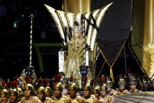
Silly, perhaps, but then football was never free of myth: think of The Four Horsemen of Notre Dame, winning one for the Gipper, and other hoary tales.  Likewise, science fiction has always been about the present, and about the relationship between politics and society.  The Super Bowl is a relative newcomer, but thanks to the power of spectacle it’s catching up fast.  An extravaganza for the masses where tickets cost thousands of dollars, it knows a thing or two about contradictions.  Thus, the photo above captures something of the spirit of the age: an age where all media are mixed media (to quote W.J.T. Mitchell) and mixing genres is now second nature in media production at all levels from major media events to what’s on your smart phone. Even so, it’s still a photo from the sports page.  To really see how far fantasy football can extend, you have to go to Madonna.

Eat your heart out, Cleopatra.  The material girl keeps the political allegory going strong, but now we’re back in a Pharaonic court.  Like what you see, America?  This past could be your future, and remember: the job of litter bearer can’t be outsourced.

Or maybe it’s just for fun.  Or perhaps it’s really a football picture after all.  You make the call.

Photographs by Elsa/Getty Images and Matt Slocum/Associated Press.  I discuss Madonna’s use of the courtly style in Political Style: The Artistry of Power, pp. 83-86.

Cross-posted at BAGnewsNotes.

 2 Comments