Sep 15, 2010
Sep 24, 2017
Jan 26, 2015
May 28, 2010
Jul 25, 2011
Nov 10, 2010

Iconography in Contemporary Art: Hirst’s Shark

By guest correspondent Monica Westin

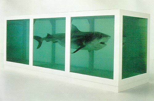
At a time when cultural production is characterized by vast range and enormous volume, it might be difficult to imagine a single image functioning as a paragon for contemporary art.  And yet if I had to name an artist who stands in for contemporary art, it would be Damien Hirst.  His work sells for astronomical sums, making headlines at a time when market value has become an aesthetic quality of its own.  Hirst also articulates institutional critiques that both joke about the art market and take advantage of it—the logical conclusion of the postmodern artist.  While Hirst’s recent diamond-covered skull has made the most headlines for its sheer cost, the image that continues to circulate the most is Hirst’s 1992 work involving a formaldehyde-preserved tiger shark, The Physical Impossibility of Death in the Mind of Someone Living.

The piece itself takes up and comments on contemporary art’s arguably strongest trend: to use found instances of natural or social life, and then to frame that life and repackage it as an aesthetic piece or performance. (Bourriaud’s Relational Aesthetics, seemingly the current bible of museum curators, is the touch point).  In this case, an embalmed shark is art because it has been framed.  Thus, Hirst frames both the shark and contemporary art, a subtle critique that is all the more entertaining because the shark is disintegrating.

Hirst’s earlier embalmed sheep had more or less single-handedly brought him stardom, but that work has stopped being circulated.  So, embalming alone won’t do it, and one can ask, what has made this particular piece iconic?  There’s an undeniable element of humor to the piece—how seriously can it really take itself?—that contributes in large part to its staying power, but lots of artworks are a bit humorous.  We could analyze the piece formally: it involves an animal that, unlike a sheep, never stops moving, and so the freezing of it is a stronger framing tied to guaranteed death, making it a suspended vision of both life and death and thus a commentary on art-making.  There’s the threat (of art itself?) in the open mouth of the shark, and then there’s the pop culture reference to Jaws that’s become part of collective memory.  My favorite explanation is that there’s a possible allusion to cultural “sharks,” dealers in the art world, whom Hirst recently attempted to sidestep by becoming the first contemporary artist to sell his work directly at auction–which was deemed a “game changer” by anxious art insiders.

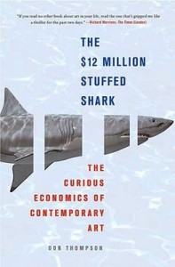
Whatever the reason, the framed shark continues to be circulated as a symbol of the current and instantaneous despite now being now almost twenty years old.  Examples of this iconic status include its place on the covers of contemporary art books, from Terry Smith’s 2009 What is Contemporary Art, an ambitious and critically acclaimed attempt to catalog current movements, to The $12 Million Stuffed Shark, economist Don Thompson’s 2008 freakonomics-esque attempt to explain the art market.

Thompson’s cover doesn’t even need to reproduce a photograph of the piece, only reference it with the animal and bands of blankness where the tank’s frame would be.

Because Hirst’s shark stands in for contemporary art, it’s been appropriated and reappropriated (as has much of his work) for years in art-pop culture, as well as by other artists commenting on contemporary art.  My personal favorite, from Small Artists John Cake and Darren Neave, makes a witty comment about class, democracy, and the lack thereof in the contemporary art world: Note how the scruffy janitor Lego man is scowling in front of Hirst’s multimillion-dollar half-joke, not finding it very funny.

Maybe he knows something we don’t.

Monica Westin is a Chicago-based theater and visual arts critic and editor, as well as a Ph.D. student in rhetoric at the University of Illinois at Chicago.  She can be contacted at monica.e.westin@gmail.com.
 1 Comment

Seeing Gender in Transition

By guest correspondent Emily Dianne Cram

Afghan Passing.2.2010-09-29 at 8.18.41 PM

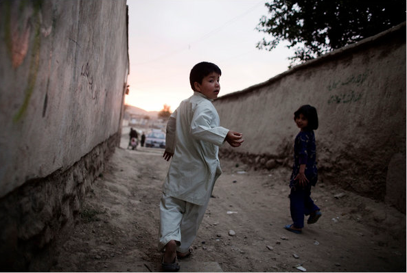
Two children in Afghanistan play in an alleyway between two houses.  The child on the left awkwardly turns forward while looking back towards the viewer.  The child, whose name is Mehran appears to be running toward a place in the distance where bodies blur almost indistinguishably from one another.  Or maybe Mehran is running away from the spectator watching the scene unfold.  Whether moving towards or away from particular coordinates, the important point to note is that the viewer of the photograph sees Mehran suspended in what appears to be a moment of stasis, yet simultaneously always moving.

Mehran’s story is one of several featured in a recent New York Times essay and slide show that chronicles a practice known as “bacha posh,” in which female-bodied youth pass as boys to secure their families’ status within their communities.  The title of the essay—“Afghan Boys are Prized, So Girls Live the Part”—cues the spectator habits the “gender abroad” genre typically evokes: condemnation of a misogynistic practice.  Yet, such a judgment seems problematic if we take another look from a perspective that troubles how we think about gender.

What is remarkable about the slide show is the banality of bacha posh in a cultural context Westerners typically see as marked by strict gender segregation.  In the image, below, Azita Rafaat, a member of Parliament, leans down to address Mehran, who dresses as a boy.

Afhan Passing 3.2010-09-29 at 8.39.54 PM

The entire scene invokes the narrative of a mother attempting to quiet and contain an unruly child in public. Rafaat’s hand curls firmly around Mehran’s shoulder as she demands the child’s attention with what appears to be a stern look. Rafaat reacts with an expression that is in equal parts puzzlement and discontent.  What is especially distinctive about the photograph is how Mehran’s white clothes blend into the bodies of the men in the background, while Rafaat, shrouded in black, awkwardly ushers the child through the scene.  And what we get is something of an allegory for the often confusing norms of public and private behavior that implicate the equally confusing norms of gender and sexual identity as they manifest in their local contexts. And in the end, Mehran’s particular identity hangs in the balance.

These photographs illustrate how gender in particular is a way of moving one’s way through the world to produce forms of social relationality.  Yet, this view is contingent on seeing gender as a permeable category that people use as a means of building their communities.  Accordingly, gender is an embodied act, something that is done to produce a relation to others in the world.  This perspective enables us to see gender in transition, and how cultural practices often exceed the strict binaries of male/female and woman/man.  Perhaps if we take our everyday embodied violations of categories more seriously, we can see the work gender does in a different light, rather than rush to judgments about others.

And yet, the act of seeing gender in transition is imbued with its own paradoxes.  In the photograph below Zahra, a girl who has passed as a boy since childhood, gazes pensively through sheer curtains towards a bright, sunlit day.

Afghan Passing .1.2010-09-29 at 8.18.16 PM

The juxtaposition between the shadows behind Zahra’s back and the white light greeting “hir”* face and torso suggests that the secret past is coming to an end.  Part of bacha posh is a transition into womanhood and the rites of marriage and motherhood.  For Zahra and others, such a transition is difficult and at times undesirable because of the way their bodies sediment a particular way of being with others.  Another look shows Zahra gazing towards an inevitable future with a sense of heavy dread, and we learn not only of hir desire to live as a boy, but that s/he has never “felt like a girl.”

Zahra’s story shows the contingency of gender, and the heartbreak that emerges when one’s own desires for a particular embodiment conflict with community norms and practices.  This tension is endemic to the human condition, one that we all embody as we attempt to find the way our bodies fit into spaces of the world.

* “Hir” is a neutral pronoun that serves as one alternative to the gender binaries embedded in the English language.  I choose to use “hir” in this case because of the way Zahra describes hir embodiment: female bodied, yet desiring a male public presentation. “Hir” emerges from a transgender critique of language, a perspective that understands the limits of and inventional potential of language in articulating the complexity of embodiment.

Photo Credit: Adam Ferguson/NYT

Emily Dianne Cram is a PhD student in Rhetoric and Public Culture at Indiana University, and her research engages the intersections of visual culture, embodiment, and gender and sexuality.  She can be contacted at emcram@indiana.edu.

 3 Comments

A Sporting Memory of 9/11

By guest corespondent Michael Butterworth:

Baseball Shoe 911.2010-09-16 at 4.10.20 PM

At first glance, this photograph may appear well-suited to NCN’s category “boots and hands.” But the cleats of Chicago Cubs outfielder Alfonso Soriano are not the real story here, or at least not primarily so.  While the foot commands our attention, the real focus is on how it directs the viewer’s gaze to the legend printed on the base: “We Shall Not Forget.”

Even the most casual observer of sports has likely noticed how commonplace such memorials have become.  The sentiment should be simple enough: 9/11 was an event of such magnitude and consequence that it is incumbent upon us to remember the things which bind us together as a nation.  And since such “binding” seems to be one of the socio-cultural functions of national sporting events, it is little surprise that  they have become the perfect vehicle for circulating such memories.

While such declarations make it clear that we should not forget, what is left unstated is exactly what we are to remember.  Note, for example, that we are not being asked to remember the actual events of 9/11 itself.  Indeed, memorials like those found in this photograph are only partially about the past; as memorializing is more often a reflection of a community’s needs in the present.  And the  present here, of course, is defined by the so-called “war on terror,” a military campaign that is now only minimally about 9/11 itself.  With this in mind, we can view “We Shall Not Forget” as it overlaps with the numerous visions of militarism that have become woven into the fabric of sports—from red, white, and blue emblazoned ball caps, to military flyovers, to museum exhibitions—and conclude that sports in the United States continue to contribute to the normalization of a problematic war.

The tragedy in this is that the photograph reminds us that it needn’t have turned out this way.  Behind Soriano’s carefully balanced cleats is the blurry image of the Miller Park outfield grass.  Baseball mythology is grounded in, among other things, the idea that the ballpark represents a pastoral sanctuary—a metaphor of the countryside that offers comfort, security, and community.  Although that mythology can be flawed, 9/11 precipitated a rare moment when the “national pastime” really did invite all Americans to participate in an imagined community, one based on genuine human needs laid bare in the wake of the terrorist attacks.

All too quickly, those initial ceremonies—of mourning, of healing, of hope—that took place in baseball stadiums in September and October of 2001, gave way to belligerent expressions of hot patriotism and militaristic vengeance.  This photograph reminds us that in the days, months, and years after 9/11 there was a more humane and less violent path available to us.  Now, just like the outfield grass in this photo, that path seems blurry and somehow out of reach.  How easily we have forgotten, after all.

Photo Credit: Jeffrey Phelps/AP Photo

Michael Butterworth is an assistant professor of communication in the School of Media and Communication at Bowling Green State University and host of The Agon, a blog on rhetoric, sport, and political culture.  Michael is also the author of the recently published Baseball and Rhetorics of Purity: The National Pastime and American Identity During the War on Terror (University of Alabama Press, 2010).  He can be contacted at mbutter@bgsu.edu.

Cross-posted at BAGnewsNotes.

 3 Comments

Earth Day + 1: Aric Mayer on Home and Wildness

By guest correspondent Aric Mayer:

Aric Mayer Turtle Kiddie Pool

For the past three years I have been working on an intimate body of photographs [the slide show can be seen here] made within walking distance of my home and studio. Our property is in the middle of an orchard, parts of which have been left to go feral, the trees growing towards their natural grizzled tangle, while other parts have been bulldozed and prepared for development, only to be left for the weeds and the thistle.

For a time it has been a place grounded between categories, neither kempt nor wild. I have come to see it as a kind of crucible within which local tensions are played out in ways with global significance.

Probably the most significant issue of our lifetimes will be the emergence of global climate change as a consequence of human development. How we picture living with nature has everything to do with what we can imagine as a response to looming catastrophe.

There have been sets of parallel visual expectations that emerged over the last 50 or so years, on the one side there is a vision of nature as pristine ala Eliot Porter’s The Color of Wildness, and on the other side a vision of the American suburb that is bulldozed flat, gridded off and built up in a completely controlled fashion. Over the last few years, that American vision of the huge housing development has become quickly associated with decay and entropy as so many sit unfinished and empty, partially built and partially ruined. Suburbia and wildness developed mutually exclusive visions were neither had room for the other, and yet both have to exist.

A successful city is generally imagined as completely counter-entropic. It is permanent progress. Fully realized. In contrast, nature is understood to be cyclical. It is a system where the counter-entropy/entropy tension is contained and fully resolved within a system that is sustainable. An organism is generated, feeds, grows, dies and decays, returning its components completely to the ecosystem.

There is a dialectical tension between the constant effort required to sustain a counter-entropic city and the tendency of nature to absorb everything into a cyclical rhythm of growth and decay. As Carl Jung said in his essay “Alchemical Studies,” “Nature must not win the game, but she cannot lose.”

This interaction between home and wildness has profound psychological implications for it mirrors the evolution of human consciousness itself. A similar and analogous set of tensions is played out in the interaction between consciousness and unconsciousness, the first being the creator of technology and home, and the second being a product of nature, emerging from millions of years of evolution. These exist in dynamic tension, in constant movement to dominate or subsume the other. In fact, the history of development is in a sense the history of human consciousness, with many of the same tensions and contradictions.

Cross-posted from Aric’s blog.

 0 Comments

Ready to Do Violence: War Games or Simply Modern Warfare?

By guest correspondent Christopher Gilbert:

“People sleep peaceably in their beds at night only because rough men stand ready to do violence on their behalf.”  —George Orwell

call-of-duty-4-modern-warfare-2

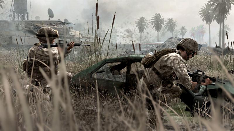
On December 1, 2009, President Obama deployed 30,000 troops to Afghanistan. Neither of the soldiers above is one of them. Indeed, neither is real, but rather digital representations found in the new video game, Call of Duty: Modern Warfare 2, released late last year, one day before Veteran’s Day. I wonder if, when you looked at the picture above, you thought it was an actual picture taken from the battlefield, as did I.

War has long been the shadow cast on the backdrop of American life, a part of us, varying in degrees of prominence the brighter or darker it becomes, so it chilled me to read a review of this game titled, “Modern Warfare 2 Kills Well With Others.”  The implications of the title notwithstanding, the author of the review, Gus Mastrapa, reinforces an “us v. them” perversity, writing: “the game cribs its morality from post-Vietnam Hollywood: War is bad, except when it’s not. Soldiers who fight for freedom are good, except when they’re not.” At least he attempts to moralize the game. Yet a game itself has morals per se as much as war, capitalism, or even journalism, which is to say “not at all.” It is not the concept or pursuit or game that has the morality, but the human subjects who impel it,  create it, and  play it. And increasingly more individuals are playing these first-person shooter military simulations—whether for pleasure, recreation, catharsis, or even combat training—trying to “get a taste” of war. One commentator goes so far as to say that “[MW 2] makes you feel every ounce of [it]” as if “you are there, doing it all.” Not only is it violent and graphic, but “realistic,” capable of “building community,” while showing that “violence has a real cost.”

Modern Warfare 2 may be realistic, but it is absolutely not real. Indeed, as a genre video games are inherently detached from any obligation to represent reality. Despite the fact that digitized blood spatters across the screen when the gamer is shot, the game itself—and any violent game for that matter—is clean (as is much of our conception of real modern warfare, my own included). Thus, such virtual simulaitons can house the “perfect enemy,” since it is imaginary, and can be justified as such (especially against those who condemn it for its violence, realism, vulgarity, even pathology) insofar as it is “just a game.” Though it is graphic and realistic, it is merely a digital portrayal, a simulacrum—blips on a screen, pure fiction. As such, the only “real cost” that it incurs to the gamer is $59.99 paid to purchase it.  In real-life images, too, we can see but a glimpse of the “costs of war,” of its materiality. Consider below:

Soldiers

As numerous NCN posts have reminded us, we generally see relatively clean images of war. We also experience war from a distance. In the video game, the imagery is dirty (though you can “turn off the blood”), but the player is unsoiled. The images are close, but the horror is at a remove. Indeed, in an important sense the problem is not the video game per se, but that war/violence is not clean, and attempts to make it appear otherwise are inherently dissimulating.

The fact is that the video game player really loses nothing. At the end of the game, his or her violence is not real. He or she can simply turn off the device, feeling only satisfaction, disappointment, excitement, perturbation, or some other virtually induced emotion. The real soldier, however, stands to lose much, much more. You or I can play a video game or look at photographed soldiers, but we can never truly know the horror that is war. All the more reason that we renew and review our collective senses of community, of humanity, of war, while remembering what Kenneth Burke said: that getting along with each other—and not fighting, defaming, victimizing, or killing each other—is the essence of the good life.

Photo Credit: www.broadbandgenie.co.uk and Joe Raedle/Getty Images.

Christopher Gilbert is a graduate student in rhetoric and public culture in the Department of Communication and Culture, Indiana University. You can contact him at cgilbie@gmail.com

 4 Comments

WANTED in Times Square

By guest correspondent Rachel Hall

Times Square is an iconic point of arrival for aspiring actors, international tourists, and now criminals.  Last week, the FBI announced that it would begin screening wanted fugitives on an electronic billboard donated by Clear Channel Outdoor.  The police and the press have long collaborated on outlaw displays, but the FBI’s move is significant in terms of both scale and placement.

Compliments of The Today Show, you can see Belle Chen, Assistant Special Agent in charge of the FBI’s violent crime unit in New York, and Harry Coglin, President of Clear Channel’s Outdoor New York staged like two television personalities hosting the ball drop on New Year’s Eve.

Today Times Square

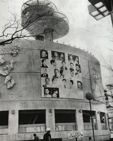
The FBI’s larger-than-life notices are reminiscent of Andy Warhol’s Thirteen Most Wanted Men mural commissioned for the 1964 World’s Fair.  In a characteristically cheeky moment in The Philosophy of Andy Warhol, the artist provided a caption for his mural: “Nowadays if you’re a crook, you’re still considered up there.  You can write books, go on TV, give interviews—you’re a big celebrity and nobody even looks down on you because you’re a crook.  You’re still really up there.  This is because more than anything people just want stars.”

thirteenmen

The wanted poster’s authoritative tone inspires fear, moral indignation, and patriotic fervor for law and order.  And yet as Warhol understood, the public’s desire for images of crime and punishment often exceed the bounds of patriotism in order to produce pleasures based in outlaw identifications, frontier nostalgia, or the desire for a dose of danger in everyday life.  Like Times Square, the wanted poster simultaneously attracts and repels us.  In his book, Where the Ball Drops: Days and Nights in Times Square, Daniel Makagon observes: “Times Square is a place, both real and imagined, where historical images of a vibrant public sphere collide with contemporary cultural practices triggered by a proliferating consumer society.  It is a place where some long for increased security in public space while others gravitate towards its historical reputation for sex, sleaze, and the thrill of danger” (xiv-xv).

The FBI’s giant, electrified wanted poster participates in ongoing battles over public spaces increasingly claimed by the interests of multinational corporations.  Clear Channel Outdoor promises to: “Reach the mobile consumer.”  Currently, the company has a presence in 44 U.S. cities and 31 other countries, including China and Russia, as well as many countries in Europe, North and South America.

Artist Jenny Holzer protests the privatization of public space in cities around the world by installing screens on a scale like and in prominent locations characteristic of those currently managed by Clear Channel, from which she transmits critical provocations.

holzer-003

Holzer is trying to confront the media-security-advertising complex directly, but she is outgunned.  Clear Channel’s joint venture with the FBI is modeled on an earlier partnership between Lamar Outdoor Advertising and Crimestoppers.  Over the last decade or so, Lamar has been at the center of heated legal disputes in municipalities across the U.S.  In each new market, Lamar finds itself locked in a struggle with local community members who fear the flashy signs will be a traffic hazard or resent having to bask in the glow of billboards each night.  Over time, the company has become adept at branding its electronic billboards as part advertisement, part public service, stressing the fact that the company donates space and time to screening wanted fugitives and AMBER alerts.  Likewise, in his report on the FBI’s “Broadway debut” for the Today Show Pete Williams told home viewers: “And these electronic billboards can also be used to spread AMBER alerts and seek help finding missing persons.”

The “public service” on offer from companies like Lamar and Clear Channel is ideologically loaded and leans heavily toward the privatization of public space.  The wanted poster and missing notice symbolically mark the border between “home” and the external dangers that threaten its sanctity.  In the context of Times Square, home is what the aspiring actor leaves behind on her journey to stardom.  It is the rights of a particular configuration of family that renders homoeroticism suspect, if not criminal, in Warhol’s ironic mural.  And it is the rights of the family on tour that Mayor Rudy Giuliani violently defended in street sweeping campaigns of the 1990s, which banished sex shops and paved the way for the Disneyfication of Times Square. Like Times Square, and the billboard for that matter, the wanted poster has a long history of animating the tension between private interests and public spaces.

Photograph of the Jenny Holzer installation by John Marchael, © 2007 Jenny Holzer, The Artists Rights Society/. “Spectacolor electronic sign. Times Square, New York, 1986.”

Rachel Hall is an Assistant Professor of Communication Studies at Louisiana State University and author of WANTED: The Outlaw in American Visual Culture.  You may reach her at rchall@lsu.edu or visit her website.  [Thanks to Chris Hardy for calling my attention to the Today Show piece.]

 1 Comment

Kitchen Debate Redux

By guest correspondent Elisabeth Ross

A little while ago, the New York Times ran a story about the so-called “family dinner” predicament, which in this latest commentary was anchored by yet another study suggesting an association between frequency of family dinners and adolescent substance abuse rates.

The photograph accompanying the article on the front page of the Style section forecasts the nostalgic, eternal return to that staple of the modern visual lexicon: the mid-century kitchen, complete with iconic 1950s housewife emerging to present a casserole to her adoring family seated at the table.

guilty_casserole

The faded pastels, washed out background, and dinner table floating in a cloud of whiteness suggest an ethereal quality, interrupted only by the father’s black suit.  He sits slightly off balance, imitated by his son, but not quite able to project full parental authority.  The smile is a little too forced.  Is he nervous?  Maybe he and his wife have just had a fight.  Maybe he’s wondering if that casserole is about to hit him in the head.  Maybe she’s looking at it, gauging just how much she’d have to clean up afterward and if it’s even worth it.

Of course, that’s not what we’re supposed to be thinking.  But we have seen this sanitized domesticity performed so many times, that we should know better than to confuse the ideal with the real.  The image of the dressed-up housewife in her otherworldly kitchen can be considered today in terms of underlying doubt, anxiety, and potential for transgression.  In this way, the image speaks to another photograph from the same article:

dinner-in-the-van

In this 21st century family tableau, the mother is similarly turned inward, that is, facing her family and facing away from the viewer.  Comparison with the first image is supposed to be damming: look, for example, at how the four individuals are eating junk food while strapped into seats that keep them separated from one another.  But that’s not the only way to see it.  The space is private but mobile, comfortable, and with modern amenities at hand.  The mother–nothing suggests she is a housewife: no apron, no casserole, no husband, no house–is firmly planted in the driver’s seat.  The pink apron is replaced by business-casual black.  Mom’s in charge.  At least, of dinner.

And that’s part of the problem.

After presenting the inverse ratio of family dinner frequency to teen drug use, the article parenthetically notes that 80% of family dinners are prepared by women (while still holding 50% of all jobs) and then features interviews with 8 women, who describe their commitment to or reluctant abandonment of the family dinner (one woman would only admit to the latter on the condition of anonymity).

Every year for the last decade or so, we hear the same statistics linking family meals to an assortment of psycho-developmental benefits for children.  The data does not show causation, researchers admit, rather, simply an association.  Which means that any number of variables on both sides of the equation would change the actual cause and effect outcomes dramatically.

So what is really going on here?  The Columbia University authors of this latest study are also the folks who created “Family Day, ” designed to promote family dinners.  (This year, it was September 28, in case you missed it).  The website has a “sponsors and partners” link which, when clicked, display giant logos; among others are Stouffers, Coca-Cola, and Smuckers.  And anyone who has visited a supermarket recently will have noticed a revival of food products marketed as quick and easy ways to get the Family Dinner ready.

Keeping in mind that the iconic images of 1950s housewives and their kitchens were strategically deployed to promote an entire postwar aesthetic tied to consumer spending, one should ask what such images really show and what does that have to do with reality, then or now, not to mention quality time with the kids. “I don’t think we really know what a good family dinner is,” one psychologist notes in the article. And apparently we don’t know what one looks like either.

Conjuring up 1950s iconography may work for some, but for others it is an invitation to shifting interpretations and resistance.  The housewife and her kitchen should invite interrogation, not surrender.  And one question to begin with might be why, in 2009, we are even suggesting that kids might be turned into drug addicts unless women conform to a model of family life that never really happened.

Photographs by Getty Images and Scott Dalton/New York Times.

Elisabeth Ross, a graduate student in the program in Rhetoric and Public Culture, Department of Communication Studies, Northwestern University, has no idea what her kids will have for dinner this evening.  She would like to salute Elinor Ostrom of Indiana University on this week becoming the first woman to receive the Nobel Prize in Economics.  Dr. Ostrom was not permitted to take advanced math in high school because women were routinely advised at the time that they did not need trigonometry or calculus, “if they were going to be barefoot and pregnant in the kitchen” (NPR interview, 10/12/09).  You can contact Elisabeth at e-ross@northwestern.edu.

 2 Comments

Death and Mourning in Retail

By guest correspondent Troy Cooper

One of the consistent visual conventions of the current economic recession is the photograph of a store closing.  Any number of major retailers have announced their intent to shut the doors at many or all locations, and the conventional image often accompanies such news.  Record stores, due to a number of factors, not the least of which is the popularity and availability of digital music, have been phasing out over the past decade.  So the demise of another one might not be surprising, but the closing of a music megastore suggests that more can be involved than discounts and shuttered windows.

With the closing of the Virgin Megastore in New York City comes a ritual normally relegated to human loss.  In the store’s last days, we bear witness to death, loss, and mourning.

poster-bin

In a space where one would aurally browse the latest albums now resides a repetitive emptiness, as if each of these stations is an individually numbered victim of the downturn.  One might even envision the cold steel drawers of the morgue in this photo, numbered to identify the dead.  The young woman in the photograph stares dismally into the poster bin, as if in mourning of the loss behind her.  Perhaps she is there to identify a fallen loved one.  No longer do consumers share in the experience of new music side by side in the store; instead, scavengers pick through the detritus that remains.

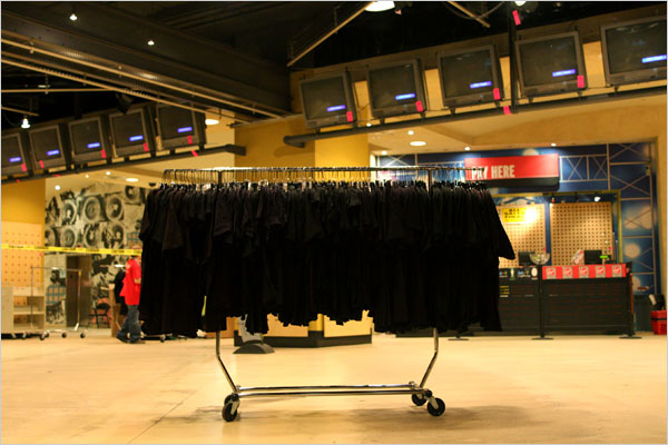
shirt-rack

Here, amid the vast emptiness of the retail floor, exists a lone rack of black Virgin-branded t-shirts, one of the last remnants of the megastore’s inventory.  The composition of this image is notable. The image of a gurney or a casket comes to mind, as the shape of the rack on wheels centers the image; the blackened televisions above suggest flatlined heart monitors.  The deceased is prepared for transport to the cemetery.  The recession has claimed a mega-victim.

Yet, what is it about the death of the megastore that gives us cause to mourn?  Our investment in consumerism is intimately tied with civic responsibility.  It is the consumer-citizen’s responsibility to tend to the dying industry, for without her attention, its lifeblood is drained.  Despite one’s best efforts to the contrary, we are all part of consumer culture.  Our roles in the culture may differ, but our commitment to capital remains constant.  While some may applaud the death of a megastore, others lament.  We all have our ways of mourning.

Interestingly, in this particular case of the store-closing photograph, we are provided a glimpse of the store’s last days.  We are allowed to witness the slow and steady death of the retail chain; perhaps we are also called to witness the death of an industry. More importantly, we are privy to the mourning process; we see human grief for the loss of commerce, exchange, goods often enjoyed in common.  The photographs ask us to consider the utility of the megastore in troubled economic times, our reactions to various effects of economic recession, and our personal relationships to consumerism.

Photograph by Jessica Ebelhar/The New York Times.

Troy Cooper is a Ph.D. Candidate in the Dept. of Communication at the University of Illinois, Urbana-Champaign.  His dissertation examines the visual rhetoric of consumer activism during the rise of modern advertising in the United States.  Troy can be contacted at tcooper2@illinois.edu.

 2 Comments

When the People Point and Shoot, What Do They See?

By guest correspondent Daniel Kim

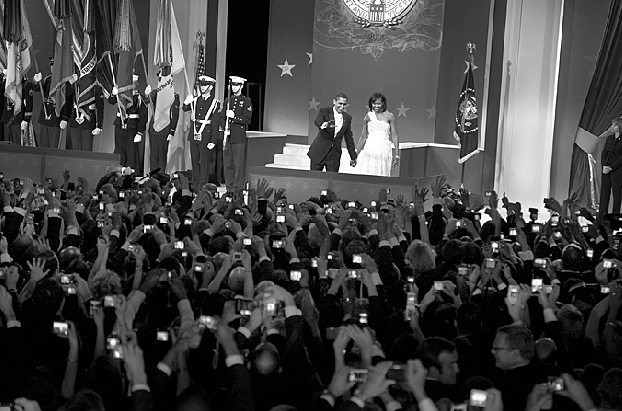
elliott_erwitt-_obamas_magnum

Peer into the small, circular opening of just about any camera’s viewfinder, and you’ll see the familiar, rectangular frame through which the photographer composes her image. There exists, however, within contemporary point-and-shoot cameras, another frame that is often relegated to the background—quite literally. This LCD frame is positioned behind the camera and it provides the photographer with an instant relay, or feedback, of what unfolds in front of her.

Photojournalists employ a pejorative term called ‘chimping,’ which denotes the act of admiring one’s own photo directly after each shot. The term is meant as a critique of the photographer who may otherwise miss an important shot within the course of his self-admiration. I do not share in this criticism, but I do want to discuss the chimping that is now ubiquitous in snapshot photography. My concern—or hope, rather—is that we can transform how we think about, and therefore, how we go about the process of looking at one another.

If we are to consider how photography can act as democratic speech—as a practice adding to the richness of citizenship—then the snapshot photographer should be capable of a degree of reflection, during the act of taking the photograph, that we have yet to witness with any regularity within the culture of everyday life.

The photo above can be read as part of a continuing critique on photography’s affair with the spectacle. But the predictability with which this phenomenon now occurs, be it at government inaugural or rock concert, reveals just how entrenched the habit of seeing through a screen becomes to those determined to capture rather than look. Taking a step back, Magnum photographer Elliott Erwitt contemplates the sight in front of him, and freezes the moment—on film. The image registers both the banality of capture and perhaps the attempt by a photographer to push the other way.

The LCD frame shares several features with the camera’s viewfinder, particularly the display of representation in real-time. But the rear-facing frame has an unmistakable resemblance to the familiar, rectangular borders enclosing what had counted as western art for centuries (i.e., that which was worthy of framing). The molded, raised plastic on the back of the camera forms a physical border, a tactile frame that cues us toward what it is that we should shoot. The framing convention of the past is now resurrected on the back of today’s common camera.

This repeated ‘shooting-and-looking’ at the ephemeral, frozen image is a two-step process that first addresses the photographic subject, and then immediately investigates the LCD frame for evidence of the photographer’s success. The photographer is now the viewer, and the viewer, the photographer. And because of the whiplash caused by chimping, the photographer now participates in a rash, malformed process—a process more interested in the ownership, or capture, of the camera’s subject than a meaningful study of another within his community.

Chimping, and the technology that enables this practice, strips away a photographer’s ritual of the past: an emerging likeness that magically appears under the red darkroom light bathed in chemically-diluted water (courtesy of Rochester). And this is not simply nostalgia. Nor is it a concession that the older craft is a better craft. Rather, the various technologies of photography can cause us to rethink, more thoughtfully, the ways in which the photographer participates in a measured exchange with not just friends and family, but also strangers we might get to know through the act of photographing.  We need not cover up our LCD screens with gaffer’s tape (as some have apparently done), but we can ask how technology leads us to look in certain ways, ways that resist contemplation and limit relationships. And we might consider how to use the same technology to see each other anew rather than as objects to be consumed.

Perhaps, we should celebrate a different kind of ubiquity–the prospect of affordable technology for the purposes of capturing loved ones, strangers, and the details of everyday life. And significantly, as argued here, we should celebrate that the shared viewing of a small LCD screen to show off images to others, enacts and instigates a sense of community. The larger point is this: accessibility need not be at odds with a reconsideration of our photographic practice.  Such rethinking can work toward the democratization of attentive, measured ways of photographing each other—looking at each other—for amateurs, enthusiasts, and professionals alike.

Photograph by Elliott Erwitt/Magnum

Daniel Kim is a former photojournalist and recently completed his first year of Ph.D. study in rhetoric in the Department of Communication, University of Colorado.  He can be reached at daniel.h.kim@colorado.edu.

 0 Comments

After Cronkite: Sizing up "The Way it Is"

By guest correspondent Elisabeth Ross.

Earlier this week, the New York Times reported the death of Walter Cronkite with the headline, “Trusted Voice of TV News.”  That sentiment was echoed in obituaries across the country, many of which also suggested that there had been a decline in the character and credibility of news coverage from the days of network television.  The Times story also included this front-page photograph:

cronkite_screen

This image of Cronkite seated in front of television monitors hardly seems noteworthy, beyond serving as a fitting visual tribute to the news anchor whose career spanned the history of television news itself.  Of course, much has changed on both sides of the camera.  Cronkite’s pose here captures a sense of the newsroom as command center, a somber stage free of the competing visual cues of contemporary media sprawl.

Consider the subtle background: barely visible behind Cronkite, stacked next to the active screen in the image, are three additional monitors, each blank, waiting for a control-room command.  In the hierarchy of the nascent television newsroom of the 1950s, man still dominated machine, and the trustworthiness and reliability of the medium rested largely in the projection of the self-assured anchor.  The era’s bulky media equipment ensured that control over media images lay in the hands of a few professionals.  In the days before the now essential teleprompter, the news is literally in Cronkite’s hands.

Most obituaries could not help quoting Cronkite’s signature sign-off, “And that’s the way it is,” a trademark phrase that, together with news show titles such as “You are There” and “See it Now,” played on the early television audience’s need to be reassured that they were experiencing something real.  Television anxiety is, after all, as old as television itself.  The medium that came of age during McCarthyism and the Cold War was prone to a paternalistic model of the authoritative screen, one whose audience–with far fewer screens to choose from–was alternately transfixed by and mistrusting of the powerful images newly anchored in their living rooms.

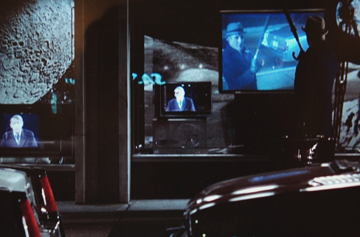
Not that there haven’t been dissenting voices.  Director Hal Ashby’s 1979 film Being There mocks the very idea that TV can bring the audience “there,” “now” or anywhere resembling reality.  When the simple-minded main character Chance Gardener, played by Peter Sellers, leaves his television-riddled home for the first time, he is armed only with his remote control.  The little hand-held piece of equipment appears laughable (and is promptly put to humorous effect by Sellers).  It soon becomes clear, however, that Chance and everyone else is already enmeshed within an enormous technological apparatus–one in which the news can never be “the way it is.”

chance_screens

In the thirty years since the release of Being There, equipment such as bulky cameras and big screens  has been augmented by powerful small technologies such as the portable, wireless digital recording device.  The possibilities for visual media experiences that could be called “You are There” and “See it Now” have grown, as has the media savvy of the viewing public, which itself is armed with increased means of capturing and deploying images through an ever-expanding variety of media outlets.

Cronkite’s death was lamented by most commentators as the end of an era in television news.  Certainly there has been a changing of the guard, not least because the public is no longer limited to the chronic mindlessness of network news.  When that change opens possibilities for increased reflexivity and citizen participation, “the way it is” can take on richer meaning, expressed by competing voices and disruptive images, meaning that hopefully reflects the complexity of relationships that in turn drives the critical consciousness of the viewing public.

Photograph of Cronkite from Bettmann/Corbis. Screen grab from Being There (Director Hal Ashby, Warner Brothers, 1979) taken on 7/23/09.  Elisabeth Ross is a graduate student in the program in Rhetoric and Public Culture, Department of Communication Studies, Northwestern University.  You can contact Elisabeth at e-ross@northwestern.edu.

 1 Comment