May 06, 2015
Mar 11, 2015
May 24, 2016
Aug 20, 2011
Jun 11, 2008
Nov 07, 2008

In the Interest of a Useable Past, Part II

By guest correspondent Patrick Wade.

As long as we are cataloging historical moments of American injustice, violence, protest, and trauma in early May–and their importance for ongoing memory-work “in the interest of a usable past”–we shouldn’t forget about the labor dimension of May Day, and its origins in the Haymarket tragedy of May 4, 1886.

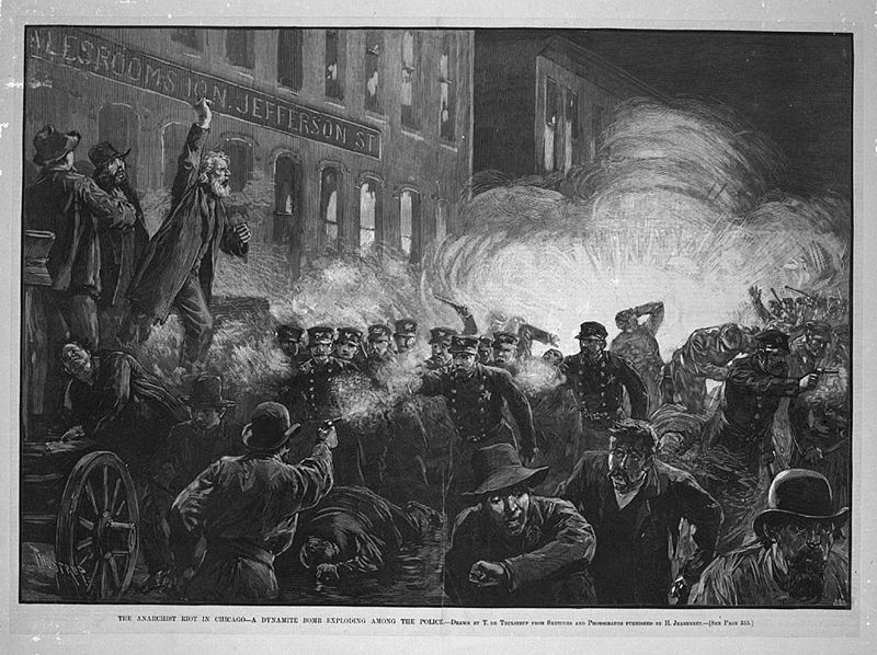
On May 3, Chicago police officers killed two strikers in a fight at McCormick Reaper Works. In response to the killing, a meeting was called by August Spies and Albert Parsons at Chicago’s Haymarket square. As the meeting was winding down and Samuel Fielden, the evening’s final orator, was speaking, 175 Chicago police officers marched on the gathering and demanded that the remaining crowd disperse. An unidentified person in the crowd threw a dynamite bomb into the police ranks, instantly slaying Officer Matthias Deegan and wounding several others. The police began to fire into the crowd, and, in the aftermath, eight prominent anarchists and labor leaders were arrested and tried for murder. Five were executed by hanging, although Chicago Mayor John Peter Altgeld would later pardon the survivors and exonerate the executed, as none of the men could be proven to have taken part in any conspiracy to murder.

On May 15th, 11 days following the initial events, Harper’s magazine published the illustration that you see above. The image–like much of the editorial commentary at the time–blamed anarchists and labor agitators for violence. Samuel Fielden is pictured exhorting the crowd in spite of the melee unfolding below him. One crowd member is shown firing on the police. The image depicts a riot, one with villains (the crowd) and heroes (the police). The illustration is composing a useable past–for the state.

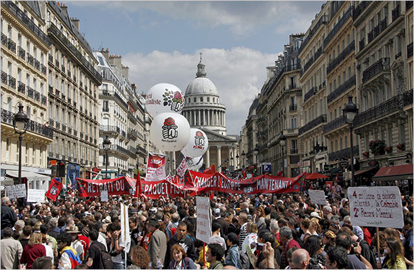
Photography’s realism doesn’t hinder depictions of “wild” crowds of protesters to paint dissent as illegitimate, blameworthy acts of violence against the legitimate guarantors of social order. We would do well to remember this as we look at contemporary news stories displaying the violent outcomes of May Day rallies across Europe. See, for example, the MSNBC.com article “May Day Turns Violent across Europe, or the New York Times article “Anger and Fear Fuel May Day Protests.”

Conventional images of protest such as this foreground the wild-eyed, long-haired, bearded anarchist as a threat to the social order. And are images like the one below, that represent the “pure” possibilities of peaceful protest, any less naive in their erasure of the inherent potential for violence in the gathering of crowds?

When the New York Times leads the online version of its story about European May Day protest with this image, the viewer is encouraged to see legitimate protest as serenely peaceful, which makes images of violent protest distressful, disturbing, and illegitimate by comparison.

But of course, we need not be trapped between these two images of protest. There is a third, democratic possibility, one that relies on a different strategy that falls outside of the play of guilt and innocence in the two photographs above.

Here we see a photograph of the community gathering together to engage in collective action to bring about change. The crowd is always potentially violent, and this is part of its strength. But this violence is always implicit, and it creates the possibility of a political demand–one that can best be represented in the gathering of bodies together in a collective, embodied argument, under a banner, in plain view of a seat of governmental power.

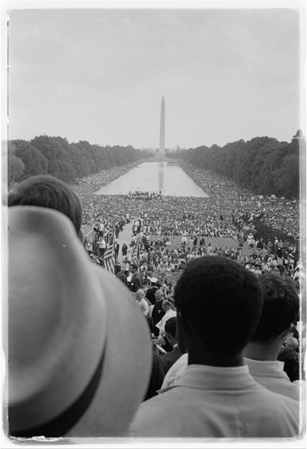
Can we not draw a further parallel to a different photograph, another image of a crowd taken from the civil rights movement in the US? One that draws upon all the aesthetic powers of photographic design to eloquently depict collective solidarity?

Yes we can.

Illustration by Harper/s Weekly/public domain. Photographs by Mustafa Ozer/Agence France Press – Getty Images; Fred Dufour/Agence France Press – Getty Images; Lucas Dolega/European Pressphoto Agency; Warren Leffler/US News and World Report. Patrick Wade is a graduate student in the program in Rhetoric and Public Culture, Department of Communication Studies, Northwestern University. He can be contacted at wpatrickwade at gmail.com.
 0 Comments

Old/New Media on Old/New Europe

By guest correspondent Elisabeth Ross

When President Barack Obama returned last week from his first official visit to Europe, a flurry of photographs documented the enthusiastic reception by a welcoming European public.  During the trip, Obama spoke of mending relationships and of the need for adjustments and self-reflection on both sides in order to rebuild an alliance between Europe and the United States that would withstand the demands of the 21st century.

The new millennium had been marked by the souring of relations with European allies under the Bush administration, a deterioration memorably accelerated by then Defense Secretary Donald Rumsfeld’s 2003 dismissal of France and Germany as “old Europe” for their opposition to the Iraq war.

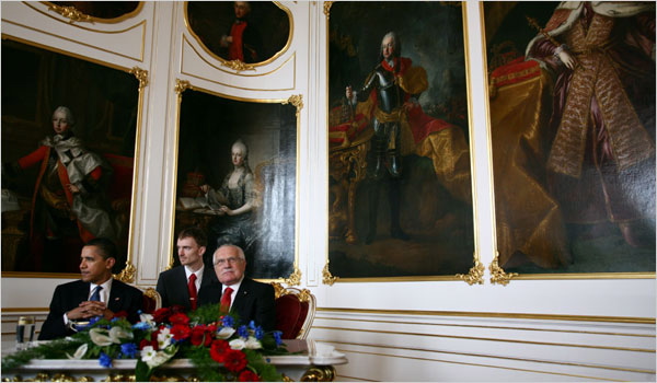
Two recent images from Obama’s trip speak to the question of an old and new Europe and to why Rumsfeld got it all wrong.

The first image shows President Obama meeting with president Vaclav Klaus of the Czech republic, a country Rumsfeld would presumably have us believe is part of the “new” Europe, given its relatively recent NATO membership.  But the two leaders, off-center and passive, are dominated in the frame by the towering portraits adorning the walls of Prague Castle.  The portraits appear to challenge the authority of the diminutive figures beneath them. These rulers from the past bear all the trappings of their nobility: from rich robes and furs to powdered wigs and armor, their imposing presence a reminder of centuries of Austria-Hungarian dominance in the region.

The new media of press photography highlights here the assertive presence of old media, and the ceremonial portraiture recalls Jürgen Habermas’ description of representative publicness, which relied on “demonstrations of grandeur”: the staging of authority and status before a public which was excluded from participation.

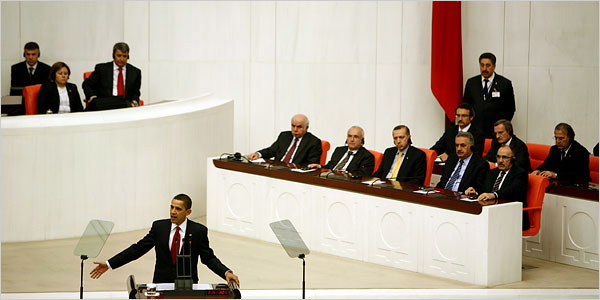
The stage is entirely different in a second image that appeared the next day when Obama addressed the Turkish parliament in Ankara:

Against a sheer white background, Obama is an animated speaker before an attentive audience; the listeners behind him reciprocate his style of dress and hold their focus on him in a neutral stance.  Even the Turkish flag, unceremoniously cropped, with its crescent moon and star hidden by its own red folds, appears deferential, as if too shy to do its work.

Whereas the past dominated the Prague photograph, here the bare walls represent a clean slate. Turkey is, after all, seeking admission into the European Union, a process begun years ago and a prospect that arouses deep anxieties among EU member nations.  Rather than emphasize a glorious past, the photograph presents the democratic basis for a new era of statehood.

Obama praised Turkey for its strong secular democracy and promised to support its bid for EU membership.  Much has been made of the so-called European identity crisis, in particular when it comes to fears over the admission of a majority Muslim country into the EU.  These contrasting images speak to how to define Europe – old and new – and, of course, other players on this stage as well.  By reading between the images, old media and new media work together to reveal the complicated portrait of a union of states which, like the US, defies simple representation.

Photographs by Todd Heisler/The New York Times.  Elisabeth Ross is a graduate student in the program in Rhetoric and Public Culture, Department of Communication Studies, Northwestern University.  You can contact Elisabeth at e-ross@northwestern.edu.

 0 Comments

War Images at Work

Today we welcome guest correspondent David Campbell.

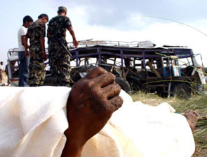
Photojournalism’s representation of war is often standardized, familiar, even clichéd. Regardless of the time or place it can seem like we have seen it before, regularly and repeatedly. But if we always approach the problem from the same vantage point – asking how the event is represented – we run the risk of missing vital dimensions and important effects of the image, as this picture from Nepal demonstrates.

This picture comes from that country’s decade-long civil war which ended in November 2006. The passenger was among 36 killed when Maoists bombed a bus near Madi in June 2005. As one of the 15,000 people who died in this period, he was an unknown statistic in what was, for the rest of the world, a forgotten conflict, an event that had disappeared from the radar even before it could be remembered.

We could read this image, which is being recirculated through a book launched at this year’s biennial Chobi Mela festival of photography, as the making visible of something we should have known about. Or it could be another testament to lives lost, marked by hands of death. Or we could see it as a further instance of the indirect marking of mass death, preserving dignity while recording loss. While such accounts provide understanding, they do not draw our attention to the larger significance of this image. If we shift our focus from representation to enactment, from meaning to work, we can appreciate this photograph for its vitality in the present rather than merely its record of the past.

As one of the 179 photographs by 80 photographers selected from the more than 2,000 submitted for the exhibition “A People War: Images of the Nepal Conflict 1996-2006,” this picture toured Nepal throughout 2008. As a book and exhibition, “A People War” contains what individually might be regarded as unremarkable images in the global archive of war photography. Its catalogue of uniformed guerrillas, grieving widows, destroyed infrastructure, damaged individuals and mobilizing soldiers could, by themselves, have been drawn from any number of conflicts. Despite the editors desire to forgo showing unvarnished violence (hence the photograph of the bomb victim’s hand), there are pictures that shock, especially those that record the lynching of a teacher and journalist.

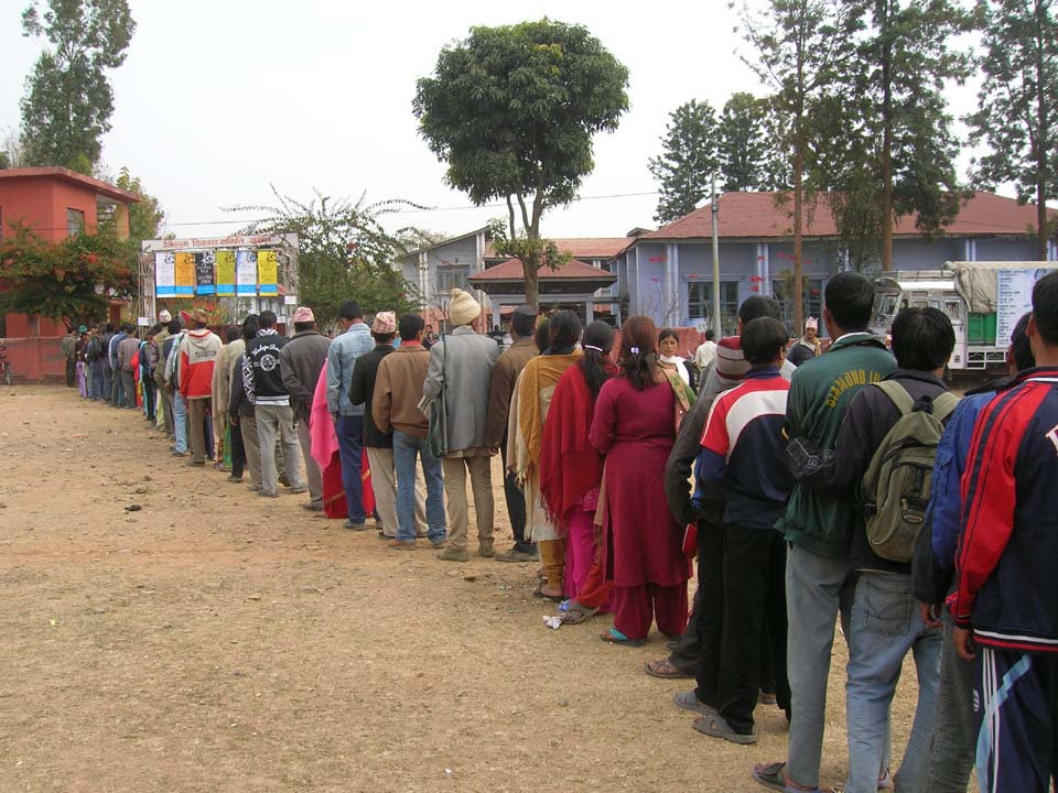
If, however, we view the images collectively and ask ourselves what work they are doing through the book and the exhibition, then they become something quite remarkable. Being shown within a year of the war’s end, this collection is an act of raw experience, a detailed encounter with what the conflict’s participants and victims have suffered so recently. Nepalese responded to this act in large numbers, with more than 350,000 people queuing to see it in 30 towns across the country – as in this picture from Surkhet. With thousands of free copies of the book distributed to public and school libraries across the countries, and a Nepali language budget edition made available for widespread sale, the organizers have ensured the photographs the broadest circulation possible.

People did not just look at the pictures. They engaged with the photographs. Mothers looked for evidence of missing family members, soldiers faced the consequences of their actions, and children witnessed what the future could be like if politics did not triumph over violence. To this end, the exhibition is also a warning to a fragile country. It functions as a statement in defense of the new federal republic, using the photographs to speak of a time to come, declaring that even if that future is not yet capable of being pictured, Nepalese know only too well what it could look like.

Photographs by Kumar Shrestha and Kirin Krishna Shrestha/nepa-laya. A gallery of additional images of the exhibition is available here.

 2 Comments

The Family Photograph

Guest post by Aric Mayer.

Over the past three generations, the volume of images casually generated out of family life has increased exponentially. From the early 1900s when the Brownie camera made photography something that can be practiced easily, families have made records of important events and people, hoping perhaps to create traces and artifacts that can bind the past into the present, keeping time from marching away. There is also the strange paradox that occurs as we stage current events in order to photograph them so that we can look back at a future time and see them again. We perform for a future audience of our selves and our friends, rewriting history as we live it. As film and now digital technologies have developed, the ease and number of these types of images has gown. It is hard to know what the final impact of this flood of visual information will be on the next generation.

Exactly eighteen months ago my wife gave birth to our two children Laszlo and Chloe. In our short year and a half as a family there is already the sense that time and events are forever passing—the first tooth, the first steps, the first words … every week seems to bring another first, and with it comes loss. The temptation is there to record everything, to make an effort to translate life into a document that we can hold and thereby inoculate our selves from the losses that time brings.  That would be impossible, of course, but it doesn’t stop me from trying, as in the process I have accrued 20,000 photographs of our personal lives together.

I recognize that when I am photographing, I am not simply recording events, but rather am converting them into frozen dioramas that do not necessarily recall the moments that they come out of. It is entirely possible to make a beautiful picture in the middle of crying and chaos. Likewise visual chaos can be made out of the mundane.

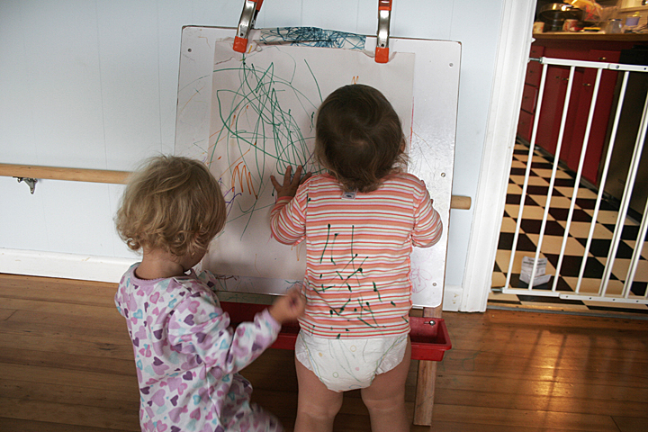
The photograph above is one of my favorites. Laszlo is drawing on paper. Chloe is drawing on Laszlo. And I am converting the scene into an image that frames them in that moment, creating a drawing of my own. It speaks to the multiple ways that we as families leave un-erasable marks on each other at so many levels. 

The taking of family photographs is not simply a way of stopping time or recording the present for future consideration. It is also a way of organizing how we see ourselves. After a day with my children, I still on occasion set up a slideshow on my computer and watch my photographs from that day for half an hour or more. Even though I was with them in person for the day, the photographs bring something different than our relational interactions. These images are also about me. Not in a narcissistic sense, although we must be careful how heavy handed we are in shaping our children’s images of self. These pictures contribute to how I see them and to how I organize my understanding of their place in my life. Included are pictures of the crying, scrapes and bruises, bad days, the other half of the picture. It is an intensely personal body of photographs. And by the time my children are in their early twenties, they will inherit hundreds of thousands of these images. Along the way I will select a few thousand that stand out for me. Who knows what these will mean to them? What will we even do with such an amount?

Editors Note:  The National Gallery of Art hosted a show titled “The Art of the Snapshot” in 2007.

 1 Comment

A New Aesthetic of Patriotism

Guest post by Marita Sturken

Of the many seismic changes signaled by this election, one is surely a change in the aesthetics of American political culture. Not only is Obama telegenic in a way that we have not seen in decades, but the aesthetics of his campaign and of the image economy that emerged around his candidacy signal a new kind of aesthetic, one that is embedded within a contemporary image culture of pastiche, play, and savvy image-making.

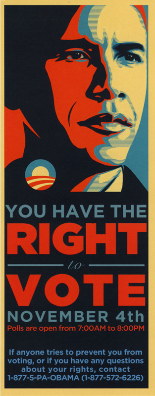
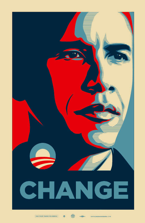
Let’s take, for instance, this flyer, which was handed out by volunteers in Pennsylvania in the last get-out-the-vote push (it was created by the Pennsylvania Democratic Party, not the Obama campaign). The flyer has a very specific informational intent (its reverse side gives information about voter rights and explicitly counters the misinformation campaigns intended to confuse voters), yet it is a strikingly visual document. It is derived from a poster that was made in support of Obama by Shepard Fairey, a street artist who became know for his Andre the Giant graffiti in cities such as New York, who has since made his name through a clothing line and his Obey Giant logo.

Fairey is emblematic of a new kind of cultural producer, at home with commerce and cultural politics simultaneously. In the new edition of our book Practices of Looking, Lisa Cartwright and I analyze the widely circulated Fairey-Obama posters (one features “Hope” and one “Change”) as both evocative of the historical image of JFK and as deploying the visual style of graphic poster design used by the Bolshevist agitprop artists of the 1920s. The graphic newsprint-like reproduction gives the work a sense of political urgency, playing with the idea of the image (and political figure) with mass appeal. The aesthetics of the image convey the spirit of progress and hope experienced both in the early Soviet context and in the Kennedy era. Contemporary viewers might be expected to read the poster’s graphic style as evoking a very modern kind of hope and optimism recoded within a savvy postmodern culture. The elegance of the poster is worth noting, with its deployment of a blue that is lighter than the stars and stripes blue, and a yellow warm tone—evoking yet not fully using the conventions of the red, white, and blue.

Of course the Obama logo (seen on the flyer) has already received significant attention (it’s been referred to as the “hardest working presidential candidate logo”) with its clever play on the “O” of Obama with the image of a sunrise evoking change, and its color scheme subtly signifying patriotism and the flag. Simple, evocative, smart. It was designed by Sol Sender of Sender LLC in Chicago in collaboration with mo/de, and was used in highly adaptable ways in the campaign. This week’s post-election coverage signals that the “O” will be played with throughout Obama’s tenure in office in headlines, political cartoons, and images (see, for instance, the cover of this week’s New Yorker).

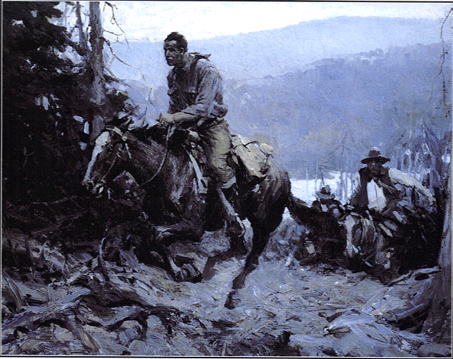
It was amusing to hear that when Bush showed Obama the Oval Office for the first time this week, he took him on his standard tour of the kitschy artifacts in his personal collection on display there (one can see this tour on the White House homepage). Presumably the tour included his painting A Charge to Keep, which depicts a lone cowboy riding his horse up a hill followed by a pack of riders, an image from a pulp cowboy story about a thief fleeing a posse that Bush had mythologized as the lone “determined horseman” who has a “difficult trail.”

One can only imagine the aesthetic disconnect the president-elect might have felt in that moment, and perhaps in quietly “measuring the curtains” he might have considered for a moment what kinds of images he would take with him to the White House.

Sidney Blumenthal has written on Salon.com about the “peculiar aesthetics propagated in the age of George W. Bush” with its “contradictory styles of softening nostalgia and hardening cruelty.” Blumenthal saw the Bush kitsch as a rejection of the Reagan-era kitsch of patriotic sentiment, stating that “under Bush, kitsch has been transformed from sentimentality to sadomasochism.” The kitschy (and brutal) cowboy aesthetic of the Bush Administration has finally run its course, and a new aesthetic, one that rejects kitsch for a nuanced play off the visual codes that evoke America, is emerging in its place.

 5 Comments

Obama, Aesthetics, and the Way Forward

Guest post by Aric Mayer.

Let me just come out and say it. Barack Obama’s landslide victory on Tuesday is the greatest moment in politics for my generation. This is the fifth presidential election that I have voted in, and it is the first where I feel as though the country is being moved by the collective will of its younger citizens. As an eyewitness to many of America’s great domestic tragedies over the past eight years, this election affects me deeply and I can’t write outside of the relief and hope that it brings.

With that said, all is not champagne corks and confetti.

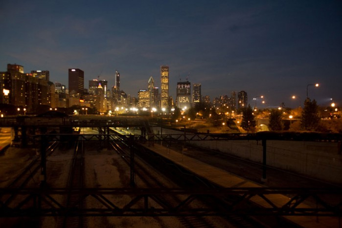
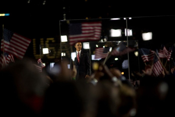
I want to draw your attention to two images by Alan Chin taken in Chicago at the Grant Park celebration where Barack Obama gave his acceptance speech as president elect.

Here the viewer stands alone while looking out over empty railroad tracks at Grant Park with the Chicago skyline spreading across the horizon. In the distant center, the letters USA are shining off of one of its buildings. As a symbol, a city represents the best of human cooperation and achievement. There is promise ahead. And it is going to take real work to get there.

In his acceptance speech Obama looked tired and sometimes grim. He knows what is ahead. Obama has often quoted Reinhold Niebuhr, the moral philosopher who wrote about the destructive nature of power and how it is sometimes necessary to use it even as it corrupts you. Obama inherits two lengthy and costly wars, the near bankruptcy of our own domestic policies, an American economy in free fall and a world economy that appears to be teetering on the edge of the unknown. But as dark as this may seem, the alternative was even darker. John McCain’s last efforts at character assassination and fear mongering left him in the isolated position of having nothing to win but a completely fractured constituency.

The election on Tuesday was won in part through the unprecedented turnout of minority and young voters. It ultimately came down to a contest between the nuanced, hopeful and inclusive pluralism of Barack Obama and the entrenched fears of a segment of conservative white working and middle class voters that was the final platform of John McCain’s candidacy. In contrast to the fear being spread by the McCain campaign, Obama focused on statesmanship, policy and the choice of pragmatism over idealism in forming a new government in America. In a theatrical paradox, while drawing huge crowds Obama frequently played down the drama to the extent that newspaper editorials began to call him boring.

What was happening though was not boring at all, but was and is a ground shift towards pluralism, nuance and complexity with aesthetic consequences. As Obama’s campaign traced its arc from the Democratic Convention until Tuesday night, he clarified his message by moving away from the inflammatory and the incredible and towards the gritty and the pragmatic. To live in a multidimensional society we must recognize that while our own positions are uniquely ours, they do not make up the entire country. The post baby boomers who had such a powerful impact on this election have been accused of self absorption and narcissism, frequently by baby boomers themselves. But there are advantages to self absorption within context, for it reveals the limits of self. It helps to know oneself in order to make room for one who is unlike you. At the heart of this is an acceptance of the “other” and a grass roots rejection of fundamentalist divisions along ethnic and racial lines. What is emerging in America is a more truly plural constituency. At the same time, the depiction of the American Dream as a place and an experience where you can have it all is being replaced by pictures of collapsing markets and a very uncertain economic future. The Great Depression and the New Deal brought us documentary realism. It remains to be seen what will emerge for us out of the current growing crises.

In the second image, Obama is surrounded by waving American flags. It is a triumphant moment, framed by reminders of danger. The bullet proof glass is already in place. In the back left the letters USA appear on an electronic ticker, the same lettering that streams up to the minute data of the market turmoil. There is a balance of hope and realism.

We need to cultivate this balance. Obama wrote it into his speech. While warning us of the difficulties ahead, he still took the time to remind us that there will be children and a new puppy in the White House. A new generation in American politics begins.

A complete slideshow of Alan Chin’s images from Grant Park on November 4 is available at BAGnewsNotes.

 3 Comments

What We See and What We Know

Guest post by Aric Mayer.

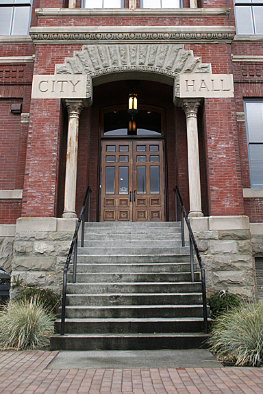
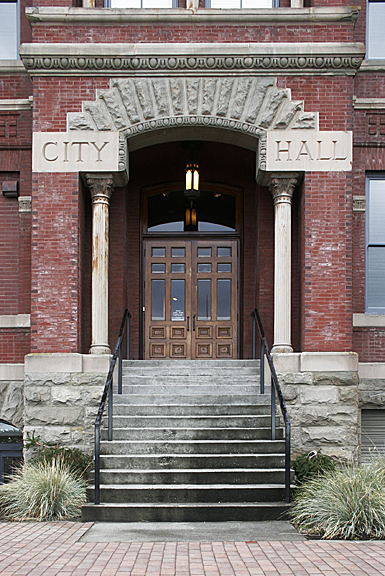
Consider for a moment these two mundane photographs taken this morning. In their differences lies a subtle insight into the Western mind.

In the first image, the columns and porch are recorded looking up with the vertical lines receding away from the viewer and converging somewhere in space off the top of your screen. For the second image I have corrected this so the vertical lines are parallel. In both the brick in the foreground creates receding lines that emphasize the horizontal space moving away from the viewer. For the purposes of this post I will skip the technical means by which this is done in camera and instead focus on what this means for how we see.

To understand this better, let us travel back in time to the early fifteenth century when there comes into painting the theory of two point perspective. This opens up the world for realistic depictions of a single point of view. For the first time space is rendered as though it is being seen through a single eye, rather than through the multiple viewpoints of the previous ages. It is architecture that makes this possible, for the theory of two point perspective relies on the understanding that the world, or at least the man made world, is made up of parallel lines that remain equidistant from each other in reality and in perception appear to converge as they recede away in space.

If you spend time with paintings from the Renaissance to Modernity, you will see that the sophistication of the way space is rendered as it moves horizontally away from the viewer grows. But almost universally the vertical axes remain vertical. This corresponds to how we know the world to be. Up is up and down is down. But this is not how we see. If you stand at the base of a tall building and look at its middle, you will not see it as a rectangle, but more as a cone where the top is much smaller than the base. The vertical axes are not
straight up and down. They conform more to the way space is rendered in the first image.

Optically speaking, vertical axes are possible only when our eye is pointed directly at the horizon, thereby creating a balance between earth and sky, with each occupying an equal amount of perception. In this case the viewer is visually located between the two. To experience this personally, stand near the base of a tall building and look through the building towards the horizon. You will perceive with your peripheral vision that the vertical lines of the building above you do not converge but go straight up as we know them to do. The ground will also occupy about the same amount of perception as the building does. Perceiving vertical axes seems to ground us with a sense of balance.

Consider again the above images. The first image seems to dominate the viewer, looming slightly while the second is arranged in the picture frame in balance as we know the building to likely exist. The feeling is subtle but distinct in its difference. As you look at photographs, pay attention to how these axes are recorded. They can be manipulated to create different senses of space and feeling within the image.

 0 Comments

Underground Democracy

Guest post by Aric Mayer.

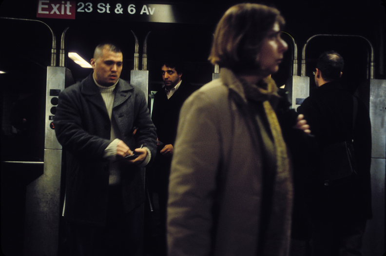
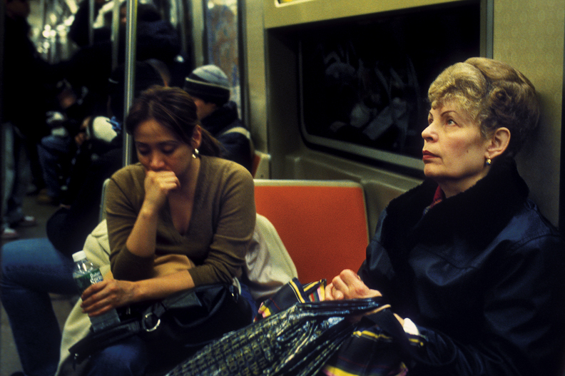
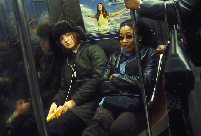
New York City is one of the greatest cities of the world, and certainly is one of the most integrated and diverse.  Here you can find all cultures and all ethnicities practicing their own heritages side by side.  People who in their homelands are at war with one another here manage to find ways to coexist.  This coexistence is exhibited best in New York City’s Subway.

When the train doors close, instance and ephemeral communities are formed.  Status and power do not buy you a seat at rush hour.  On an average weekday five million riders board the train, and whether rumbling along in the darkness of the tunnels or the daylight above, community standards are created and enforced by proximity.

In an age of internet associations across geographic lines, it is becoming easier and easier for communities to form, communicate, share ideas and reinforce each other’s belief systems. The internet has the promise of a great Athenian experiment in civic discourse. Unfortunately the trend seems to be that people are increasingly able to seek out and congregate only with others who are like them, and diversity, once the great possibility of the internet and the fundamental promise of democracy, suffers, replaced by a stultifying homogeneity.

And yet, by contrast, the New York City Subway is the great leveler of class, ethnicity, and virtually any other form of difference and distinction.  It encourages the daily practice of tolerance and cohabitation among millions of users.  And by doing so  it has become a gritty sort of civic square where all, for a time, are mostly equal.

Many pictures of democracy in action will be offered over the next weeks as we lead up to one of the most important presidential elections in recent memory.  And many of these will be grand visions of power and triumph.   In the midst of this, let us not forget what a great jumble of people we are.  And democracy is a messy business, worked out in the daily act of differing peoples coming together to work out their differences — or just to live with them.

 0 Comments

Environmental Transformation

Guest post by Aric Mayer

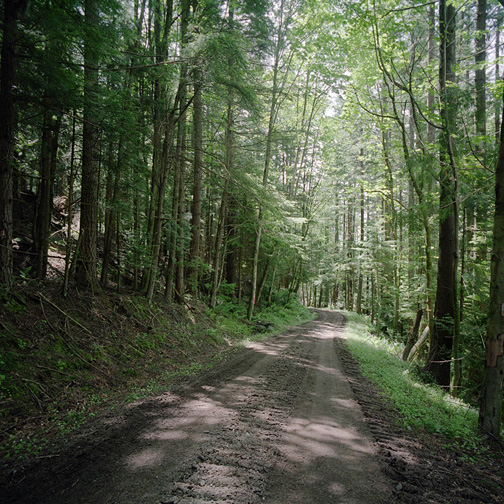
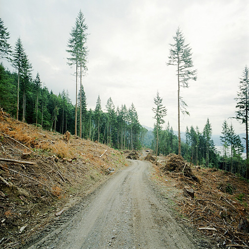
For the past few months I have been following a logging operation that is taking place within the watershed of Bellingham, Washington. High up on the hillsides above Lake Whatcom, the timber rights for public land are sold off and the trees are cut in commercial logging operations. There are many obvious problems with logging within one’s watershed. Erosion and habitat destruction are two.

There are also difficulties in visually communicating environmental transformation through photographs. Visual drama is easy to catch. It is the long, slow passage of time that pictures cannot easily touch. Cinema is a medium better suited to constructing a narrative. Photographs are fixed and therefore are unchanging. There is no passage of time within an image. Because of this, though, it is possible to see into two places in time simultaneously. The effects can be jarring, especially when it is the same place in two radically altered states.

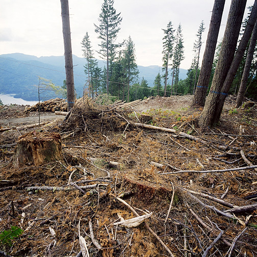
The first picture above is a view of a healthy middle-aged forest. In another 20 years, the trees would have thinned out, with the stronger trees thickening and growing taller, pushing out the weaker in the quest for sunlight, and the weaker trees falling and contributing through their decay to the life of the forest floor. In the second image, taken some weeks after the first, the forest is completely destroyed in a commercial logging operation. For a decade this will be almost entirely uninhabitable land. With no trees to impede the sunlight, brush and weeds will rule. Then, slowly, birds and animals will return again to find habitat in the returning trees.

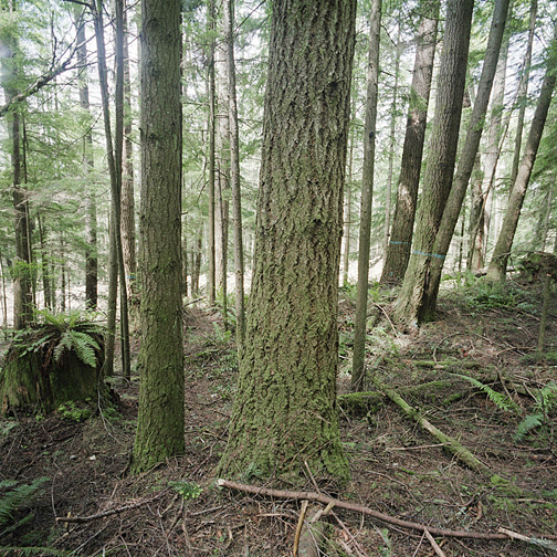
In this next pair of images, we first see trees in the foreground in a healthy forest. In the second image they are gone, cut down, dragged away, stripped and stacked on the pile of logs in the background waiting to be sent to the mill. The three less useful trees with blue painted bands in the upper right corner anchor both images. The green life has been stomped out of the foreground. Only broken branches and debris remain.

Not only are these images a record of the passing of a forest, but they are also competing visions of success. Progress in the first images takes decades to achieve. Progress in the second can be reached in just days. There is an obvious question of values here. Many of us may not be alive long enough to see this forest return. On a planet with looming environmental crises, how much cheap lumber do we need, and at what expense?

 1 Comment

The World in Miniature

Guest post by Aric Mayer

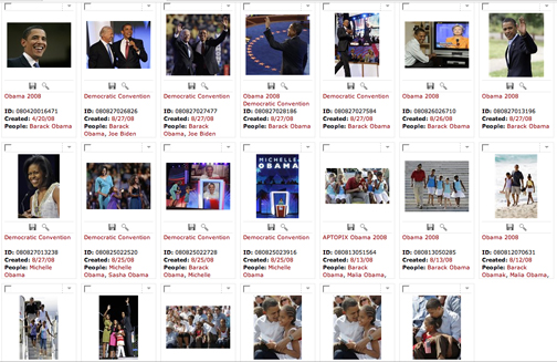
A page on the AP photo website, where a search for “Obama” yields 20,652 publishable images, or 1,033 pages just like this one.

A former colleague of mine is a photo editor at a weekly magazine. In the normal course of her job she edits a section that requires her to review up to 18,000 images a week to publish fewer than 20. Most of this editing takes place over the course of two days. As she goes through these images that are coming in off of the open wire, she knows that her competitors are looking at the same images as well. If she misses one great image that is picked up by another magazine, there is going to be some answering to do. Talk about pressure. There is a kind of marathon quality to the performance. I’m not even sure the human brain has evolved yet to handle this much volume in visual stimuli.

The technical way that almost all photo editing gets done these days is through editing programs that allow hundreds and thousands of images to be searched for by keywords and then browsed through as thumbnails. See something you like, double click on it and you get the full size preview. And here is the limiting factor. Almost any image going through this system must have some appeal as a thumbnail or it is almost sure to be overlooked. In other words, if your image doesn’t look good at one or two inches on a computer screen, it isn’t likely to make it through the editing process at all.

Due to the volume that editors are handling under tight deadlines, this is a necessary evolution. It also is a great limiting factor on the kind of work that gets published. Loud, colorful, graphically dramatic work tends to win the day. Quieter, more complex work has a tough time competing on this level because it doesn’t work at that size and in that format. We can look to another related medium, painting, to see more clearly how this works.

An early lesson that a beginning painter must learn is that scale and format really do matter. Before a painting begins, the shape and size of the surface have to be determined, and those decisions will influence the effect of the painting right through to its completion. The next lesson is that painting a larger painting is not at all like making a small painting. Increasing scale changes everything.

On the larger scale, detail at the surface level is the same only there is a lot more of it, and to make an integrated piece the detail must be related to the entire piece. Which is to say that making an 8 foot by 10 foot painting requires approximately 144 times the attention to detail than an 8 inch by 10 inch painting, since the larger painting has that much more surface area.

But, making the larger painting is not like making 144 of the smaller ones, because the entire surface must come together to make a whole. All the ingredients, including the scale, must be necessary for it to work.

What does this mean for photography? Making a bigger photograph is very different than making a smaller one. Scale matters, but the ingredients in the photograph must require that scale in order for it to be necessary. There must be sufficient detail, resolution, and interest in the photograph to hold up at scale. Since venues for larger images are shrinking while smaller images get into distribution easily on the web, the aesthetic of the thumbnail is winning the day.

Consider also the tonality of the image. Printing photographs on paper is a master craft, as is making color separations for CMYK printing in magazines. In each case, the final viewing experience is largely under the control of the printer. Not so on the web.

A few years ago I went to the opening of a gallery show exhibiting some recent photojournalism. Many of the images were familiar from their appearance in popular magazines. What was surprising to me was that the images, printed at 30×40 inches, in many cases appeared to have less impact at that size than they did at full page and double truck sizes in the magazines. On the wall they started to fall apart. The scale wasn’t necessary for the final object.

Years of working in 8.5×11 or 11×17 as maximum scale had made those photographers maximally effective in that format. With one notable exception–all work shot with a Leica on black and white negative. The grain just got sexier as it went up in size. The compositions were tight and the teeth of the film carried through. Digital images blown up past their prime need real help to make it. They tend to lose surface appeal.

The web is one of the easiest ways to distribute photography and it is one of most limiting ways to view it. Almost all of the problems I have detailed above play out over the web. Images have to be small to be viewed properly. There is significantly less detail in most computer monitors than there is in a finely made print. Each step of the way something is thrown out. By the time the image reaches you on the other end of this computer exchange, it is but a shadow of its real self– the final, beautiful, nearly perfect print.

 4 Comments