Feb 22, 2013
Jun 13, 2010
Dec 02, 2007
Jan 05, 2009
Jul 20, 2012
Feb 03, 2012

NCN Celebrates Sixth Birthday Party

 Laurel_Hardy


We even got dressed up for this one.  And once again it is a time to say “Thanks” and to take stock.  Thanks to all our readers, and not least to those who comment on the posts.  If anyone would like to give us any advice about the blog itself, now is a good time to do it.  We can’t say we’ll follow that advice, especially given our limited resources, but it always is appreciated and sometimes one thing can lead to another.  You can comment below or email us at rhariman@gmail.com and lucaites@indiana.edu.

We won’t be posting for a few weeks, but we will continue to read our mail and hope that you will return on July 8th as we start another year at NCN.

 1 Comment

Photographic Mood, on the Eve of Destruction

You might say that this image is all too conventional: the people’s hero bravely taking a stand on the barricades, right out of Les Miz.  Of course, it’s much better than that, but why?

Protests in Istanbul

All the elements of the Revolution in the Streets script are there: the people milling about (check); smoke from tear gas or guns (check); trashed furniture and other stuff piled up as a barricade (check); the hero at the center of the barricade (check); the standard held high precisely as the hero is being sacrificed (check); what’s not to like?  Well, someone might say, “He’s a real human being actually putting his body on the line.”  OK, but we knew that, and the drama never was entirely in the image: politics itself is a mode of conflict before spectators, and if you take away all the conventions of presentation, the scene becomes aimless, meaningless, incapable of being seen as action of any sort.  Like any photograph, this image has to draw on conventions of social behavior to be intelligible at all, and like many photographs it might be artfully compressing and coordinating those conventions to say something to a public audience.

But what is being said?  We can’t settle for something as banal as “Protestor waves a flag in Istanbul,” or even the more dramatic “Protestor waves a flag in Istanbul while being gassed.”  Let me suggest that two reasons I think this photo stands out above many others.  The first is the way that the man is framed, not by other protestors or the police, but by the wreckage being created by the conflict in the street.  Instead of merely becoming a symbol of The People, we see that he actually is having to contend with the destruction of his environment.  (Indeed, the willingness to accept that destruction is one sign of how fed up people are with the deeper destructiveness of the regime.)  While holding up the flag and covering his contaminated eyes, he also has to step carefully, each foot on a different level, obstacles that could trip him in every direction.  More to the point, the photo may be prophetic: suggesting that, as with other revolutions in the region, this one will end in the Pyrrhic victory of regaining one’s country only to find it gutted, looted, and reduced to rubble.

One need not come to that conclusion, of course, but the second distinctive feature of the photograph provides a context for doing so: now I am referring to its amazing color.  It’s much easier to see than describe, so look again.  Neither quite color nor black and white, it seems to create a dimension halfway between documentary reportage and artistic reflection.  Color can provide tone (in oratory, the speaker’s sense of the situation), and mood (the emotion offered to the audience as a means for thinking and feeling along with the speaker).  The tone here seems both candid about the dire situation and yet willing to believe in the cause.  The mood seems almost elegiac, as if they have already lost but should be remembered nonetheless.

To appreciate more fully what has been accomplished, let me briefly bring in another photo.

Lee Chong Kuang, scrapped supertanker

Amazing, isn’t it?  One might think that all these two images have in common is their similarity in color, tonality, and mood.  Or one might feature important differences: say, that the second places human action within an expansive natural tableau where serenity will persist long after these small creatures called humans have passed through the scene.  Either way, the comparison could be faulted for trivializing the political action in Istanbul.  That, however, is not what I have in mind.

Consider instead that the second image can extend some of the strengths of the second.  It can slow us down a bit to think more carefully about the nature of change. Note also that both images feature wreckage (the looming hulk is a supertanker being cut up for scrap in Bangladesh).  Perhaps wreckage is our lot, and therefore no reason to avoid change.  And perhaps regimes, no matter how large and powerful, will all one day be cut up for scrap.  (They will, as they always have.)

Perhaps the scripts don’t change much, but that need not determine how we feel about them.

Photographs by Daniel Etter/Redux and Lee Chong Kuang/National Geographic Traveler Photo Contest.  Etter’s photo was included in a guest post earlier this week on viral images in Turkey; Time Lightbox provides more on the photo here.

Cross-posted at BagNewsNotes.

 1 Comment

Those Who Forget the Past …

Jim Corw.2013-06-09 at 8.30.30 PM

The above photograph pictures a sluice of life in Mobile, Alabama in 1954. I don’t know who saw the photograph in 1954 or how they might have interpreted it, but it is hard to imagine that one would not have been affected by the ironic tension between the image of an elegantly dressed African-American woman and her niece, shot in “living color”—a  rarity in 1954—and the neon sign to a movie house marking the “colored entrance” and designating a stark difference between black and white.  However one might have received and engaged the photograph when it was first produced there can be no questioning the fact that the scene that it depicts serves as an aide-mémoire to a critical moment in the American experience to which we are all heirs, a collective past that we ignore or repress only at our national peril.

Of course, Jim Crow segregation was not only a southern phenomenon—I remember seeing “colored only” beaches at Asbury Park, New Jersey when I was growing up in the 1950s—but it certainly had a home in Dixie where it was aggressively defended in the name of “states rights.”  And from this perspective the photograph is a vivid and eloquent reminder that there are times when “home rule” and a parochial localism need to be governed by a more capacious moral compass, not least when human and civil rights are at stake.

It is this last point that bears special attention today as the photograph was recently printed in the NYT along with the reprise of a series of similar images shot by Gordon Parks for an issue of Life magazine originally published in 1956.  What makes it especially pertinent is that the Supreme Court is about to rule on a number of cases concerning the constitutionality of gay and lesbian marriages and legal unions. Many are arguing that such decisions should driven by local interests under the rationale of states rights.  Of course, it was not so long ago that the cultural logic that warranted the “colored entrance” sign in the photograph above also proscribed interracial marriage as an unnatural act of miscegenation in many states.  That changed in 1967 with the Courts decision in the case of Loving v. Virginia.  One needs only to ponder the photograph above and the legacy that it gestures to, both past and present, in order to understand why the Court needs to guarantee the civil right of gay and lesbian couples to marry and join in legal union.

Photo Credit:  Gordon Parks/Gordon Parks Foundation

 0 Comments

It Can’t Happen Here

Civil War Austerity.2013-06-02 at 9.05.22 PM

There is no shortage of photographs of riot police containing protests against austerity measures instituted by various countries in the European Union, from Germany to Greece, Italy, Portugal, Slovenia and beyond, including most recently Turkey, which has made application to join the EU.  And there is nothing particularly distinctive about the vast majority of these images as they pit generally youthful and bedraggled unemployed protestors against state security forces dressed in black riot gear that might well be the late modern version of medieval armor, prominently wielding riot shields, batons and tear gas grenades.  The conflict marked by these photographs is altogether generic and but for the occasional signage in Greek or French or Slovenian they are all interchangeable with one another.  They could be anywhere in Europe, a feature that contributes to naturalizing the image as it signifies an “other” world wholly distinct from the US.  And at least one implication is, “it can’t happen here.”

The photograph above caught my eye because despite the fact that it is similar in many regards to the numerous other such images of European austerity protests it is distinctive in one important respect that warrants our attention.  Shot outside the Parliament of Catalonia in Barcelona it shows Spanish police forces advancing on Spanish firefighters with their riot batons raised.  What makes this image distinct is not so much the aggressive stance taken by the police—as disturbing as the poised baton, ready to strike, is—but the fact that they appear to be attacking other civil servants who are also sworn agents of the State.  In short, we are not just witnesses to an instance of civic unrest;  rather, we are spectators of  a more profound, extreme civic disorder that borders on something like mutiny or perhaps even civil war.  Put simply, we are viewing the State fighting against itself in a manner that challenges the very legitimacy of whatever it is that the police officers are “defending.”  One can only wonder how long a State can persist under such conditions?

Austerity hounds in the US have faced a number of strong challenges in recent weeks stemming from the fact that the economic scholarship which presumed to ground their case has been proven to be seriously flawed.  This has not stopped them from repeating their mantra, that “we don’t want to end up like Greece or Spain.”  There are good reasons why the fiscal crisis in the US is different than that in the EU and thus the analogy doesn’t apply all that directly. That said, the photograph above suggests one of the potential risks of too austere a response to the recession that we certainly don’t want to see in the US.  We probably don’t face a strong likelihood of this happening at the present moment as unemployment and other signs of large scale economic improvement like housing prices seem to be rebounding—albeit at a snail’s pace; but if those pushing for something on the order of the Ryan Budget in the House were to get their way it is not impossible to imagine how a growing number of “have not’s” could be pushed to the outer limits of their ability to sustain themselves.  And if that were to happen images very much like the one above might become more than just a bad nightmare, giving a different meaning to the plaint that “we don’t want to end up like Greece or Spain.”

Photo Credit: Paco Serenelli/AP

 0 Comments

Reflections on a Scene (or Two)

Screen shot 2013-05-19 at 8.49.44 PM

We don’t write about sports very much here at NCN and today will be no different.  After all, what is there to say here.  The photograph pictures the Miami Heat’s  four time MVP LeBron James about to take the Chicago Bulls’ Jimmy Butler to the basket.  The only suspense is whether it will be a three point play or not.  No, what makes this photograph notable has almost nothing to do with the actual action taking place and everything to do with the way in which the camera has captured two scenes at once—one on top, the “real” scene, and the other, on the bottom, a reflection from the highly polished floor.

Of course, one might argue that this is only one scene, the inverted image on the bottom a natural extension of the top image.  And that would be true also.  The question, really, is how one wants to “read” the image.  We typically think of a mirror reflection as an inverted but otherwise identical (re)presentation of the original.  It is one of the reasons we are so often challenged to “look at ourselves” in a mirror, so as to see what is “really” there, or at least what others purport to see  But here, while the original and the reflection bear enough points of similarity that one might identify them as the same scene, they are not identical.

The top image is sharp and clear, consonant with the photojournalists avowed dedication to the realist aesthetic that purports a sort of mechanical objectivity—everything to scale, the light natural, the natural plane of the image represented as if one were actually there witnessing it. The bottom image has more of the quality of an impressionist painting, the appearance of thin brush strokes that call attention to texture, especially as it relates to human movement; emphasis on the quality of light as it effects the scene; and finally notice of the unnatural angle that resituates the viewer, underscoring the sense in which what we are looking at is clearly a representation that needs to be decoded and not the thing itself.

The effects of the image and its reflection are different as well.  Note, for example, how the realist image locates the contest between James and Butler in a multiplicity of scenes that first calls attention to the game itself as we see the coach calling out orders and other players positioning themselves to respond to the central action, and then calls attention to the immediate crowd watching the event.  The focus is clearly on the two principles, but they are part of a larger event.  By contrast, the impressionist image focuses our attention almost entirely on the central actors, giving them an almost epic significance, everything else cast with a spectral patina that suggests that they are both there and not there (perhaps like the external viewer of the image).

Whether you see one scene or two either (both) is (are) shot with the same camera, with the same aperture, from the same vantage point, and at the same moment in time. And yet what we see are two potentially and palpably different (albeit related) events, each calling attention to the otherwise taken for granted conventions that underscore both what is present and what is absent in the other and thus animating the possibilities of meaning.  What makes the photograph particularly interesting then is how it schools the viewer concerning the everyday necessity of visual literacy, always “reading” an image, not just glancing at it, seeing it for what it always is: an artistic construction.

Photo Credit:  Mike Ehrmann/Getty Images

 1 Comment

When Words are Photoshopped

Yet another prize winning photographer has been accused of visual deception.  Subsequently, Paul Hansen’s World Press Photo of the Year passed the forensic review that was set up hurriedly–by WPP–to address the scandal, but it has become clear that the image was substantially “improved” in post-production.  All commercial photos are enhanced, and few news photos have ever appeared without some artistic manipulation, so there is at the least a sliding scale involved.  At some point, however, art becomes deceit, and with that the integrity of the press as an institution is at risk.  Thus, the press needs its own watchdog, and from the beginning of photojournalism there have been those who were happy to question whether the images in the news were telling the truth.

I’m fine with that, but what I don’t get is why captioning so often gets a pass.

Mideast Israel Palestinians

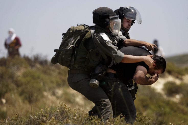
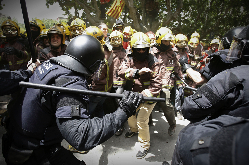
This photo was captioned by Time as, “April 30, 2013. Israeli security forces arrest a Palestinian man during clashes with Jewish settlers, left background, near the Jewish settlement of Yitzhar, near Nablus.”  Now, the photographer and magazine were playing by the rules, carefully identifying who, what, when, and where in sufficient detail to place the photo within the event being covered.  We now know that the photo was not taken on April 29th and that it was near Yitzhar (the Jewish settlement) near Nablus (the Palestinian city) and not near some other settlement or city.  Given either forensic or historical questions, those could be crucial details.

Those are not the only questions that apply, however.  There also are political and moral questions, for example.  In respect to those questions, a very significant detail has not been identified.  Look closely: the man is double over in pain while trying to get something out of his eyes.  He is a large, well-muscled man yet unable to resist the two soldiers grabbing him, so the pain must be debilitating.  Now look closer still: the two soldiers are trying to spray something into his face. The one is spraying–you can see that he is holding and firing a spray canister, and that the foam or mist is coming out as white blur.  The other soldier is trying to hold and turn the man so that the first can hit him directly in the face.  Hit him squarely in the eyes, that is, and perhaps for the second time.

The caption did not say, “April 30, 2013. Israeli security forces try to force a second dose of pepper spray into the eyes of a Palestinian man during clashes with Jewish settlers.”  That probably would be the more specific, more accurate description of what is being shown.  It also would shift the sense of political blame: instead of a man being “arrested,” as if a criminal, we have Israeli soldiers siding with the settlers who rioted following a stabbing.  (The stabbing of a settler was of course criminal and should lead to an arrest, but ask yourself how rioting following a crime would be treated in your town.)   Instead of settlers violating the rule of law, here the Palestinian is the sole law breaker.  Instead of soldiers attacked a wounded man to deliver a second dose of punishment, we have merely an arrest.  Of course, I’ve had to make some suppositions here and may be mistaken, but keep in mind that this is a result of the caption not supplying key information.

The saving grace of photographs is that they can show what is happening contrary to the interpretation that is applied to them.  Even so, as many commentators have pointed out, captioning can significantly influence what is seen, what is remembered, and how it is used.  The caption tells you both what to see and what to ignore in the photograph.

Nairobi beating

Most of us would see a vicious beating.  The London Telegraph apparently wasn’t so sure, as it captioned the photo this way: “At least five people were killed when police fired on about 100 Muslim youths in the Kenyan capital who were protesting against the arrest of a radical Jamaican-born Muslim cleric whose teachings influenced one of the 2005 London bombers.”

Well. I guess we are to think that they guy on the ground is one of the lucky ones–after all, he’s still alive, isn’t he?  (Barely, I would guess.)  And if he is getting a good beating, perhaps we are to think that it might be deserved: after all, he is associated with one of the London bombers.  The paper is showing the violence, of course, but it also is coaching the viewer in how to look past it, minimize it, pretend that even though nasty things happen on behalf of homeland security one really doesn’t have to say that they happen.

So it turns out that there really are two sets of rules: the rules that guide reporting what is supposed to be said, and the rules that ensure that some things are not said.  That second list probably is longer than we would like to think (speaking of learned denial).  To give one indication, in my own not-scientific survey of documentary images, it seems to me that police brutality often is not mentioned.  To the credit of the news organizations, it is shown, but it it not mentioned.  That strategy probably is safer for the news organizations–they are less likely to be accused of being “political,” or of having their photographers beaten.  But the omission is not just a prudent division of labor: it schools the public in seeing and not saying.  In short, it encourages the worst form of bystander behavior.

Words were being manipulated long before photography existed. They still are being manipulated with all the power and subtlety that we expect of Photoshop.  When attached to a photograph, they can seem all the more innocent, as if providing nothing more than background information that can be checked instantly for its accuracy.  Except that those words often are not innocent, and they are persuading us to not see, not check, and not ask.

Photographs by Nasser Ishtayeh/Associated Press and by Thomas Mukoya/Reuters.  To read a better caption of the second photo, go here.

Cross-posted at BagNewsNotes and PetaPixel.

 5 Comments

About to Die (But not in the USA)

Falling Man.2013-05-12 at 9.18.41 PM

The man we see here is in the clutches of death. Still alive, but only for a few seconds before his body meets with the pavement five floors below, his death is imminent and all but certain.  As Barbie Zelizer points out, such “about to die” images sanitize the visual representation of death, emphasizing the contingency of the moment while nevertheless gesturing to the only logical conclusion.  Such images not only neutralize the emotional affect and spectacle of a broken and mutilated body, but they serve as well to draw the viewer into the scene, inviting contemplation of the subjunctive moment and to consider the possibilities inherent in the image (if not in history itself).  Photographs of death have a finality to them that the visual trope of an “about to die” photograph challenges.  And because the still image stops the action for all time it leaves open—for all time—the tentative possibility of alternate outcomes.

The photograph above is of a man who has “fallen” from a burning building in Lahore, Pakistan.  Or at least that is how the caption for the image typically reads.  It is more likely that he jumped to his death—as did at least four others—to avoid the immolation that killed at least seventeen people.  But whether he jumped or fell, it is clearly an “about to die” image.  It was reproduced in many of the “pictures of the day/week” slideshows that are now featured at most journalistic websites.  What drew my attention to it, however, had less to do with the simple fact of its quality of an “about to die” image and more with how it reprises similar images of people plunging to their deaths from Manhattan’s Twin Towers on 9/11.

There is no official count of how many people jumped from the towering infernos on that fateful day, but the lower end estimations put the number at nearly 200.  Many of the jumpers were captured by videographers and a number of still photographs appeared in newspapers, though almost never on the front page.  More importantly, these photographs disappeared from public view almost as quickly as they had originally appeared, virtually erased from the public record through at least the tenth anniversary of the event itself.  One can now access some of these photographs by searching on the internet, but the larger question has to be why it was deemed inappropriate to broadcast and publish such images then, and yet now it seems acceptable to document the tragic fire in Lahore with virtually identical images and, indeed, to feature the photograph in institutionally sanctioned journalistic websites?

One answer to this question is the assumption that foreign lives count for less than American lives; it is hard to abide such cynicism, but events in recent years make it an answer that we should not discount altogether.  Nevertheless, I think there is something more going on here than an hyperbolic and over-extended American exceptionalism.  One of the features of the “about to die” photograph is that it activates an audience engagement with the image that bridges the distance between here and there, implicating the viewer in the scene being depicted by requiring them to complete the event frozen in time, both cognitively and affectively.  This can produce an especially powerful identification when the actors portrayed are strangers, distant others, as we would imagine most Pakistani citizens to be for most American viewers.  When the actors are easily identified with—by type if not as particular individuals—the problem is reversed, as there is an emotional need to provide some measure of distance.  In the immediacy and aftermath of 9/11 the problem of distance from those who died in  the terrorist attack had to be managed differently as the photographs operated in an interpretive register that distinguished social identity (which arguably needed to be pushed to the background so as to mute social pain) from political identity (which needed to be placed in the foreground to animate the anger needed to spur collective action).

The point is a simple one, but worth emphasizing:  as with linguistic conventions, so with the conventions of visual representation, literacy dictates attention to context at multiple levels: historical, social, cultural, political, and so on.  And perhaps most important in recent times, international and global.  And more, it is in learning how to interpret and engage with such images that we begin to get a sense for what it means to see and be seen as citizens in all of these different registers.

Photo Credit:  Damir Sagolj/Reuters

 0 Comments

Invisible Modernism and the Texture of Ordinary Life

Images like this one used to be depictions of the impersonality, alienation, and anomie of modern life.

modernist building Chicago

Perhaps the retro chic and post-feminist nostalgia of Mad Men has changed the way we think about mid-century modernism, but the show is more likely to be a symptom than a cause.  For whatever reason, these completely uniform, featureless, rectilinear, steel and glass cages no longer have to carry the symbolic baggage of an earlier era’s popular sociology.  The Organization Man, The Man in the Grey Flannel Suit, The Lonely Crowd, Death of a Salesman, and other titles of sixty years ago documented the anxiety and desperation that hung like second hand smoke throughout the new society of imposing office towers and distant suburbs.

Individuals still have their preferences, of course, but modernism is now a period style rather than a dynastic order.  The technologies, architectural designs, and engineering have become ubiquitous and are used to support a wide range of artistic and political initiatives, while also no longer being directly coupled to either capitalist hegemony or authoritarian regimes.  (Le Corbusier once said the choice was between “Architecture or Revolution,” and, not to be outdone, the Soviet Union and China converted their revolutions into disastrous schemes for centralized, state-controlled modernization.) The modernism that was the leading edge of 20th century development has been relegated to the background in the 21st.

office carpet Japan

Just like the carpet at the office, you might say.  And with that demotion in status, it may be time to take another look.  Ironically, modernism’s abhorrence of decoration proved to be no safeguard against other kinds of excess, including hubris.  But cut back to scale, the functional simplicity, elegant abstraction, geometric patterning, subtle textures, and other characteristic features of modern design still are capable of evoking a sense of beauty and even of serenity.  Take away the imperial power, crushing hierarchies, and totalizing extension into all aspects of the lifeworld, and you are left with a sculpted space and muted tones that could nurture both comfort and creativity.

As with the two images above, modernism always was about radical manipulations of scale.  The same aesthetic could be found in a gleaming skyscraper and the chairs or staplers inside the building.  Usually it was about scaling up, however.  The sequence of images here provides a scaling down, much like the change in status that they represent.  One thing I like about the second picture is that the aesthetic is taken down yet another notch by the slight fraying of the wall covering along plastic baseboard.  Look closer still and you can see the line separating two swatches of carpet on the left.  Whether the original piecework or evidence of deterioration over time, these details give us a modern environment that isn’t so far removed from the human condition after all.

This corner, like the building above, will have become almost invisible.  Nothing distinctive to be seen either on the skyline or down the hall. They haven’t just faded into the background, they now are the background for another era still struggling to define itself–in fact, still struggling to even begin to become something other than another repetition of a culture hanging on past its time.  Perhaps one small way out of that dilemma is to see all of modernism as a useful backdrop to a future yet to be designed.  And when caught in one of those moments when the mind seems stuck, perhaps we might look a little closer at the surface of those things now taken for granted.  Things that, once the old urban angst no longer applies, we can see both for what they are and for how they might suggest better things yet to come.

Photographs by Michael Wolf, The Transparent City, and Lars Tunbjork/Agence VU, Office.  Both images are part of the slide show “A Major Case of ‘the Mondays’: Photographs of Office Life,” curated by Myles Little, Time Lightbox.

Cross-posted at BagNewsNotes.

 2 Comments

Landscape Photography and the Philosophy of Abundance

There is no doubt that landscape photography is popular, but is it really important?  When people take photography seriously, they almost always are doing so to focus on the people who are being shown.  War, poverty, politics, sports–whatever the subject, the point is to show what people are doing and experiencing.  They are shown in specific circumstances, but there is no doubt that who matters more than where.

Paddy Fields in China

So why would we value an image that shows us only the land, the flow of light over a hill, and the ease with which the earth exceeds human scale?  Perhaps this photograph from Donglan county, Jiangping, Cbina isn’t the best example, as it allows a concession for admiring human handiwork.  The exquisitely fitted paddy fields are the result of many generations of careful agriculture, and if their beauty, as if fine jewelry, can’t be appreciated from the ground, they are no less artfully wrought for that.

Like any garden, most landscapes reflect human engineering of one sort or another–and not least the framing and other artistry provided by the camera–so perhaps it’s not such a bad example after all.  The landscape could be a subtle exercise in narcissism: Humans can pretend that they are looking at nature while actually admiring their own reflection.  Or these photos could be another form of vanity: suggesting an easy harmony between humanity and nature (and perhaps nature’s God).  Such photos rarely feature nature’s harshness, where animals will eat their prey before it dies, and in any case the camera will not let you feel how cold the desert gets at night or how flies can drive you mad.

Some landscapes have been put to very good use, and very serious use, in the service of the environmental movement.  With images from Ansel Adams’ portraits of Yosemite to the Earthrise on the cover of the Whole Earth Catalog to the successive Sierra Club magazine covers to the many documentaries of environmental degradation, landscape photography has been a powerful means for political advocacy on behalf of a planet that cannot speak for itself.

I wouldn’t want to leave it there, however.  At some point, the environmentalism (which includes some posts at this blog) overwrites the images; they become merely means to an end, rather than something also capable of guiding other forms of reflection.  Let me suggest one such alternative, one that is consistent with an environmental ethos but not the same thing either.

Whatever else it is, the landscape photograph can be an image of abundance.  Whether capturing purple mountain majesties or the traces of the wind on a barren sand dune, the landscape shows a world that is immensely larger, more interconnected, more amazing than anything any human society will ever make.  Buddhism has tried to capture that immensity, and to contrast it to the paucity of human meaning-making, but I’m not sure the Abrahamic religions and the civilizations they are part of have an equivalent point of departure.  Sure, there are Biblical passages celebrating cosmic power, but that’s just the beginning of how one might marvel at the richness of this planet in this universe.

None of this denies the role of scarcity in nature or human affairs.  Indeed, the photograph above can be seen as a subtle meditation of how to build a sustainable relationship with scarcity on behalf of abundance.  But often abundance is misunderstood and under appreciated (“under theorized,” as they say on my side of the street).  A few have approached it–Georges Bataille, Paul Feyerabend, Anne Norton–but an abundance of writing on the subject is not yet the norm.

I don’t think complaints about over-consumption qualify as a sufficient account of abundance, as they presume a more beneficial scarcity.  And don’t conclude that this post a brief for obesity, gluttonous oil consumption, or other dysfunctional or non-sustainable habits that harm individuals, society, and the environment.  Both abundance and scarcity need to be understood apart from contemporary extremes, not least if we are to see how often those extremes are artificial rather than natural conditions.

Whatever has been said, I doubt that it begins to articulate how much we could learn, and how well we could live, if we were to really look at what landscapes can reveal.

Sony photo awards


Photographs by  Xinhua/Landov/Barcroft Media and Elmar Akhmetov/Sony World Photography 2013  award.


 4 Comments