Oct 01, 2012
Apr 28, 2010
Jan 04, 2017
Oct 01, 2007
Aug 31, 2009
Jul 17, 2009

What Happens When Photography Imitates Art?

Screen shot 2014-03-12 at 9.17.07 PM

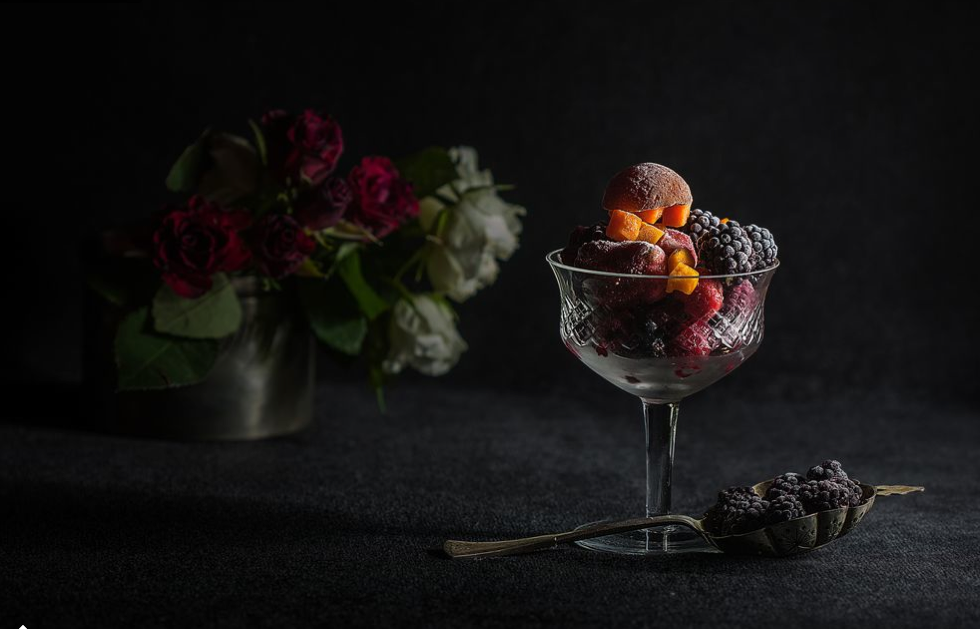
You can see why I asked the question.  Like the caption itself (“Still Life”), every detail of the composition connects directly to the art of painting, and to its history and within that to a specific genre, and within that to a particular style.  And “composition” refers to both the technical values of the image and the careful arrangement of the objects that were photographed.  There is nothing accidental here, and so the intention seems clear: to create an image, and response, that would as closely as possible approximate the experience of viewing a work of fine art.

Which would be enough to make some critics go ballistic.  From Baudelaire to Sontag and beyond, the censors’ reactions have been clear.  It is only an approximation, and a cheap one at that, they say.  The skill that is supposedly on display–and that was reason for the existence and value of the genre in the first place–is in fact being supplied by the camera.  Oh, sure, some technical craft is involved, just as is the case with arranging the table, or for that matter a department store window, but it can be learned in hours, not the years that would be required to paint such an image.  Worse, that de-skilling is matched by a loss of value in the work and in the audience.  Finely wrought images become cheap things to be admired and as quickly forgotten.  Because of the easy reproduction of the image, the artwork loses the aura that comes from being experienced within a tradition, and with that loss we become less capable of being open to or improved by the art itself.  Instead, modern society becomes susceptible to kitsch and related habits of excessive consumption.  A still life on your desk top, or those cheap reproductions of Modern Art  in every hotel room, or it doesn’t matter: whatever they are, they are not really art.

I’ve argued against this attitude, and usually I take the angle of saying that photography is not a fine art and all the more important for that; instead it is a public art, among other things, all of which have considerable value for modern society and politics.  (By the way, you don’t win an argument with an attitude in a day.)  Today, however, I want to take a different tack.

My argument can be stated very simply: It’s beautiful.  You can tell me that it’s derivative or that it’s not authentic or that it’s more contrived that photography should be, but you can’t tell me it’s not beautiful.  (And I’m speaking for me, by the way, not you.  If I’m a sucker for elegance or any other social value evident in the image, that’s my problem, though certainly not one foreign to painting.)  My idle scanning through a slide show stopped the moment I say it, and my day is richer for having seen it.  Nor is it idiosyncratically or oddly beautiful; instead, its beauty comes in part from how well it has reproduced the conventions of the painterly genre.  Trust me, I’ve seen a lot of still lifes, and I’ve walked by a good number that did not catch me as this one did.  (Yes, this had the advantage of not being in a museum context, but frankly I think photography always is orienting us, to greater or lesser degree, to see as if we were in a large, open air museum.  Furthermore, it stood out at National Geographic, which is saying something as far as photography goes.)  Long story short, although I never would have set out today to look at still life paintings, this photograph provided one nonetheless, and it’s beautiful, and I’m grateful for that.

There also is a more complicated argument to be developed along the same path, but I’m running out of time.  One thing to consider is how the photographer has labored to put photography back into the tradition of painting, and how something like an aura may be one result.  At the same time, there is little likelihood that anyone would mistake this image at a photography website for a painting, so perhaps the art of approximation also is being featured, and with that the conventions and history of the artistic genre.  This image may be an imitation of a painting, but also an imitation of a photograph; and it may be about photography more than painting, which would move it closer to the work of art in any medium.  (Admittedly, this still life doesn’t stun me, enthrall me, and challenge me as the best art does, but in my experience that’s a problem of the genre.)  And if it is about photography, then it is about modernity.  If tired of defending the arts, you might to think about that.

It might also be a statement that simple elegance is more available than we might think–much like a photograph is less expensive and more accessible than a painting.  It could be a demonstration of how beauty can be shared easily via photography, indeed, how photography is pitched toward sharing while painting continues to be defined largely by hoarding in mansions and corporate hallways.  When a photograph imitates an older art form, such questions are brought to mind.  Surely that can’t be all bad.

Photograph: “Still Life” by Rucsandra Calin, Craiova, Dolj, Romania, from National Geographic’s Daily Dozen, March 11, 2014.


 1 Comment

Random Acts of Public Art

Winter still hangs on in the Northern Hemisphere, with the occasional thaw only enough to bring up the accumulated dirt and trash.  In the Crimea, another democratic spring has been flipped within days into another authoritarian consolidation of power; the pattern is now all too clear, while the rapidity of the military response is becoming truly impressive.  In Malaysia, a 777 has disappeared into thin air; at least the UFO hunters will be thrilled, but everyone else who flies now lives in a slightly more uncomfortable world.  And if that weren’t enough disquiet, for some us the calendar has moved into Lent, a time for reflection on our many personal failings.  So perhaps you can appreciate why I am grateful for this photograph.

bp2

The caption at The Big Picture said: “Reflected in a puddle of melted snow, people and dogs walk past umbrellas suspended from trees at Spanish Banks Beach in Vancouver, British Columbia, on Feb. 25.  The art installation, called the ‘Rainblossom Project’, was put up by an anonymous group to be a celebration of the rain the city receives.”

My favorite part of that caption is the word “anonymous.”  Whatever else happened on February 25th, there was someone in Vancouver who wasn’t working on branding, who wasn’t worried about others free-riding, who was willing to spend time and money and effort to improve the commons, and do it without any reward, much less making a profit.  Maybe it was a hedge fund manager on his day off, but I doubt it.  This was done by someone who cares about art and the general welfare in equal measure, and who is able to express those commitments generously.  We can call it a random act of public art.

The same can be said of the photograph.  “Random” may seem incorrect, for surely the photographer was acting on an intention, but the same is true of the red umbrella hangers and the other strangers signified by the allusion to “random acts of kindness.”  The act is, by definition, intentional, but “random” because not directed by the usual logics of economic exchange, competitive marketing, political persuasion, or even direct social reciprocity.  Yes, the photographer will have been paid for the image, but there was no guarantee of that happening, not least because there was little chance of finding hard news, or even soft news, on a beach in Vancouver in February.  This image barely qualifies as news at all, although it does inform us about the public artwork on the beach.  It’s something else: another work of public art, and one just about as incidental, unexpected, ephemeral, and generous as the other.

And what a fine work it is.  The photo is true to the work it depicts, while enhancing and extending it as well.  The red umbrellas hang improbably in the sky, and the trees, mountain, clouds, sky, and lake seem equally improbable and beautiful as well.  That lake, itself perhaps newly freed from the ice, reflects the figures above it, just as the photograph reflects the entire tableau.  Likewise, the deep blues balance the blossoms of bright red, as if they were low and high notes harmonizing.  These symmetrical optics evoke a sense of serenity, but not by pretending that the scene is any more solid than it is.  The reflection on the water can be broken by a single ripple, just as the scene can disappear the moment you turn away.

And we all will turn away.  Even those in the scene, who rightly seem to be enjoying it immensely, will walk on.  The clouds will thicken, and the rain will come–remember, the umbrellas are an offering of gratitude for the rain–and the umbrellas will deteriorate or be taken down.  Like the rain, this scene is not something that you can hold on to.  Only the photograph will remain, albeit probably forgotten.  But that’s OK, if we understand what it is teaching us today.

The world is more abundant that we know.  Not always, but too often the suffering that occurs is due to artificial scarcities: due to greed, hoarding, and the withholding of kindness.  Any decent society ultimately depends on more than natural abundance: on commitments to the common good, the general welfare, and sharing in both hard times and good times.  So it is that we ought to feel thankful for those artists and arts that are themselves acts of generosity for a public world.

Photograph by Darryl Dyck/The Canadian Press via Associated Press

 0 Comments

Seeing Through the Colors of Carnaval

Screen shot 2014-03-09 at 9.09.04 PM


Lent is upon us, and that means the Carnaval season, with its abundance of hyperbolic, bodily exaggerations and all around revelry that mark a world turned upside down.  And, of course, there is a profusion of lavish colors; a coordination of fluorescent reds and yellows and blues and greens, all of which underscore the festive nature of the event, but more importantly accent the relief from the regular conventions and constraints of everyday life.  Indeed, the combination of bodily excesses and explosions of color has made Carnaval a prime destination for photographers and every year the slide shows at all of the major news outlets comply by featuring a profusion of such images of the event in Brazil and around the world (see, e.g., here, here, and here).  If one didn’t know better the regularity and regular similarities of such slide shows might appear to be motivated by a commercial interest in advertising La Paz or Rio de Janeiro and other similar locations as sites for tourists in search of an exotic holiday.  What is missing, of course, is any sense for the history of the celebration or its close connection to nationalist sensibilities as it appears both naturalized and commodified.

But, of course, Carnaval is more than just a commercialized, global event designed to attract tourists with its outrageous revelry.  And so we have this image from the celebration in a rural community in Trinidad.

Screen shot 2014-03-09 at 9.57.16 PM

Here too we have the appeal to bodily excess and exaggeration, and with it a marking (and mocking) of the conventions of everyday life, though the appeal is to a more localized history of colonial control. I am especially drawn to the tension between the exaggerated, historical costumes and the somewhat dainty parasols on the one hand, and the contemporary footwear on the other.  I don’t know if those are Nikes or Adidas or some other internationally marketed running shoe, but they are as uniform as the rest of the costumes being paraded about, and both no doubt speak to the colonial influences that have been imposed upon Trinidad from abroad, both then and now.  Few are likely to flock to rural Trinidad for an exotic vacation, but that doesn’t mean that the celebration of Carnaval that takes places there is any the less interesting or worthy of consideration.

But there is another point to be made, and it concerns the contrast between color and black and white photography.  There was a time not so very long ago that one would rarely if ever see a color photograph in a newspaper or in most magazines (National Geographic would have been the most notable exception).  That changed within the past twenty years or so, and now color photography has become something of the photojournalistic norm with black and white photographs relegated largely to the world of art photography. When black and white photographs were the norm, color photography underscored the ways in which the grey tones of black and white images were an artistic representation that was and was not the reality being displayed.  And now that color photography has become more-or-less the norm, black and white photography operates in something of the same register, albeit in reverse, reminding us that the tonality of an image—and no less the tonality of the society that we are seeing—implicates and is implicated by the manner in which it is constructed and represented.

Photo Credits: Juan Karita/AP; Pablo Delano/Trinity College

 2 Comments

Fire and Ice in the Winter of Our Discontent

As I write, demonstrators opposing the authoritarian government in Kiev are being killed in the streets, Aleppo is being bombed into the stone age by forces loyal to the Syrian dictatorship, China has said that the UN report on the torture chamber known as North Korea contains “unreasonable criticism,” and the Central African Republic is turning into another of the world’s hellholes.  No wonder people are watching the Olympics: why not opt for mindless diversion?  Even if the show is a day late (in the US, for example).  Even if it is being staged by yet another autocrat.  Keep the eyeballs on the screen, as you can’t do anything about the rest of it anyway.

Ice

Actually, I get that.  And I think cultural critics, and particularly those fixated on visual media, have gotten way too much millage out of faulting people for wanting to chill at the end of the day.  Frankly, a lot of culture is diversion first and foremost, and only then can it rise to something else.  If you look at culture with an attitude that is too pragmatic or instrumental, you won’t be open to what it has to show or say.  If you look too long at the moral and political disasters that demand one’s attention, you may become too reactive or too exhausted to respond as you should.  We look away because we can’t stop looking, and perhaps after looking at something else we can circle back to respond to the pain of others with a better sense of perspective or empathy than before.

And so you might ask, what is that tiny block of ice doing there?

One answer is that it is being placed willfully in front of the images from Kiev, Aleppo, and other contemporary disasters, and placed there in order to block them out.  Soon enough they’ll be back, waiting for me in the morning paper and online throughout the day.  As well they should be: we live in on a single planet, alone in a desert called space, and so we need to watch out for one another.  For a moment, though, it might help to contemplate a world of natural harmony and no human predation.

We think of fire and ice as opposites, as they are in ordinary experience, but this image reminds us that they both are part of a unified physical universe that will always be greater than our capacity for comprehension.  The Siberian sun can melt the ice layered on Lake Baikal, but not before its light is reflected and refracted by the ice.  The small block of ice seems majestic in its ability to stand up to the sun for awhile, and so it fittingly looms large and distinctly shaped while the great star appears small and hazy in the background.  The ice is doubled by its reflection and seems more solid for that, while the sun appears less powerful because its light is reflecting off of every surface.  The subtle irony of the scene reflects back on us as well: we know the ice is ephemeral, but the sun is as well.  By valuing the ability of the ice to persist a while before its inevitable dissolution, we are looking at a reflection of our own mortality.

The Greek word “cosmos” means both universe and ornament.  Macrocosm and microcosm, beauty and totality.  The photograph above is but an ornament–a decoration and diversion–but like the ice, it reveals something much larger.  Perhaps by reflecting on that, we can do something about the fires that are raging elsewhere.

Photograph by Edward Graham/National Geographic Traveler Photo Contest

 0 Comments

A Winter’s Tale: A Tragicomedy in Two Acts

Atlanta Black Ice 2014-02-16 at 10.24.40 PM

I like winter.  I really do.  The cold can be bracing, but it is also refreshing.  There is something life affirming about seeing one’s breath as it floats in the air.  And the snow often has a mystical quality about it, even as it always gives way to a more down-to-earth reality.  It falls quietly, even in blizzard conditions.  It blankets everything in its path with a degree of equanimity that is both amazing and, in a certain way, comforting.  It appears pure—hence the phrase “pure as the driven snow”—and thus reminds us of such a possibility, but before long it bears the footprints, tire tracks, and other markings of life and activity that remind us no less how nature is subject to human presence and how provisional any appeal to purity always is.  But even at that our sense of winter often leaves us with romanticized images of a wonderland with children bundled in snowsuits sledding down hills.  Such a view is just a little bit too much like a scene from Norman Rockwell, of course, and even at its pragmatic best it ignores the harsher realities of snow and ice and sub-zero temperatures and all of the miseries that this can too often entail.  The photograph above is a case in point as it pictures a landscape in which winter has brought all commerce—indeed, all human activity— to a halt.

The road above leads into the city of Atlanta, the ninth largest metropolitan area in the nation.  Georgia is not accustomed to snow and ice storms and this winter the meteorological patterns have been especially cruel with two major storm fronts separated by only a few weeks.  Several weeks ago in the midst of the first storm the road above was literally covered with abandoned cars as drivers surrendered to the snowy and icy conditions and found their way home or to shelter on foot.  That scene had a comic quality to it as major thoroughfares were reduced to ad hoc parking lots. This time around, however, what we see is eerily apocalyptic, somewhat akin to a ghost town. The markings and vestiges of civilization are prominent, but all humanity is absent, the barest of life erased from a scene reduced to the conditions that nature has ruthlessly and arbitrarily imposed upon it. The city rises tall in the hazy background, its promise as a haven of progress and culture and community altogether inviting, but the black ice that covers the roads leading into it—barely seeable and all the more treacherous for that very fact—make it appear impossible to approach and enter. The line between comedy and tragedy, it seems, is ice thin.

Soon the snow and ice will melt, of course, and people and vehicles will once again populate the roads leading to and from the city.  Commerce will return and all will be normal, at least until the next catastrophic weather event appears.  It could be a drought or a tornado or a hurricane, it is hard to say.  But whatever it is it will remind us—once again—that we are subject to forces that, like the black ice above, can be hard to see, but that doesn’t mean we can ignore them.  Or put differently, we ignore them at our peril

Credit: Tami Chappell/Reuters

 0 Comments

A Short List of Lists

pants-articleLarge

This week Feature Shoot lists 50 Awesome Photography Websites.  (Full disclosure: NCN is on the list.)

Photo Contest Insider Lists Over 150 Photo Contests.

And did you know what Wikipedia has a list of photographers who already are the subject of Wikipedia articles?

I told you it would be short.  The fact that I forgot to do a post for today had nothing to do with it.  Nothing at all.

And thanks to the Norwegian Olympic Curling Team for filling in.

 0 Comments

Judging the Photography Awards: How Much Art Is Too Much?

The Sony World Photography Awards shortlist has been announced, and some of those entries are being showcased in slide shows.  Doing so will build interest in the final decisions, but it also reflects interest already present.  That interest extends not only to the photos but also into discussions about how they should be judged.  Increasingly, the judging itself has come under scrutiny; as one example, one of the most viewed posts at this blog is on The Rhetoric of Prize-Winning Photographs.

To summarize the broader debate, winning photos have been declared to be too conventional, too safe, too much like previous winners, and too arty, while the contests have been faulted for elitism, cronyism, and selling out.  All this is simply more evidence that photography has arrived–that its status as a public art is being taken seriously.  Welcome to public debate, and by the way, what have you done for us lately?

Since the criticisms come from all sides, consistency is hardly a virtue, but what might seem to be contradictions need not be.  Can something be both explicitly artistic and safe?  Well, actually, yes.  Are you likely to sell out if already comfortably elitist or networked?  Well, yes, and by then it may even be second nature.  But are the criticisms always right?  No.  And even when on target, should they be the last word on what criteria should be used to judge photography?  Again, no.  Not, that is, if we really are going to consider photography to be an important public art.

So let me take up briefly the concern that photography awards can favor artistry over other values such as documentary witness, hard-boiled realism, formal simplicity, or critical provocation.  Of course, these are extremely important values, but we know that.  The question is whether photographs should win awards for doing something else; something like this.

Wildebeest airborne

This is a scene from the annual wildebeest migration in Kenya.  And it is a scene, a tableau, because this photograph looks very much like a painting.  More to the point, it has a lot in common with the landscape painting of the Hudson River School of Thomas Cole, Asher Durand, and others who drew on Romantic aesthetics to capture the grandeur of nature.  Using strong contrasts of light and shadow and movement and mass amidst a moody atmospheric haze, the composition suggests the enormous energies flowing through the land, water, herd, and sky, yet leaves their source or purpose illegible, as something that is too large to ever by captured by art alone.  This combination of awe and futility is epitomized by the beast leaping from the high bank, soaring improbably but magnificently through the air.  Perhaps he (or she) will stick the landing–I can’t help thinking of its similarity to an Olympic athlete–but the important fact is that the beast has to answer to crash’s law, the rough ground and uncertain fate of any animal having to survive in a harsh environment.  Ultimately scenes such as that are not about the individual, save for the spectator, who is to marvel the powerful forces shaping the earth.

The romanticism goes further still, as the photograph can be seen as elegiac.  The sublime offered the Hudson School a sense of consolation, for they were meditating on how nature was being lost to civilization: both displaced (destroyed) and forgotten.  The same may apply here: as the space and water left to the wildebeest becomes more limited, their migration routes disrupted, their numbers reduced further by poaching and other predations.  This beautiful photograph can hint at the dark finality of all of that, but its beauty also could be taken as a form of consolation, and with that an act of abandonment.

So why not just paint it?  The cynical answer is that painting would take more skill than photography.  If that’s your answer, go back to the studio and paint.  For those who recognize that we are not in a zero-sum competition among the arts, the question still points in the right direction.  Does the photograph offer anything that a painting would lack?  And does the explicit artistry of this photograph–specifically, its painterly quality–add or detract from the distinctively photographic contribution?

Frankfurt School theorist Siegfried Kracauer defined photography as being shaped by two generative principles: “there is on the one side a tendency toward realism culminating in records of nature, and on the other a formative tendency aiming at artistic creations.”  As he also noted, this tension generated aesthetic problems for the medium.  He could have added that it explains the subsequent division in the road between documentary photography and fine art photography, as each developed one media capability or the other while trying to avoid problems that could, if not mastered, lead to either paralysis or mediocrity.  But as Kracrauer correctly observed, the specificity of photography comes from the primacy of the realistic principle.  Although “a minimum requirement,” it is almost absolute: photographs are expected to show something that was in front of the lens prior to the creation of the image.  The more they deviate from this requirement, the more they become merely inventive, which is why fine art photography is inherently compromised: unlike the other arts, experimental optimization leads it away from its own medium.

Almost all photographs are not fine art photography, however, including those that are submitted to photo contests.  The habitus of photography is capacious, and almost every photograph taken has some value beyond solely aesthetic value, and almost every photograph submitted for an award professes to show us something, not just about the art, but about the world.   So it is that, outside of a fine arts context, the reality principle rightly holds pride of place, which in turn makes artistry suspect.  Awards do bring the tension to the fore, however.  If given only for documentary fidelity, the judges would soon have to be basing their decisions on the topics rather than the images themselves, or on purely formal criteria which, as Susan Sontag pointed out forty years ago, has become a “bankrupt” vocabulary for photography.  So what is to be done?

Kracauer recognized that the imaginative and realist principles don’t have to conflict: indeed, the formative tendency “may help substantiate and fulfill” the realist tendency.  In a nutshell, the judges for photography awards should be looking for exactly that conjunction.  Artistry can be quiet or explicit, but it should bring the viewer to see, understand, and work out a relationship with a reality that might be overlooked otherwise.  And, to get back to the question above, the photograph, because it is a photograph and not a painting, should be about a reality that exists regardless of human imagination, something having its own place and value in the universe beyond our limited ability to understand what that is.

Perhaps by imitating a painting, the photograph above can remind us that photography itself is not a mirror of nature, but rather one useful but still limited way of seeing.  And by hinting at the limits of representation, the image may also call up more emotional or intuitive responses to the world.  As Kracauer noted, the best photographic seeing “is of a kind which is closer to empathy than to disengaged spontaneity.”  That is the difference between depicting a sudden leap into the air, and bringing you closer to the beast.  Look at the photograph again and ask yourself, which is it?

Photograph by Bonnie Cheung/2014 Sony World Photography Awards.  Quotations from Siegfried Kracauer, Theory of Film: The Redemption of Physical Reality (New York: Oxford UP, 1960), p. 12 ff., and Susan Sontag, On Photography (New York: Picador, 1977), p. 136.  For the record, I’m not saying Cheung’s photo should win an award (or not win, either), only that it provides a fine example for public discussion of an important question about photographic excellence.

Cross-posted at BagNewsNotes.

 1 Comment

“Give Me Your Tired, Your Poor …”

Times Square Huddled Masses2014-02-02 at 4.14.28 PM

New York City’s Times Square is arguably the busiest pedestrian intersection in the world, with more than a quarter of a million people traversing its sidewalks on any given day and, by some estimates, hosting nearly 40 million visitors every year.  Little wonder, then, the street is full of buskers trying to make a living by performing for the masses.  And so if you have been in “the city that doesn’t sleep” recently you might have noticed that Times Square is not only home to the Naked Cowboy, but to Mickey and Minnie Mouse, Sponge Bob, Elmo, the Cookie Monster, Woody and Buzz Lightyear, and numerous other popular cartoon characters, all of whom will pose to have their picture taken with passers-by – for a  “voluntary” contribution, of course.  And given that Liberty and Ellis Islands sit just a few miles away  in New York Harbor, there should be little surprise that the lady who “lifts her lamp beside the golden door” can also be found roaming the streets.

There is something a bit unsettling about the photograph above.  As Linda Zerilli has demonstrated, the Statute of Liberty, perhaps more than any other symbol of American identity, has been a primary site of national contestation, standing in across time for transnational republicanism, immigration, the threat of (some forms of) immigration to the nation-state, a universal symbol of democracy … and the beat goes on.  And yet in this photograph, all of that seems to be erased or evacuated: no longer a magnificent statue it is reduced in size to human scale; no longer standing out against the backdrop of the city’s skyline, it has all but blended in with the muted grays of the sidewalk and surrounding buildings; no longer holding her lamp high, a beacon of freedom to the “huddled masses, yearning to breathe free,” it now carries trinkets for sale to tourists who are consumers and customers, not citizens; no longer her head held high, her gaze cast forward to a different and better future, her head is bowed—in sorrow or supplication or simple embarrassment, it is hard to say. No longer an icon of American freedom and liberty, she has been cast as little more than a cartoon character.

It is easy to see the photograph as one more manifestation of the crass commercialization of American society and we should not resist that reading entirely, but there is another point to be made, for here the Statue is totally and entirely alone, almost as if being shunned, isolated and estranged in one of the most populous cities in the world.  It is hard to know quite what to make of this, but a second photo from the same photographer might offer some insight.

TImes Square. Huddled.2 NYT

Here the Statue has been unmasked and is being challenged by one of New York’s finest, who, according to the caption, is “demand[ing] to see his documents.” The problem, it seems, is that these street performers are something of a public nuisance.  And more to the point, most of the of the buskers wearing costumes in Times Square are immigrants, some of them anonymous and undocumented, doing their best to eke out a basic human living.  Alas, it turns out that the “tempest tost” have no place in the land of opportunity, or as Times Square is often characterized, at “the Crossroads of the World.”

Perhaps what we are really seeing in the first photograph above is not so much a lone individual performing just outside of the public gaze, but rather the very alienation of Liberty itself.

Credit:  Joana Toro/Redux Pictures


 0 Comments

What Can You Really See From Space?

Well, you tell me.

San Francisco Bay

The short answer is San Francisco Bay.  Or as the European Space Agency put it rather poetically, “An urban sprawl engulfs San Francisco Bay in a sea of lights.”  The inversion of making the land mass a “sea” is a license we readily give to words, while pretending that our vision should be anchored more firmly to reality.  According to the conventional wisdom, that anchor is supposed to be provided by the caption–the verbal description, which can be so easily or subtlely metaphoric, and you might want to think about that.

But I digress.  The question remains whether you are seeing The Bay Area.  Now that you’ve been told, perhaps, but could you pick it out of a lineup of other cities at night?  Those who live there, sure, they might be able to zero in a bit as if on Google Maps, but most people would have to take it on faith.

And so we do, and that may be a problem.  Not the problem that usually is promoted at this point: I really don’t think there is an epistemological issue here.  Yes, it could have been faked or there could be a mistake in labeling, but here as in many other places we can rely on institutional practices and social norms, not to mention the fact that most people have enough to do just telling the truth.  (I fall into the latter category, so save your breath about me making it up.)  It is what they say it is.

But is it?  The problem I want to raise is that once you’ve been given a literal description of the image, your imagination may shut down too soon.  The image is also an optic–a way of seeing–and we can think of the imagination as an extended way of seeing.  Thus, any image might prompt imaginative extension, elaboration, or transformation of what is being shown, an extrapolation into the realm of metaphor, you might say.  And why would one want to do that?  Not merely to play with possibilities, although there is no law against that, but rather to get closer to what really is there to be seen.

Fortunately, the ESA caption wasn’t strictly literal.  There’s another deviation in that regard beyond the “sea of lights.”  We are seeing, we are told, “an urban sprawl” (my emphasis).  That’s not standard American English usage, and so it opens a crack in the door of possibility.  “Urban sprawl” would have been more typical, and it would have implied that we are seeing a general phenomenon, one that can be found and that would be much the same in other cities and countries.  Such captioning is actually an exercise in abstraction, not direct reference to the hard ground of reality, and you might want to think about that as well.

“An urban sprawl” sounds more like a single thing–like an organism, for example.  An amoeba.  A virus.  A radiant life form, a body electric humming with energy.  Something that can pulsate, grow, replicate as it directs more and more energy through its neural pathways to become more intelligent, vital, beautiful.

And that can go dark in seconds, collapsing into a chaos of darkness as its energy disappears, systems crashing, gasping for the terawatts of power that no longer are available because the unseen earth has given up the last of its oil, coal, and gas.  Or because another virus has emerged, this one too strong and predatory to be stopped, whether digital or biological, all that is needed to make the darkness sovereign.

Or perhaps something else.  Pick your metaphor and try to see what the image is telling us.  Think about it: it’s not really needed to do what governments do with visual technologies: surveying, surveillance, and propaganda could each be there, but weakly so, and they have far better options elsewhere.  No, I think it’s provided because it’s beautiful and enigmatic, which is enough to intrigue and awe many people inside the space program and without.  Best of all, it’s what you need if you want to see what really is there.

Photograph by ESA/NASA.

Cross-posted at BagNewsNotes.

 0 Comments