the visual public – Page 11 – NO CAPTION NEEDED
May 19, 2008
Nov 18, 2013
Aug 22, 2012
Dec 09, 2012
Jun 23, 2017
Feb 04, 2008

The Way We Were

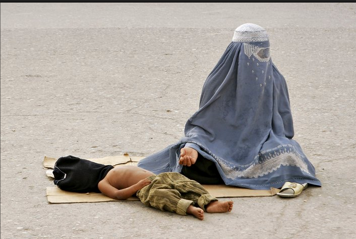
The first day of school. It is a bourgeois, middle-class ritual. New clothes. New backpacks. A new start on a new year. And, of course, photographs; lots and lots of photographs, usually taken by parents and grandparents trained to recognize a Kodak moment when they see one—snapshots that celebrate the normative and gradual transformation of childhood to adulthood, marking it for future use and consumption with the tinge of nostalgia. “This,” the photograph says, “this is the way we were.” My family photo albums are filled with such images. And I cherish them, even though I know the many crises and unhappy moments that they help to repress and erase from memory and family history.

Capturing the first day of school is also a photojournalistic ritual, especially in local newspapers that regularly mark and celebrate the various cycles of the calendar: fall harvest, winter holidays with families meeting in reunion and engaging in spiritual observances, spring break renewal and the planting of new crops, summer fun on the beach, and on an on. And, of course, in an analogy with the photographs in our family photo albums, they frame and feature the habits of sociality and collective living that we want to observe and remember. The picture below appeared in a Washington Post slide show titled “Starting a New School Year” and consisting of eighteen photographs of elementary school children returning to school in the Washington D.C. area.

Post.Back to School1

The photograph is in many respects typical of the other pictures in the slide show and of similar images one might find at many other newspapers. According to the caption they are a group of children “march[ing] to class” in a new school in suburban Maryland. Clean and orderly, they have learned early to walk in line at a common pace and to maintain their distance from one another (“no touching” is one of the rules we learn in kindergarten), and yet they are not automatons as each displays a somewhat unique personality in dress, attitude, and gesture. They are different and yet unified, obedient but not rigidly or obsessively so, and thus they evidence the habits of communal living a liberal democracy might want to inculcate among its citizens. And, of course, they are all African Americans being educated in a brand new school.

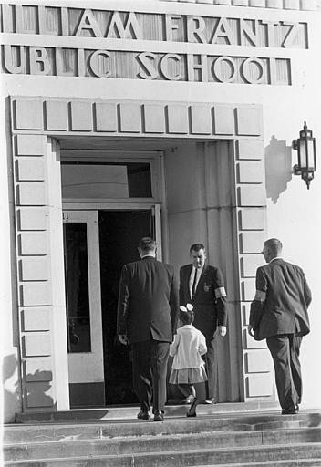
What caught my attention in the picture was the second girl from the left, dressed in a white blouse and taking what seems to be a playfully long stride, nipping at the heels of the boy in front of her. Where had I seen this image before? It took a few moments to register, but eventually I realized that it was vaguely reminiscent of Norman Rockwell’s “The Problem We All Live With.”

Rockwell, The Problem We All Live With

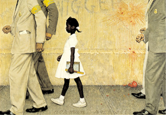
This painting first appeared in Look magazine in January 1964 but it depicts a scene from four years earlier when six year old Ruby Bridges was escorted by U.S. Federal Marshals to William Frantz Elementary School in New Orleans following a court order to integrate the schools in accord with the mandate of Brown v Bd. of Education (1954). White parents removed their children from the school and only one teacher—Barbara Henry—was willing to instruct Ruby. And for much of the next year Ruby was a class of one.

It is a painting, not a photograph, but in all likelihood it was artistically derived from one of several AP photos that show Ruby and her escorts entering the school. It is marked by strong contrasts of color: her dark skin and white dress, shoes, and hair ribbon stand out against the drab, muted colors of the suits and the wall. Notice in particular how the color of the suits connect the headless and anonymous marshals to the wall and the vicious word scrawled across it; the composition thus subtly identifies the institution now protecting Ruby with the institution that built the walls of segregation and contributed to her oppression and stigmatization. The wall is stained with the red of a tomato, the color of heated passion and blood, and thus a sign of the threat that abides outside of the frame of the picture. But amidst all of this is Ruby, pure, innocent, and, of course, looking forward to a new day–the first day of school with a new notebook and ruler in her hands. Note too that her stride is natural, but she walks faster than the escorts behind her, riding up on the feet of those in front of her. She is thus anxious to get to her destination, but she also holds herself in reserve, her emotions contained and constrained, another strong contrast with the scene around her. She is also an individual. And though there were hundreds of persons who orchestrated this moment in history, it is the lone individual standing up against the much larger forces of oppression that is featured (and remembered). It thus functions as part of the standard liberal antidote to political trauma, and in its own way it anticipates the photograph of the lone individual stopping a row of tanks in Tiananmen Square many years later.

There is no doubt a great deal more that can be said about this image. But it is its relationship to the contemporary photograph from the Maryland suburbs that most warrants attention here. For now we have seven children not one. We can assume that there are teachers directing the parade even though we don’t see them–a sign, perhaps, of established authority and effective leadership. Indeed, the photograph purports to be an ordinary (bourgeois, middle-class) first day back at school. It depicts an orderly scene in an open and brightly lit modern building. There is nothing that suggests even the hint of a threat; the vicious “n” word has been replaced by an affectively neutral and abstract term: “primary.” That the children are exclusively African American seems almost incidental—and more so when seen in the context of the entire slide show—as if the problems of equal educational opportunity among the races has been solved; and maybe in this school district they have, as this is a picture of a brand new school. But one has to wonder if there is not also a sense in which the photograph works to erase the image of the Rockwell painting from public memory, a substitution of the “real” for the “mythic.” Or if the word “erase” seems too strong, then perhaps the photograph mutes the mnemonic force of the earlier image, suggesting “that was then and this is now.” In either case, its reference to the conventional first day of school frames both images in a somewhat nostalgic register that underscores a myth of social progress: the idealism of the lone individual standing up to the forces of oppression (then) and the appearance of the happy-go-lucky first day of school (now).

If only that’s the way it truly was.

Photo Credits: Marvin Joseph/Washington Post; Norman Rockwell Estate


Digg!

 2 Comments

Who's That Man in the Picture, II

Chicago Storm

According to the caption this is “a pedestrian [who] battles a heavy rain storm in downtown Chicago.” It could be Bob Hariman, but I happen to know that he is stuck in Evanston without electricity and working hard to bale out his rain drenched basement. Rather, what we see is an anonymous citizen doing his feeble best to stay dry in the wind blown rain while walking down a nondescript urban street. We are told it is in Chicago, but it could be in any city in the world. Indeed, is an altogether ordinary picture of an ordinary event on an ordinary public thoroughfare. And it was designated by the Washington Post for display as part of its “Day in Photos” slide show for 8/24/07, which obviously makes it something just a little bit more than ordinary.

Of course, it is highly unlikely that anyone will come forward claiming to be the man in the picture in the same way that individuals have lined up trying to prove that they are the sailor in the famous “Times Square Kiss.” But in some measure that is precisely part of its attraction. For while we tend to focus attention on those photographs that emphasize the recognizably great and the near great—political leaders and celebrities—or major crises and tragedies, a large portion of the photographs published in daily newspapers show ordinary citizens doing ordinary things, negotiating the travails of everyday life including everything from battling the weather to participating in civic and communal activities (e.g., voting, assisting at the PTA, participating in a charity car wash), to helping their neighbors, doing their jobs, nurturing their families, caring for their pets, celebrating local events and holidays, mourning their losses, and so on. Sometimes they are identified by name, but usually the particular identity of the people being represented doesn’t matter very much (except perhaps to the individuals pictured and their families and closest friends). What matters is that we have an opportunity to see ourselves in all of our sociality as members of a public or a community, that we have models of citizenship and political friendship, and that perhaps (and just perhaps) the world is made a little bit less strange.

It is a small point, to be sure, but one well worth emphasizing: A successful late modern democratic polity relies upon our ability to negotiate with a public full of strangers—people we don’t know personally and who are different from us in some measure and to some degree, but people with whom we also share ordinary and everyday similarities. The anonymity (or near anonymity) of many of the photographs that appear in our newspapers and other media is thus an important feature of photojournalism as a civic and public art which functions at its best to help us to see ourselves and to be seen in turn as citizens in a world full of strangers as we struggle to engage the stresses and strains of ordinary, everyday life.

Photo Credit: M. Spencer Green/AP


Digg!

 0 Comments

Hiding in Plain Sight

Northwestern graduate student Brett Ommen recently completed the oral defense of his Ph.D. thesis on the role of graphic design in public culture. Brett’s argument is too detailed for me to summarize it here, but he highlights something everyone ought to consider from time to time. Brett claims that an important function of graphic design comes not from the message content but rather from how it covers the surfaces of public space. Thus, even when not attending to the myriad of signs that surround us, we are unconsciously responding to the “surface message” that our environment is intensively communicative. To illustrate this point, Brett took a page from the work of an artistic project called Delete!, which covered the signage along Vienna’s Neubaugasse for two weeks:

delete-vienna.jpg

Brett did the same virtually, here with an image that replaces the signage in Chicago’s Ogilvie Center with whiteout.

ogilve-copy.jpg

The Center is a late-modern environment that doesn’t encourage civic association, and you can see just how barren it is when the graphic content is deleted. You also can observe how much you see-but-don’t-see. I’ll bet that few commuters could fill in many of the blanks. You might look at a familiar street scene of your own and count how many signs you overlook at any given time. We are awash in information and continually accosted with appeals, yet much of that registers, if at all, only as a form of blind sight. That idea might be extended further: how much of the information about who we are collectively is already right in front of us, but unseen? More important, how is that inattentiveness not only characteristic of our relationship with signage, but also with each other? You can’t and really don’t want to see everything, of course, but what are we missing?

Photograph by Hans Punz/Associated Press. An AP article on the Delete! project is here.


Digg!

 2 Comments

The Color of Sorrow

This photograph was front page above the fold at the New York Times yesterday (Monday):

firehouse-memorial.jpg

The caption read, “Photographs of Joseph Graffagnino, left, and Robert Beddia at the firehouse for Engine 24 and Ladder 5. They died fighting a fire at the Deutsche Bank tower.” By highlighting the photos taped to the windows this description may distort the overall effect of the visual composition. Likewise, the smaller image here may not do justice to the emotional power of the photograph’s placement in the print edition. It remains a complex and strangely moving photograph nonetheless.

The emotional power of the image begins with the color of the firehouse door. Red is the color of blood, fire, anger, and other intense experiences: psychologists would tell us that it stimulates emotional responsiveness. Red also is the firefighters’ iconic color, but we don’t see the shiny metal surface of a fire truck. The red wood has the grained, organic feel of a barn and its associations of working hard while living close to nature. The large color field is enveloping and yet somehow also soothing, perhaps because of the square panels and solid bolt construction. This is a good red that helps us feel our way into the photograph.

The second major element of the composition is the line of four windows that divide the monochromatic color field. They are tied to the colored door by the touches of red on shirt and badge, but the primary effect is one of contrast. Instead of an exterior surface, we peer into a deep interior. Instead of a surface that catches the light, there is only the all-too-symbolic darkness. The photographs on the windows not only memorialize the dead but accentuate the sense that a window both reveals and buffers. The door becomes a divider between those suffering within and the rest of us peering in from more distant lives.

The photographs themselves are heartbreaking. We see young people full of life and love, and now two of them are only images. The large white frames isolate the vitality of each couple and set these past scenes against the utter darkness behind them. Thus, a second contrast, for the photos of the dead are all the more compelling by being placed in a line with the two living firefighters on the right. Again, darkness lurks behind everyone, but two are obviously alive, real people hurting yet breathing in real time, while the others are now only images on paper that are pathetic, hopeless masks placed on the darkness.

And so we are left with the living. They remain behind a scrim of mourning, but we can see two individuals lost in different though related postures of sadness. They are touchingly close to one another and yet each is lost in thought, dwelling on the tragedy as they work side by side to re-enter life in the outer world. You can’t ask for much more than that, and so they become a model for others’ mourning as well.

It also matters that this is not the first time. The fire was in a building that has been a dangerous wreck since the World Trade Center attack, and the Times story was titled, “Scarred on 9/11, a Firehouse Mourns Again.” The photographs make the same connection visually, as snapshots of the dead were an important part of street-side memorials and Times obituaries after 9/11. Since then, too many Americans have become experienced mourners. This photograph suggests how the rest of us might join them. Patriotic boosterism didn’t save a single life while destroying many American soldiers and Iraqi civilians. Perhaps only by grieving together can we achieve the emotional maturity needed for political wisdom.

In classical rhetoric, one could speak of the “color” of a speech in order to mark its emotional tone. We might do the same today for other works of public art. I would not say that red is a color of mourning, but this photograph as a whole has an emotional tone that is at once nuanced and profound. It is the color of sorrow.

Photograph by Hiroko Masuike for The New York Times.


Digg!

 1 Comment

Why Can't a Minaret Look Like a Spire?

Yesterday the Chicago Tribune posted a report about protests arising in Cologne, Germany regarding plans to build a new mosque in the city. The story is an object lesson in negotiating the visual public sphere. To begin with, an obviously ideological reaction is being couched in aesthetic terms: “The residents complain that the minarets would clash with the towering spires of the city’s celebrated 13th Century cathedral.”

cologne2_web.jpg

Never mind that the two buildings would be over a mile apart and that the Gothic cathedral would be nearly three times the height of the mosque.

The reaction against the mosque moved from far-right crabbing to a full-blown public controversy once it was voiced by Ralph Giordano, “a respected German-Jewish writer” and Holocaust survivor who warned that the mosque represented “‘creeping Islamization’ of Europe.” In a radio interview Giordano observed that the sight of veiled women on the street disturbed him, and he labeled them “‘human penguins.'” You might think that a German-Jewish Holocaust survivor would be wary of stigmatizing fellow citizens by their ethno-religious garb, much less describing them as animals. Apparently the Holocaust was a long time ago. In any case, this is yet another example of how the sight of the veil in public spaces can deeply trouble the Western viewer. And sure enough, the debate about the Mosque includes arguments about, on the one hand, the “openness” of the design, and, on the other hand, how it symbolizes “isolation” and enclaved resistance to assimilation. (The Tribune included an illustration of the design in the morning paper, and it appears beautiful, open, and uplifting; unfortunately I can’t find a good copy on the Web.) Neither of these claims are in any way directly religious, but they feature a fundamental norm of the bourgeois public sphere: transparency, and not as a metaphor for institutional accountability but as an actual condition of interaction in public.

And so we get to the street, that is, to a demonstration earlier in the summer protesting construction of the mosque. This is the photograph accompanying the Tribune story:

4338089.jpg

The photo incidentally provides an outline of the planned mosque, and you can bet that the architect imagined a visual homage to the cathedral. That’s not what the demonstrator’s saw, however. The placard’s illustration deviates considerably from the architect’s drawing precisely by making the mosque appear less open, more enclaved. It also appears more traditional and less modern than the proposed design. The placard visualizes what they see, which is what they fear.

Three other features of the image also caught my attention. Because we see the backs rather than the faces of the demonstrators, they are themselves somewhat veiled, as it were, and so perhaps may appear not entirely legitimate. Second, although the red slash over a politicized image is a stock use of the “prohibited” sign from public iconography, it acquires additional meaning here: what should be an informational sign used in the neutral administration of public space has become a primal ban, the sign of fundamental exclusion from the community.

And so we get to the cross. The coincidence of the two in effect makes all the placards into crosses while turning the cross into a political tool. This is the political transformation that Giordano unleashed. And I can’t help but notice that the cross is tilting; indeed, it is starting to look like a swastika.

Getty/AFP photograph by Henning Kaiser.


Digg!

 2 Comments

Bare Life in Kabul

This photograph is one I could write about for hours, and yet none of that could do justice to the image itself:

burqa-begging-image.png

I’m not going to write for hours, but where to begin? The photograph combines in a single, compact image so much of the human condition: naked physical need, confinement, dependency, vulnerability, shame, desolation, death. Surely this is the truth of the image.

And perhaps we should stop there. It is a stunning, haunting, damning image. Leave it alone. Think about the carnage and suffering being wrought in the world, about how these two human beings without status or money are caught between two civilizations, one medieval and the other mechanized, and excluded and abandoned by each of them. Think anything you want, just don’t turn away, yet another abandonment.

But it’s not that simple. Read the caption: “A woman begs as she lets her son sleep with his head covered to attract attention in Kabul, Afghanistan.” How the writer knew her motive for covering the child’s head, I don’t know; it could also be covered to help him sleep in the sunlight. And perhaps this caption exemplifies the abyss between image and text, between the mad, raw truth of an image and the linguistic shroud being applied to keep it tame. Perhaps, but the fact is the boy is asleep, not dead. In fact, he looks pretty healthy. And his pants look like they came from the mall and not long ago either. Does she really need to beg, or is this just a gambit to pick up some loose change when the foreigners walk by?

Perhaps there is a double manipulation, one by her and the other by the photographer. We’ve written at this blog about how the burqa (she is wearing the Afghani variant called the Chadri) is a traumatic violation of Western norms of visibility, and of how images of feet and hands (accompanied by virtual decapitation) are techniques for creating emotional meaning and intensity. And that empty desert background is part of a city, not some alien moonscape. Worse yet, the photograph is austerely beautiful and so perhaps aestheticizing suffering. There also may be an orientalist appeal to the male gaze: the mystery of flesh revealed from underneath the restrictions of purdah. And one can go further down that road. The photograph seems to be a powerful witness to suffering and yet also a trap pulling one into a perversely pleasurable spectacle.

That’s where a lot of academic commentary would stop, but let’s look at it again. She is sitting on a piece of cardboard; that seems to undermine the idea that she is being opportunistic. This could well be her sole source of income, at best. Next, and this is the punctum (the term comes from Roland Barthes, Camera Lucida) in my experience of the photo, look at her shoe. What is it doing there? It could be a signal, it could be that she was more comfortable sitting on her bare foot, we don’t know. It looks like an ordinary sandal that could have come from Walmart, and that may bring the manipulation thesis back in, but I see it differently. The shoe is a sign of several things that further complicate the meaning of the photograph. First, this odd, ordinary item of apparel reminds me that her culture is not medieval but, like all culture, hybrid. Second, she is not a symbol but someone who acts, however limited her sphere of action, and acts practically by adjusting, dealing, making do. I’m not sure how, but somehow her mundane practicality challenges any metaphysical exclusion or aesthetic regime. That shoe is a thread connecting to other threads of personal and then social activities that can become a web of associations, obligations, actions. Thus, she is not entirely cast out but rather still within her society, and ours.

Photograph by Farzana Wahidy/Associated Press; caption from the Washington Post Day in Photos, May 8, 2007. For a summary of Giorgio Agamben’s concept of “bare life,” read here. If you want to see another (consistent) level of meaning, read the story in Genesis 21 of Hagar and Ishmael.


Digg!

 2 Comments

"It's the least the American People can do …"

Purphle Heart 1

Earlier this week former Secretary of Defense Colin Powell visited Walter Reed Hospital and presented Purple Hearts to two soldiers wounded in Iraq. The formal occasion for the ceremony was inauspicious: the third reissue of a U.S. postage stamp honoring the Purple Heart on the 75th Anniversary of its having been initiated by the War Department (even though the order establishing it was signed in February 1932, not August). In presenting the awards, Powell, himself a Purple Heart recipient, noted, “It’s the least the American people can do to recognize those of our soldiers, sailors, airmen, Marines and Coast Guardsmen who have been willing to step forward to serve the nation …” As I read these words I was reminded of an episode of the TV show M*A*S*H in which Hawkeye Pierce responded to a similar comment with the retort “… and never let it be said that we didn’t do the very least that we could do.”

Even a minor occasion for a photo-op requires photographs and this event was no exception (after all, August is a slow news month). The AP posted 8 photographs. Two featured Powell by himself, one featured Powell and the Postmaster General unveiling the new stamp, and there were five photographs that featured the Purple Heart and the presentation ceremony. Of these later five, all by the same photographer, three are particularly interesting.

The first photograph of the set, shown above, is the one that seems to be most frequently reproduced in newspapers and on websites. It is a thoroughly conventional representation of an awards ceremony. We’ve seen it before in pictures from the county fair, or the local Rotary Club, and so on. Here the former Secretary is pinning the medal on Army PFC Marcus LaBadie while his mother proudly (if somewhat uncomfortably ) looks on. The image is shot from a slight, low angle, and from off to the side. The effect is to distance the viewer from the scene as spectator, and thus to allay emotional identification; the more important point is that there is no evidence of injury. There has to have been one, of course, otherwise there would be no award, but the clear message here is that once hurt, LaBadie is now whole again.

Contrast this with an image that, as far as I can tell, has not been reproduced anywhere but at the AP website. This photograph seems to be a somewhat sardonic comment on Powell’s claim that the American people are in fact doing the least that they can do:

Purple Heart 2

Here we have Pvt. LaBadie’s wheel chair with a framed reproduction of the postage stamp commemorating the Purple Heart resting where he should be. Following the conventions of realist photography, it is shot straight on and in fairly close range, encouraging the viewer’s direct involvement, and thus increasing the likelihood of emotional identification with the scene. The wheel chair is a harsh reminder that LaBadie is not as well as he looks in the previous photo as, apparently, he still needs help getting around; but of course all of that has to be inferred as the hurt body itself has vanished. The framed commemorative stamp physically takes his place – and our attention – and is thus a reminder that the occasion has more to do with a political spectacle than the honoring of a particular soldier’s sacrifice. Or perhaps it is a signal that contrived photo ops such as this actually damage the award itself, putting it in need of rehabilitation and care. In any case, the placement of the picture frame is a clear indication that the presentation of such awards, however honorable and deserved, is a poor substitute for giving soldiers what they need in order to heal and become whole. It is an image of “the least the American people can do” with the clear implication that much more is needed.

In the third photograph the body returns.

Purple Heart 3

On the left is Powell’s healthy hand, the prosthesis on the right belongs to Army Sgt. Robert Evans. Again, it is not a photograph that has been reproduced all that much, though it did appear in the Bloomington Herald-Times (8/8/07, C8) in conjunction with a story on the number of U.S. troops killed in Iraq in the first week of August. Like the photograph of the wheelchair, it is shot straight on, though here the cropping is tight and in a manner that forces the viewer’s attention to focus on what she or he might prefer otherwise to ignore. If you “really” pay attention, the image suggests, here is what you get: Aging men (notice the wrinkles on the hand) in suits dictating what men in uniform do. And the result is palpable. The Purple Heart can help in the process of healing, perhaps, but it must sit in the shadows and in the background; it should never – because it can never – replace what was lost.

This last image is, in some measure, a poignant synthesis of the first two pictures. It moves beyond the somewhat antiseptic vision of the first, but it lacks (or rather softens) the biting cynicism of the second. It is a powerful and searing emblem of the real costs of war and who pays the price; but it is also a reminder that even as we need to do more than the “least [we] can do,” sometimes doing even as much as we can may never be enough.

Photo Credit: Charles Dharapak/AP


Digg!

 3 Comments

Fort Rule of Law

I recently participated in a conference on the prospects and challenges of democracy in the modern world. One of the primary issues for discussion concerned the appropriate and effective constitutional mechanisms for advancing the goals of democratization in emergent democracies, and in particular, the role that the rule of law might play in such a process. One of the questions posed in this context was, “what does the rule of law look like”? The question is not as odd as it might at first seem, for the “rule of law” is not just a thing to be envisioned, but a legal concept, a frame through which we envision–literally see–the political and juridical world. And, of course, as we see the world, so are we inclined to engage it and to act in it.

The NYT recently featured this picture of the “Rule of Law Complex,” which it characterized as “an unusual measure to help implant the rule of law” in “a city plagued by suicide bombers and renegade militia.”

NYT Fort Rule of Law

While constitutional democracies depend upon the rule of law, not all governments that employ a rule of law are constitutional democracies. And the problem with a democratic rule of law, as with democracy more generally, is that it relies fundamentally upon a modicum of popular or public trust in its ministrations. Where such trust is lacking, the rule of law can only survive by virtue of sheer force or other “unusual measures.” As this photograph indicates, Baghdad’s “Rule of Law Complex” rests precariously between contemporary Iraqi society–the troubled world of Sunni and Shiite fears and suspicions of one another–and the occupation by imperial force. Here, the rule of law is isolated from the larger society, with Central Baghdad just barely visible on the distant horizon. Contained and fortified by 10 foot high fences sporting razor wire, the encampment appears rather more like a prison compound than a government “complex,” with armed guards securing its boundaries. The irony, of course, is that prisons are designed to keep its detainees under surveillance as part of the process of protecting those on the outside from those on the inside. Here, that function is reversed, as the rule of law is quarantined (and protected) from the outside world—more a fort, perhaps, than a prison.

The real question posed by the photograph is who is doing the watching? And what are they seeing—what exactly does the rule of law look like? What does it envision? For the rule of law to gain the traction necessary to a functioning constitutional democracy in Iraq, one might imagine that the most important viewers here would be Iraqi citizens, though what exactly they might need to see in order to coach their trust in an imperial and imposed legal system is not easy to know from our ethnocentric, Judeo-Christian, judicial world view. But this photograph seems to tell a different story, with a different purpose in mind. The viewer is decidedly western, not Iraqi, and the goal has less to do with creating identification with the rule of law than with reinforcing western attitudes concerning the uncivilized and threatening conditions of a world “plagued by suicide bombers and renegade militias.” Note, for example, that the camera is positioned along a west-to-east axis, with Central Baghdad sitting to the west of the complex (a point emphasized by the NYT reporter). The viewer is thus literally situated to see from a western perspective. But more, the viewer is framed figuratively by a modernist aesthetic that incorporates many of the conventions that anthropologist James C. Scott affiliates with “seeing like a state.” The image is shot from a high angle and at some distance from the event, thus encouraging the perspective of a neutral spectator who can neither be harmed by nor affect the action unfolding below. Such distancing separates the viewer from the scene both physically and emotionally, substituting a topographical perspective that encourages the rational and strategic calculation of actions and events, rather than an emotional identification with either. The appeal to a strict, instrumental rationality is further invoked by the functionalist and stark geometrical design of the complex, underscored by the trajectory and perspective of the fence as it draws our line of sight to the distant and barely visible Baghdad.

The photograph thus locates the “rule of law” within a western perspective for modern eyes. One might even imagine the nineteenth-century American frontier with military forts used to protect “settlers” from the threat of indigenous forces in the “march of the flag” ever westward. The flag now marches in a different direction, but the conclusion seems obvious: Their present is our past! We can only wonder how far the analogy will extend.

Photo Credit: Benjamin Lowy/New York Times


Digg!

 2 Comments

Lil' Bush at Street Level

John has written about Lil’ Bush, referring to how the president is being photographed to emphasize a diminished stature; whether the reduction in size reflects his slide in the polls, a corresponding loss of political effectiveness, or continued moral decline may be in the eye of the beholder. John and I have each written on photographs that feature hands or feet while cutting faces or the rest of the body out of the picture. And last week I wrote about a striking illustration by Barry Blitt for the Sunday New York Times. Given these interests, imagine my reaction when I saw Blitt’s illustration in this Sunday’s Times:

29opart-1650.jpg

There he is, a real little Bush, surrounded by the many different shoes one can see in any New York City street scene. The illustration is a stand-alone piece, moreover, as it has only a very general relationship with the Frank Rich essay for which it is a visual caption. Rich presumes Bush’s loss of credibility and focuses on the administration’s strange PR strategy of hiding behind General David Petraeus. None of this is marked in the drawing.

So what is going on? Certainly the drawing does a fine job of cutting the president down to size. (To really get the point, look at the silhouette.) The contrast with the many feet brings in more as well: Bush and the other figures represent two versions of the body politic. Bush provides the standard image of the elected official speaking to the public. In that model, the official stands in for the office that represents the body of the people. He is a single person and they are a single, unified collectivity, as if a single audience within earshot of the speaker. Obviously, Lil’ Bush isn’t up to that job. And perhaps he shouldn’t want it anyway. Instead of the president’s stock gestures (note the prominent hands), canned speech, and failed policies, we see a variety of anonymous people representing different lifestyles, going about their business briskly in different directions, without getting in each other’s way. This is a different idea of the people–a plurality that need not be One, pluribus without the unum–because they already are members (note the pun) of a liberal, pluralistic civil society.

But liberal visions need not be innocent of violence. I think the image also evokes the fantasy that one of those busy feet on the crowded street might just step on Lil’ Bush and squash him flat. You can’t blame people for thinking–or drawing–that way, but this is one example of how even the reality-based community, feet solidly on the ground, needs to be reminded that there are no simple solutions.

llustration by Barry Blitt for the New York Times, The Week in Review, July 29, 2007.

 0 Comments

Mourning in America

Memorializinig Iraq

As of this posting there have been 3,013 U.S. military casualties in Iraq since the beginning of Operation Iraqi Freedom. That is three thousand and thirteen indistinguishable, flag-draped coffins. Three thousand and thirteen individual bodies. And the question is, how should we honor and mourn their sacrifice, as individuals or as faceless members of a collectivity? The issue came to a head at Fort Lewis, Washington this past week, where the base commander considered doing away with the practice of individual services for each death in lieu of a collective monthly memorial. The rationale was logistical, if not a little bit ironic: there are just too many deaths coming out of the war to honor and remember each individual. The protest from soldier’s families and veterans was palpable and pronounced. The policy was subsequently revised to hold weekly memorials, a compromise which surely satisfies no one.

The photograph above was featured with the original New York Times story – although it was subordinated after a few hours and replaced on the mast with a picture of an honor guard performing a rifle salute – and then repeated the next day in a story reporting the compromise. And as poignant as it is, it nonetheless underscores a very real problem: this is not WWII, where an entire generation sacrificed and fought and died, and thus could be memorialized in the collective – “the greatest generation.” Nor is it Vietnam, where those who fought and died became the scapegoats for the nation’s sins and could only be memorialized after great public controversy, and at that by splitting the difference between the collective and individual trauma of the war in a monument that honored both at once, with names inscribed in black granite. Rather, it is a war being fought in the shadow of our dueling memories of WWII and Vietnam, by men and women who are individuals first and soldiers second (and only incidentally so). We have yet to come to terms with this difference, or the symbolic register in which it is being experienced and enacted, and yet, as this image hints, it is a difference that will no doubt animate a unique mode of memorium, one that in the end, perhaps, will need to put the individual face in front of the flag.

Photo Credits: Kevin P. Casey/New York Times


 2 Comments