Oct 14, 2011
Apr 05, 2013
Jun 18, 2008
Jan 25, 2008
Mar 29, 2009
Feb 10, 2012

The Street Collective Shares their Craft


street_cover

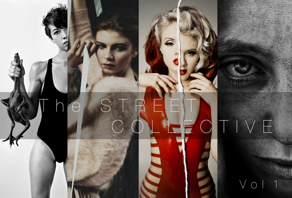
For a limited time, the photography site PhotoWhoa is providing a free download of an e-book they’ve produced on street photography.

Freddy from PhotoWhoa says, “We’ve just spent months creating a free e-book with insights from several extremely talented street/doc/fine art photographers. We entitled it ‘The Street Collective.’

The Street Collective was the result of many hours interviewing top photographers such as Bryan Formhals (of LPV Magazine) and World Press Award winner Laura Pannack about their process and how they achieve
their unique looks. We did this to help our audience learn what it takes to make great street photography.”

You can see the free e-book here and download your own copy here.  The work is highly stylized, which is not to some tastes, but the price is right and there is much to be said for this kind of sharing and networking.   The site offers other freebees here, as well as plenty of pay as you go classes.

You also might want to opt in to their subscriber list.  They don’t sell or share their list, but you would get emails about product recommendations, as that is part of what they do.  Once again, photography needs to keep experimenting with varied business models, and this might be an effective way to get professionals and amateurs working together in win-win arrangement.

 0 Comments

Governing and the Archaeology of the Present

There isn’t a single photograph that begins to capture the Republican Party’s decision to shut down the US government, so let me provide one.

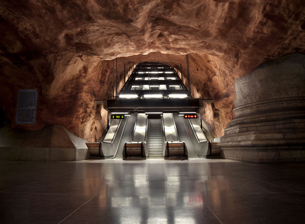
abandoned subway

This is actually a double image.  On the one hand, it’s an image of what happens when states are governed well. Civilization can be hewn out of rock, common goods such as transportation facilities can be gleaming monuments to efficiency, everyone can benefit from this investment in shared infrastructure for enjoying liberty and prosperity, and this can be done not only well but beautifully.

On the other hand, it’s also an image of the fate that awaits every government, every state, dare I say many a species including perhaps our own?  Those ancient civilizations that now lie buried were once vibrant, not least when they were overcome by the volcanic ash, moving desert, invading horde, ecological crash, plague, or other catastrophe.  We already have self-made ruins such as missile silos, defunct nuclear reactors, and highways to nowhere, but that’s the least of what could follow.  Better to imagine how something both practical and beautiful could become an empty, abandoned fragment of a lost civilization.  Although this machined space was wrested out of the earth by skill, labor, and organization, the rock will outlast anything not renewed, the silence will reign far longer than any party, and maybe, maybe it will receive the accidental tribute of someone wondering how a people so advanced could have disappeared.

At this point I probably should add that this subway station is in Stockholm, Sweden.  Now, Washington. DC has a fine subway system, so I won’t knock that, but it would be nice if the government above ground were allowed to work as well.  More to the point, this photo from another place and time can stand in for the many failed attempts to say something, anything about the current crisis.

I’m referring to those photos of “closed” signs in front of government buildings, tourist stragglers in front of empty memorial sites, political leaders looking grave, and similar fare.  The fault isn’t the photographers’, as there really isn’t much to see at all–that’s the result of something not happening–and both the reasons and the effects are even less visually apparent, at least for a while.  The fact that the media are putting up dozens of these stock images doesn’t hide their ineffectiveness even as it tries to compensate for it.  But even that’s not the real problem.

Actually, there are two problems.  One is that there haven’t been any strong photographs regarding the recent debate about the shutdown and about “Obamacare” more generally.  Let me suggest that this is one reason we have been witness to such a stunning demonstration of GOP mendacity, press complicity with their tactics, and the seemingly bottomless ignorance and gullibility of the American public.  It’s only a counterfactual supposition, but I think one cause of the low quality of public discourse is that there has been no strong image of harm or corruption to bring people to their senses.

The second problem is that none of the photos we do have are able to do what photojournalism at its best does: expose the deeper truth that lies underneath the froth of the news.  That truth would tell us something that we really need to know if we are to live well: say, something about why American society is becoming so dysfunctional and what might come of it.

Which is why I’ve offered the photograph above for consideration.  One thing that often is irrevocably lost among the ruins is the reasons people gave for fighting one another or not working together or abandoning the principles that had sustained them.  Reasons that they were so sure about, that they thought were so important at the time, that they knew were right.  Such pride goeth before the fall, but few are around to remember it.

So it is that photography might push back against the arrogance that can shut down a legitimate, well-functioning, democratic government.  In this case, it can’t work by exposing the lies, for they are present for all to see.  What it might do, however, is remind us how much can be lost, and lost even when so much else looked so good and worked so well.

Call it an archaeology of the present: the images that would remind us of how close we can be to becoming ruins.

Photograph by Valentijn Tempels/National Geographic Traveler Photo Contest).

Cross-posted at BAGnewsNotes.

 0 Comments

It is All in the Eyes of the Beholder

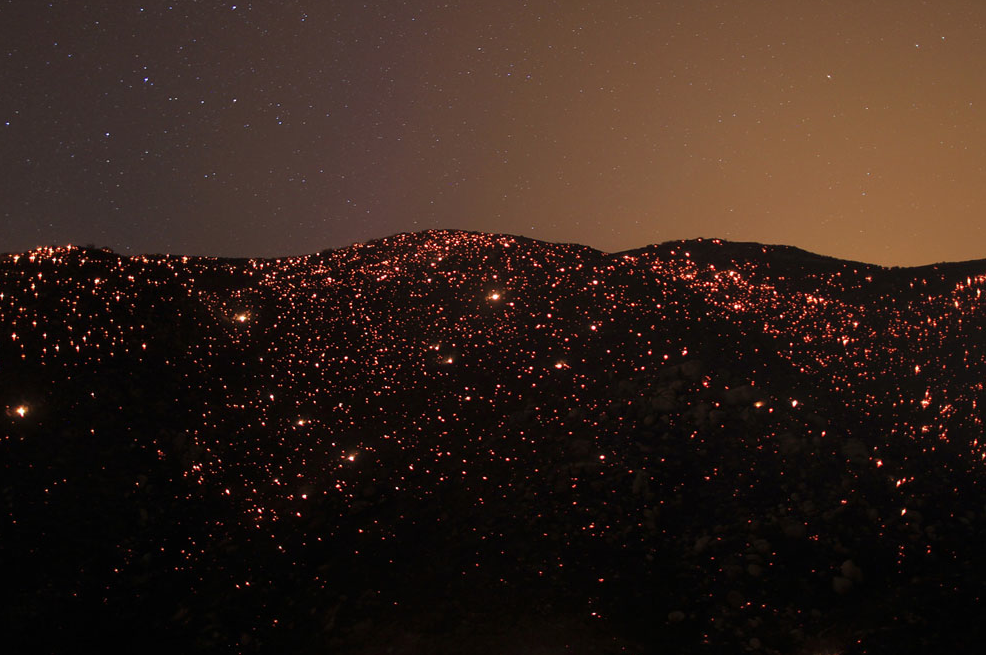
One of the complaints against the photograph as a medium of representation is that offers a partial view of the world that distorts reality.  The complaint is spot on, though to be fair we have to acknowledge it recognizes a burden that every mode of representation bears.  A more useful approach is to recognize the capacity of photographs to offer multiple views of the world that frame and underscore the complexities of the universe.  Consider the photograph below, an image that circulated widely on mainstream slideshows last week.

Beautiful.2013-08-13 at 8.38.03 PM

Without a caption it is hard to know exactly what we are looking at, but it is also hard not to look at it.  Shot from a distance and on high it appears to be a landscape of some sort, and the contrast between the horizon and the body of the image invites our attention. The lights below appear to twinkle, lending something of a human quality to the image, perhaps marking something like civilization, but it is the aura that marks the boundary between the horizon and the body of the image that gives the image its distinctive quality.  Perhaps the sun is setting, or maybe it is about to rise, but in either case, the image invokes what we might call a sense of “tranquility” that is altogether aesthetically pleasing.  It is a beautiful image, and whatever it is that is being represented, the perspective calls attention to that beauty.

From a different perspective, however, the affect is somewhat different.

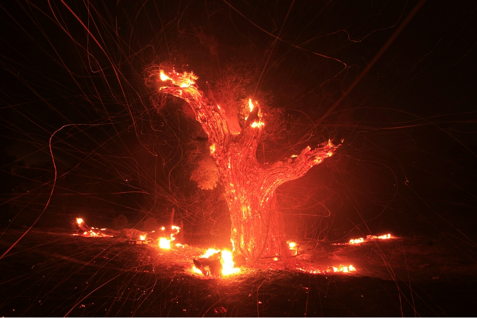
Sublime2013-08-13 at 10.30.19 PM

 Shot now from a much closer vantage, the field of vision straight on, the contrast between lightness and darkness is not gradual but stark, and as a result the image does not invite a sense of tranquility but rather a sense of violent disruption.  It is still hard to avoid looking at the image, however, but what in the earlier image appeared to be a quiet and restful twinkle is here blazing hot.  Indeed, one can almost feel the heat consuming what appears to be a tree, and in its own way it reaches out to whomever stands in front of it, at once pulling them in and warning them off.  It is what Edmund Burke characterized in the 18th century as an instance of the sublime, a representation of a natural scene that manages the contrast between intense lightness and darkness so as to invoke simultaneously a sense of horror and pleasure.

What is important to acknowledge is the fact that both photographs are of the same scene at roughly the same time.  In each instance we are observing a wildfire burning out of control in Banning, California.  Is the scene tranquil or violent?  Is world represented here harmonious or out of control?  Is it beautiful or is it sublime?  The answer to all of these questions is, in some measure, yes!  The event being represented is simultaneously tranquil and violent, harmonious and out of control, beautiful and sublime.  And it is the capacity of the camera to show us  how such apparently contradictory qualities can (and regularly do) co-exist simultaneously in a single event or phenomenon that makes it such a powerful and important technology of representation.

In short, what might be understood as the weakness of photography as a medium of representation might well be its greatest strength.  It is all a matter of how you look at it!

Photo Credit: Gene Blevins and David McNew/Reuters

 6 Comments

Ready, Aim, Shoot!

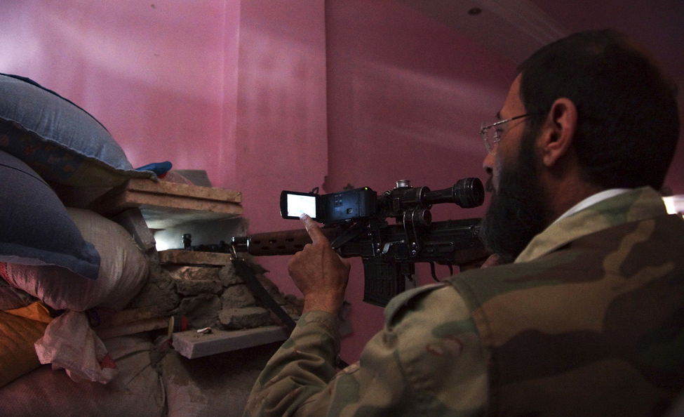
Gun.Camera.2013-07-28 at 8.59.12 PM

Much of what we do here at NCN is a celebration of photography.  And among its many virtues are that it slows the world down, indeed, it stops the world in ways that normal sight is often hard pressed to do—at 1/800th of a second, for example—inviting  us not just to look at the world around us, but to see it, sometimes with fresh eyes.  It operates as such in many registers, but sometimes it invokes what the philosopher and literary critic Kenneth Burke called a “perspective by incongruity,” literally encouraging us to “see” things in terms of things that they are not. Or perhaps, as in the photograph above, encouraging us to ponder the similarities between things that on the face of it we assume are altogether different.

According to the caption we are viewing a member of the Free Syrian Army who is simultaneously “pointing” his weapon and his camera at a “scene” in Deir al-Zor, one of the largest cities situated in the eastern part of Syria.  Of course, he is not just “pointing” his rifle, and the purpose of the gun is not to so much to capture a “scene” as to contain or intrude upon a strategic space.  And so, one might think that the language of photography somehow masks and moots the language of weaponry.  But, of course, the language could be reversed as we might say that he is “aiming” his camera and “shooting” at his enemy.  And if that seems like too much of a stretch, don’t forget how cameras have become one of the primary “weapons” in the war on terrorism—and more—surveying public spaces, authenticating identities, and so on.  And indeed, if nothing else the image of the Syrian freedom fighter is a stark reminder of how entangled the language (and, as it turns out, the history) of the camera and the gun are, each calling attention to the capacity of the respective technology to aggressively intervene in, capture, and control a situation.

There is no question that I would rather be “shot” by a camera than by a rifle, and I have no doubt that the world would be a better place if we could truly substitute “pixels for pistols.”  But for all of that,  we should not lose sight of the potential predatory power of the lens or the ways in which a camera can serve as a weapon, however good or ill the purpose to which it is put.

Photo Credit: Stringer/Reuters

 0 Comments

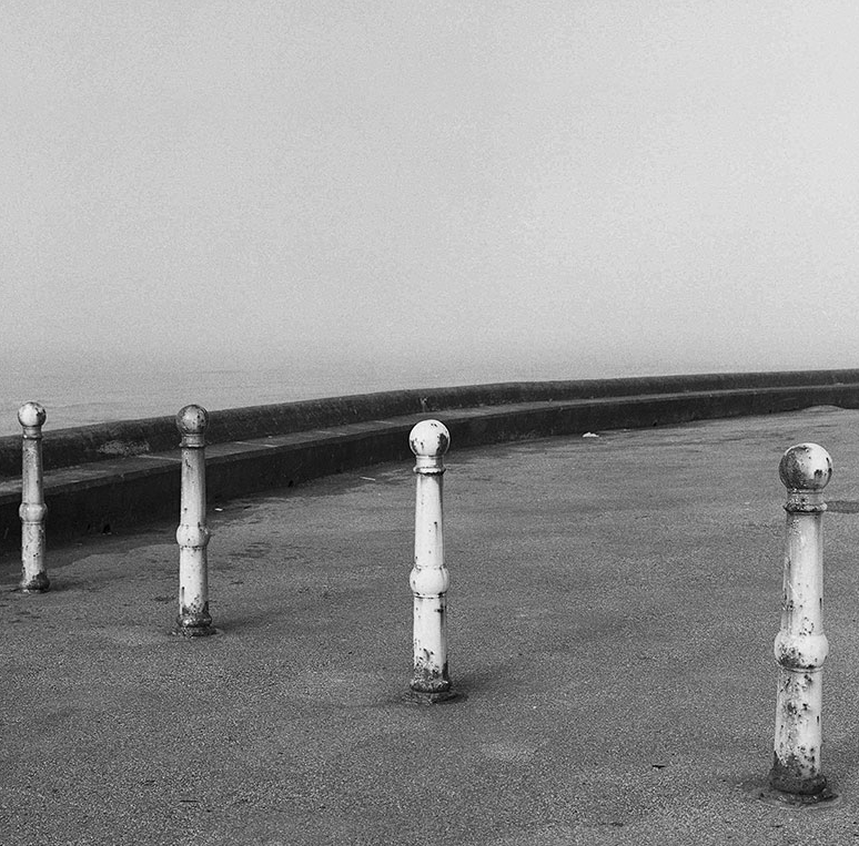
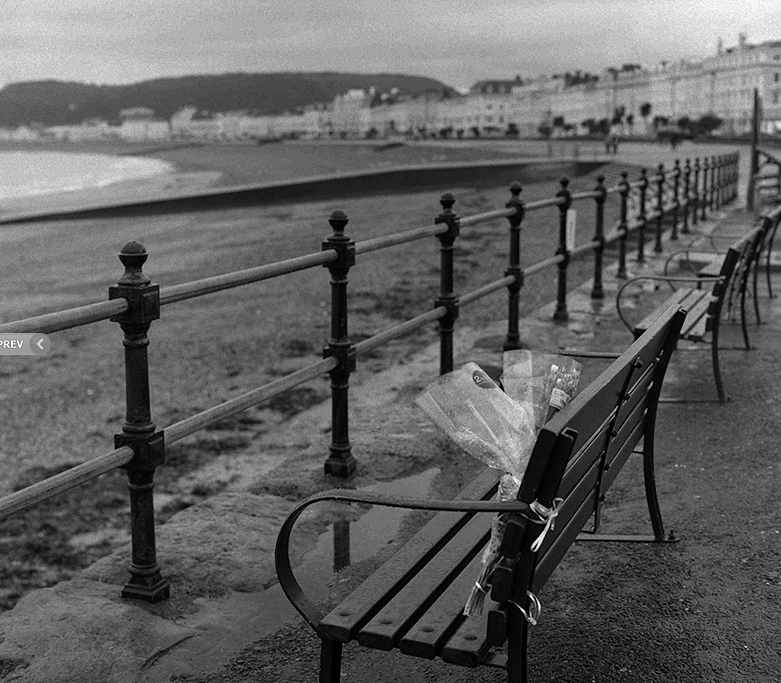
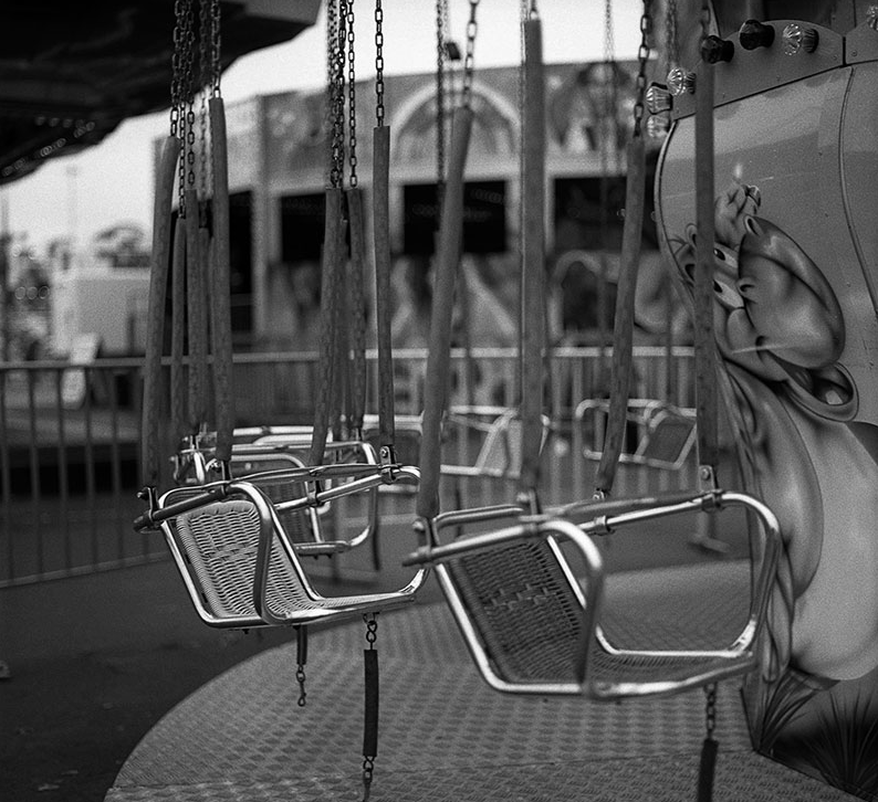
Andrew Fisher’s Images of Emptiness Beside the Seaside

One might ask why a public art would have a place for emptiness.

Screen shot 2013-05-23 at 8.31.34 PM

Photography certainly does.  Whether looking across a Civil War battlefield, or at a road in the Crimea, or at the desolate streets and empty storefronts of urban decay, or at grasslands burnt down to dust by drought, scenes of desolation have played an important part in photography’s history.

One result is that it is easy to see another exhibition of empty places as verging on cliche; haven’t we been here before, and what is to be gained by looking again?  When the loneliness is part of an amusement park or boardwalk or beach, one can feel manipulated: isn’t it just a cold day or off season?  What’s to be learned when we know the people are just somewhere else and perhaps having a good time anyway?  Is the point merely to contrast the artist’s work from the Happyville aesthetics of commercial media?  That very likely is one motive behind a lot of documentary photography, but is that all we have here?

Screen shot 2013-05-23 at 8.30.24 PM

These questions were part of my initial reaction when looking at Andrew Fisher’s exhibition, Beside the Seaside, but something else keep me looking a bit longer.  What I like about these images is that they don’t just show a degraded public space, even though the decay on the posts in the first photo hints at that.  What I get instead is a complex sense of public space that says several things at once: that pubic life requires a built environment, however minimal that might be; that minimal is often good enough, because of how much will happen simply by people being present to enjoy a bit of leisure in a largely uncoordinated fashion; how it really is about the people and how they can share a common space, something we can forget when dazzled by newer construction or when isolated in our places of media consumption; and how association can lead to abandonment of the place and of each other as people follow their different interests to go elsewhere; and how even that sadness need be only for a while and can become a basis for reflection and repose.

Screen shot 2013-05-23 at 8.29.19 PM

So we need images of emptiness after all.  Public culture is not just a story of bustle, excitement, conflict, change, and progress.  It is all of this, but they all are prey to time, which is in fact something that Andrew is trying to tell us.  We experience the amusement or the conflict or any specific event as if it will always reverberate across our lives, and some do.  But there also is the down time, the emptiness, which was there before and will come again and is within us right now, always.  Sometimes it helps to see that.

 1 Comment

Reflections on a Scene (or Two)

Screen shot 2013-05-19 at 8.49.44 PM

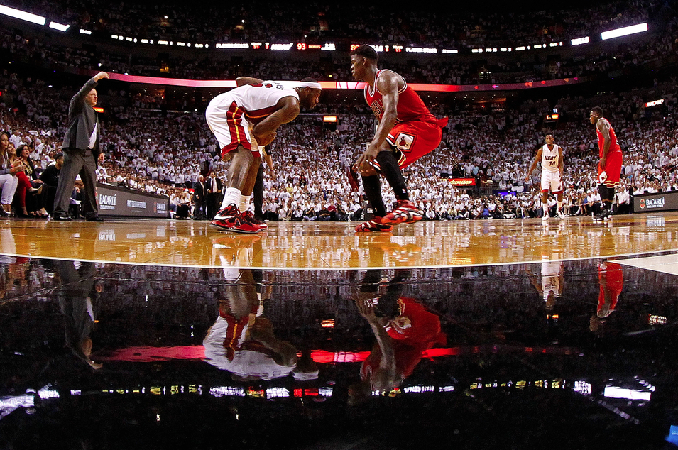
We don’t write about sports very much here at NCN and today will be no different.  After all, what is there to say here.  The photograph pictures the Miami Heat’s  four time MVP LeBron James about to take the Chicago Bulls’ Jimmy Butler to the basket.  The only suspense is whether it will be a three point play or not.  No, what makes this photograph notable has almost nothing to do with the actual action taking place and everything to do with the way in which the camera has captured two scenes at once—one on top, the “real” scene, and the other, on the bottom, a reflection from the highly polished floor.

Of course, one might argue that this is only one scene, the inverted image on the bottom a natural extension of the top image.  And that would be true also.  The question, really, is how one wants to “read” the image.  We typically think of a mirror reflection as an inverted but otherwise identical (re)presentation of the original.  It is one of the reasons we are so often challenged to “look at ourselves” in a mirror, so as to see what is “really” there, or at least what others purport to see  But here, while the original and the reflection bear enough points of similarity that one might identify them as the same scene, they are not identical.

The top image is sharp and clear, consonant with the photojournalists avowed dedication to the realist aesthetic that purports a sort of mechanical objectivity—everything to scale, the light natural, the natural plane of the image represented as if one were actually there witnessing it. The bottom image has more of the quality of an impressionist painting, the appearance of thin brush strokes that call attention to texture, especially as it relates to human movement; emphasis on the quality of light as it effects the scene; and finally notice of the unnatural angle that resituates the viewer, underscoring the sense in which what we are looking at is clearly a representation that needs to be decoded and not the thing itself.

The effects of the image and its reflection are different as well.  Note, for example, how the realist image locates the contest between James and Butler in a multiplicity of scenes that first calls attention to the game itself as we see the coach calling out orders and other players positioning themselves to respond to the central action, and then calls attention to the immediate crowd watching the event.  The focus is clearly on the two principles, but they are part of a larger event.  By contrast, the impressionist image focuses our attention almost entirely on the central actors, giving them an almost epic significance, everything else cast with a spectral patina that suggests that they are both there and not there (perhaps like the external viewer of the image).

Whether you see one scene or two either (both) is (are) shot with the same camera, with the same aperture, from the same vantage point, and at the same moment in time. And yet what we see are two potentially and palpably different (albeit related) events, each calling attention to the otherwise taken for granted conventions that underscore both what is present and what is absent in the other and thus animating the possibilities of meaning.  What makes the photograph particularly interesting then is how it schools the viewer concerning the everyday necessity of visual literacy, always “reading” an image, not just glancing at it, seeing it for what it always is: an artistic construction.

Photo Credit:  Mike Ehrmann/Getty Images

 1 Comment

Seeing Consciousness: Embodied, Machined, Photographed

Photography can’t represent everything, or many things, or perhaps even any one thing.  It is profoundly emotional and relational, but that leaves a lot of thinking unaccounted for.  If you want to know what it is like to work through a long set of logical problems, or go back and forth about a difficult decision, or understand the subtext in a negotiation, you should go elsewhere.  When it comes to depicting mental complexity, one page of a Henry James novel does more than any hundred slide shows.

Even so, this binary between emotion and cognition also misses something, or many things, and perhaps even something important.
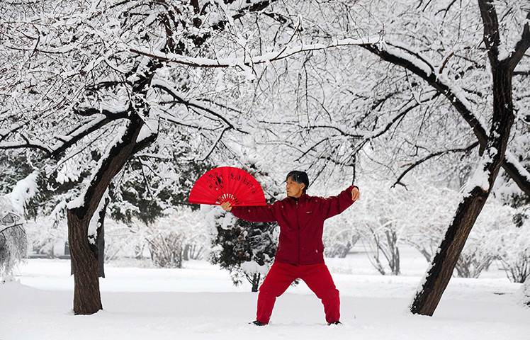
Shenyang, China: A woman practices tai chi with a fan after a snowfall

“A woman practices tai chi” in Shenyang, China.  A human being is shown in a moment of controlled movement.  Against a background of winter stillness, she creates an intentional act of repose.  Feet apart, knees bent, arms lifted, hands cocked, head turned, every part of her stance was created through movement that has been momentarily stopped.  She is a portrait of concentration, as she exhibits both mental focus and a gathering of energy.

This fine photograph is relatively unusual in that it takes us close to a moment of sheer consciousness.  She is doing something, but in the absence of action and social context it seems close to doing nothing.  Just as the winter scene of inert trees and snow around her seems to be doing nothing, although it actually is doing something as part of the wheel of the seasons.  The difference between doing nothing and doing something in the landscape is filled in by our knowledge of natural processes.  The difference between her lack of movement and her doing something is filled in by our recognition that her pose is intentional, deliberate, practiced, and all-absorbing.

Photographs can show so much about social relations, material conditions, and much else in the human world, but few get as close as this one to pointing directly toward consciousness itself.  Although consciousness–that incredible, profound, yet evanescent subjective awareness–can never be seen as such, but it can be communicated, and sometimes even by an image.

And by considering how this photo may be unlike many others, we also can recognize how the many others are nonetheless like it.  For if the photograph only points toward or takes us to the outer edge of consciousness, it also does something much more important, which is show us that mind (and mindfulness) is also embodied.  The idea of pure thought or sheer awareness is itself largely a fiction–or shall we say an extension of one part of us at the expense of the rest.  By acknowledging that the photograph above shows us embodied consciousness, thinking as it is realized in the controlled use of the body in an actual place with specific props, we can recognize that photography is doing that all the time.  In fact, that is what it does exceptionally well: the traces and textures evident on the surface of things can be remarkable signs of how we are aware of ourselves and the world as we are living in and moving through it.

And for that reason, photography also can raise questions about what is happening to human awareness.
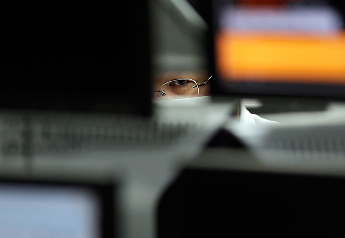
Tokyo, Japan: An employee at a foreign exchange

This image trades on the cliche that the eye is the window of the soul, but for good effect.  “An employee at a foreign exchange trading company looks at monitors” in Tokyo, Japan.  The photograph also is showing seeing (and for more on that concept see W.J.T. Mitchell’s book, What do Pictures Want?); thus, as above, we are cued to the intentional mental activity that can’t be seen directly.  This, too, is a photograph of consciousness, and of embodied consciousness, although now the body is reduced to an eye.  An eye, moreover, that sees through a lens while looking at several machines.  Whereas the first image places the whole (albeit clothed) body in a garden, here we have the cyborg self–a scrap of face enclosed in a carapace of optical equipment.  Consciousness, like seeing, is still the focal human experience, yet it also has been enhanced and dispersed through an apparatus of instrumentation.

But we were already there, of course.  That’s what photography had already accomplished: placing each one of us within powerful technologies of vision and communication.  Consciousness is embodied and machined, in the flesh and prosthetic.  These are different states and significant tensions, to be sure, but perhaps it can be reassuring that photography is part of each, and that it can help us become more aware of our complexity.

And of how consciousness can be understood, extended, shared, and perhaps even found where we might not expect it.  To that end, take another look.

Photographs by Sheng Li/Reuters and Toru Hanai/Reuters.

 0 Comments
Civil Rights Photos and How NOT to Repeat History

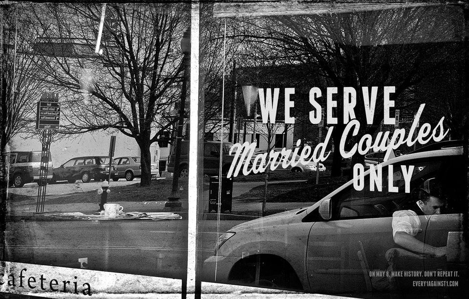
As I write this the Supreme Court is hearing oral arguments regarding California’s Proposition 8, which banned gay marriage in the state.  Many other states have done the same, including North Carolina, which voted last May 8 to pass a constitutional ban by a 21 point margin.  Only recently, however, have I learned of an ingenious visual advocacy campaign against that measure:

e1a1_restaurant_med

Get it?  Other images do the same: for example, separate and not so equal water fountains are labeled “straight” and “gay.”  The images were the work of Every1Against1, an advocacy group opposing the ban.  (The group’s name reflects the name of the ban on the North Carolina ballot: Amendment One.)  By putting gay rights into the visual template of Jim Crow signage, these photos perfectly illustrate how the struggle for–and resistance to–social justice can be a case of history repeating itself from one era to the next.

What the images didn’t do is turn the tide of votes for the ban.  It’s not likely that any one form of advocacy could do so.  One has to wonder, however, if failure wasn’t preordained in the images.  Their basic assumption is that the Jim Crow signs were wrong–a cruel, immoral practice that no modern society would allow to stand.  In the case of North Carolina–and dozens of other states–that assumption may be mistaken.   I’d like to think otherwise, and the times they are a-changing again, but exactly when will a majority of ordinary citizens come to their senses and prove that they really do believe in the constitutional principle of equality?

Fortunately, the founders recognized that majority rule needed to be balanced with judicial oversight.  And so now all eyes are on the Court.  Let’s hope that the justices have a suitable sense of history, one that would help these images become relics or curiosities–and not something that we ever have to see again.

 0 Comments

Nature’s Image: Finding Unity in Deception

This weekend the photojournalism community was flooded with debate regarding an exposé at BAGnewsNotes.  The charges included deception and plagiarism and, in response, unprofessional reportage.  Along the way, a number of people remarked that, aside from the specific case, the issues reverberated across wider circles of concern, from norms of photojournalism to the role and impact of new media forums to basic questions about the relationship between image and reality.  When extended to this outer arc, one might want to encourage a more vital relationship between photojournalism and fine art photography.

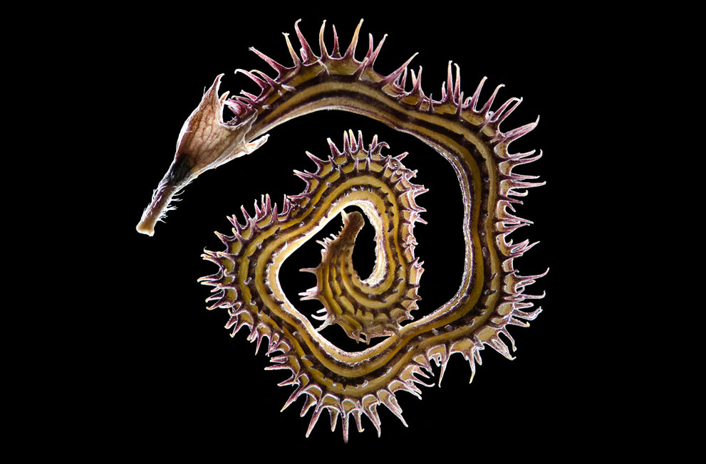
animal flower pod

“Artistic license” is, of course, nothing less than a license to fabricate, whether in stone, words, or images.  It is for precisely this reason that photojournalists are trained to keep their work firmly grounded in recording what is, rather than fabricating what might be.  Along the way, this discipline on behalf of the public interest can lead to a doctrinal hostility to artistry, and good photojournalists then become very skilled in an art whose name can’t be spoken.

The division of labor between documentary and fine art photography has many institutional forms, and is replicated in blogging as well: for example, one reason we do so little with fine art is that it is covered so well at Conscientious. But today is different.

Is it a seahorse?  A worm?  Some small animal that may have inspired the image of a dragon?  Or is it imitating some other organic form in order to hunt or escape predation?  This beautiful image presents something that at once seems to be uniquely itself and yet also allusive, enigmatic, or evocative.

You are looking at a pod of the flowering legume Scorpius muricatus (common name “Prickly Caterpillar”).  What might have seemed animal is vegetable.  What might have seemed to be a parasite is part of a plant.  What could have been an ornament from fantasy fiction or perhaps even some ancient culture is just a tiny fleck of nature.

But, of course, it is a fleck of nature that has been depicted artistically, framed for a special act of perception, capable of creating its own resonance with a much wider, deeper, richer sense of being.  One can sense that animal and plants alike are all emanations of  a beautiful, endless flow of form and energy.   If there is any deception in the plant or its presentation or (most likely) in the mind of the spectator who can’t help but see several possibilities at once, this trick is in the service of opening the viewer to a profound sense of connectedness.  Indeed, “deception” and the very idea of a hard discrimination between appearance and reality is no longer the appropriate framework for understanding.  Sometimes that distinction matters a lot–it can be everything–but sometimes we can set it aside on behalf of other ways of being in the world.

The dissension and debate of public life is a very good thing, but we need repose and unity and wonder.  And not just as individuals, but as a way of living together.  Fortunately, photographers are providing the images that are needed for that as well.

Photograph by Viktor Sýkora.

 1 Comment

Science, Fashion, and the Post-Human

“Science” and “Fashion” are not often found in the same sentence, but welcome to the 21st century.  As the design arts and sciences become the central constellation in a new organization of knowledge, the older distinctions between science, art, technology, fashion, engineering, entertainment, and other domains of modern culture will become increasingly outmoded.  To get a sense of how things are changing, take a sniff of this.

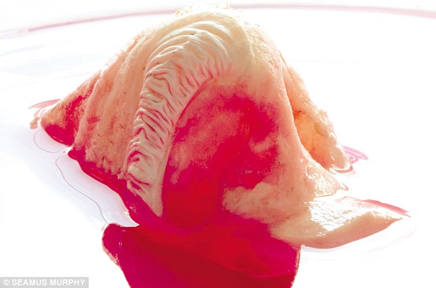
synthetic cell nose

You are looking at a synthetic nose in a petri dish.  By coating a polymeric cast with human cells, the University College London’s Department of Nanotechnology and Regenerative Medicine can produce organs that can be transplanted without risk of immune reactions leading to bodily rejection and other complications.  Noses, ears, and even a windpipe are now possible, with much more to come.  (For a frothy, not very informative report on the lab, go to this story by the Daily Mail.)  Gives new meaning to getting a nose job, doesn’t it?

Jokes aside, one does wonder where it could end, and what strange sights might become commonplace along the way.  The artist Stelarc has already been cutting a trail in that direction, not least with through the surgical construction of a prosthetic ear on his arm.  (I’ve had dinner with the guy and seen the thing myself.)  But we expect that from artists, right?  Well, not exactly, but after the fact we come to believe that was the provocation we might expect.  And despite the lengths to which artists will go to break through to the other side, their efforts can remain merely provocative precisely because they are still framed by the cultural category of art.

Which is one reason to look again at fashion.  Although an even more limiting categorization, it also is a form of visionary design that can slip under the radar precisely because it is assumed to be so superficial and ephemeral.  Which it is, but not before it can be downright disturbing precisely because it might be modeling the future.

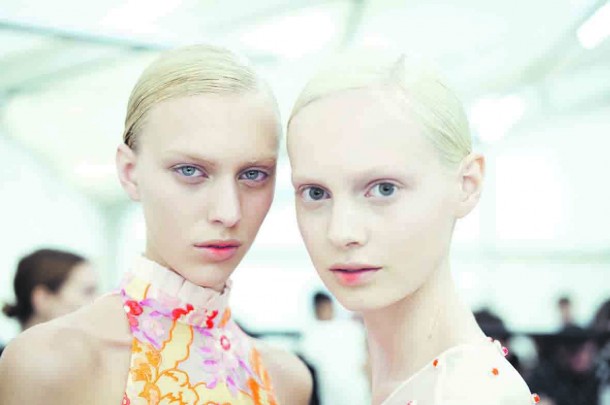
Erdem-Beauty-2452-610x405

These creatures are from the Erdem collection during London’s Fashion Week.  Don’t they look like they could come from a vat in the lab?  The gush at The Daily, the industry publication for the show, got it exactly right: “Clone-like, robotic girls made up a beautiful model army at Erdem. The pièce de résistance? A dusting of neon orange to the inner lip. ‘It’s as if they are grasping a neon bulb in their mouth and it’s glowing,’ explained the show’s make-up man Andrew Gallimore.”  And some day we’ll be able to design for that more extensively.  Plug and play, you might say.

Which brings up the matter of gender, doesn’t it.  Just where will designing women end?  Equally chilling is the idea that the lab would select for such extreme whiteness.  Now that we have an image of the cloned body, and not just the part, we can realize once again that the real problem may not be the technological capability, but how it could be used to reproduce a retrograde politics.

That’s the kind of reflection that art is supposed to provide.  As one design art is used to reflect on another, perhaps the post-human can become a future that is not only possible, but worthwhile.

Photographs by Seamus Murphy and Morgan O’Donovan and Shaniqwa Jarvis.  FYI, I’ve mentioned the post-human before here, here, here, and here; as you can see, I haven’t even settled on the spelling yet.  I’ll hope that my understanding of the subject is, well, evolving.

 0 Comments