Warning: Undefined array key 0 in /home/hariman/nocaptionneeded.com/wp-content/plugins/as-random-post-images/as-random-post-images.php on line 20

Warning: Undefined array key 0 in /home/hariman/nocaptionneeded.com/wp-content/plugins/as-random-post-images/as-random-post-images.php on line 20
Aug 18, 2013
Dec 09, 2012
Jun 15, 2008
Apr 08, 2015
Jan 10, 2014
Jan 10, 2010

World Press Photo Contest: Why is the World not Weary of War?

The 2013 World Press Photo Contest Winners have been announced, and the news is not good.  I’m not referring to the quality of the judging or the photographs–far from it–but rather to what they show us about the world today.

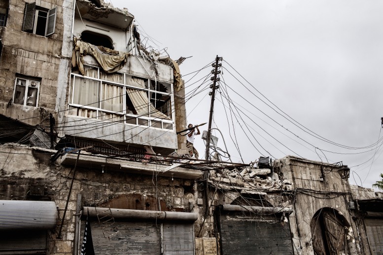
BattleToDeath_01

Frankly, the world revealed by these photographs is a shit hole.  All too many of the images depict the ravages of war or of other conditions that are war by another name (gang violence, the brutal subjugation of women, poverty).  And as you can see above, a common denominator to these many sad stories is that a place where people were just trying to live decent lives is being wrecked, with little hope that anything good will come of it.  Or to put it another way, what seemed to be a modern world, or at least a part of the world on the way to full modernization, may in fact be going in the opposite direction.

I think it’s also telling that many of the slide shows featuring the winners–here, here, and here, to mention just a few examples– have selected images that don’t avoid this emphasis but may soften it a bit.  Certainly they haven’t led with the most horrific images, and neither have I.  Few of us really want to look at how awful life can be, and there is a great deal of peace, prosperity, and beauty in the world, and not much we can do about the rest anyway, right?

Right.  Sure.  Whatever you say, boss.  And that’s part of the problem.  In a period of time when in fact most of the world is at peace, in fact far too much of the world is at war.  And while terrible social, cultural, economic, and political degradation is spreading across the Middle East, Africa, Latin America, and elsewhere as well, the rest of the world goes about its business, as if business were all that there was to living with others.

That’s why I picked out the image above.  It was not a big winner–second prize, Spot news stories–and it’s certainly not a particularly striking image or one that with sharp emotional intensity.  It’s not even quickly legible, and you have to peer at it to see the lone rebel fighter aiming his grenade launcher in the direction of Syrian forces.  But for the same reason, I think it captures something important about the world being revealed by all of the photos.  A place where people have lived for millennia is being ruined, and with not much more than emptiness and the smoke of another battle on the horizon.  Just as bad, the lone human being in the picture is a puny part of the scene–a bit player, really, as larger historical forces crash together to create continuing upheaval.  Sure, he has the power of action, but even justified revolution turns too easily into just another cycle of violence.  At the end of the day, all we may be left with is a long night.

Of course, there may have been a bias in the contest toward bad news.  That is the nature of news, and so we should not be surprised that the stories told here are harsher than those at, say, National Geographic.  And this comparison reminds us that the quality of photography need not depend on its subject, so perhaps more of the winners could have been taken from the sunny side of the street.  But that would miss the point, which is the reason World Press Photo exists.

There comes a time when the most important thing is not how well the photo was taken, but what it reveals about the world.  In the words of William Carlos Williams, “It is difficult/to get the news from poems/yet men die miserably every day/for lack/of what is found there.”  These photos are the poems for our time.

Photograph by Fabio Bucciarelli.  The William’s quote is from his poem, “Asphodel, That Greeny Flower.”
 1 Comment

Remittances: Images of Migrant Labor by Robert Gumpert

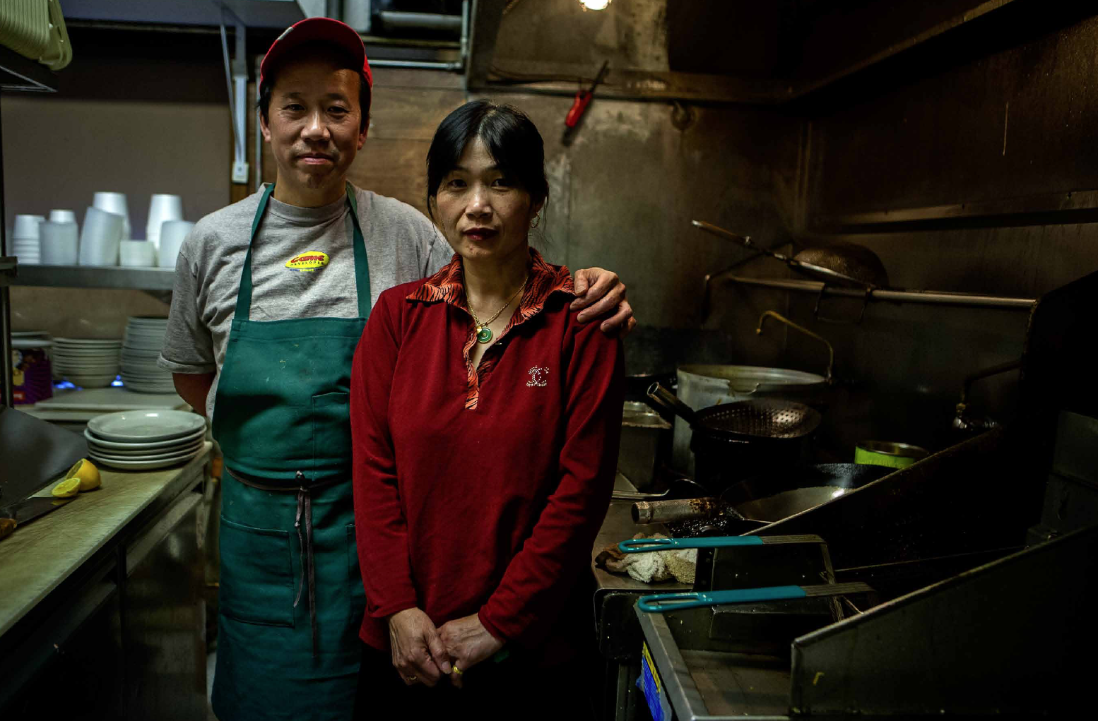
Given the date, I’m tempted to label this one, “Valentine’s Day, The Day After.”  It’s a beautiful, beautiful image of what love is all about: the deep bond and real beauty that can be found when people face life’s struggle together.

Gumpert Remittance 8

I could go on about the richness of this image–the fruit on the table on the left, as if out of a Dutch still life; the varied cultural associations, all powerful, caught up in her red shirt; the tension between repose and anxiety in her clasped hands. . . . But these and the other details, both light and dark, in this remarkable photograph are not there for merely artistic appreciation.

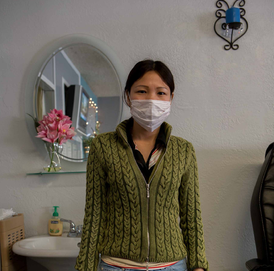
The photo is one from the Remittance series by Robert Gumpert, a photographer working out of San Francisco on behalf of prisoners, migrant laborers, and other human beings.  (Warning: this link to his website will take you to some heart-stopping photos.)  This series is a meditation on migrant earnings–the remittances–that flow back across borders as yet another form of alienated labor.  Gumpert notes that, according to the World Bank, remittances to developing countries are expected to increase 7 to 8 percent annually, reaching $467 billion by 2014.  Thus, capital flows at the bottom of the economic hierarchy much like it does at the top: transnationally, and in a manner that can abstract, displace, or destabilize social relationships.  The difference, of course, is that the flows at the top hurt other people, while the social costs at the bottom stay there.

Gumpert Remittance 6

Which is one reason why this highly enigmatic image is so moving.  It could be a work of performance art, but it’s not.  The decor suggests that she is doing fine, but the mask, well, that’s another story yet to be told.  Asthmatic?  Factory worker?  Sex Worker?  (In fact, she works in a nail salon.)  She is both present and concealed, and somehow alienated from us and even it seems from her own environment.  She seems too enclosed for her own good, and yet that enclosure may be all she has left of herself, with her money, chance of getting ahead, and control over her own life already sent elsewhere.

Gumpert Remittance 2

I don’t know what Robert Gumpert had in mind when he took these images, but I do know that he has given us something to think about, and something to think with.   Each image captures a profound sense of reality without out telling us exactly what that is.  What is unsaid is as important as what is being said; if, that, each side of the image is used to understand the other.  This back and forth is not an arbitrary exercise in interpretation, however, but essential to understanding a reality that is defined by people and capital constantly moving back and forth across so-call borders, and often leaving only desolation in between.

Photographs by Robert Gumpert.  The series is not yet available for public distribution, but I’ve provided these examples with his permission.

 0 Comments

Repurposing Public Arts

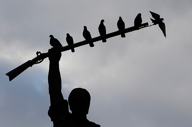
Statues of civic heroes are not placed in the town square to become splattered with bird shit, but that is what happens.  In fact, birds pay attention to the monuments long after human attention has faded.  Once the work has become part of the background of daily life–not to mention an antique artform–it takes a second act of dedicated looking to capture the initial sense of monumentality.  And even then, the birds can alter the visual effect.

Birds roost on the rifle of a statue of Benjamin Milam at dusk

You might say they’ve become part of the picture.  (You can see another example here.)  What’s remarkable about this photograph is how it captures simultaneously both the original intention of the art work and its mildly comic appropriation by the birds.  Indeed, it blends intention and use in interesting ways.  The defiant gesture is beautifully highlighted by the contrast between the dark silhouette and blue and grey sky, while the bird’s behavior also makes perfect sense, not least as they are spaced evenly almost as though part of the original design.

This blending of different perspectives (gun or perch) is reflected symbolically as well.  On the one hand, the doves could seem to be an implicit criticism of the martial citizenship that has been set in stone.  Instead of the Sturm und Drang of history, they seem to have admirably simple concerns.  Instead of battling for sovereignty, they represent another kind of liberty.  Instead of trying to make a statement in stone, they alight and fly away as they please.  And at the end of the day, it seems that war is trumped by peace.

On the other hand, that bird on the end almost seems to be shot from the gun, and one could say that war buys peace and liberty.  This monument in San Antonio to Benjamin Milam celebrates the Texan war of independence, and that political act might acquire the aura of natural law once it is seen as so easily coordinate with a cloudy sky, the symbol of peace, and an act of soaring into space.  If you don’t think so, just consider how opinions differ on gun laws.  The fact that this image appeared in a slide show during a time of renewed debate about those laws may not be entirely coincidental, and it may well capture a basic dilemma at the heart of that controversy.

Public arts can be used in more than one way.  Birds use the statue in ways not intended, and humans do the same.  More to the point, the artwork never has only one meaning, even at the moment of dedication.  No design can compel only one response, and the meanings vary because viewers vary.  The passage of time works in more than one way as well: the public artifact becomes increasingly part of the background, seen but not seen, while the society’s range of possible responses becomes ever larger and more complex.

Photography is a public art, and it records other artworks.  Thus, it is subject to all the problems that come with being placed in the public square, but it also can reactivate awareness of what can be seen and how we see in civic spaces.  I hate the word “repurposing,” but it captures exactly what has become a common habit of a media-intensive society.  Images and other fragments of public culture are continually being put to additional use that may go far beyond what was originally intended.  So it is that the image above need not be about the birds or the stature, but about what it means to look at a photograph.

Photograph by Eric Gay/Associated Press.

 2 Comments

Visions of Austerity at Fashion Week

Fashion Week lasts far longer than a week, which is perfectly in keeping with its comprehensive commitment to excess, and also with its uncanny ability to capture the spirit of the age.  And this year, the buzz is all about austerity.

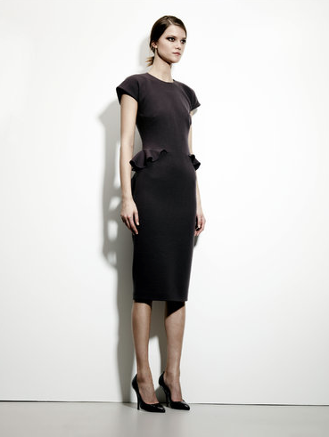
austerity model Bottega Veneta

The New York shows have started, and the Times has two articles and a slide show to point out “a Conservative Touch” that will provide “Thrills Without the Frills.”  Really.  And, of course, no frills doesn’t actually mean doing without frills, as you can see on the hips of the model posed above, but by the standards of the high end shows, the look is definitely, unmistakeably austere.

I can’t say why the industry has converged on this minimalism, and the answer would have to include the natural oscillation between styles that fashion needs to exist at all.  What I find more interesting is how the shows can double as political allegory.

Only a year ago, the Milan show captured the Aristocratic Dreams that lie behind the acceleration of income inequality around the globe.  Now, after a year in which the draconian austerity policies of Europe and the UK have withstood both continuous public debate and comprehensive failure to meet their own objectives, the US  is approaching yet another self-inflicted recession brought on by the same ideology.

The model above may suggest how this s0-called discipline feels inside the elite compound.  She doesn’t look too happy, but she isn’t starving either.  (Well, ok, she’s a model, so she is starving, but she’s getting paid for it.)  She also looks wary, and as if accustomed to wariness–that is, to keeping a close watch on what’s her’s and making sure that no one else gets any of it.  Perhaps there is a touch of fear mixed in as well–after all, if resources are thought to be scarce, then wealth makes security a preoccupation.  She stands almost as if at attention, as financial and military elites will naturally converge around shared conceptions of order and control.  At this level, austerity isn’t so much an economic necessity as a style for ruling in a Hobbesian world.

Which is how we get to this image.

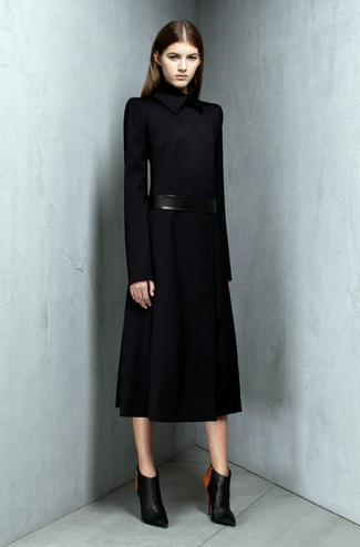
austerity model Narciso Rodriguez

After the shows are over, this should be put on the cover of Margaret Atwood’s The Handmaid’s Tale.  (Just as Fashion Week mimes social theory, it also can channel science fiction.)  Young, wrapped in a functionary’s costume much like she is trapped in a corner, and yet like her shoes elevated and fetishized, this could be the image of an imperial concubine.  But the Lords of Finance pride themselves on being liberal in more ways than one–two, actually–so she also could be a ruler in training.

Like the fictions it evokes, Fashion Week pretends to be about the future while being finely turned with the present.  Which is why it might have something to teach us: For those in power today, austerity is just another way to clothe the politics of greed.

The New York Times slide show features photos from the pre-fall collections previewed last month.  The two dresses shown here are from Bottega Veneta and Narcisco Rodriguez.  If you have any doubt regarding my claims about the failure of financial austerity policies, read Paul Krugman.

 0 Comments

International Street Photography Awards Competition

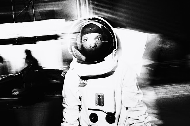
spaceman, Tomasz Lazar

Now in their third year, the International Street Photography Awards are looking for the best street photography from around the globe.  The past two years saw entries from 113 countries, and allowed street photographers the chance to have their work seen on an international platform.

This year the awards will be hosted by FOTOURA.  The 2013 Awards will include Open and Student categories, and are open to photographers from all over the world.  The winners and a selection of the best entries to this competition will be shown in an exhibition in central London in Spring 2013.

More information is available here.  The deadline for entry is February 12, 2013, 11:00 pm GMT.

“Spaceman,” by Thomasz Lazer, Poland; the photograph received third prize last year.

 0 Comments

The Silence of the Lamb

Often political art is unimaginative, predictable, and didactic, but sometimes it can be horrific.

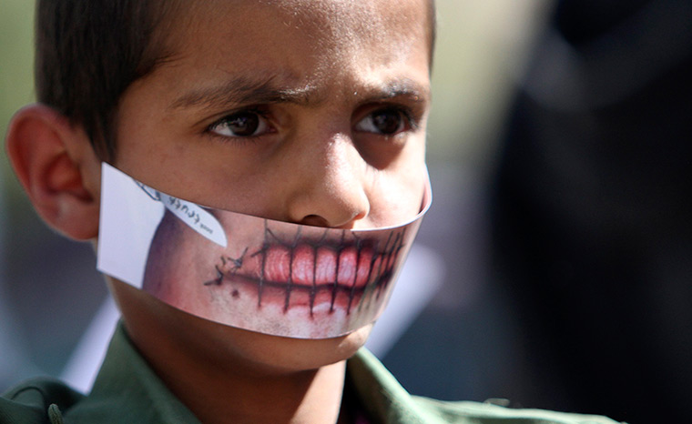
Sana'a, Yemen: A boy wears a paper mask to depict silence

The boy is wearing a mask outside the UN office in Sana’a, Yemen.  He is there as part of a protest “against the silence of the international community over the plight of Muslims in regions of conflict.”  The caption sounds like it was written by a party communications officer, and I doubt that it was the boy’s idea to march down to the UN office.  Nor is that mask something that was made in the schoolyard.

I wish it had never been made at all.  Awful, terrifying, gruesome, grotesque: one shudders with each attempt to describe its effect.  The lips sewn shut are profoundly disturbing, and all the more so for being placed over the child’s mouth.  The ghastly distortion of the torture is magnified further by its now disproportionate size against his small, delicate features.

One assumes that the boy’s mouth has not been damaged, but one can’t shake the sense that he has been harmed by the mask.  His lips are sealed so that he can’t speak, his mouth covered and nostrils almost covered, his body controlled by unseen adults ready to use him for their own political ends.  There is something monstrous about the image he now presents to the world, and perhaps some demon lies behind it.

While protesting silence, he is there to be seen but not heard.  More to the point, he is there to be photographed.  And he was, and the image traveled well, and so the combination of two mute media–the mask and the photograph–creates a kind of speech.  It is speech that can be easily understood: for example, I may have misread the situation regarding the specific protest, how it was organized, and how he got there.  But it is precisely the ability to push everything else out of the picture that contributes to the rhetorical power of this close-cropped portrait.  One art has relayed and amplified another, and by bringing the spectator into an almost intimate relationship with an unsettling depiction of suppressed speech, someone got the word out.

Still, I can’t help think that the child was used.  Not to mention being made party to an act of symbolic violence that is perhaps overwrought, unnecessary, and even likely to habituate one to torture and other forms of actual violence.  Perhaps this claim is itself overwrought and unnecessary, but it at least has the excuse of being provoked by artwork that was designed to be provocative.  And really, what silence?  The news sources I read are full of stories and images about Muslims suffering in regions of conflict.  Today the stories included executions in Syria, riots in Egypt, civil wars in North Africa, more land grabs in the Occupied Territories, protests in Bahrain, and on and on.  And, frankly, “Muslims” is a suspiciously broad category, is it not?

If there is silence, some of it may be self-imposed, and some of it  might be inflicted on those who could have been allowed to think and speak for themselves, instead of being enlisted in yet another conflict.

Photograph by Mohamed Al-Sayaghi/Reuters.

 2 Comments

Time Lost to Violence in Syria and Texas

One of the basic ideas that I bring to this blog is that a lot can be learned from photographs that are not striking, dramatic, or otherwise visually assertive.  Of course, most of the time I’m still working with high-grade professional images, but the distinction holds all the more for that.

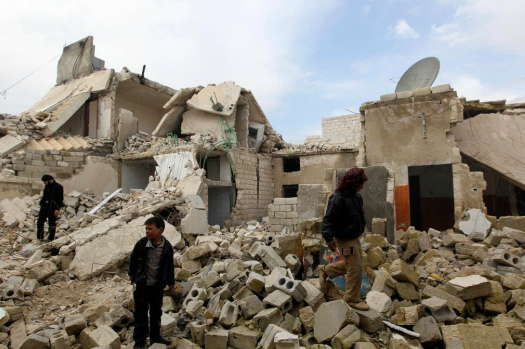
Aleppo rubble

Few photography instructors would advise their students to take a distant, poorly lit shot of people walking aimlessly across a pile of rubble.  But they might need to think otherwise if they were preparing those students for a tour of duty in a war zone.  This is an all-too-typical scene from Aleppo.  The electronics remaining along the roof line suggest this had been a high-tech building, but now it’s been bombed back to the stone age.

Instead of downloading, people are scavenging.  Not for food (not here and not yet at least) but more for something to do.  And that is what the photo reveals: not just destruction, but how much war is about killing time.  Soldiers know all too well how bursts of activity can be separated by long stretches of boredom, but that is nothing compared to what many civilians experience.  War imprisons them–whether in their homes or a refugee camp–while destroying virtually all work, schooling, or play.  As the built environment around them is degraded more and more every week, their opportunity to do anything productive becomes ever more constricted and difficult.  Time looms large as something to be filled–with what?–but in fact that time is being lost.  Lost to them and to the rest of society.  Time that could be used to do so much: to learn, work, entertain, invent, and not least to actually live and not merely survive. . . .

Look at the photo again and consider how you can see what I’m talking about.  Not just the destruction of the building, with all the hardship that will cause, but also how time is actually present in the photograph, expanding to fill the craters and exposed buildings, spreading across the rubble that now blocks any attempt to do anything in that place.  Look at how helpless those in the picture are to beat back the emptiness.  Even the playfulness evident in the figure on the right will soon be exhausted, and more time will be lost to the bewilderment and hopelessness evident in the other boy and the adult to the left.  Their time will be like the space in the photo: there is too much of it, now that it can no longer be productively organized by the buildings and routines of ordinary life.

So you might ask, Is that just one photo, or can we see the same thing elsewhere?  My guess is that you can find the same problem wherever there is persistent violence.  In the US, for example.

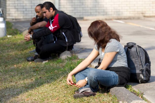
Lone Star students

These students at Lone Star College are killing time as their campus is being locked down following a gunfight.  Apparently two guys were carrying, and so we now all are witnesses to an example of NRA-style conflict resolution.  Of course, it didn’t exactly play out the way it was supposed to.  Instead of two rugged individualists settling their differences with frontier justice, someone else was caught in the crossfire and thousands of students and staff at several institutions in the area had their day seriously disrupted.  (Has anyone measured the collateral damage in lost time and productivity from all these shootings?)  But the details here are not the point.

No, the point is that this, too, is an image of war.  The circumstances differ in many ways, of course, and so the definition is being stretched too far, but consider how one effect may be the same in both countries.  Shooting in both Syria and Texas is not only destroying people and property, it also is killing time.  Killing it by making it useless and a burden to be borne rather than a precious resource to be used and enjoyed.

If the NRA had its way, every college and university would be required to allow people to carry concealed weapons on campus.  Welcome to the war zone.

Photographs by Muzaffar Salman/Reuters and Brett Coomer, Houston Chronicle.

 0 Comments

Best Photographs of 2012

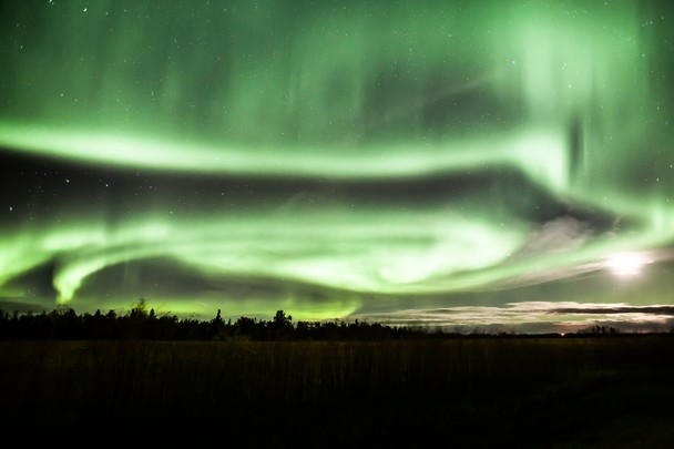
Aurrora Borealis, Zoltan Kenwell

The Monroe Gallery has put up the mother of all best photo lists, which you can see here.

One list you won’t see there is this one by Mikko Takkunen, whose blog Photojournalismlinks is a great resource for anyone who wants to appreciate the range of work being done in the field.

And the photo above?  Not a winner, as far as I know, but it was an entry at the National Geographic Photo Contest, and it seemed a good way to represent photography as an energy field enveloping the planet.  Others might fear the Matrix or see the Illuminati or worry about government control of the radiation belts, but let them.

Photography is not about winners or losers, or about reality and fantasy, but something broader, richer, democratic, radiant.  A plenitude, like the world it represents, and a screen for projections, like the mind that sees.  Pulsing, patterning, appearing and disappearing again, things seen to remind us of forces unseen.  Happy New Year.

Photograph of the Aurora Borealis, Lamont, Alberta, Canada by Zoltan Kenwell.

 3 Comments

Small Arts and Great Crimes

This photo was front page above the fold at the New York Times, and for good reason: it’s a work of public art.

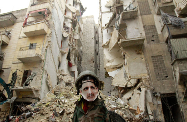
syria-articleLarge-v2

Two works, actually: an effigy of Syrian president Assad and the photograph framing it with an apartment building gashed in two by bombing.  The building is in the war zone formerly known as the city of Aleppo.

The effigy might have been made by an artist or by some kids on the street, and the photograph might have been taken by an old pro or a young stringer.  Doesn’t matter.  Both are skillful and work in the same direction, while the photograph relays and adds something to the stuffed figure to bring out its full artistic potential.

And what a statement that is.  Comically askew helmet and uniform on a ruler who takes no risks while having others do his killing for him; photographed face on a dummy’s body for a man who hides behind an authoritarian screen of authority; a hunched, wary, remorseless attitude that allows his society to be torn apart as he turns his back on the suffering. . . . the vernacular artist has eloquently captured this vicious martinet’s lack of flexibility, legitimacy, empathy, and shame.

The photograph adds to the composition by making the connection between the tyrants’ personality and the damage done to the nation.  We can easily imagine that Assad might some day stand over a country in which every building has been razed, only to say, “but I’m still in power.”  And that is what photography is supposed to do: extend the imagination.  Photojournalism in particular is there in part to extend the political imagination, allowing us to see how the future might be already evident in the present.  Evident, for example, in the character of the leader, and in the suffering, knowledge, skill, and resolve of the people.

Art works by allusion as well, in this case to the Chaplinesque figure of the Great Dictator, who was really a little dictator.  And so it is in Syria: the great man is really very small, and 60,000 people are dead because he doesn’t have a larger heart or mind.  But there is another point to be made here as well, which is that this distortion in magnitude is one that is best captured by small arts.  Arts like the effigy and the photograph, for example.

Great leaders, like great moments in history, may require more panoramic media to be adequately represented.  But when a petty despot is leading his people into the slaughter pen, the grand painting or sweeping film won’t do.  Leadership is one thing, criminality another.  Fortunately for modern times, we have the arts we need.

Photograph by Agence France-Presse/Getty Images.
The photo accompanied this story at the Times.

 0 Comments