Aug 31, 2011
Apr 24, 2020
Nov 21, 2008
Mar 12, 2008
Mar 13, 2012
Feb 10, 2010

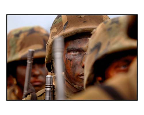
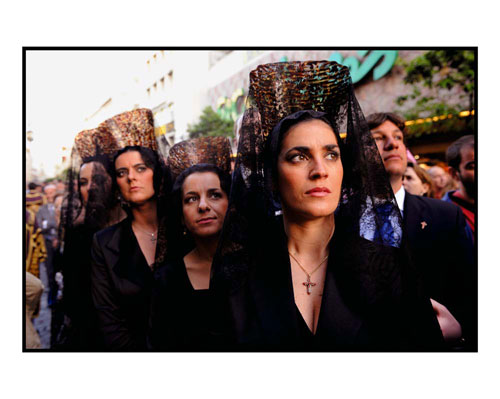
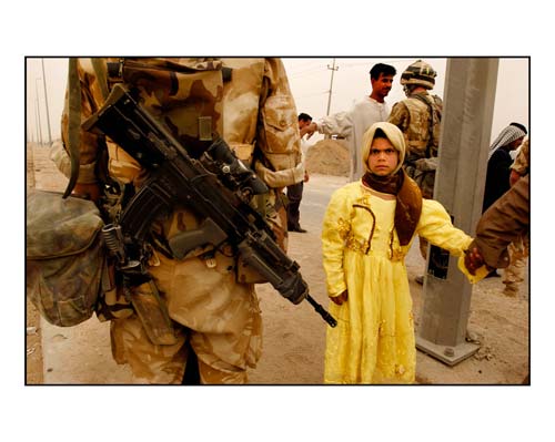
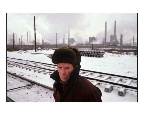
Peter Turnley, “La Condition Humaine”

Chelyabinsk, Russia, 1991

Marines in basic training taking part in an exercise known as the “Crucible.” Camp Pendelton, Oceanside California, 2002.

La Semana Santa. Seville, Spain, 2010

War in Iraq, near Basra, 2003.

“La Condition Humaine,” an exhibition of sixty photographs by Peter Turnley, has opened at the Galerie Agathe Gaillard in Paris.  The show provides a retrospective on Turnley’s work over several decades.  If you can’t get to Paris, you can see some of the work at websites that also offer an interview or commentary on the show.

The exhibition closes on November 3, 2012.

Photographs courtesy of Peter Turnley.

 0 Comments

Someone New is Working the Edges of a Post-Racial Society

Now that the Chicago teachers strike has been resolved, the Monday morning quarterbacking can begin.  One question of likely interest to readers of this blog is whether the Chicago Tribune should have refused to publish this ad:

The interesting thing here is that the Tribune did refuse to publish the ad.  Given that the paper has not exactly been known to be either a supporter of unions or a bastion of unbiased journalism, or in such sound financial shape that they can kiss off full page ads, they must have believed that something important was at stake.  Supporters of the ad say that the reason given was the ad’s “‘racial overtones,'” but that “‘the message of the ad has nothing to do with race.'”

And it is even more interesting to consider that they may both be right.  It seems that both sides agree that the photograph of The Stand at the Schoolhouse Door was all about race.  Alabama Governor George Wallace may not have liked unions either, but he was standing to stop racial integration–first, last, and always.  But a photo of injustice and intransigence in one domain such as race relations certainly could be appropriate to use in another domain–for example, progressives would not be likely object to the image being used to oppose gender discrimination.  And enough change has occurred socially and demographically that one can imagine that a group once oppressed now could themselves be part of an organization that is blocking reform.

Indeed, some progressives have argued unions are obstructing progress. Eric Liu and Nick Hanauer set out this conundrum in two sentences: “Unions are a crucially important part of our economy and society.  Unions have become overly protectionist and are in need of enormous amounts of reform” (The Gardens of Democracy, p. 7).  So, one could conceivably use a racially charged photograph with a post-racial intention.  And one might believe that the message of the ad had nothing to do about race, because “message” would mean what those making the ad intended to say.

But as we all learn, it is easy to say more than one intends, not least because the meaning of what is said (and shown) also depends on how it is interpreted.  It could well be that the Chicago Tribune was connected closely enough to its readership and its community to believe, perhaps correctly, that this photo from the civil rights era could be incendiary or at least distort and damage the negotiations and public discussion by making race more of a factor than was right.  More to the point, some might have felt that its use was a slap in the face for African-Americans: indeed, how could the ad not be insulting when it equated union negotiations over working conditions with white resistance on behalf of a society that was profoundly unjust, inhumane, vicious, and destructive, and suggested that poor schooling was not the legacy of racism and poverty but rather the work of a multiracial union.

To which the reply would be, again: “But that’s not what we meant.”  And it might not have been; if you look at the other ads put out by The Center for Union Facts, they do not look like a Tea Party organization.  I mention the Tea Party for good reason, as it has provided many–way too many–examples of people making patently racist jokes, drawings, Photoshopped photographs, and other vile statements about Barack Obama and then claiming that they were not being racist.  And maybe they really did believe that about themselves: to lack that much sensitivity requires staggering deficits in both knowledge and empathy, but ya know. . . .

But I digress.  Some scholars of rhetoric argue that persuasion, and particularly the ethical dimension of persuasion, comes down to our assessment of the speaker’s character.  (See, for example, For the Sake of Argument, by Eugene Garver.)  Thus, once you get enough evidence of a person’s character, you can start making judgments about whether to trust what they say, and what they say about what they say.  Some of that evidence is provided in the saying, but sometimes you simply can’t tell.  In the case before us, one photograph intentionally taken out of its original context may not provide enough evidence to judge.  Or once again, where you stand may depend on where you sit.

In any case, we might want to avoid becoming too wrapped up in one photograph and one ad.  On the one hand, it is but one example of many, many cases of how people–particularly conservatives, but some progressives as well–are working the edges of the idea that the old identitarian politics no longer apply since Obama has moved beyond them.  On the other hand, there are many photographs that suggest that something beautiful already has happened: that a multiracial society really is emerging in the US.  If that is so, it doesn’t resolve the controversy about the ad, or about how to best improve urban schools.  It is interesting, however, that to see that change you need look no farther than the Chicago Tribune slide show on the teachers strike.


 1 Comment

Hiding the Cost of War

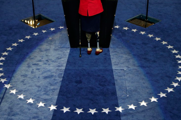
The photograph above is of Tammy Duckworth, a candidate for U.S. Congress in Illinois’ Eighth District, speaking at the Democratic National Convention this past week. She is also a war hero, having been among the first women to fly combat missions in Iraq, losing both of her legs when a grenade landed in her lap while piloting a Blackhawk helicopter north of Baghdad.  Her opponent for Congress, the incumbent Republican Joe Walsh has accused her of not being a “true hero” because she makes a point of discussing her military service in her campaign.  To quote former President Clinton in a different context, “that takes some brass,” especially coming from someone who has never served a day in the military in his life.  But the photograph above is not about Congressman Walsh’s Neanderthal attitudes nor even about Tammy Duckworth’s heroic service and sacrifice to her nation—or at least not explicitly so.

Shot from behind the podium and at a high angle that crops her body at the waist and accents her prosthetic legs, the photograph emphasizes what the viewing audience could not see—at least not while she was speaking. Viewed from the front we see a face, the marker of the liberal individual, a person.  And any person who can make their way onto the national stage to address a live audience of thousands and a mass mediated audience of millions can’t be doing all that bad.

Viewed from the back, however, the photograph invites a different story.  It reminds us of the terrible price that this individual paid—and now note that she is anonymous, faceless, another casualty of war but not one that we have to address directly.  In short, the photograph is an aide memoire to what we desperately don’t want to see, to what we want actively to forget: that we sent her into battle and the price she paid is really our debt, but it is a debt we have no way of paying.

In a sense, the photograph is a comment on the hundreds of images we see of the more than 1,200 veterans who have lost limbs in the Iraq and Afghanistan wars and yet, through the wonders of modern medical technology (ironically made possible because of advances in “war medicine”), survived to live what appear to be so-called “normal” lives.  And indeed, it is the emphasis on appearance that is very much to the point, for in the end we rarely learn very much about the ordinary lives that such people live and pain, trauma, and hardships that they face.

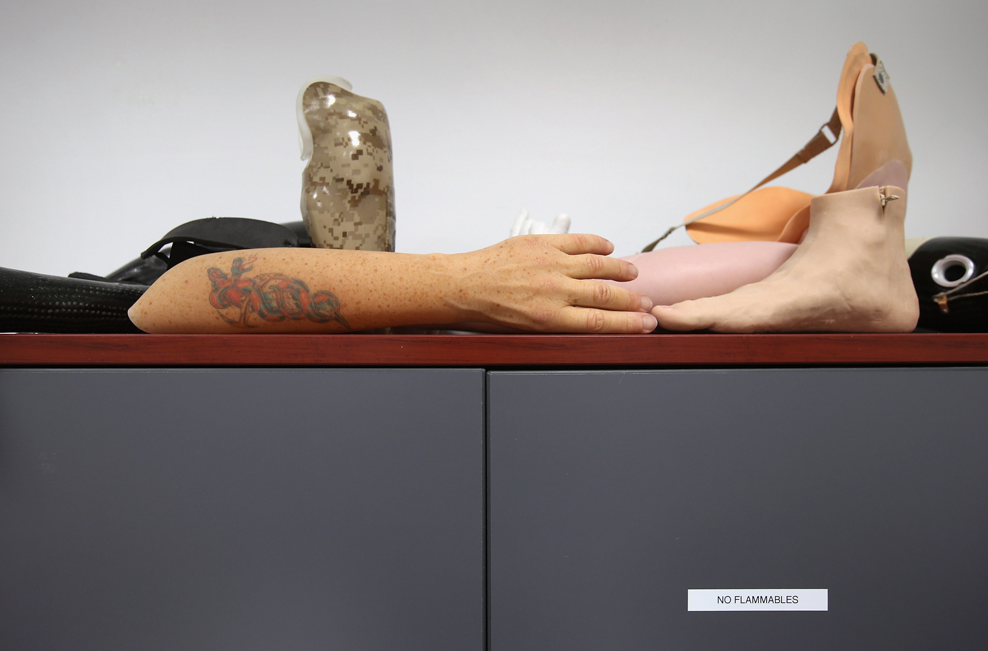
Consider, for example, this photograph that appeared recently in a slide show dedicated to the recovery of war veterans at Brooke Army Medical Center.

What you are looking at here are not real arms and legs, but rather “life-like covers” designed to slip over prosthetic limbs so as to masquerade a disability and to hide it from public view.  Note in particular the customized tattoos on the arm that make it appear to be individual and personal. There is every reason to believe that an amputee would want to be “seen” as normal, to hide his or her stigma, and thus to mask their prosthesis with a “life-like cover.”  Or rather there is every reason to believe that this is how someone who does not share such a disability—a so called “normal” person—might imagine how an amputee would want to cover-up his or her “shame.”  But really, the shame is ours and such “life-like covers” function, at least on par, as a veil that makes it easier for us to forget or to ignore our complicity with the sacrifice such men and women have made and the real debts that have to be paid.

Photo Credit: Charlie Neibergall/AP; John Moore/Getty Images

 1 Comment

Petrochemical America: Exhibition and Book

Petrochemical America
Photographs by Richard Misrach
Ecological Atlas by Kate Orff

Exhibition: August 25 – October 6, 2012, Aperture Foundation 547 West 27th Street, 4th floor, New York, N.Y. 10001

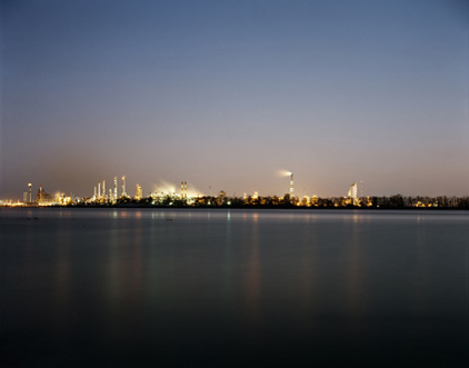
Petrochemical America features Richard Misrach’s haunting photographic record of Louisiana’s Chemical Corridor, accompanied by landscape architect Kate Orff’s Ecological Atlas—a series of “speculative drawings” developed through research and mapping of data from the region. Their joint effort depicts and unpacks the complex cultural, physical, and economic ecologies along 150 miles of the Mississippi River, from Baton Rouge to New Orleans, an area of intense chemical production that first garnered public attention as “Cancer Alley” when unusual occurrences of cancer were discovered in the region.

This collaboration has resulted in an unprecedented, multilayered document presenting a unique narrative of visual information. Petrochemical America offers in-depth analysis of the causes of specific environmental abuses in the region, and expands into an extensively researched study of the way in which petrochemicals have permeated every facet of contemporary life in America.

What is revealed over the course of the book is that Cancer Alley—although complicated by its own regional histories and particularities—may well be an apt metaphor for the global impact of petrochemicals on the human landscape as a whole. Misrach and Orff’s collaborative examination of Cancer Alley points to the past and into the future, implicating neighborhoods and corporate states. It also aims to participate in new thinking about how we can best divest ourselves of our addiction to petrochemicals, and to sketch the outlines of a more hopeful future.

Richard Misrach (born in Los Angeles, 1949) has a long-standing personal connection with New Orleans and the surrounding region. Destroy This Memory, his latest published monograph, shows a record of hurricane-inspired graffiti left on houses and cars in New Orleans in the wake of Katrina, which garnered Aperture a nomination for a 2010 Lucie Award for Book Publisher of the Year, and won the award for Best Photobook of the Year 2011 at PhotoEspaña. Another standout success was his 2007 large-format Aperture book On the Beach, a sublime visual meditation on the relationship between humankind and the environment, which is as spectacular as it is unsettling. Earlier, Aperture published Violent Legacies, which addressed, in part, the contamination of the desert due to nuclear testing. Richard Misrach’s other books include Golden Gate, released by Aperture in spring 2012, on the occasion of the seventy-fifth anniversary of the iconic bridge.

Kate Orff (born in Maryland, 1971) is an assistant professor at Columbia University and founder of SCAPE, a landscape architecture studio in Manhattan. Her work weaves together sustainable development, design for biodiversity, and community-based change. Orff’s recent exhibition at MoMA, Oyster-tecture, imagined the future of the polluted Gowanus Canal as part of a ground-up community process and an ecologically revitalized New York harbor.

The book can be purchased here.

 0 Comments

The White Party National Convention

Sometimes the facts are right there on the face of things.

I don’t mean to make light of what is almost a touching moment as Virginia Governor Bob McDonnell is being made camera ready by his wife, Maureen.  (Nice Scottish name, McDonnell, and Maureen is a fine Welsh name as well.)  They will have the skills, and the stress and strain, of any political couple, and this is not about them.  But does every woman in the picture have to be blonde?

Photographs are not logical arguments, and any one image is an extremely small, partial view of reality, so there is no need to remonstrate that some Republicans are people of color.  We know that, and if there is one black swan then not all swans are white, and if the convention speakers include a Hispanic or two then there is more to the Grand Old Party than a country club of blondes.  But when people gather for a specific purpose, the camera can do a good job of identifying how basic tendencies are there to be seen on the surface of things.  And because photographs do capture whatever is in front of the camera, they can be very good at revealing what is taken for granted or generally assumed or tacitly required for membership in a social group.

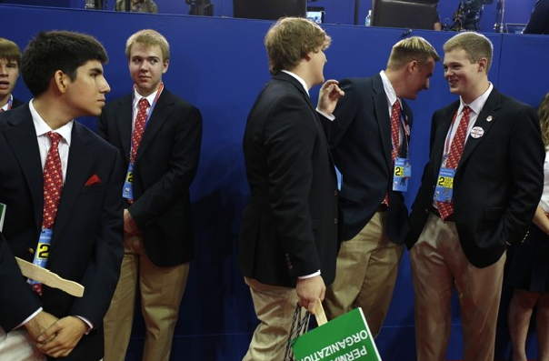
And at least since Richard Nixon’s Southern strategy, there do seem to be some basic demographic tendencies in the GOP.  Tendencies regarding, say, race and gender, as you can see in this photo of convention pages.

Nor are those biases likely to go away, as the pages will become leaders for subsequent generations of the party.  If there is a party.  (I could joke about an all-male party having trouble reproducing, but not all women are alienated yet by its program of gender hierarchy, and the Democrats still have a way to go on that point as well.)  Obviously, blonde is in fashion here as well, and in any case a narrow range of cultural conformity is already evident.  And if a great many Americans wouldn’t feel comfortable in this crowd, I don’t think their absence would be noticed.  With the Romney/Ryan (English/Irish) ticket, the Republicans have doubled down on whiteness.

That’s not how I would build an institution for the 21st century.  But I have this crazy idea that America’s beauty emerges from its diversity, and particularly so when everyone can work together to do their part for the common good.  When a major political party willfully ignores that idea, their campaign rhetoric can become even more obnoxious than usual.

The letters are colored white, as if to emphasize just who “we” is.  But that we didn’t build America or the Tampa Times Forum or the stage sets for the convention; nor do they clean the building at night.  Photographers have been challenging this arrogant delusion at least since Gordon Park’s “American Gothic,” which this photograph echoes.

It may be that the Republican Party core commitment goes beyond transferring wealth upward, but it certainly does not yet deserve to become a majority party.  To do that, it would have to learn how to live with the rest of the country, not just employ them.  The prospects are not good, however, because that would require changes that are more than skin deep.

Photographs 1 & 2 are by Lucian Perkins/Washington Post; no. 3 is by Spencer Platt/Getty Images.

Cross-posted at BAGnewsNotes.

Update: I had forgotten about a previous post that provides more context, verbal and visual, for this one.  So, you might want to also read America in Black and White.

 5 Comments

NCN on Vacation: At the Beach

There are many marvels, are there not?  We’ll hope that you can get away from the workflow for a few weeks.  By coming to see less of the usual routine, perhaps we can see more of the world in all its strangeness and beauty.

NCN will resume posting on August 20.

Photograph by Damien Meyer/AFP-Getty Images.

 1 Comment

Brighton Photo Bienniel: Photography and the Politics of Space

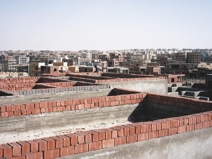
Photoworks is excited to announce the fifth edition of the acclaimed Brighton Photo Biennial, once again bringing international and emerging photographers and artists to the city.  From October 6 through November 4, 2012, Brighton will be populated by free exhibitions, new commissions, events and interventions, at a host of established and more unusual venues across the city’s urban landscape.

You can read more about it here.

Photograph by Jason Larkin.

 1 Comment

Figure, Ground, and Self-Awareness

It’s not easy to take a distinctive photograph at the beach.  They’ve all been seen already, except perhaps for this one.
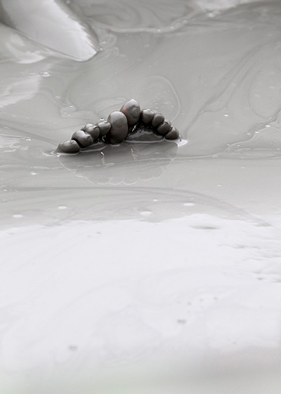
At first glance, I wondered what I was seeing.   Was it some strange species from the liminal realm between earth and sea: gooey, nearly featureless, and dumb, but able to survive for millions of years as something almost as much plant as animal?  On closer inspection, the correct species definition locked into place: toes, paired feet, human being (as Aristotle put it so aptly, a featherless biped).  And only later did I also notice the legs emerging from the sandy ooze in the background.  One fragment now was two having some figural continuity (although the line was still partially obscured), and it became easier to imagine not just the rest of the body but the person, someone not buried but rather soaking in the cool waters pooling along the shore, enjoying a day at the beach.

Now maybe you got that right away.  My obtuseness may be the problem.  Whether due to the fact that my beach time has been rather limited, lifetime, or that I’m easily smitten by surface effects such as the sheen of the watery sand, it may have been too easy for me to not see the obvious.  But if you weren’t mistaken, try to see it as if you didn’t know.  Look at that image as if it could be documenting another species, or as if it were a work of art where what mattered most was the way the smaller, darker, firmer shape emerged out of the lighter, liquid substance suffusing the visual field.

This figure-ground inversion may not be possible: as in the classic drawing, when you see the two heads in profile, you can’t see the vase.  But what you can do, I hope, is look again at the photo and see how the photographer’s adroit use of figure-ground composition has created an opportunity to see the human species as something a bit strange–as if it were not the “rational animal” but rather defined primarily by its ability to stay out of the primordial ooze by blind adaptation for sheer biological continuity.

Humans don’t often define their species by its feet, which are not seen as the basis for an exalted view of ourselves–but here they look almost sentient, if barely so.  Perhaps we should spend more time pondering them, and not just as one way to idle away the time on vacation.  And one might ask how odd the human body could appear when seen only as, say, an elbow, ear, or back.  And how is self-consciousness itself a protrusion amidst a bodily, behavioral field that is itself arbitrarily defined?  Which leads to another photo from the summer slide shows.
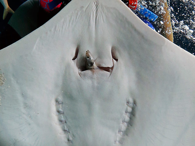
Again, the composition features a strong contrast between figure and ground.  The small fish protrudes out of the much larger body of the ray, which encompasses most of the visual field.  Like the liquid sand, the ray’s body is a subtly modulated light surface carrying  the power of nature.  There also are significant differences, however.  The figure of the fish is the more familiar sight than the closely cropped ray’s body, and the portion of the fish that is not seen is evidence of disintegration, not wholeness.  The fish is going into the maw, not peeking out, and if it is sentient–one can imagine a last shock of biological awareness that life is ending–that is about to end.  Consciousness, like any life form, can emerge, and it can be swallowed up again.  The photograph brings one to consider how the most ordinary of processes–animal eating animal–is also strange, violent, awful perhaps, while also being completely routine, natural, like gliding through the water and breathing.  The smooth, uniform body of the ray covers the digestive processes, just as the smooth, liquid surface of the shoreline covers the struggle for life that leads each species to find its niche or die.

Human beings are the strangest animals in that they have survived without yet finding their niche.  One might think of that as a figure-ground problem.  In any case, artworks such as those above provide one basis for rethinking self-awareness against the background of nature.

Photographs by Jeon Heon-kyun/European Pressphoto Agency and Itsuo Inouye/Associated Press.

 1 Comment
Photography’s Asylum of the Artificial

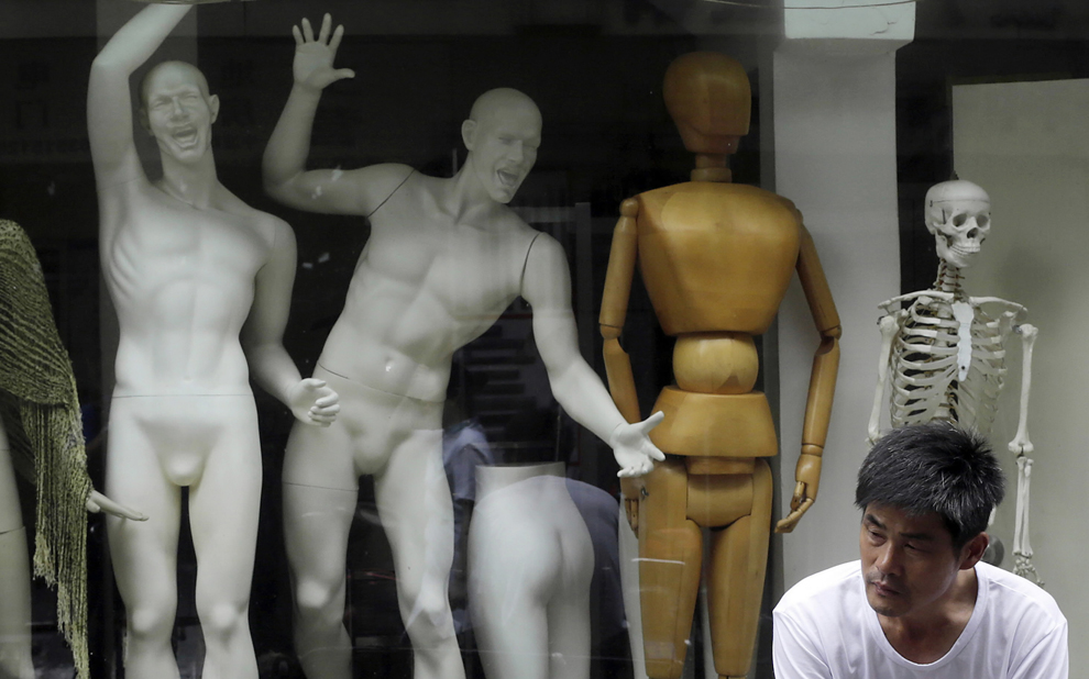
Mannequins typically are designed to serve a smooth process of consumption, so it’s a bit odd to see them behaving like madmen.

Of course, it’s a bit odd to see them behaving at all, much less as wildly emoting actors.  One can almost see the classical masks of tragedy and comedy, except that each is twisted in the direction of the other to become grotesque.  The bodies themselves are more familiar, but something is off there as well: they are both visibly pieced together and organically, athletically posed.  Beautifully molded and thoroughly expressive, yet obviously inanimate, and well muscled yet neutered, these human models are disturbingly uncanny.

The rest of the tableau is equally strange.  An antique robot and a plastic skeleton set out two variations of the theme of human modeling: the hidden structure of a person and an obvious substitute for the outer form.  These two are neutered, but also not gendered (unless you see sexual dimorphism in the pairing), unlike the other two pieces.  And I do mean pieces: the female body is present but never whole.  As each torso is cut along a different axis, you can’t even put the two parts together. A least one is clothed, so women still get to be decorative–that must be a relief!

There is just enough reflection in the window to indicate that the six actors in search of an author are behind glass.  They may look crazy at best, but at least they are interred, set apart, under surveillance, and otherwise locked up and off the street.  You can’t even hear the wailing, and so the asylum has done its job.  And that about wraps up the story.

Oh, yeah, except for the guy in the corner.  He adds another reflective element to the scene.  Were this a museum rather than a street in Shanghai, you might wonder if we were another statue.  Short of that, he must be human.  Like other people, he is both not alone and alone.  Positioned between the enclosed copies behind him and the viewer looking into the display case of the photograph, he becomes a representative figure, but of what?  Dominated by the alien species towering over him while cut off from anyone else, he seems merely human, not triumphantly so.

Sixty years ago, when The Family of Man exhibition was traveling the world, photography created a particular form of humanism–one that had its problems, but for all that was still egalitarian, pluralistic, and intentionally progressive.  By gazing at the ordinary person amidst the common routines of ordinary life, you could see humanity.  That vision has been criticized, co-opted, worn out, and displaced, but photographers continue to prompt reflection on what it means to be human.  Equally important, they do so in response to the emerging challenges that modern civilization presents to human dignity.

Photography is suited to this work because it is tied up so closely with both technological change and social consciousness.  The camera both records and prompts interaction, and does so through processes of mechanical duplication.  You might say it makes mannequins of us all.  Instead of capturing the human essence, it reveals the deep artifice dominating the human world.  But not completely: photography is not the camera alone, and so there we are, like the man in the corner of the image.  He’s a real person, an original, and all the more strange and sad for that.

Photograph by Eugene Hoshiko/Associated Press.  For review of the debates about The Family of Man exhibition (and book), see Eric J. Sandeen, Picturing an Exhibition: The Family of Man and 1950s America.

 1 Comment

Wildfires, Taxes, and the American West

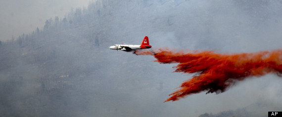
Every summer, it’s the same: forests flare up like kindling, tired emergency crews fall back along the firebreaks, home owners stand guard on their roofs with pitifully thin garden hoses, and the skies are crossed with planes and helicopters cutting through the smoke to drop the equivalent of a teacup of water on the blaze below.  Perhaps that’s why I liked this photograph from among the many more dramatic shots taken in the last two weeks.

Although cropped to feature the plane in action, the image still suggests that we are looking at a child’s toy, or at least a movie made for the younger set.  Although lacking the spectacular power of Air Force flyovers on July 4th, this nondescript supply plane would be thrilling to anyone still capable of being dazzled by simple technological prowess.  And the red fire retardant swooshing behind it bundles together work, warfare, firefighting, fire, drama, and good works alike into a visual emblem of adventure.  The West still evokes the majestic, thrilling chords of romantic heroism, even as it burns like the gates of Hell.

The photo doesn’t just play the old tune, however, for it captures as well the miniaturization of human effort when set against the vast backdrop of nature.  Westerners get that, although they also forget it from time to time.  How can you blame them, for modern civilization is a story of harnessing nature’s power and of living far beyond what the terrain alone would allow.  In the past 100 years, the US  has damned the rivers, pulled water, oil, and coal from deep in the earth, provided electrical power for everyone, and made the desert bloom.  All it takes is a good fire, however, to remind us that human scale is a small thing.

Until, that is, the cool rain finally falls and amnesia returns.  I’ve posted on the fires before (here, here, and here), and I suppose I will again.  Every summer it’s the same.  Except, of course, when it gets worse.  As Timothy Egan points out, the combination of global warming and Republican ideology can only lead to disaster.  Unrestrained growth while cutting government services (as for fire prevention and fire fighting) gives new meaning to hubris.  Need I add that currently these services are underfunded?  For example, the small fleet is aging and some planes have had to be grounded, and states and municipalities espousing low taxes once again are turning to the federal government for a bailout rather than burn to the ground.

By trying to live well on the cheap, people are playing with fire in more ways than one.  And when a political party or a society develops an excessive appreciation of its own powers, nature is sure to provide a harsh lesson in humility.

Photograph by Kim Raff/The Salt Lake City Tribune.

 0 Comments